Clarity is the True North Star for Design
I think there is a perception out there that "simplicity" is the ultimate goal of user interface design. While I agree that simplicity is important, it can lead you down the path of thinking simpler is always better. I think this can lead to poor UI decisions that prioritize simplicity over user needs.
I'd like to suggest that "clarity" is a better north star for designers to focus on, and I'll use an example of a UI element in the Mac App Store that I think exemplifies this well.
The Problem
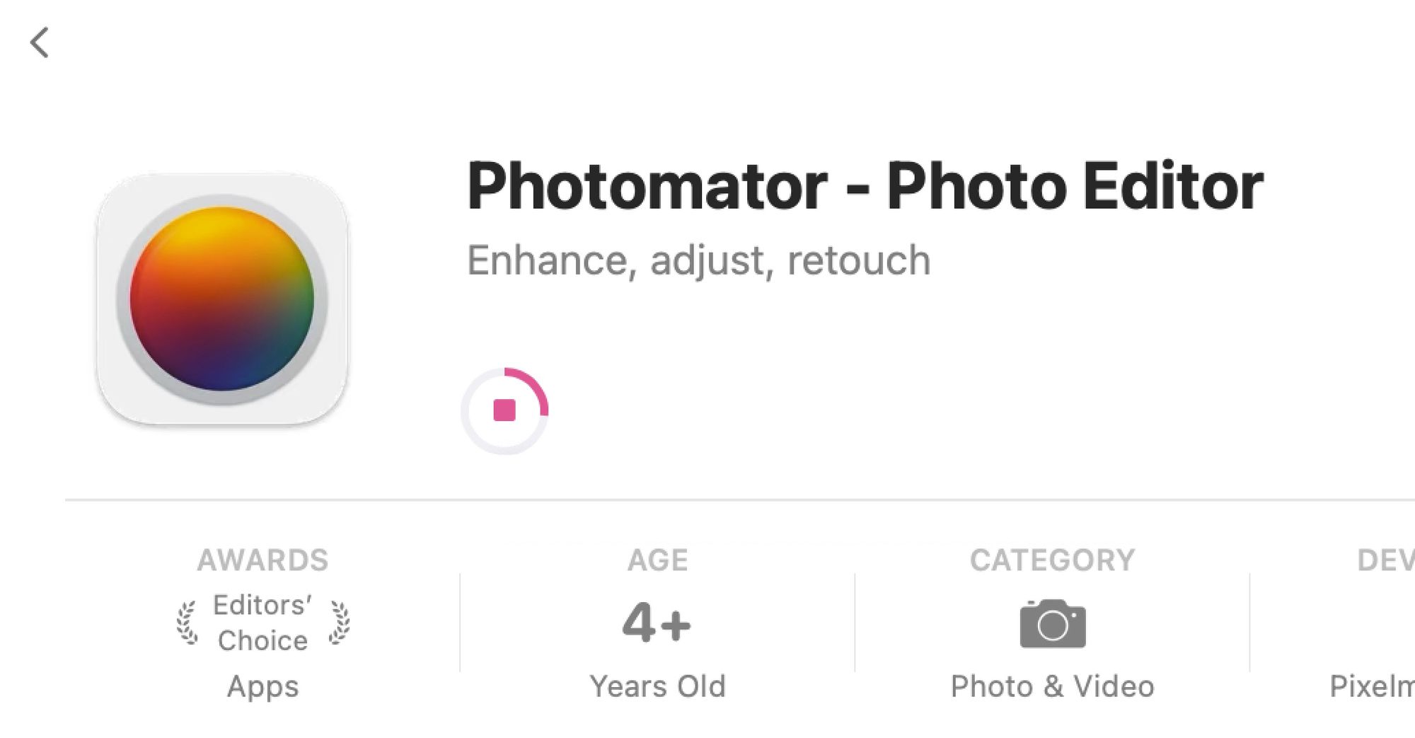
Here's what a user sees when downloading an app from the Mac App Store:
- How big is the download?
- Is it currently moving or has it stalled out?
- Is it downloading or installing at this moment?
- How long can I expect until it's done?
None of those questions are easily answered from this view. If you're downloading a small app on a high speed connection, it doesn't really matter. You see this little circle for 5 seconds, it's constantly moving, and it's done before you even have a chance to ask any of these questions.
But what if you're on a slow or unreliable network? What if the app is huge, and you want to know how long until it's done? What if you need to move out of WiFi range for a minute and want to know if it's installing or downloading? What if it hasn't moved in a bit and you want to know if that's because it's just a big download or if it's because it's stalled and you need to restart it?
So in short, the current UI is fine in the basic, happy path interaction with the app, but as soon as you get into bigger apps or troubleshooting, it becomes less effective. It's simple, but it's not always clear.
Current Workarounds
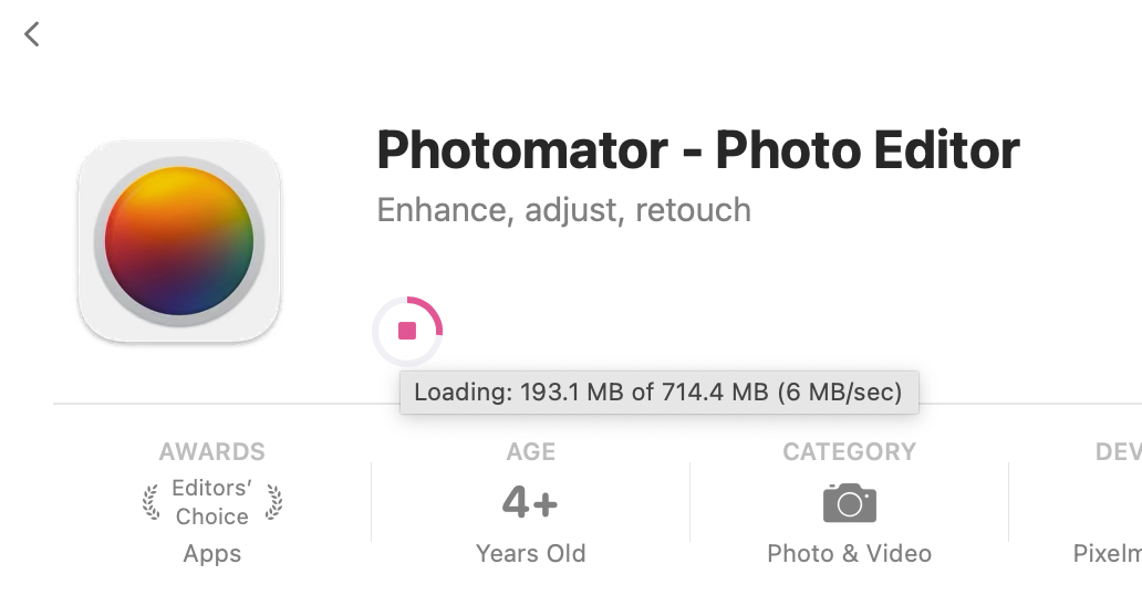
There are some ways to get more information from this simple UI. As I learned this week, you can hover your mouse over the indicator to show the download status as well as the current download speed.
Also, shout out to this post which informed me that Launchpad shows the download progress with a bit more detail as well.

Neither of these are ideal, as they are not very discoverable. Case in point, I've been using the Mac App Store for 13 years and I didn't know about either of these until this week. Aiming for "simple" has resulted in information being hidden away.
My Suggestion
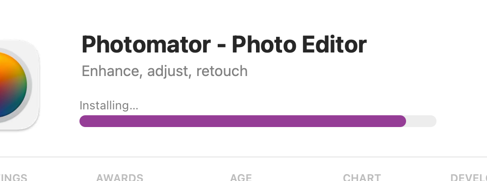
My suggested improvement is to be less simple, but more clear. Just make it a damn progress bar with basic information visible. Also, when it's shifted to the installation part of the process, it should clearly show that to you as well.
First things first, some will rightly point out (like Marquis Kurt) that users can get anxious when there is too much information, but this is not so complicated that it's going to cause anxiety in users. Especially in the case of small downloads, this will be on screen for a couple seconds and then disappear. It's also simpler than the download bars in Safari, and I don't think anyone is prepared to argue that Safari users are overwhelmed with data when they download something.
Here's some of the benefits of this design compared to the current one:
- More pixels for the progress bar means it will more clearly animate and show the progress than the circle does today. This can be especially helpful on larger apps.
- Showing the time remaining helps tell the user when they can start using the thing they just decided they want (and maybe paid for).
- Showing the current speed of the download makes it immediately clear if it's still going or if it's stalled.
- Zero other elements on the page need to change, this simply utilizes white space that was not being used before.
This also greatly improves accessibility, for those who don't have 20/20 eyesight. Simulating vision challenges can be tough, but let's just blur each option and see which is easier to parse:


While someone with this level of vision could technically make out the circle if they focus on it, the progress bar is clearly easier to read without as much effort. There is physically more space used to show the data and the thicker indicator allows for more contrast, both of which make this easier to read.
This is a great example of how improvements to accessibility benefit everyone.
Takeaway
I think people can fall into the trap of trying to make their interfaces simple when they should be optimizing around clarity. It's a subtle difference, but it's important. The current Mac App Store download indicator is undoubtedly simple, but does it provide the user with clarity on what's happening? As we discussed above, it's good enough in the best case possible, but it becomes less clear to the user what's going on as soon as you venture outside the happy path of "small apps that download quickly and without issue."
A good UI should work great when everything gos right, and it should help the user understand what is happening when things don't quite go as expected. In this micro case study, I think the Mac App Store has optimized for simplicity, not for clarity. Making the changes above would have little impact on those with good vision who are installing small apps on fast connections, but it would improve the experience for every other case.


