Android’s Notification Management Crushes iOS
There are many things about Android that bother me, but one area where Google has done a fantastic job is in creating a great experience when you swipe down to look at your notifications. This experience really outclasses what iOS 11 has today, and it’s something Apple’s product people should really be looking at as inspiration for what to bring next year.
Let’s start right at the top:
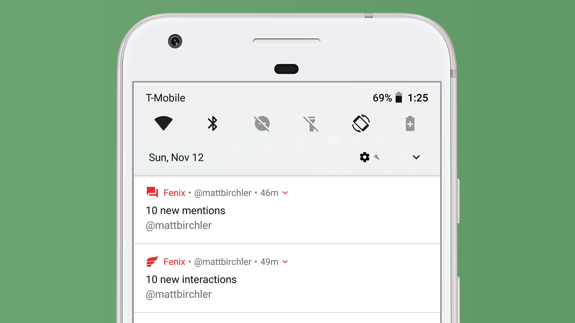
Right at the top of the page we have access to some frequently used controls. Think of this like Control Center from iOS, but paired down a bit. Those 6 controls let me toggle WiFi, Bluetooth, Do Not Disturb, flashlight, auto-rotation, and battery saver mode quickly. Those are the system defaults, and I can customize these to show a few other controls as well. I wouldn’t trade these for iOS 11’s Control Center, which got far more powerful this year, but I like this implementation as well.
You can already see a bit of what I really love about Android’s notifications below that, but let’s take a more full view of the notifications I currently have.
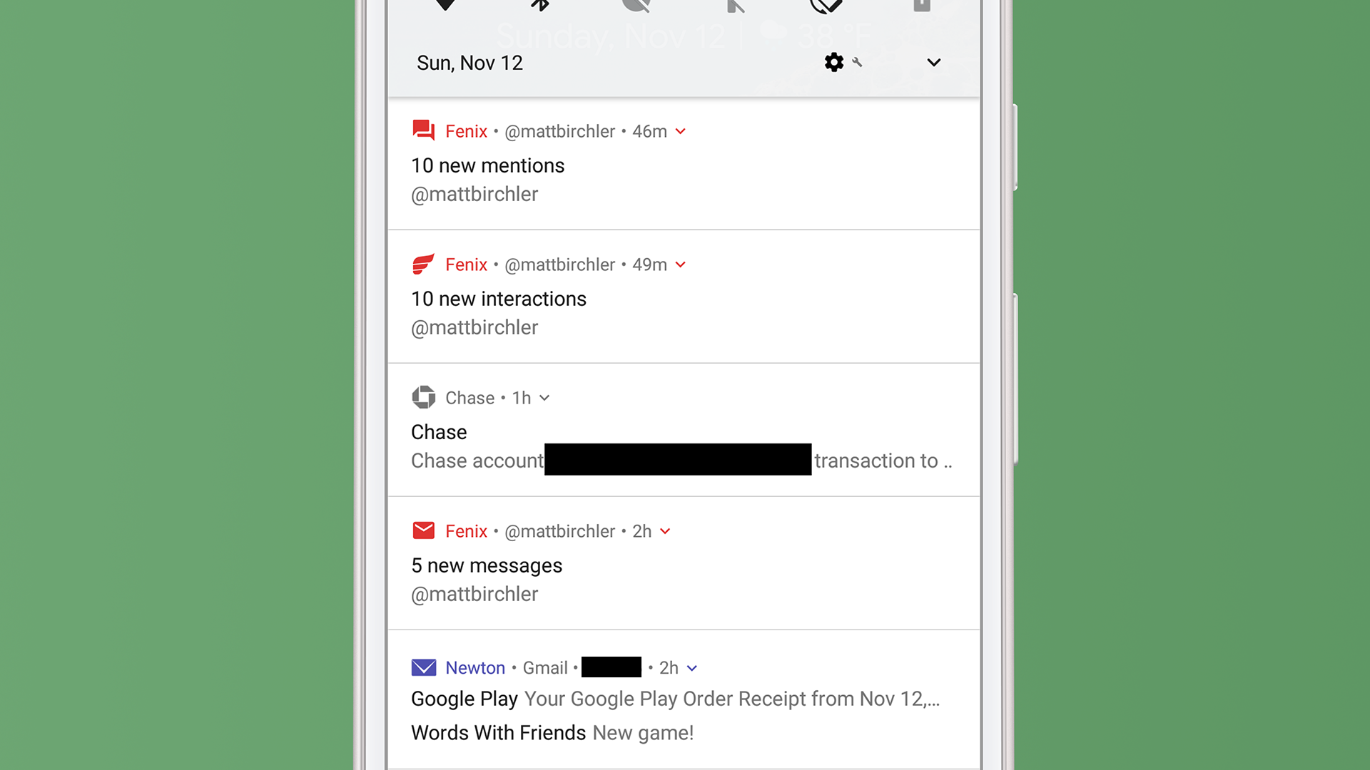
The Chase notification isn’t that exciting, and is nothing that iOS couldn’t do today, bu the Fenix and Newton notifications are really interesting.
Looking at Newton first, you see one basic advantage Android has over iOS; the ability to combine notifications from individual apps into one. I have 2 email notifications, and they only take up one notification slot, which is how it should be. No, I don’t know where those emails came in regards to the tweets above them, but I don’t really care either. I don’t deal with my notifications in chronological order, I do them one app at a time. While iOS makes it nearly impossible to scan your notifications if you have more than a couple, Android makes this a breeze. I can triage notifications much faster with this system.
There is a little downward facing carrot icon to the right of the time, and I can tap that to expand the Newton notification to show each email’s notification on its own. From there I can tap into or swipe away each email individually. I can also sometimes swipe down on one of these combined notifications to expand it, but it only works sometimes and is kind of a weird interaction. I tend to just tap the (admittedly too small touch target) carrot.
Fenix is an example of an app that really does a good job with notifications. Fenix 2 is a Twitter app that I quite enjoy, and the developer understands that there a different types of notifications that one can get on Twitter: mentions, DMs, and other (likes, retweets, lists, etc.). They have helpfully split up their app’s grouping of notifications to reflect this reality and it’s fantastic.
I like seeing my likes and retweets, but I can’t really act on them, so seeing them all bundled together and being able to swipe them all away at once is convenient. On the flip side, I do want to be able to act on my mentions and DMs, so seeing them broken out like this a godsend (the fact that DMs and mentions are separate is just a bonus). Just like the other combined notifications, I can tap the carrot icon to expand to see each tweet included in this overview. The one bad thing is that expanding these replies shows a preview of each tweet and I can not reply to them or perform any other action on their from the notification itself.
As a quick aside here, Android Oreo introduced a new feature called Notification Channels that lets developers categorize the different types of notifications they send and you can allow only the ones you want. Google advertises this for shopping apps (only delivery updates, not advertised products, for example), but I have only seen a couple apps update for this feature so far. Major notification offenders like Facebook and Amazon have not updated to use this, and frankly there is little incentive for them to do so. Twitter has at least, so there’s that.
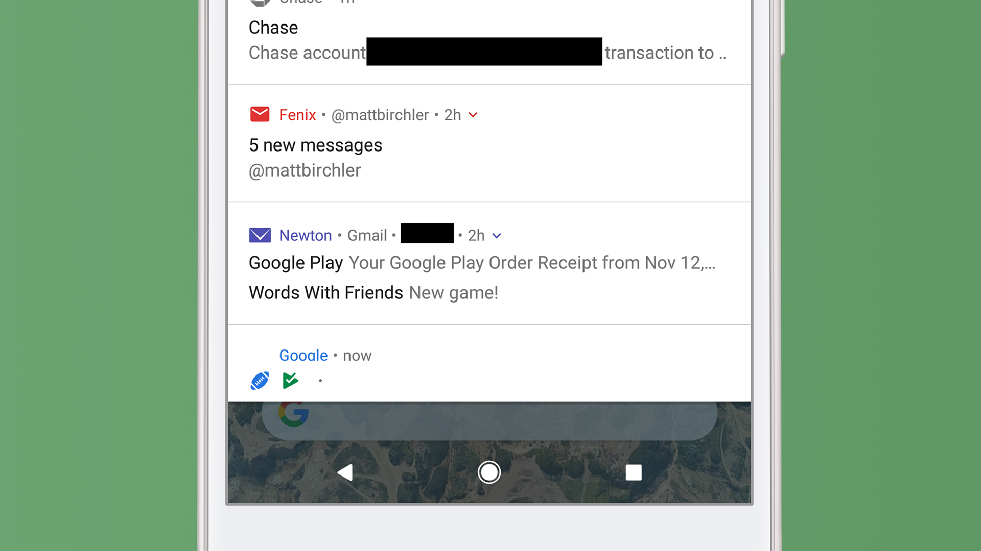
And finally we get to the bottom, at which point you’ll tell me “Matt, we’ve already looked at the Newton notification!” You would be correct, but take a look at the football and Play Store icons along the bottom of the page. These indicate notifications are available for those apps, but they are not on screen yet. They’re not terribly useful, but they do give you an idea for how much more you have to go in your list.
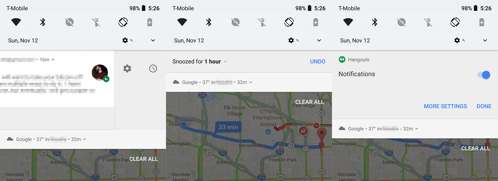
And finally you can swipe and hold on a notification to bring up 2 more buttons. The one on the right lets me snooze a notification for a certain amount of time and the one of the left allows me to either turn off notifications entirely for this app or I can tap MORE SETTINGS to go to the app’s notification settings page in the Settings app. These are nice shortcuts to have, and they are especially helpful when you just want to tell an app to shut the hell up.
When it comes to what each notification can do, iOS has Android beat by a mile, but in terms of organizing your alerts and making them manageable, Android is leaps and bounds ahead of Apple’s current implementation. Apple has made plenty of changes to Notification Center over the years, so there’s no reason to think they won’t mix things up in iOS 12 and catch up to Android in this regard, but for the time being Android has the clear advantage.


