macOS Ventura Makes macOS's Contrast Problem Worse
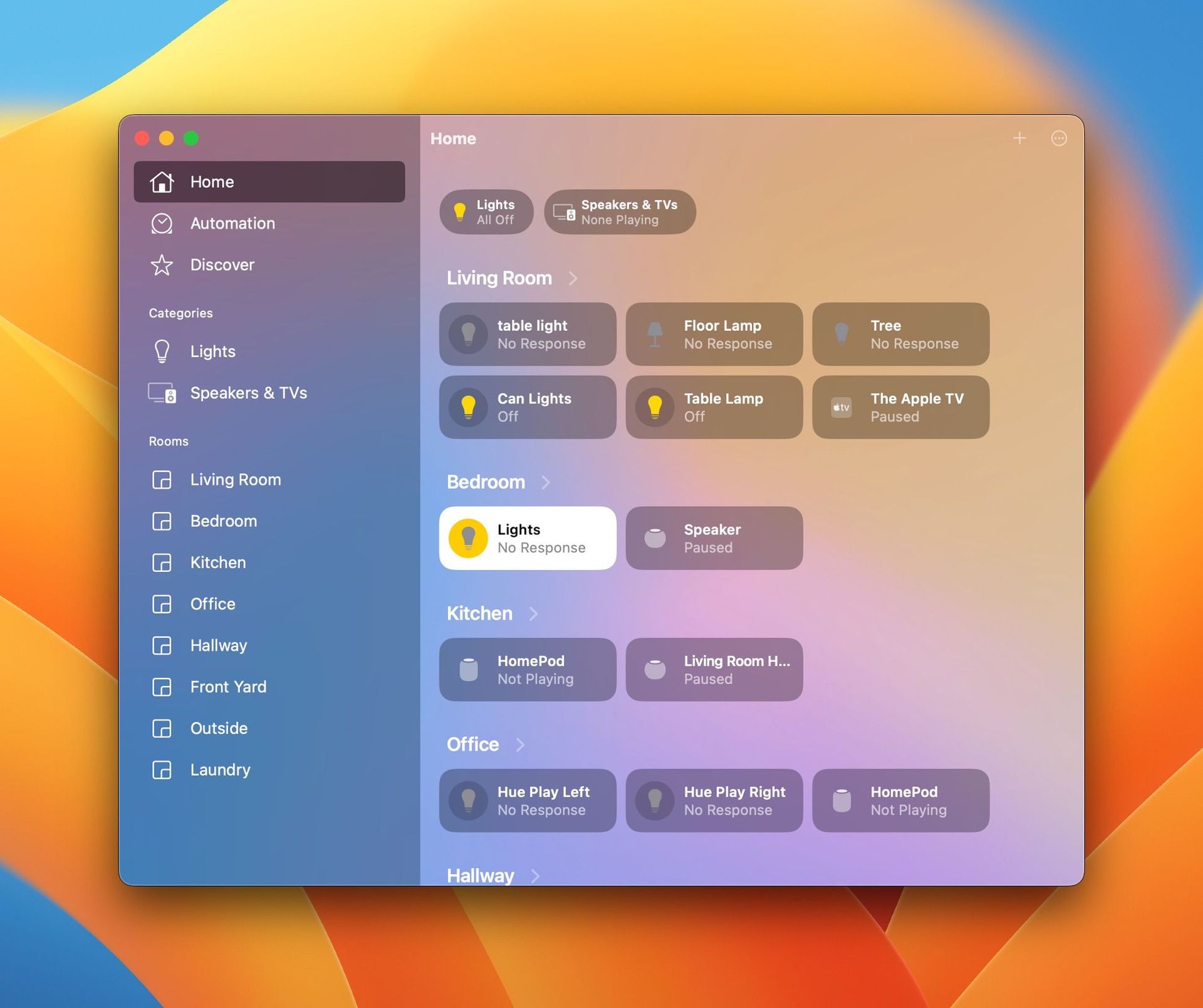
Last month I complained about the Safari download window being hard to read with the default settings. Today I'm back complaining about contrast and legibility again with the updated Home app in macOS Ventura.
I wanted to add an accessory today and I stared at the window for a few seconds, explored the menus, and didn't see a way to do it. I eventually did notice the small, nearly transparent plus symbol in the top right of the window, but good lord, that's not good.
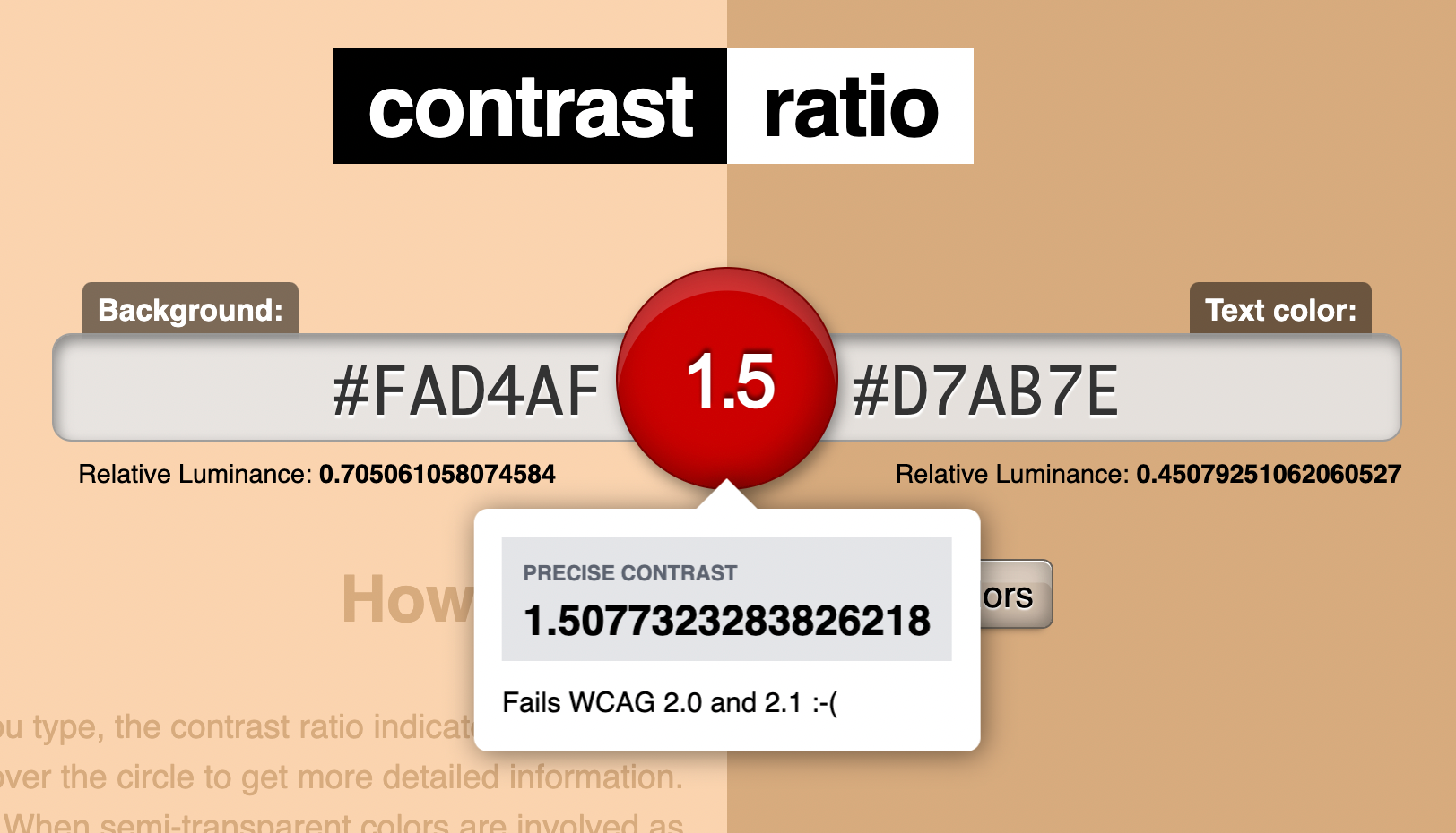
Using a simple contrast ratio calculator shows that this scores very poorly.
On the whole, I like macOS's visual design quite a bit, but contrast for UI elements seems to just not be a priority for them, and I don't know why.