Microsoft Surface Go Review: Surface Type Cover and Pen
This is a multi-part review. Make sure to check the whole thing out with the links below!
- Part 1: Introduction
- Part 2: Hardware
- Part 3: Type Cover and Surface Pen
- Part 4: Performance, Where Art Thou?
- Part 5: Maximum Flexibility
- Part 6: Conclusion
While the hardware of the tablet itself is quite impressive, the official accessories that go with this tablet are pretty damn impressive as well. Microsoft has 3 official accessories for the Go, a new Type Cover, the Surface Pen, and the brand new Surface Mobile Mouse. I think that is the appropriate order for them as that is how important they are to the overall experience of using the Surface Go.
One cool thing here is that these accessories can be purchased in your choice of 4 colors.

I chose to get the burgundy ones, but I could have also gone with platinum, cobalt blue, or black. The black Type Cover is $30 less than the other ones and is all plastic instead of using Alcantara.
Also worth noting that I did not buy the new mouse as I don't have any need at all for it. By all accounts it sounds fine for a $29 mouse, but it's not something I'll be able to cover in this review.
Surface Go Type Cover
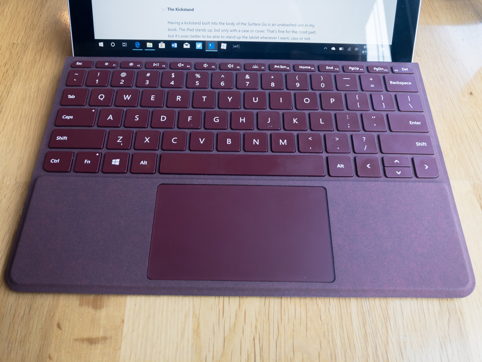
I would go so far as to say that you really shouldn't even buy the Surface Go unless you intend on buying a Type Cover as well. Without it I really don't think you're going to get a complete experience. I know I said I wouldn't, but please indulge s single paragraph about Windows 10.
Windows 10, despite shipping in a tablet device, is still very much the same old Windows we've known for decades. It is intended to be used with a mouse and keyboard above all. Yes, you can touch the screen and some things are genuinely enjoyable via touch, but this device feels at its best with a good old fashioned keyboard and mouse or trackpad. I wish this was not the case, I really with Microsoft was forging ahead more quickly into truly touch-first interfaces, but the market has slowed them on this front and it's a shame.
Alright, back to the keyboard.
Let's start with how this thing connects, which is very satisfying. It snaps into the Go with a thunderous THWACK every time, and connects even stronger than the iPad Pro's Smart Keyboard. I might say it's even too much, as taking it off requires a relatively serious tug, but you know it's not going anywhere when it's connected.
It immediately connects (no wireless here, the connector plug is rumored to be just an oddly shaped USB 3 port) and the keys light up momentarily to let you know it's ready to go. I've yet to have a connectivity issue, with makes sense because again, it's a wired connection.
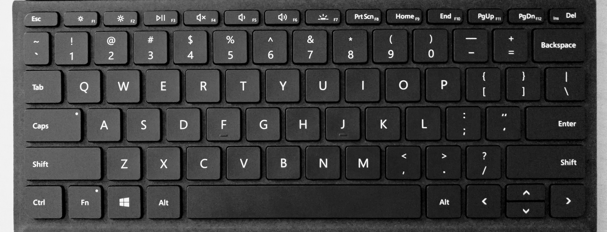
When it comes to actually typing, the keyboard feels very good. You should know that I am a big fan of the Smart Keyboard and Magic Keyboard, so low-travel keyboards are my preference, but if that sounds at all like you I think you're going to like this one too.
There is a full function row at the top that doubles as media/brightness/etc controls, and they're lovely to have, even if they're a bit small. They didn't have more space to make them bigger so I'm more happy to have them here than for them to be missing entirely.
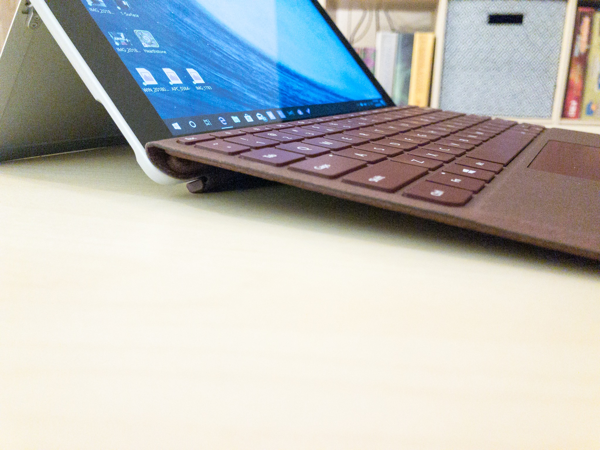
One thing I find odd is that the keyboard likes to be put up at an angle, elevating the keys every so slightly, but I really don't like this. A smidge of an angle is okay, but I mostly think keyboards should be flat. The bigger problem is that this creates a small air gap between the bottom of the keyboard and the surface it's sitting on. This leads to a little bounce as the keyboard flexes under your fingers as you type. It's not a lot and it's honestly not a big deal, but it's enough that I have taken to actively not propping up the keyboard and simply using it flat on the table. This makes the key presses feel much more solid and more comfortable for me overall.
Moving down a bit further is the trackpad, which I will simply say is far and away the best trackpad I've ever used on a non Apple device. It's seriously not even close, and while it's not quite as good as my MacBook Pro, it's shockingly close. It's big enough and smooth, and has a physical click.
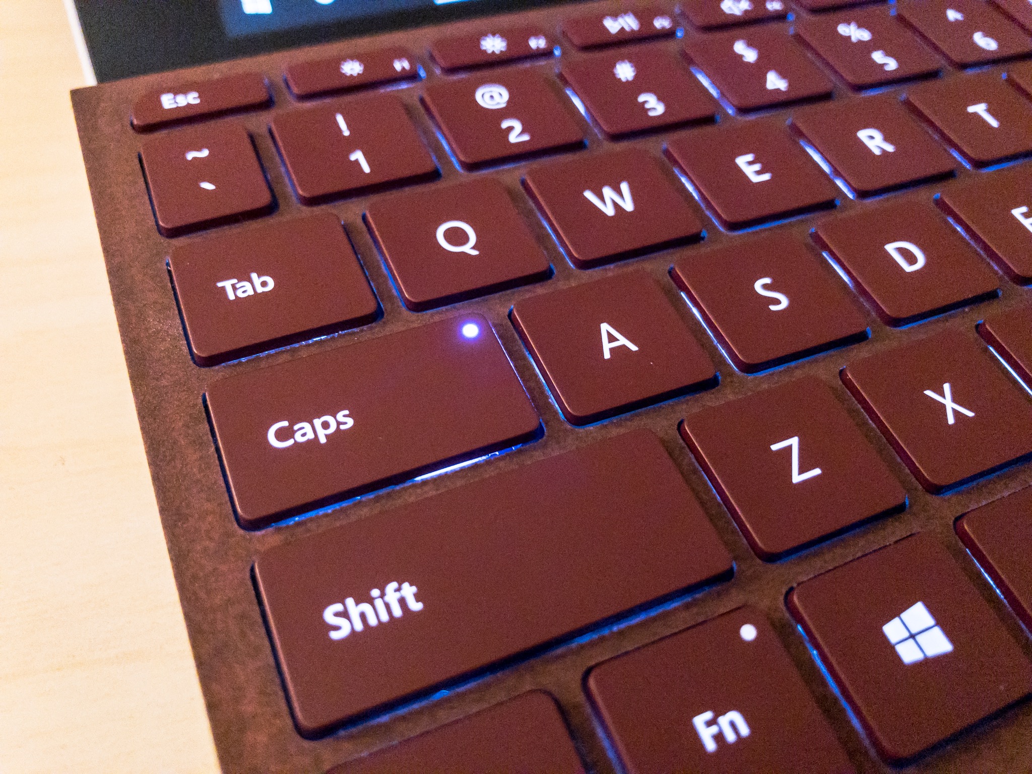
And the final bonus is that the keyboard lights up when it's dark! It does it automatically based on the surrounding lighting conditions, and you can set it to any one of 3 brightness levels manually. I love this and really, really wish the iPad's Smart Keyboard had this.
The Caps Lock and "fn" keys also have persistent lights that show you when they're active as well. Another nice touch.
Surface Pen
The Surface Pen is a very good tool for drawing, but unlike the Apple Pencil, I find it to be far less compelling as a general input device. Despite this limitation, it does actually have some nice features that make it work better with a mouse-based operating system than you might expect.
The first thing I noticed about the Pen was that it works right out of the box with no pairing required. The buttons don't do anything right away, but the basic touch stuff works great. You do have to go to the Bluetooth settings to pair the device to get its full functionality, but it was a nice first run experience to just have it work right away.
Another nice feature is that the Pen is magnetic and is also round with a flat edge, both of which help make it so this doesn't go rolling around where you don't expect it. The magnet is very strong and is meant to stick to the side of the Surface Go itself, but you can stick it to basically anything metallic. The flat edge also helps make it so this doesn't roll around when you put it on a flat surface.
The Apple Pencil is not magnetized and is perfectly round. I find the round build to be slightly more comfortable than the Surface Pen's flat edge, but I really appreciate how much better they Pen is at staying where I put it. The Apple Pencil is weighted to prevent rolling, but it's far less effective than the Pen.
But let's get back to the Pen for input. I made this video about the differences between the Pen and Pencil and it's pretty dramatic.
https://www.youtube.com/watch?v=jgN1vZuRG3I
The Surface Pen does double duty as a touch device and a mouse replacement. This is cool as it let you do things like hover over things (particularly nice on the web), but it's less convenient for quickly navigating the user interface. You really have to tap with "intention" any time you want to select something with the Pen, and that frankly got tiring for me. I felt like I was slowed down when using the Pen for navigating the UI, and I ended up electing to just use my fingers for touch navigation. Again, without getting too much into the nature of Windows here, this is more frustrating that it could be because Windows has a lot of UI elements that re quite small, and other things that simply only work with hover events, which touch as no substitute for.
If you are an artist or just enjoy doodling now and again, then you're going to like the Pen quite a bit. While there is a an annoying delay an intentionality around navigating the UI, this is not a problem for drawing situations, and the Pen is very responsive there, and has nice palm rejection.
Microsoft advertises an absurd 4,096 levels of pressure (Apple doesn't say for the Pencil), and 21ms latency (Pencil is 20ms), and as someone who uses the Apple Pencil everyday, the Pen immediately felt familiar. I wouldn't say it was more responsive than the Pencil, but it was basically a wash for me in this regard. Ultimately, they're both fantastic for drawing on screen.
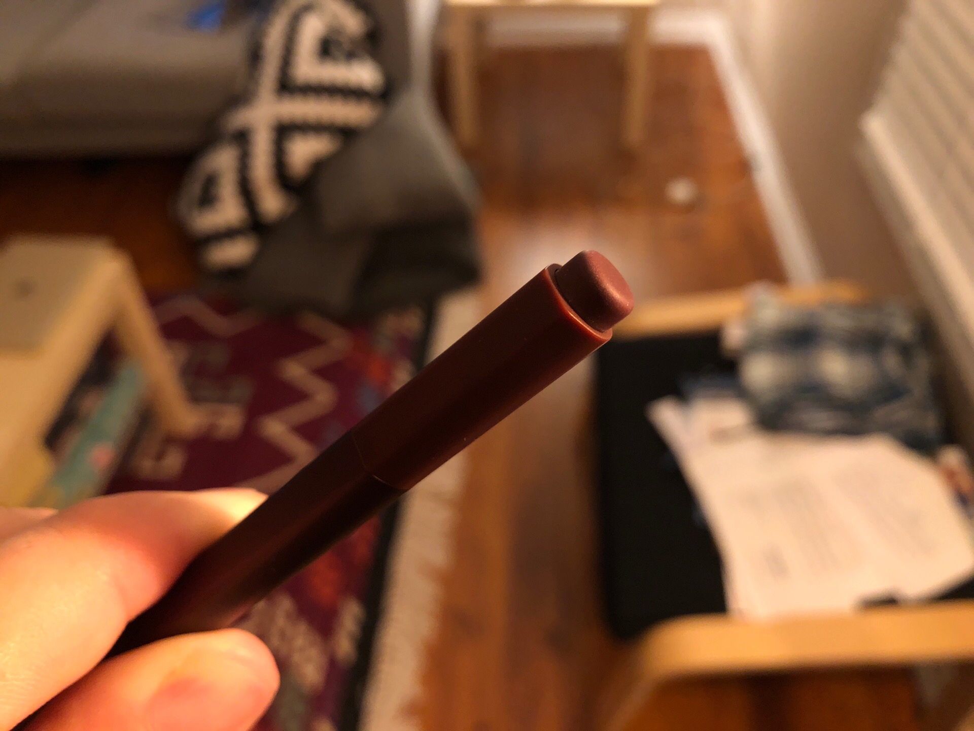
Also notable on the Surface Pen is the button at the top. Clicking this button at any time can bring up the Windows Ink Workspace, which lets you choose to open any of your Windows Ink-enabled apps or take a screenshot and mark it up with the Pen. You can also set it up to do different things, such as taking a screenshot and immediately jumping into the screenshot markup app, or you could have it launch an app of your choice. If you want more, you can also set rules for what happens when you double click and hold down the button. My setup is:
- Single click: take screenshot
- Double click: open Edge
- Hold: nothing…yet
All of this can be set up in the Settings app under Devices.
As another bonus, and this is really cool, the button doubles as an eraser in almost every app. Just like a…pencil, ironically…you can flip the Pen around and erase basically anything. Apps handle this slightly differently, with some erasing entire lines/objects when you touch them with the "eraser" and others that do a more direct "erase the pixels under the eraser" interaction. The inconsistency isn't really a problem in practice, and you figure out how each app works in seconds.
And finally, the battery life on the Pen is very good. Microsoft quotes a year's battery on a single AAAA battery (included). I obviously have not had this long enough to test this, but it is nice compared to the Apple Pencil's quoted 12 hours of battery, which needs to be recharged far more often. It's nice to never have to worry about charging this thing…ever. I rue the day it does die and I need to find a store around me that sells AAAA batteries, but hopefully I'll get a notification long before that happens and I can take the necessary steps to get one delivered in time.
The Combo Conclusion
While I would say the Type Cover is an essential purchase for the Surface Go, the Pen is more of a nice to have item. I think I like the Surface Go a bit better for having it, but I've had to change my expectation for what a stylus does on Windows to make it work for me.
Both of these devices feel very premium and are a general delight to use. I think the Type Cover is a great Windows keyboard full stop, and I really enjoy writing on it. The Alcantara fabric feels nice and gives this a different feel than more technology these days. I really appreciate the details here all of which add up to a very nice typing experience all around.
The Pen is more of a mixed bag for me, but almost entirely because of Windows decisions and not the Pen's tech itself. The Pen feels good in the hand, and while I prefer the Apple Pencil a bit overall, there are certainly things Apple's stylus could borrow from the Pen to make it even better. I love the button with customizable actions and the feel in hand is excellent. The single flat side is a win overall, but makes me feel like I'm always holding it slightly wrong, but it's not enough to keep me from really enjoying this gadget.
Microsoft makes some great tablet hardware, and I'm happy to say that their accessories for these devices are just as strong.

