The Safari Downloads Window Needs Opacity 100%

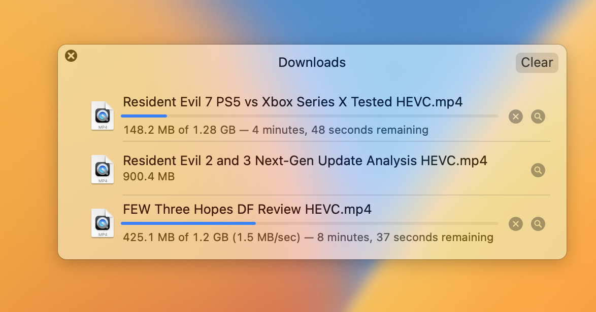
This is what Safari's download window has looked like for years on macOS. It's pretty well laid out, but I always have trouble reading it at a glance.
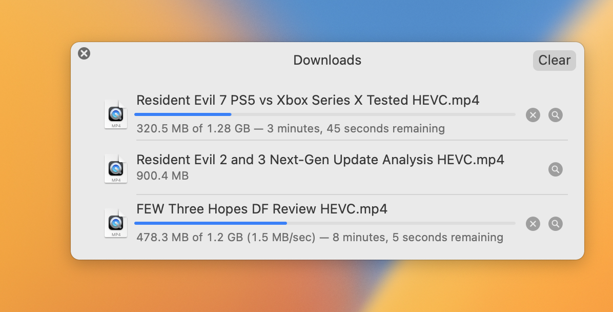
Here's what the window looks like when you turn off transparencies at the system level:

So much better!
While I'd love to leave it this way, there are so many other parts of macOS that look worse (in my opinion) with this setting enabled, so I don't want to make most things look worse to make this one window more legible. My simple ask would be for someone working on Safari to please crank the opacity slider up to 100% when no one is looking and ship it.
- Yes, I know I may not be in the majority here.
- Yes, I know this is a pretty big nitpick.
- Yes, I do support Digital Foundry on Patreon specifically to get full quality archives of their videos. I think they're an incredible asset 🙂


