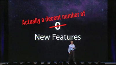
Apple Watch Series 4 Review: Bigger is Better
Every year since 2015 Apple has released a collection of Apple Watches, each with a standout hardware feature. The Series 2 brought GPS, Series 3 had LTE, and this year’s Series 4 has a vastly improved screen. The question on everyone’s mind this year is whether that screen makes this a worthwhile upgrade.
Jumping to the end, I think the Series 4 is a very good upgrade to the Apple Watch lineup, and for a lot of people it seems to be the Apple Watch update they’ve been waiting for. But that said, the Series 3 this is replacing was not exactly in desperate need of a revamp, at least in my opinion.
Let’s jump into it.
That Screen
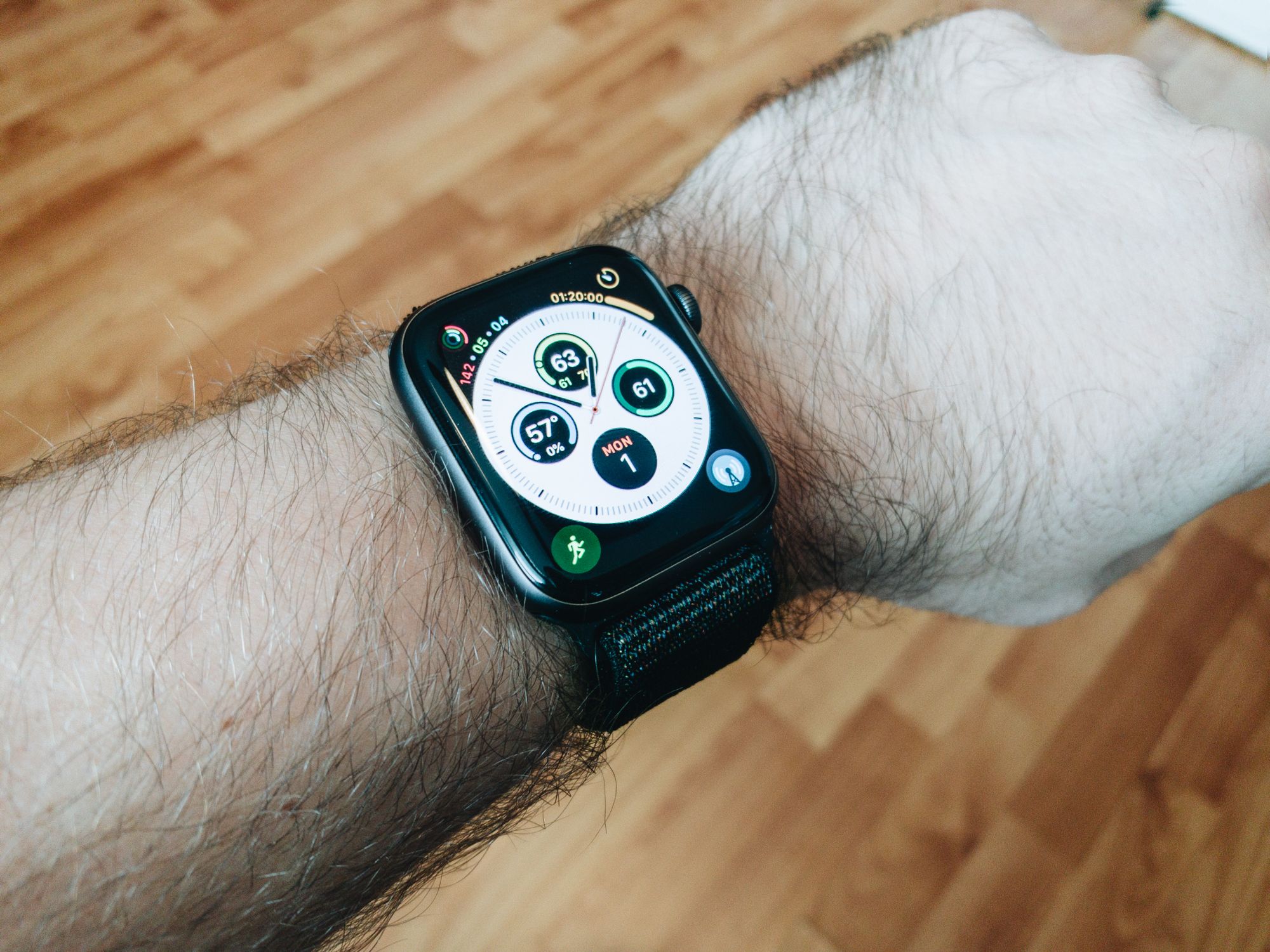
This year’s update is really all about that new screen. It’s a little over 30% larger and has a slightly higher pixel density1. What this means is that everything looks notably bigger than it did on the previous Apple Watch models. Outside of the 2 new watch faces2, Infograph and Infograph Modular, very little in the operating system takes the opportunity to show more information than before. Individual notifications still take up all of the screen, workouts display one at a time, and the dock still has the card system that only shows you half an app at a time.
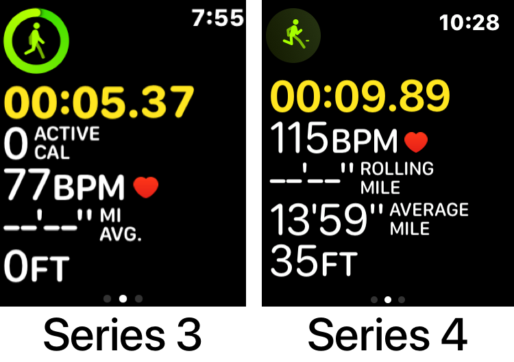
I find this a little disappointing because I was really hoping to get more data at a time. Maybe my eyes are good enough that I like smaller text (I have my iPhone’s dynamic text set to the smallest value), but I feel like most of watchOS was simply zoomed to 130% scale rather than leaving the UI the same size and showing more stuff.
For many people this is likely the right thing to do, but I am disappointed that there is no option like there is on the iPhone Plus/Max models that lets you choose whether to zoom content or show more content. For some examples, here are some screens from a Series 3 and 4:
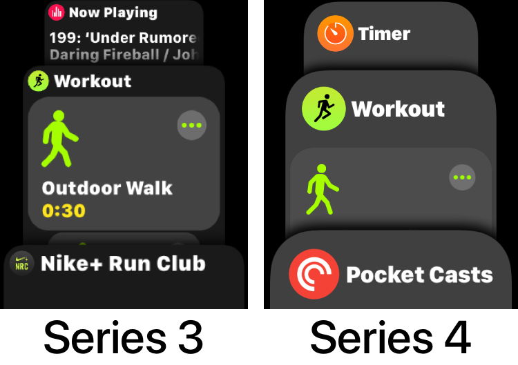
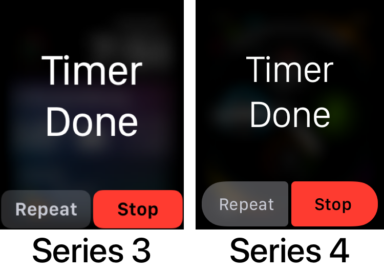
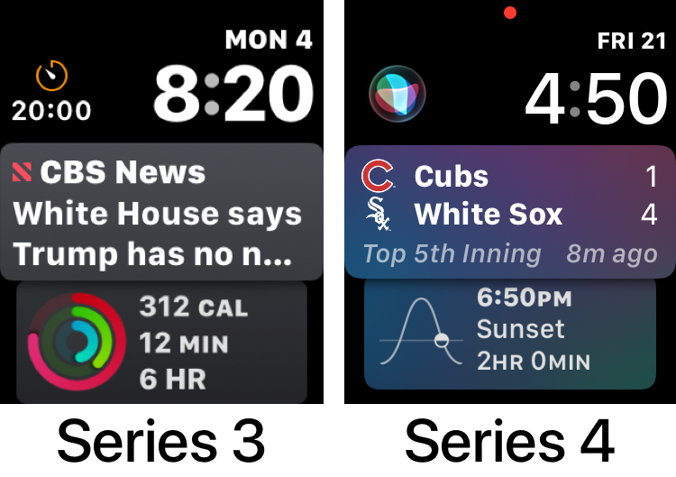
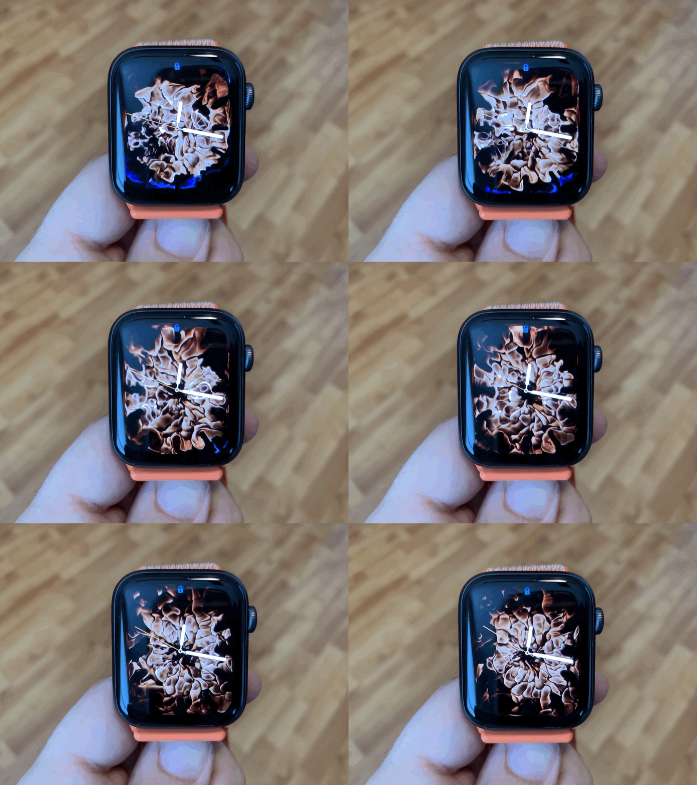
Now all that said, the screen itself looks more amazing than ever. Because everything is bigger and it’s displayed on a higher resolution screen, everything looks a little sharper than it ever has on the watch. Everything looks absolutely beautiful, at at 1,000 nits, the screen is always legible, even outside on the sunniest days.
In my limited experience with Android Wear (wearOS?) and Galaxy watches, the Apple Watch has always seemed to have a nicer screen than anything else on the market. With this year’s models, Apple pushes even further ahead.
Design
For the first time since the Apple Watch’s debut, we finally have a physical redesign. As I expected, Apple is sticking with the rectangular form factor, and simply enhanced it. The new watch is both wider, taller, and thinner than the models it replaces. I got the 44mm option and was worried the additional height would be a big deal, but I hardly noticed a change on my wrist, and I’m someone who has worn a 42mm Apple Watch every day since April 2015. I can clearly see the difference when they’re side-by-side, but it’s so slight on the wrist that it’s hard to tell at all.
One of the reasons the added height and width are hard to notice is that the watch is now thinner than it was before. They’ve reduced the thickness of the watch by about 9% and I think this combines with the 8% increase in surface area to basically cancel out. Your sensitivity may vary, but I am very happy I stuck with the larger model instead of going down a size.
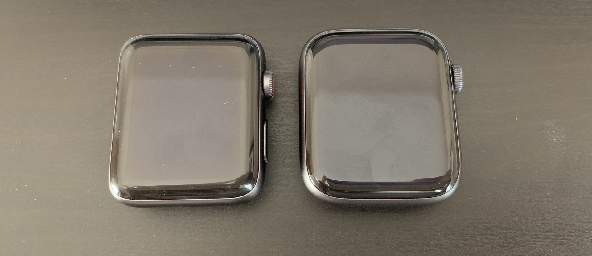
In addition to the size differences, they also changed the shape of the body. The Apple Watch Series 4 is more rounded than ever, and that change actually stood out to me more than the size difference. It’s still clearly an Apple Watch and it’s very much a rectangular face, but it’s a little softer. To put it in web developer terms, if the old Apple Watch had a border radius of 8px, then the new ones have a border radius of 12px. I personally like this, and it makes my Series 3 look a little blocky in comparison.
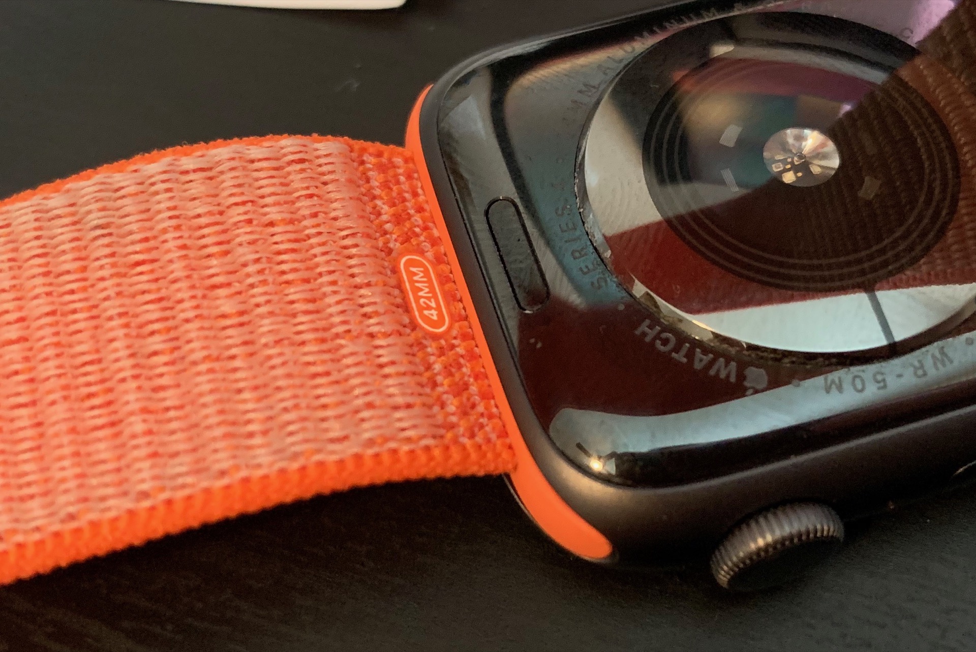
It’s worth noting here that even though the sizes have changed, all old Apple Watch bands will continue to work with the Series 4 sizes. 38mm bands work with the 40mm model and 42mm bands work with the 44mm model. The fit is pretty darn perfect too. The above photo is a band made for the 42mm watch used with the new 44mm Series 4.
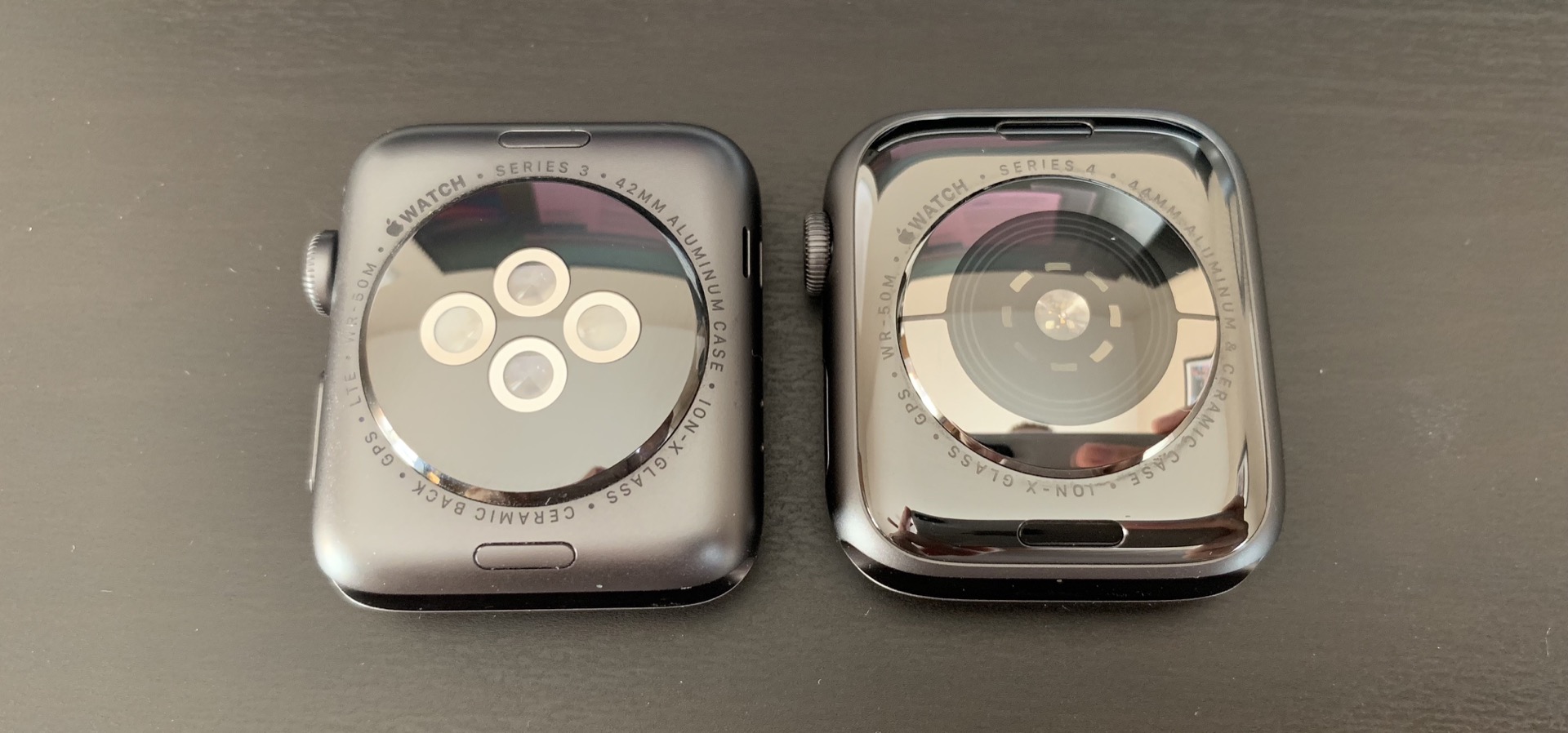
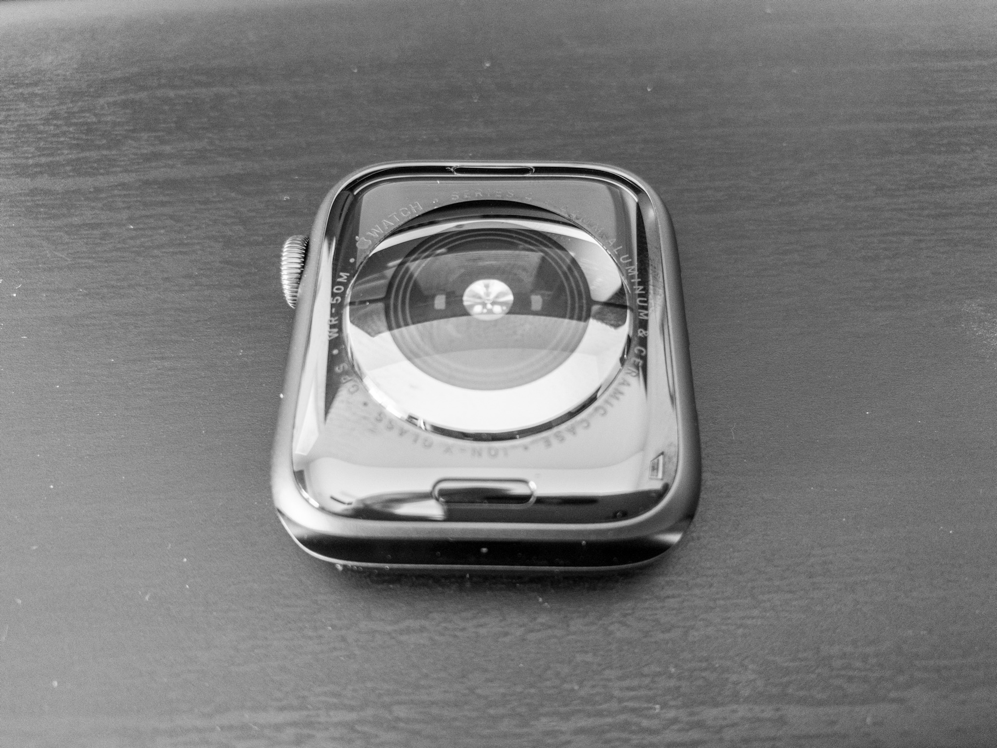
Then there’s the back side of the watch. The heart rate sensor has gotten a redesign, but it’s not a big deal as it’s not something you ever look at for more than a second or two. The bigger change here is the fully ceramic back, which makes the watch feel a little more premium, especially on the base aluminum model that I got. I’m not good at measuring this sort of thing, but it also does feel like the sensor pokes out a tiny bit less than it did before. That might be a placebo, but looking at it now, it does appear a little less pronounced.
And finally, there is the side button and Digital Crown. The side button is similar to how it’s been since the start, but it now sits flush with the side of the watch body. I like that this makes the watch look a little more like it’s one piece of metal, but it makes it so I’m a bit less confident I’m pressing it every time.
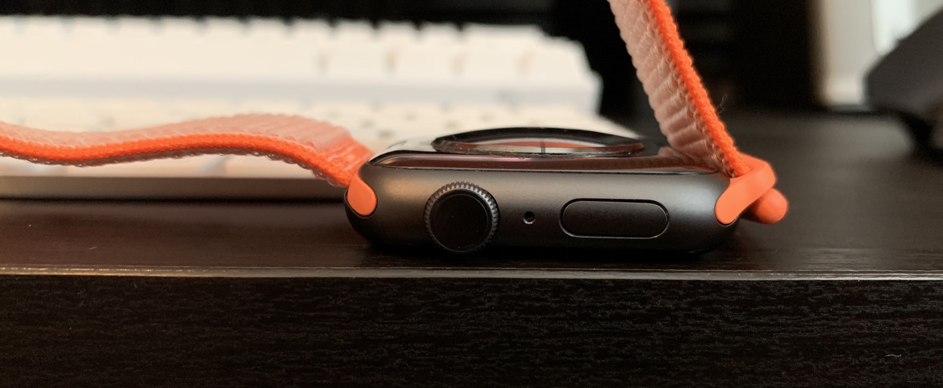
The Digital Crown got a more notable update. The crown itself sticks out a tiny, tiny bit less than before, and the pronounced red dot from last year’s LTE models has been toned down to being a red ring around the border of the crown. I got the non-LTE model this year and that model also has a glossy ring around the border, but it’s black and basically invisible unless you really look closely.
The bigger change to the Digital Crown is that it now has haptic feedback when you use it almost anywhere in watchOS. It’s supposed to simulate a click for each item on screen, and for the most part it does just that. The feedback does manage to feel localized around the crown and it does not just feel like another buzz on the wrist. It’s quite impressive. My biggest complaint is that it’s inconsistent. On the Siri watch face and Workouts app, the haptics clearly indicate each item as I scroll through the list, but when I go to notifications, there seems to be no relationship at all as to when the haptics trigger. It’s not a huge deal, but it doesn’t feel like they totally implemented this yet.
Performance

A big change we can expect every year from the Apple Watch is performance. Apple has been making these tiny computers for just the last few years, and the tech they can cram in there is growing very quickly. Last year’s Series 3 was what I called a turning point in the Apple Watch in terms of performance:
The Series 0 felt like it didn’t have the hardware resources it needed to do basically everything. Sometimes it would be quick, but that was the exception, not the rule. The Series 1 was notably faster, but it felt like it was barely hanging on for dear life. Some things went fast, while others remained slow. The Series 3 just feels fast all the time.
That watch represented a 70% increase in speed over the previous model, and a year later, I still felt like that was the case. The Series 3 remains a plenty capable watch and I rarely experienced slowdowns that hindered my use in any way. Now the Series 4 and S4 chipset claims 50% more performance over that.
Without getting into any speed tests, I will say that the Series 4 is clearly the fastest Apple Watch yet. Duh, I guess, but considering I thought last year’s Series 3 was still pretty zippy, this didn’t land with me the same way as it may have for others. I can see the differences here and there, but my watch doesn’t feel much different to use day to day. This isn’t a complaint, but a compliment to the Series 3, which is still a great deal.
Workout Tracking
What’s an Apple Watch review without a little discussion of workout tracking? Happily there isn’t much to say here. The Series 4 does about the same as the previous Apple Watches in terms of being a workout companion. Basically, if you were happy with it before, you’ll be happy with it now.
I’ve seen a few people say that they have experienced better heart rate tracking than they ever did with the Series 3, but that has not been my experience. Here are the last 3 workouts (runs and walks) I did with the Series 3, and the 3 first workouts I did with the Series 4:
The tracking looks essentially the same to me and I’m getting very comparable cretic for the same workouts as I did with the Series 3. For my money, it’s working exactly the same as before.
The X-Factors
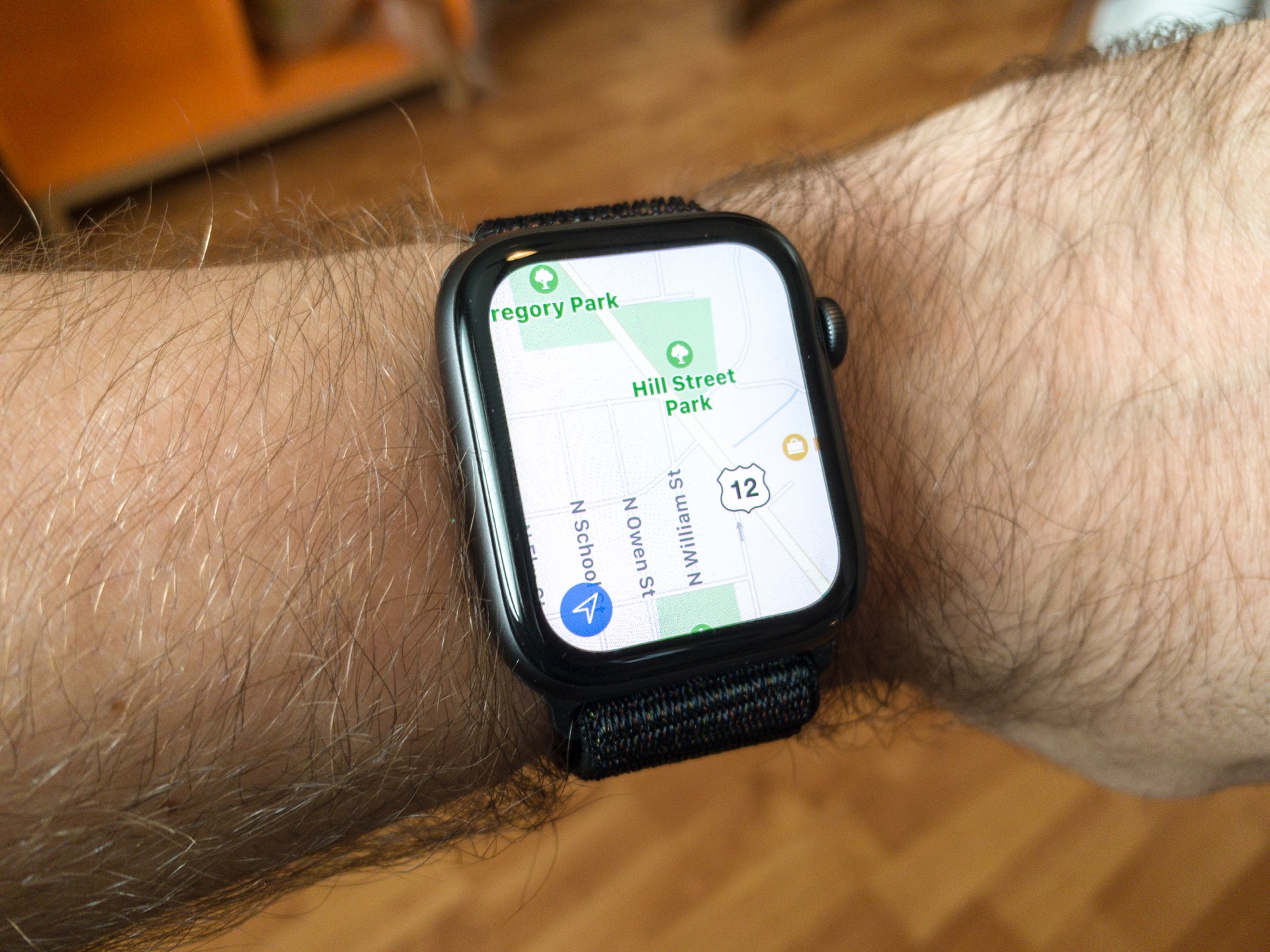
When you have the screen off, the size difference is hardly noticeable, but it becomes much more apparent when the screen is on, especially with the old watch faces. I had gotten used to things like Utility and Modular being certain sizes, and the difference in size is very noticeable there. You also really notice it in things like Maps where the UI actually takes up the entire screen.
The haptics feel ever so slightly different than last year’s model. They’re a little more delicate, but not in a way that makes them harder to notice, just different.
I think Apple missed an opportunity to revamp their whole watch face lineup this year. The 2 new faces are the only ones that get to use the new complication types, which make me far less likely to use anything else. The other watch faces feel old now and I feel like I’m compromising the new stuff when I use them. Hopefully watchOS 6 will address this, but it’s a let down this year.
Speaking of complications, I really like the new style that Apple has introduced this year. The colorful bar graphs are a great way to visualize data. I like them a lot for temperature and I love them for the timer. I would very much like for devs to be able to indicate a direction on the line as well. For example, being able to show which direction the temperature is heading. I’d also like to be able to set these to use monochrome colors since the wild rainbow of colors is not to everyone’s liking.
Battery life is not something I can say much about since it's only been 11 days, but I'm still getting well into a second day with it. That said, I have noticed the charge being a little lower than I'm used to at certain points, but not by much and not in any way that would make me get less than the advertised 18 hours of battery life, even with 2 hours of workouts tracked. I also moved from the cellular model to a non-cellular, so that's another variable that's hard for me to track.
The ECG functionality is exciting, but as of this review was not available, so I have not been able to try that out yet.
Finally, I need to mention the price. All the aluminum models cost $100 more than they did last year. That means that I spent $429 on my Series 3 with LTE Watch last year, but this year that same $429 bought me the non-LTE Series 4. It’s not the end of the world and I’ll be fine, but I was a little upset that we had a 20-25% increase in cost from year to year. I loved having LTE on my Apple Watch, but apparently the proposition of saving $100 up front and then $180 over the course of the year to T-Mobile was enough for me to downgrade.
Wrap Up
This is where I’m supposed to tell you whether or not the Apple Watch Series 4 is worth the money. I can say without a shadow of a doubt that the Series 4 is the best watch Apple has ever made (duh) and if you are in the market for a new watch, this is a great product. It’s the best of the best and warrants the praise it has received from basically every tech outlet.
That said, the Apple Watch Series 3 now starts at $279, a full $120 less than the Series 4. That’s a significant price difference and I think it’s still a great buy for most people. If you must have the latest and greatest, then the Series 4 will make you happy, but if $400 is a hard pill to swallow, then I think the Series 3 is a good place to test the waters on if an Apple Watch is right for you.
I think that if you really love the Apple Watch already and you aren’t scared off by the upgrade cost, then by all means, the Series 4 is a worthwhile upgrade from any previous Apple Watch model, including the Series 3. But if you are a first time buyer or are upgrading from a Series 0, 1, or 2, then I would seriously look at the Series 3 to see if that would work for you. No, it’s not the latest and greatest, and it may get one year fewer watchOS updates (until watchOS 7 in 2020 would be my guess), but it’s a fast, high quality Apple Watch as well.

