Data Can be Objective, but the Story it Tells is Always Subjective
Over the past few months, I've had all of my inflation-hawk friends share the price of oil as a key indicator of the out-of-control rising prices they see out there.
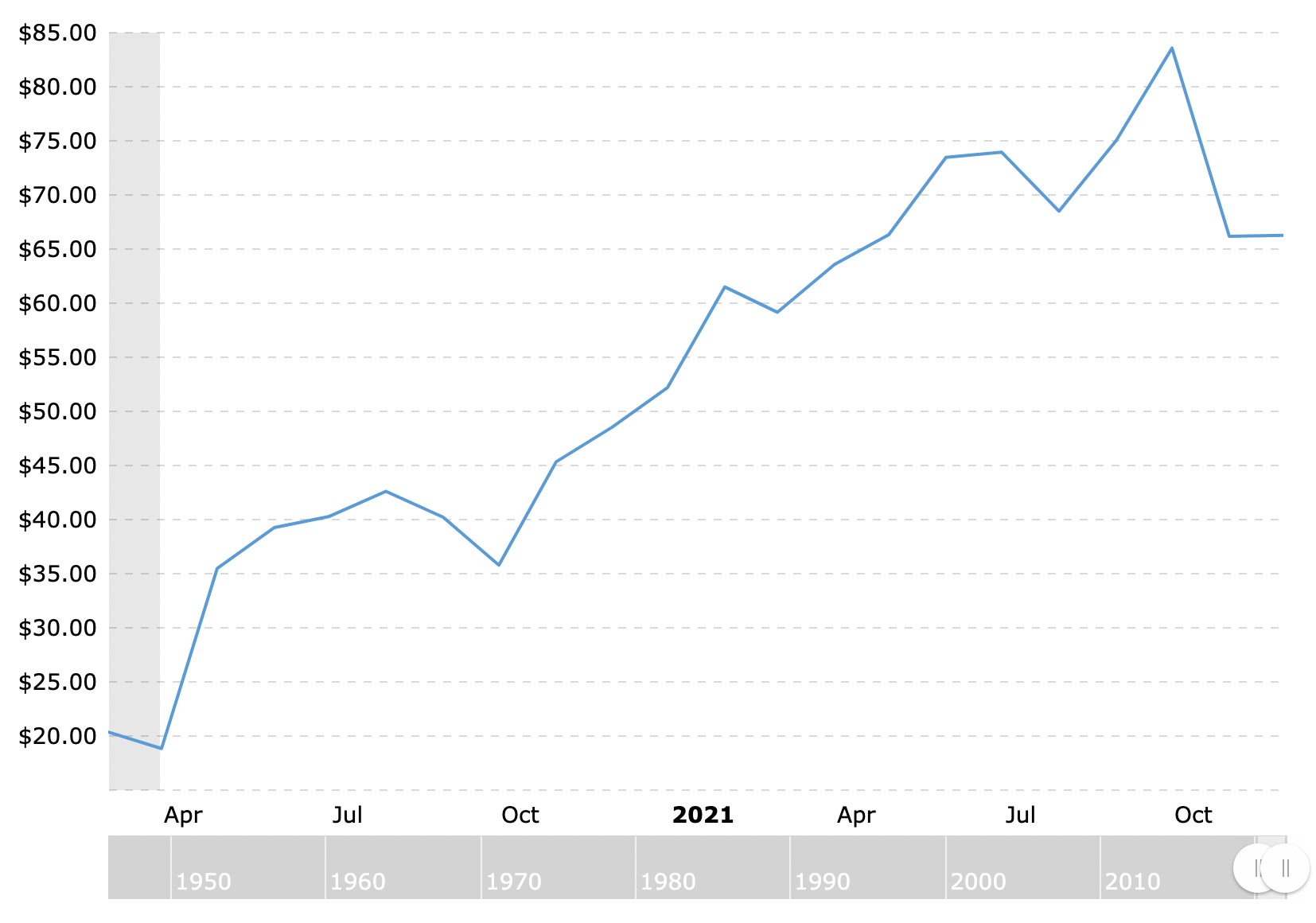
So it looks like a pretty strong upward trend, but what if we back up 10 years to see more data?
Well, this tells a much different story! Oil is less expensive today than it was 10 years ago. Yay, deflation in oil prices!
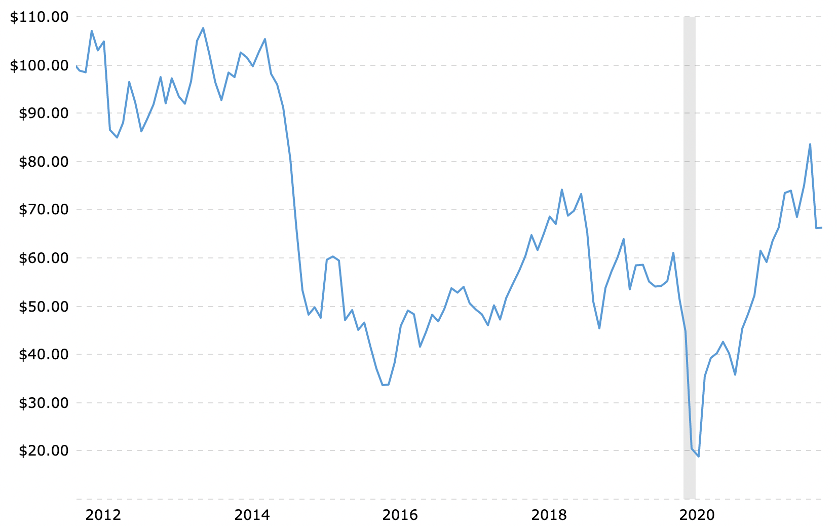
But hold on, you may think, now I'm showing you a data range that tells the story I want, go further back! Ok, going back 30 years now and we do get an upward trend, but not too shocking.
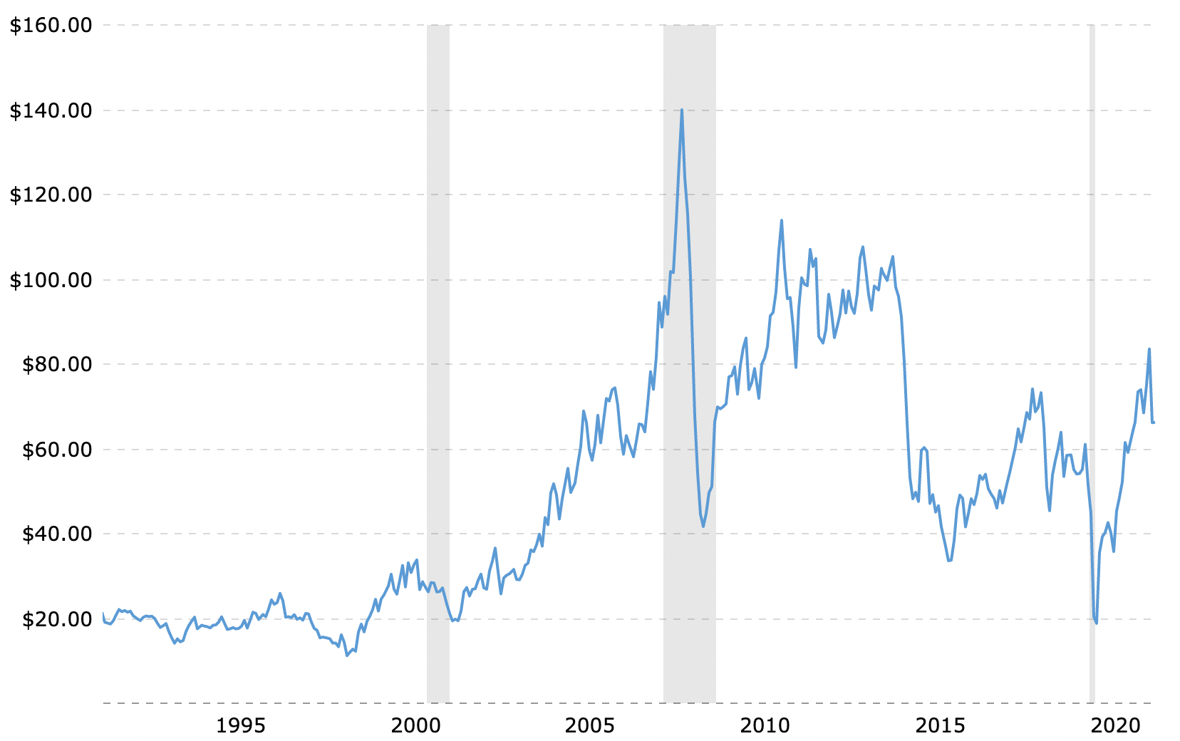
Oil was steady through the 90s, shot up in the Bush years, normalized at a higher rate, dropped a ton in 2014, and normalized again at a slightly lower rate.
More, you say! Ok, let's go back to the end of World War II and see what it's done since then.
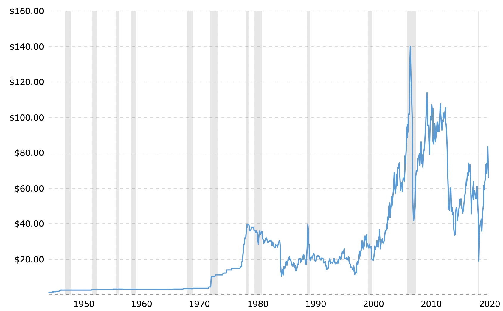
We see the spike in the 70s that haunts people to this day, and then the same stuff we just talked about in the 30 year chart.
My point here is not to prove that inflation isn't a thing or that I'm an expert on the oil markets, my point is simply to point out that we should all be careful with how we interpret the data put in front of us. In October of this year I could have said, "compared to April 2020, oil prices are up 5x!" However, looking at the data with more or less context changes the story quite a bit.