Designing for the Notch on Notch-less Phones
The Android P developer preview is here, and as any good tech blogger with a Google phone would, I installed it on my Pixel 2. One of the notable features of Android P is native support for the new “notched” world we live in. In the post iPhone X world, manufacturers have a green light to make phones with this built in, and Android P will make it easier for those companies to use native Android tools to handle them.
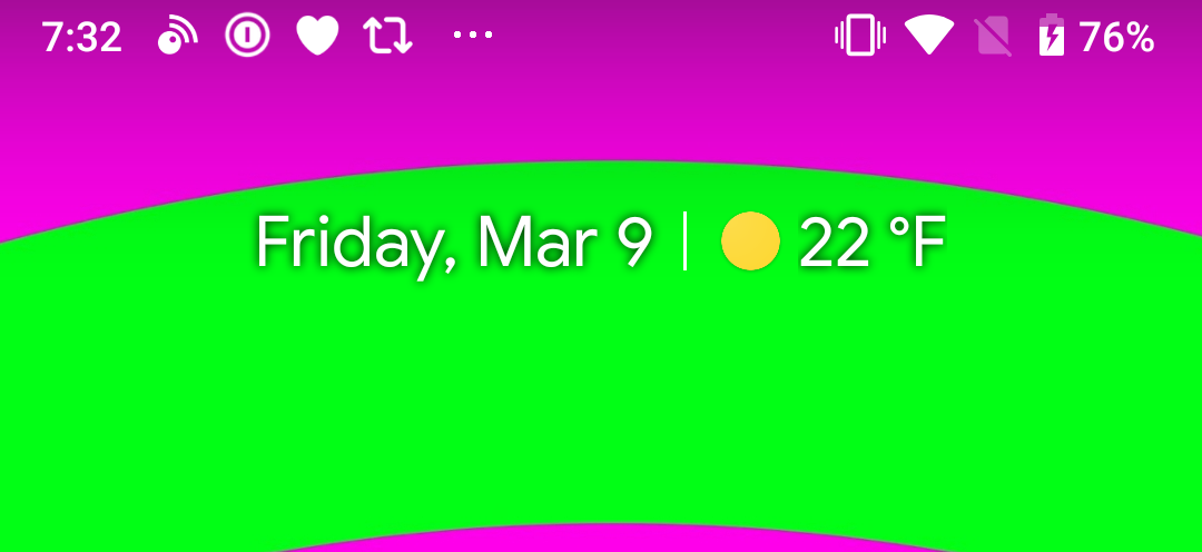
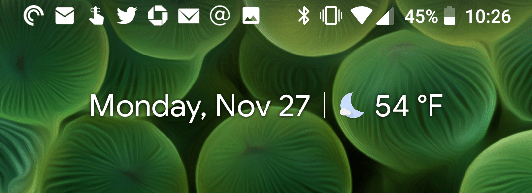
The curious thing is that from a menu bar perspective there is not a “notched” and “un-notched” mode, it’s the same all the time. As such, the center of the phone, were the notch would be on some phones, is always blank. Check out the photo above and compare it to this screenshot of Android Oreo on the same phone:
As much as I think it’s ugly to have a bunch of icons in theme bar at all times, if there are going to be any, I’d prefer more than less. Android P has an awkward middle-ground of just enough icons to be ugly, but not enough to be super helpful.
This is a developer preview build and much can change before Android P releases this August/September, so I hope this is one of the things on the table to adjust. If I have the screen space, please use it!


