Empathy, the buttons on timers and alarms are reversed, and my 3 year old fix I still dig
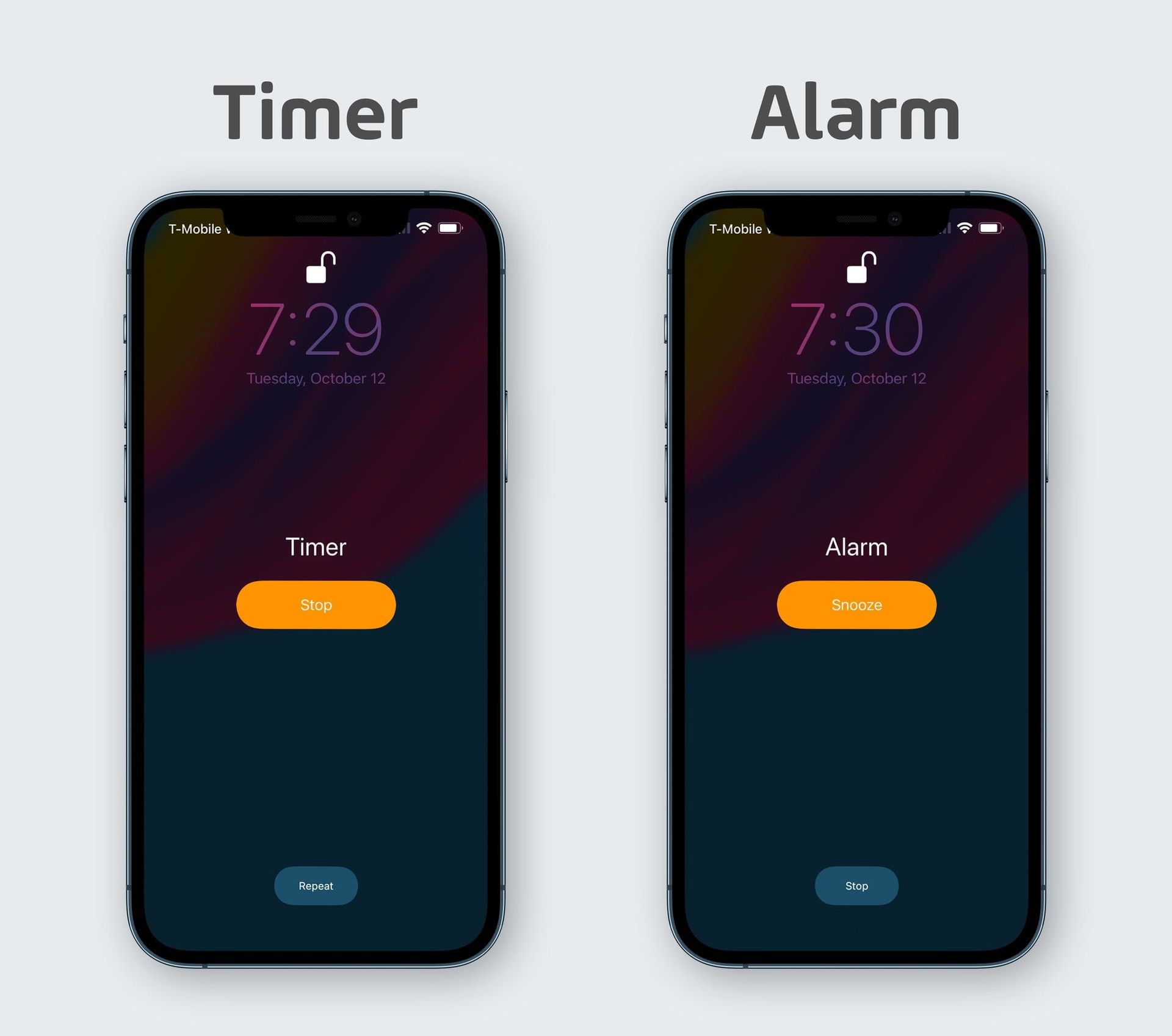
There’s a trope online where someone will post pictures of the iOS screen when alarms and timers are going off and they’ll lament, “why are the actions reversed, it’s confusing!” This post will get lots of engagement with people agreeing, but there will be plenty other people who smugly explain how the user is wrong, it actually makes perfect sense, as the main action someone wants when an alarm goes off is to snooze and when a timer goes off they want to stop the timer. Therefore, the big button in the center of the screen stops a timer, but it only snoozes an alarm.
Now, the explanation makes sense to me in a vacuum, but I’ll also say this…I use alarms more than timers, so when a timer goes off, I 100% of the time have to actively prevent myself from hitting the wrong button. It is absolutely confusing to me and I believe the many other people who think it is as well.
Why am I writing about this, though?
Well, I’ve been on a bit of a tear lately about the gap between how “thought leaders” talk about user interface design on social media and how real designers actually do their jobs. I popped off a bit in this member’s post a couple weeks back:
In my opinion, the number one skill I need to have in my job as a UX designer is to be able to empathize with the people who use my software. It's not my job to just know what's best for them and to build that...that's what the worst UX designers do. No, my job is to learn about my users, to think about them all the time, and to design software that is focused on their needs. When they tell me something unexpected, I need to be curious and dig into why they seem to want something different than I expected. If I am in a user test and I find myself explaining to someone why they don't actually want what they say they want, I'm doing a bad job Yet, that's exactly what you do when you're a "thought leader" in the technology space (or at least when you're the sort of thought leader I'm thinking of in this post).
I think what’s going on with the alarm vs timer thing is that Apple is using the same UI to do different things. It’s as tricky as it could possibly be. An orange button means stop on one of them and snooze on the other. The location of the “stop” button flips between screens as well.
I like to come to these things with solutions, and conveniently, I actually already proposed something 3 years ago and I stand by the general idea and thought process. You can read that post to see more details, but the gist is this:
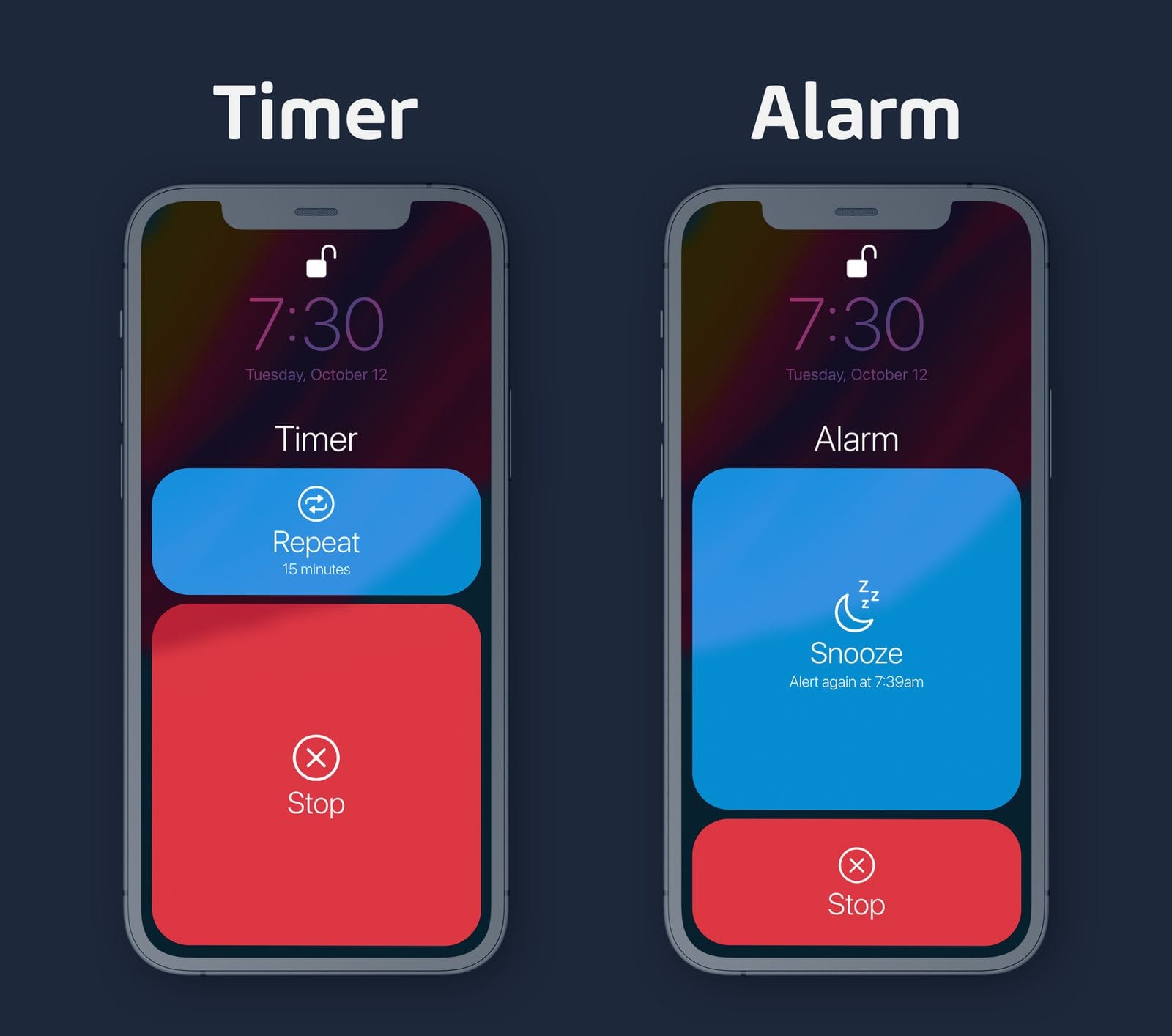
Now this UI needs a glow up, but the concept behind it is good in my unbiased* opinon. The button sizes lean into the benefit proposed by the smug “actually, it’s better this way” crowd by making the “default” action the larger touch target. However, we’ve fixed the two things that make the current system confusing to people like me. The “stop” button is always the same color and is always at the bottom of the screen.
Once again, the UI was quickly mocked up and is optimized for clarity of the idea, rather than a shipping interface, so don’t get too hung up on the blue and red that don’t fit in with iOS’s overall design system. But looking at this mock up 3 years later, I still think something like this would be better and I’d love to see it changed. Then again, it’s been like this for so long that Apple may think any change would be disruptive and may as well leave people with the devil they know, so maybe it will be like this forever.
At the very least, if you are someone who sees these posts and explains to the person why it’s not actually confusing, you’ll consider having empathy for the user who is clearly not alone in this software not being ideal for them.


