How I'd Redesign Alarm and Timer Notifications on iOS

Apologies for the iPhone 13 screenshots on an iPhone 12 body, my mock ups haven't been updated for the 13 yet…
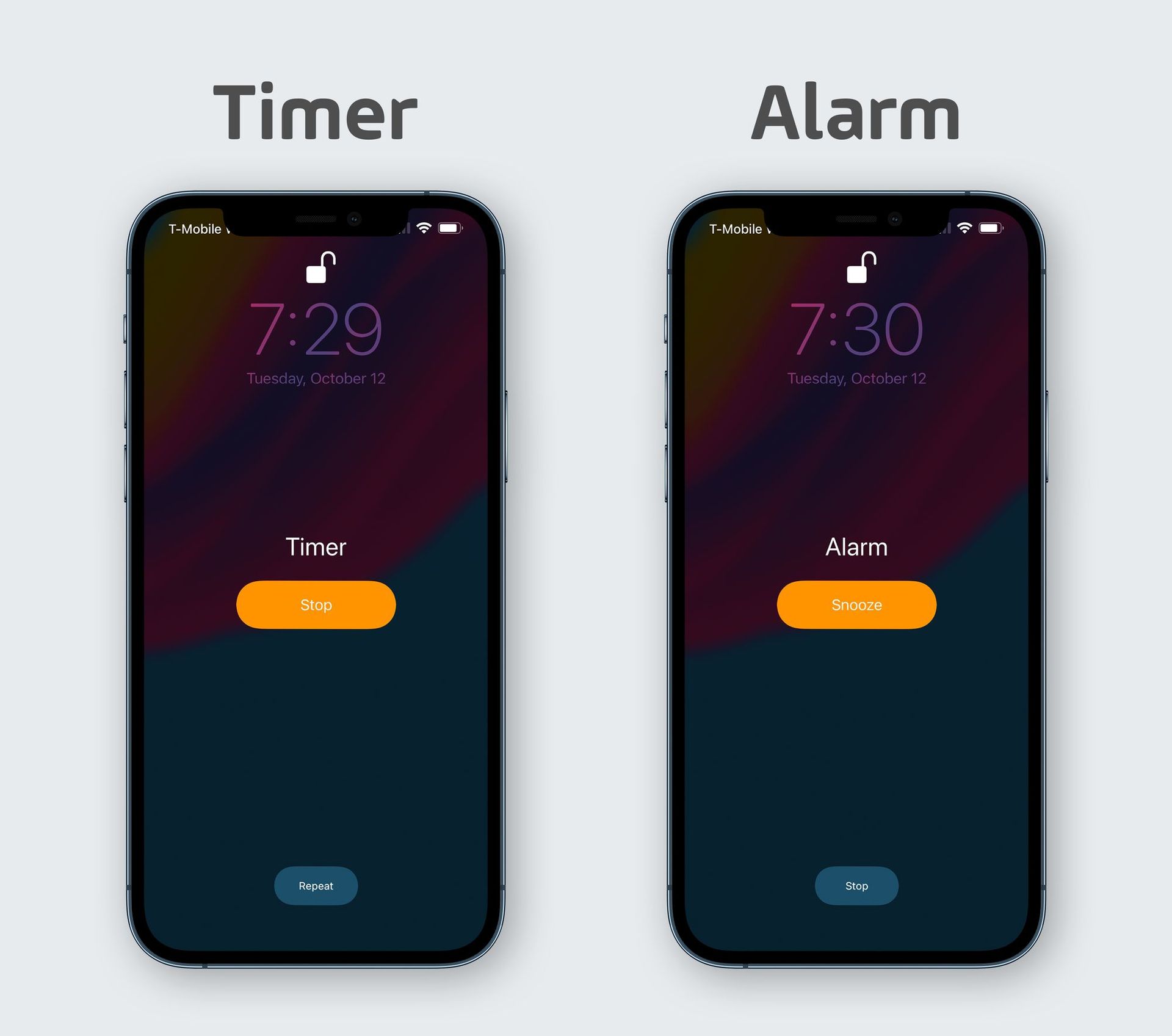
Above you can see what is presented to the user when I timer or alarm goes off on iOS. The UI is the same, but the inputs are not what I ever expect. The big orange button in the middle of the screen is clearly the "default" action, and the gray button at the bottom is the secondary one. They're slightly different, but I'd sum up the two options on both screens as:
- Thank you for the alert, I'm done with this.
- I need more time.
What's always confused me is that the timer makes "I'm done with this" the primary action, while the alarm makes "I need more time" the primary action. Why is this? Even after years with this UI, I still get it wrong sometimes because I have to do some thinking on "is this an alarm or a timer?" which isn't terribly hard, but it's harder than normal when you're either tired and have a phone blaring annoying sounds at you.
I think at this point Apple believes this is the right way to do things, so I have to consider why.
Option 1 is simple, annoying, but if often a good reason to leave something alone: it's been like this forever and changing it would cause its own confusion and anger. This is true for all software, and it's doubly true for iOS which runs on over 1 billion devices.
Option 2 is that Apple does consider the primary action on timers and alarms to be different. Maybe most people stop their timer immediately, while most will snooze their alarm at least once, so they are optimizing for the most common action. That's definitely possible, but without any actual user research you and I can only make semi-educated guesses if this is true.
Option 2.5 is that since alarms are often for waking up, people are more likely to kind of blindly paw at their phones to snooze the alarm, and they're more likely to have the phone in their hand and be able to touch a smaller button to stop the alarm.
Problems
No matter what the reason, I think there are a few main problems with the current UI, even if there is a logical reason to have their order flipped.
- The order of options is flipped between timers and alarms.
- The colors in the UI don't seem to indicate anything. Orange is destructive? The opposite? 🤷♂️
- The buttons are smaller than they need to be.
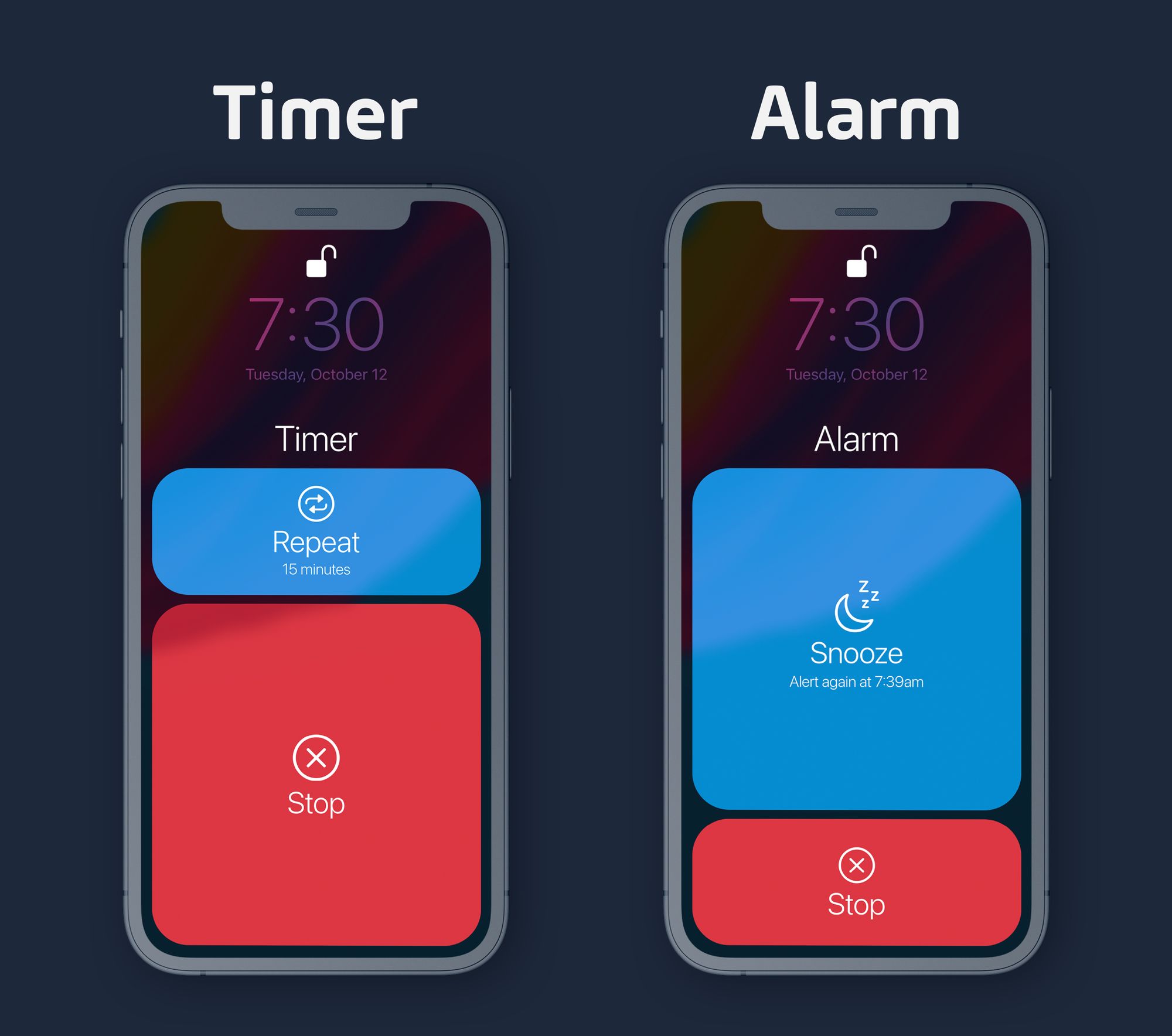
Here's my 15 minute mock up of what might be more useful:

This mock up tries to address the problems listed above while causing the least confusion to existing users.
- The actions are now in the same order.
- The colors are very clear about which one is "destructive" and which one will just delay things.
- The buttons take up way more space and are easier to hit.
There are a few other tweaks I've made to make things better, in my opinion:
- There are icons on each button, which adds another visual indicator what each button does.
- There is descriptive text on the "repeat" and "snooze" buttons to tell you what will happen when you press them.
- I've maintained Apple's size relationship, so it remains easier to hit "stop" on the timer and "snooze" on the alarm, but maintaining the same order of buttons.
Before I go, let me reiterate right here that this is a 15 minute mock up, not a final solution I think could ship exactly like this. The colors are clear, but they're a bit garish and should be refined. The sizing of the buttons is also very negotiable, as is the specific wording used in each button. This also doesn't take into account other new features Apple may want to add to this "while they have the patient on the table."
With that, I'm curious what you think! Is this UI inconsistency something that bothers you? Do you think this solution is headed in a better or worse direction? Again, I know the colors are a bit much 😛

