iOS 12 Concept: Notifications
iOS has quite powerful notifications, so much so that some people were saying we wouldn’t even go into apps much anymore, we’d just do everything from notifications when this style was introduced in iOS 10. That hasn’t played out, and I don’t think we should expect it to anytime soon, but I think Apple could make a simple fix to improve everyone’s notification experience.
For some context, this is what a notification looks like when it comes in on iOS 11 today, as well as when you press/swipe down on it:
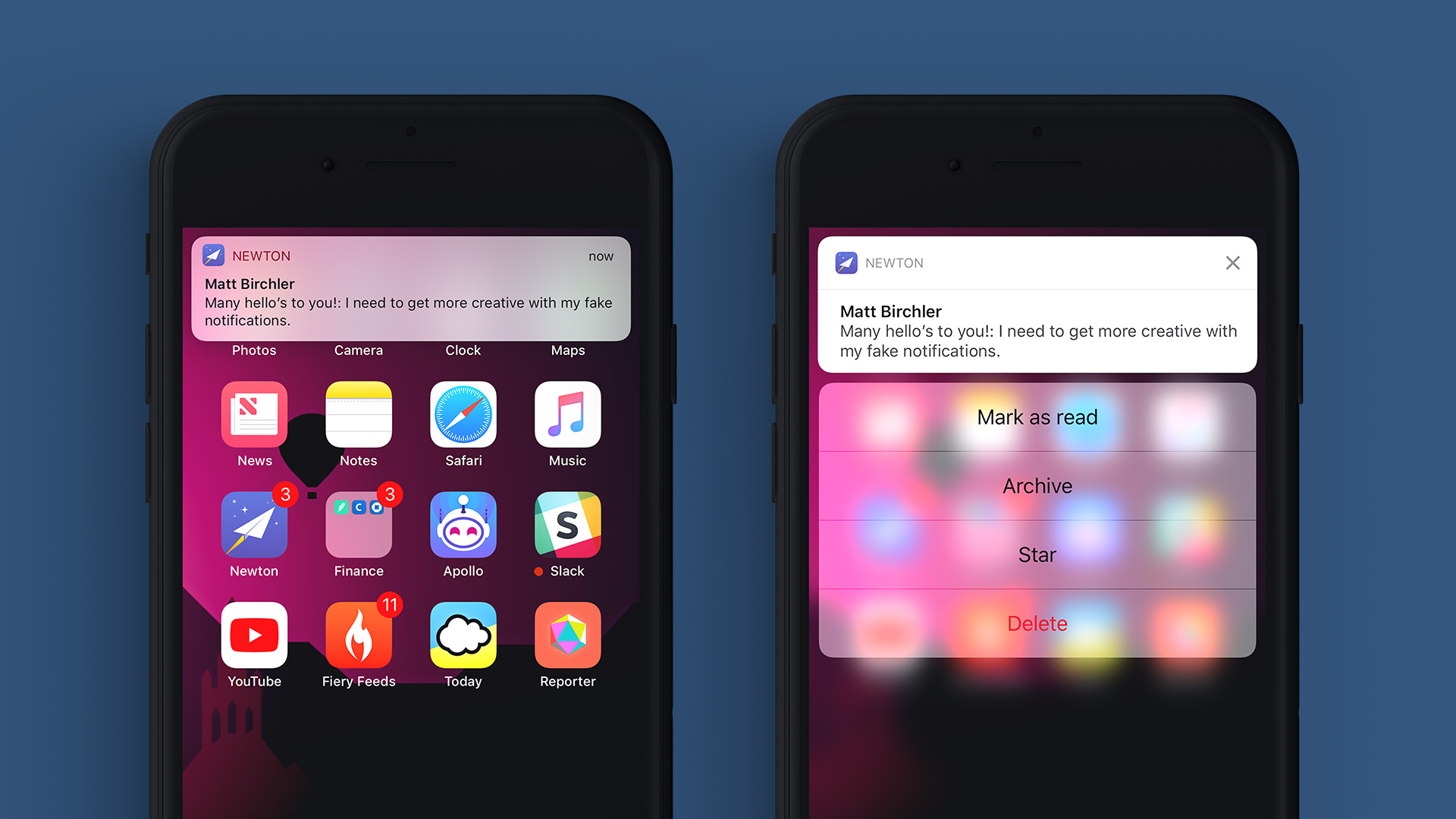
Notifications are a big feature, and this mock up is only addressing one issue, but there are 2 major issues I feel this notification view has that could be addressed relatively easily.
- Discoverability. My wife, who is technically savvy, just learned that you can pull down or force press on a notification to take action on it. This has been a thing for 18 months and she just learned it!
- Speed. Force pressing or swiping down on a notification takes more time than I’d like. This is most apparent with timers/alarms, where the phone is making a god-awful noise and I want to dismiss it as quickly as possible. The need to swipe down and acknowledge the timer is frustrating every time.
So here’s my quick solution:
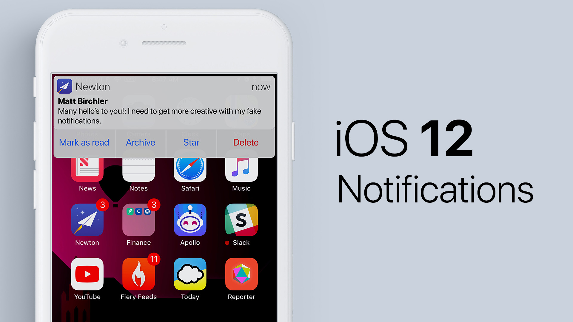
Now yes, this is very similar to Android’s notification view, but I don’t think that’s a bad thing. This retains Apple’s design style while adding more functionality up front. The buttons are visible and actionable right up front. The text is made blue to match general button text elsewhere in the system, and the “Delete” button is red to maintain the “destructive” button designation.
Oh, and I’ve reduced the corner roundness a bit because I hope Apple goes in this direction system-wide, but that’s for another post. 😃
This does introduce some new design challenges, such as what to do where the options don’t fit on screen at once. In this case I’d think the right side would fade away to indicate there’s more content and you could drag the buttons left and right to see everything. Very rich notifications would also still require some sort of action to expand them to their full view. This could still be activated by a swipe down gesture or force press.
Notifications are a deep and opinionated place, but I would love to see something like this implemented in iOS 12.


