iPad Main Menu
This concept for an iPad Main Menu is a very well put together mockup, and it’s clear a lot of thought has gone into making it. This is a fantastic mock up, and this idea of a main menu is something I could see making iPadOS better than it already is.
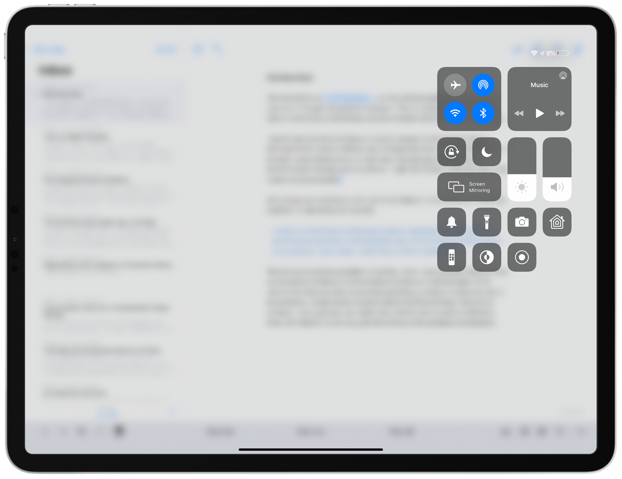
I haven’t spent any time working on a counter proposal to this, but one thing I’d definitely want to test is a different way to bring up this menu. I worry that putting it in the dock, something that is out of sight when using the app might not be as discoverable for average users as we’d like. I might test having it at the top right of the screen and be accessible in conjunction with Control Center. Look at how much empty space there is in that view today:

I’d like to consider adding a “menu” indicator of some sort to the top right “menu bar” and piggybacking on this gesture people already know from their iPhone and iPad already. It might be a little weird to combine system settings and app settings in one view, but I like the idea of using a gesture people already know to maximize discoverability of a new feature as substantial as this.
Again, I haven’t had time to mock this up, so this is just me thinking out loud. I may find time to do that later this week, but in the meantime, kudos to Alexander Käßner for putting this mock up together!