Mujjo leather iPhone 15 Pro case review
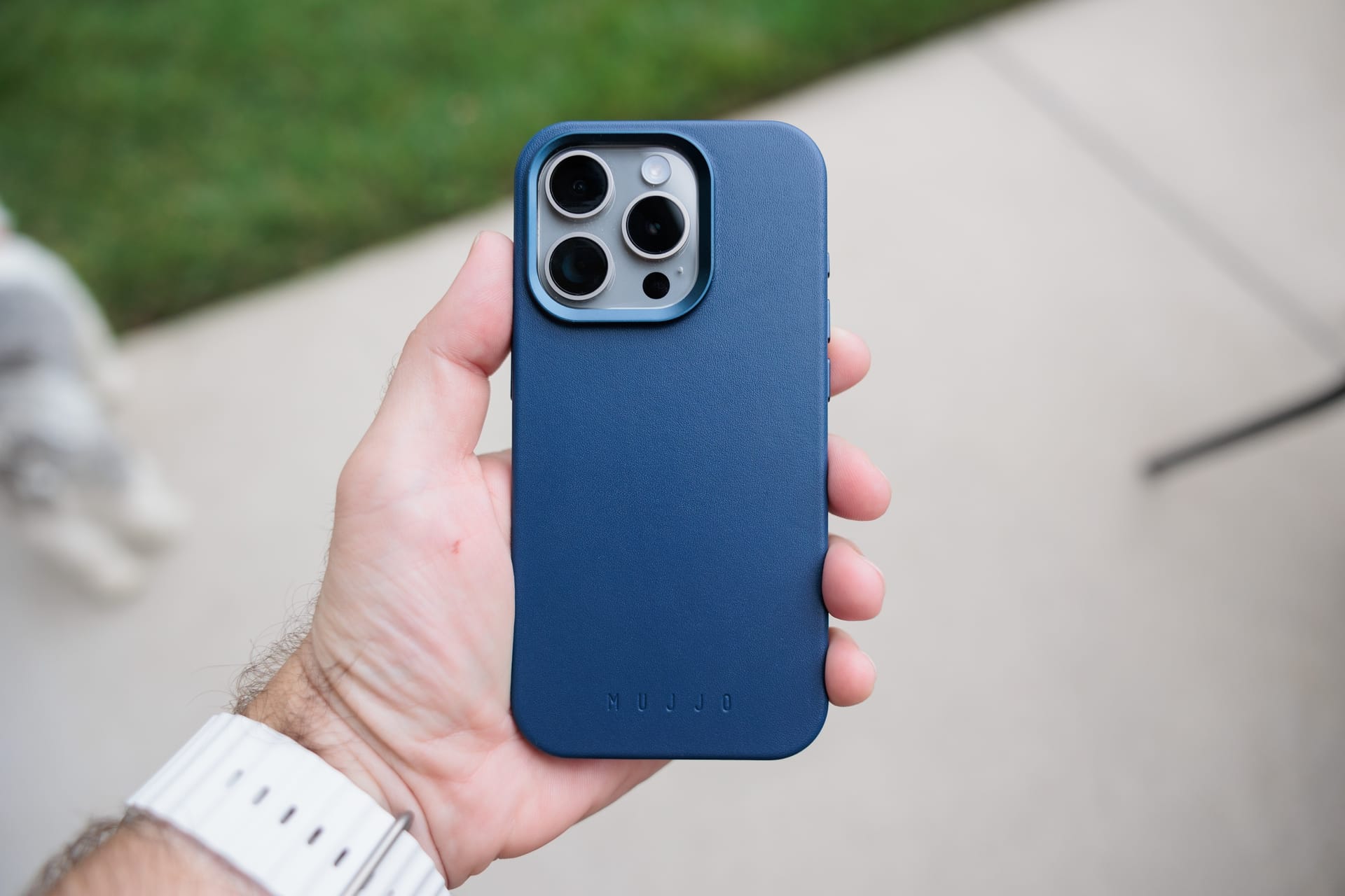
Like many others this year, I’m not thrilled with Apple’s new FineWoven iPhone 15 Pro cases, so for the first time in at least a decade, I bought a third party case and wanted to give some quick impressions since people are looking for a good iPhone case this year. I got the Mujjo Full Leather Case for iPhone 15 Pro in “Monaco Blue”, which currently sells for $59; the same price as Apple’s case.
In the interest of transparency, I have no affiliation with Mujjo, I bought this case myself, and the link to their site is not an affiliate link.
General impressions
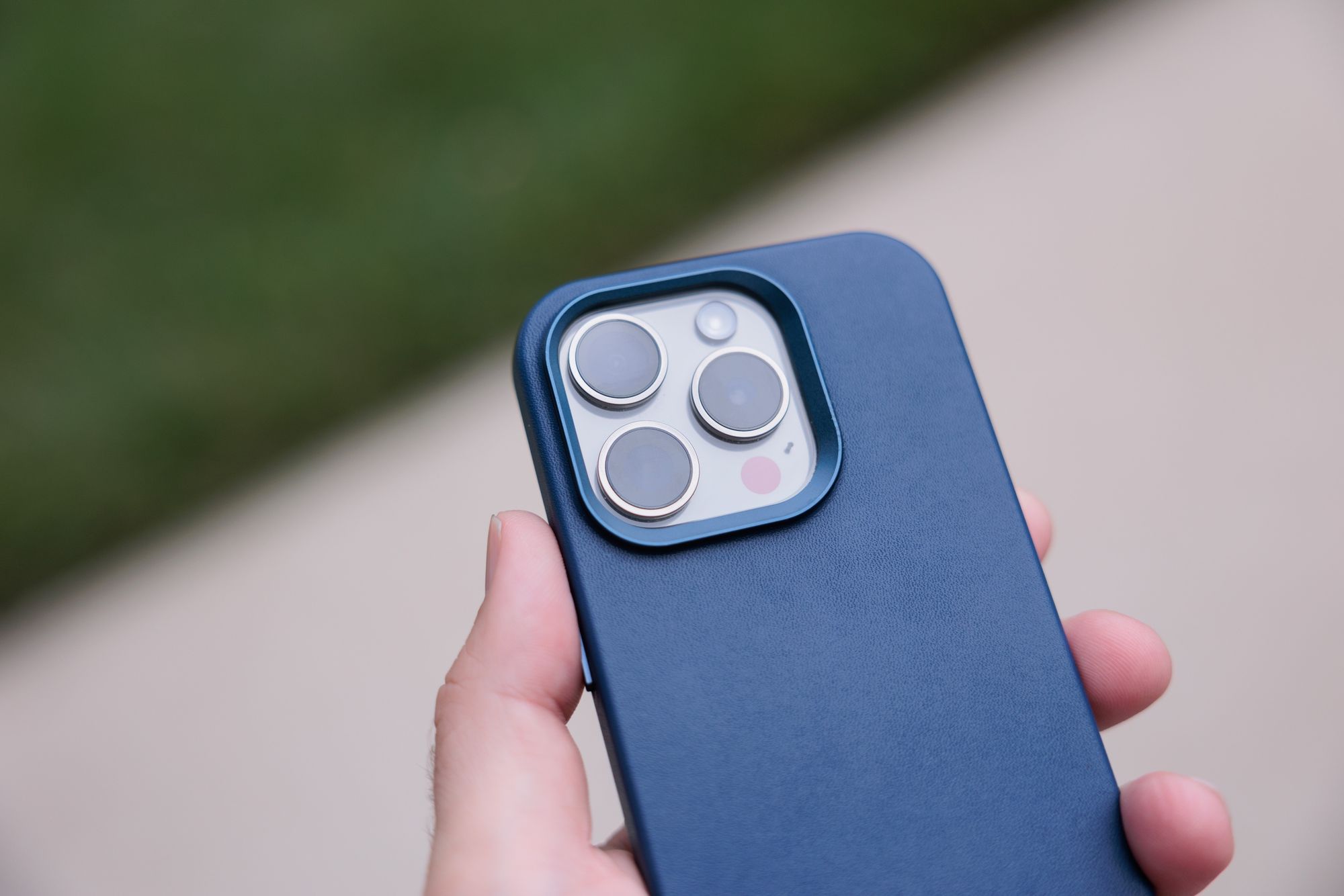
I like this case quite a bit right out of the box. It feels quite similar to Apple’s old leather cases, but with a couple differences that don’t matter a ton, but are worth calling out in a review like this, so I’ll hit those up in the next section.
Put plainly, the case feels good in the hand, and assuming it ages as nicely as Apple’s did all those years, I expect to only like it more over time. It feels premium, which is good considering the price tag, but doesn’t feel too bulky. I can’t tell exactly how thick this case is, but it feels within the margin of error of Apple’s leather cases to me.
It does have MagSafe built in, so you get all the magnetic wonder you could ever want.
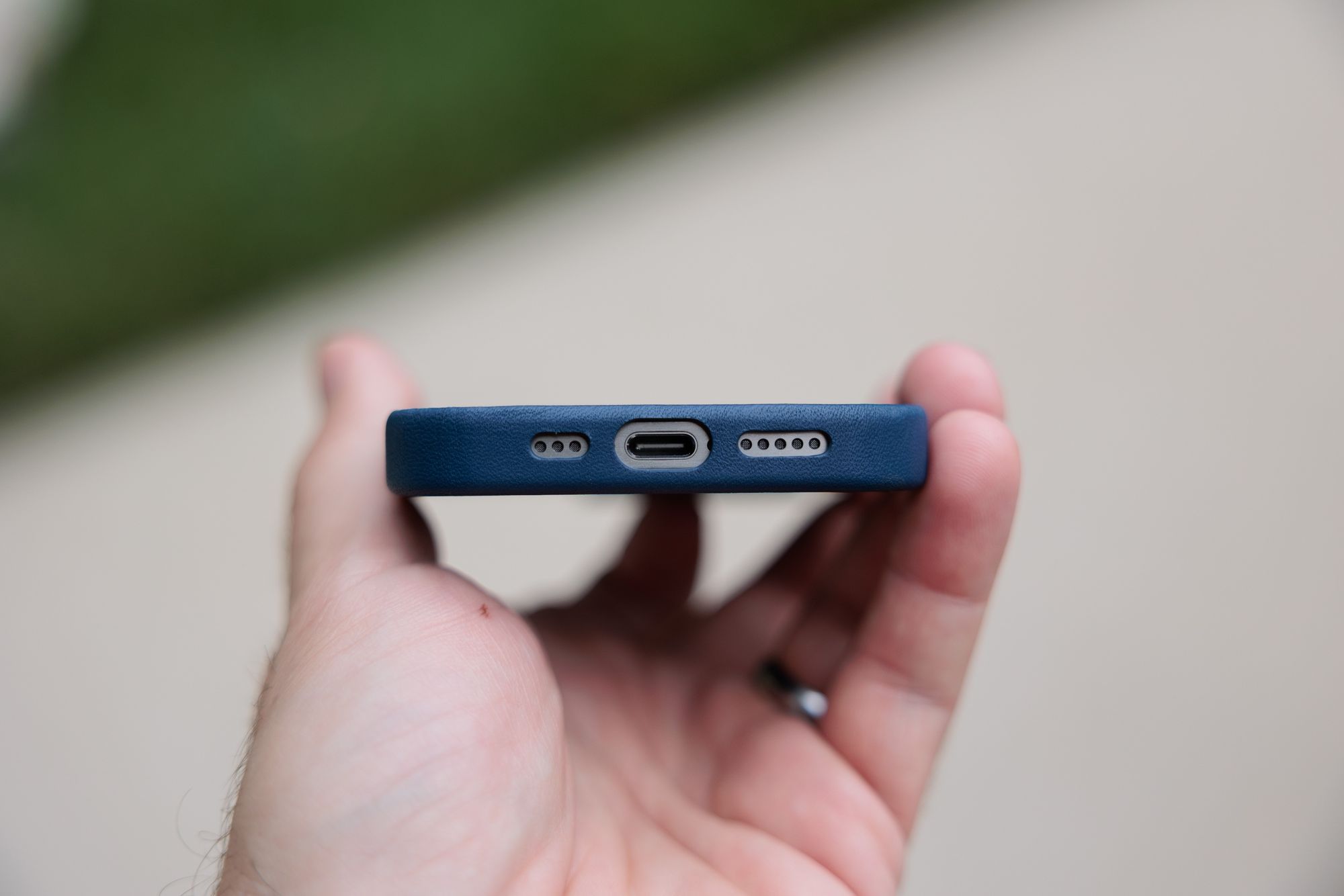
The holes on the bottom mirror Apple’s as well.
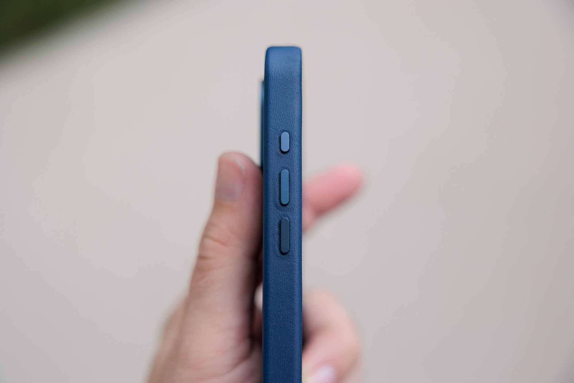
And yes, it does have a button for the action button, not a hole in the side, which I would say is basically a deal-breaker for cases.
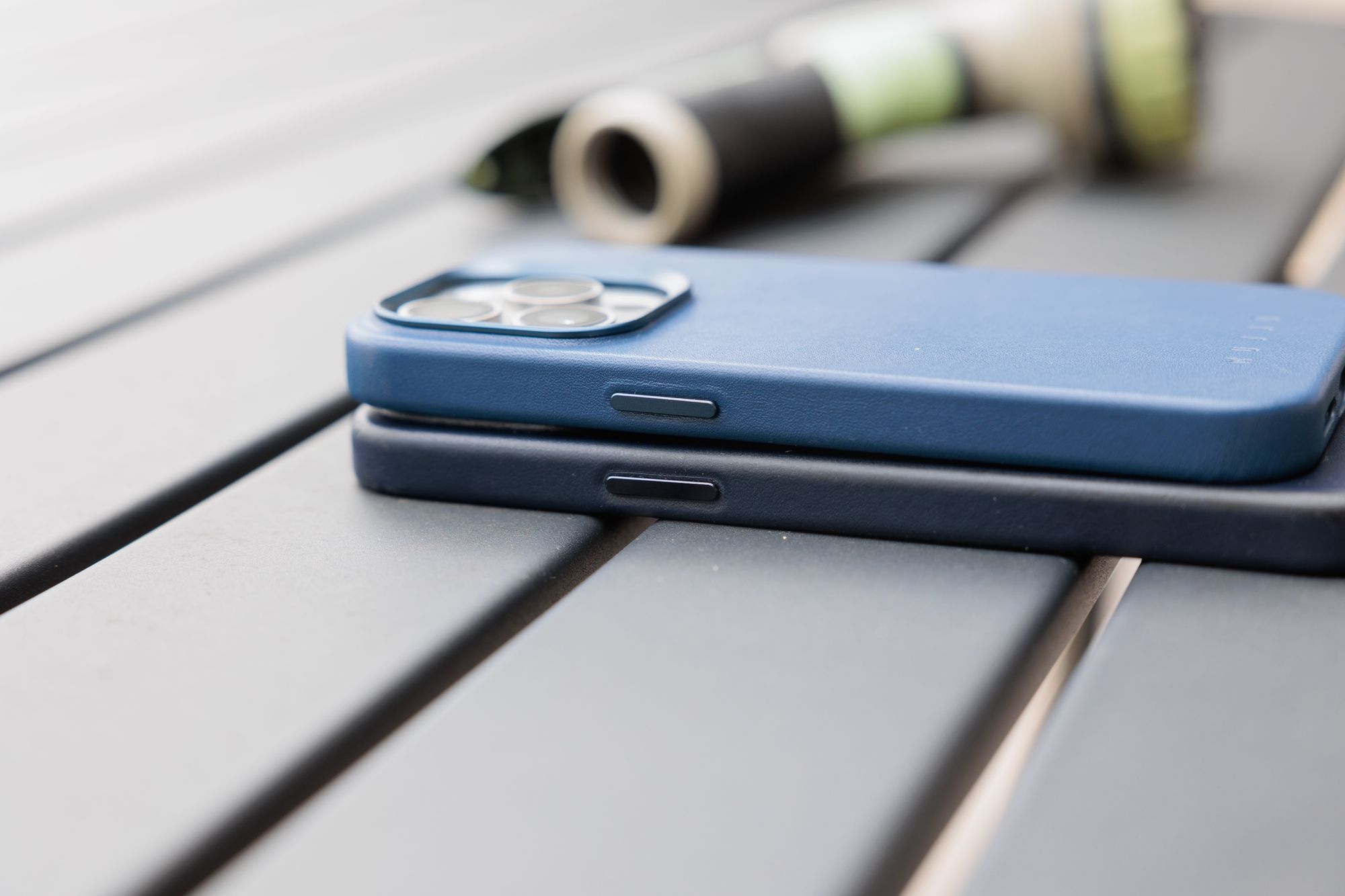
Finally, just like Apple’s cases, the buttons are all metal, and feel of similar quality to Apple’s cases.
The subtle differences from Apple’s leather cases

I still have my beautiful purple iPhone 14 Pro, so I was able to compare these two side-by-side. They’re very similar, but here are the differences.
First, as you can see in the top photo in this post, the Mujjo logo is pressed in to the bottom back of the case. This doesn’t bother me because it’s very subtle (and reminds me who I can order my next phone’s case from 😉), but I know people are weird about having any logo besides an Apple logo on their case.
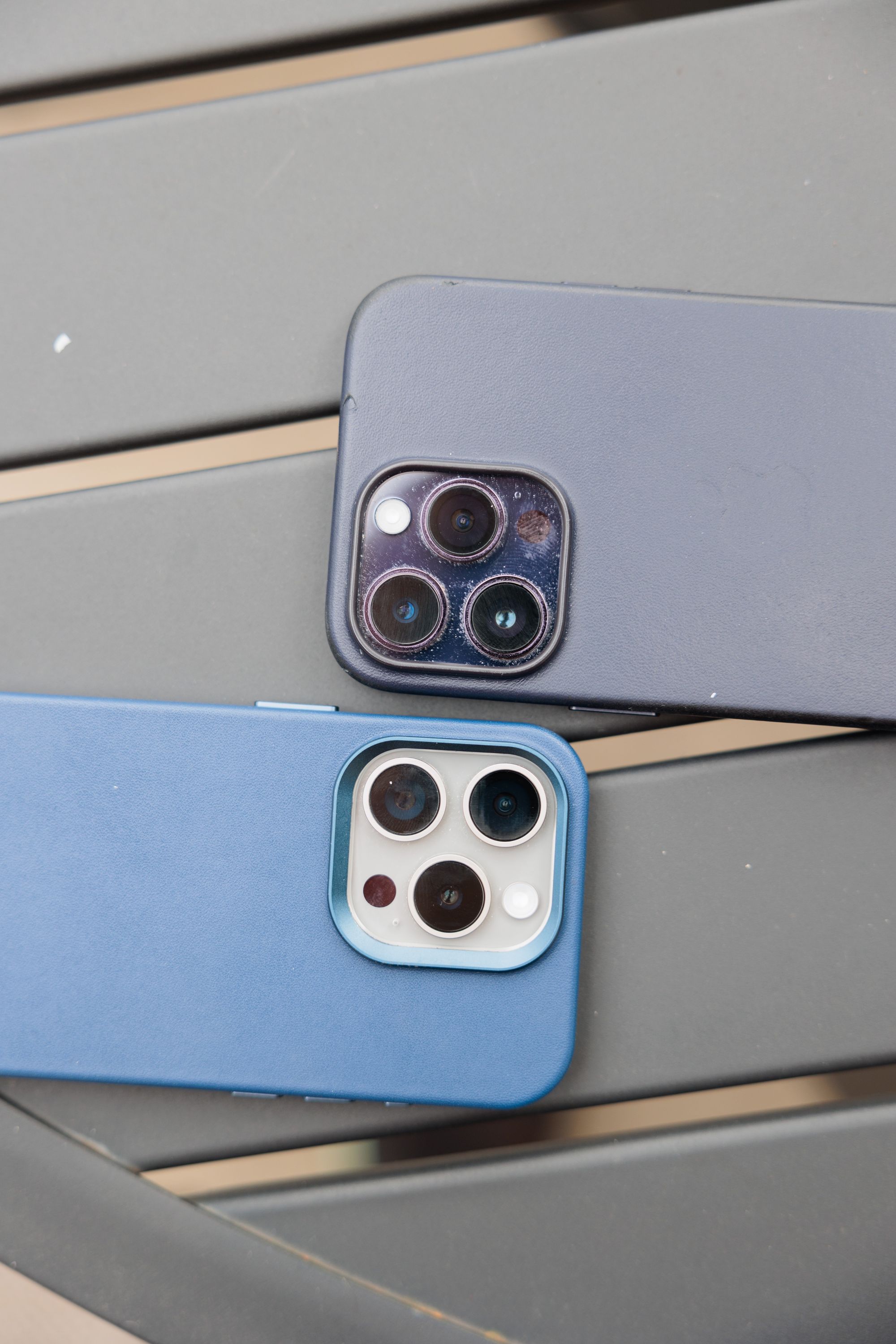
Then there is the metal ring around the camera sensors, which is noticeably chunkier than Apple’s. I’m not super bothered by this, but gun to my head I guess I’d say I prefer Apple’s subtler border.
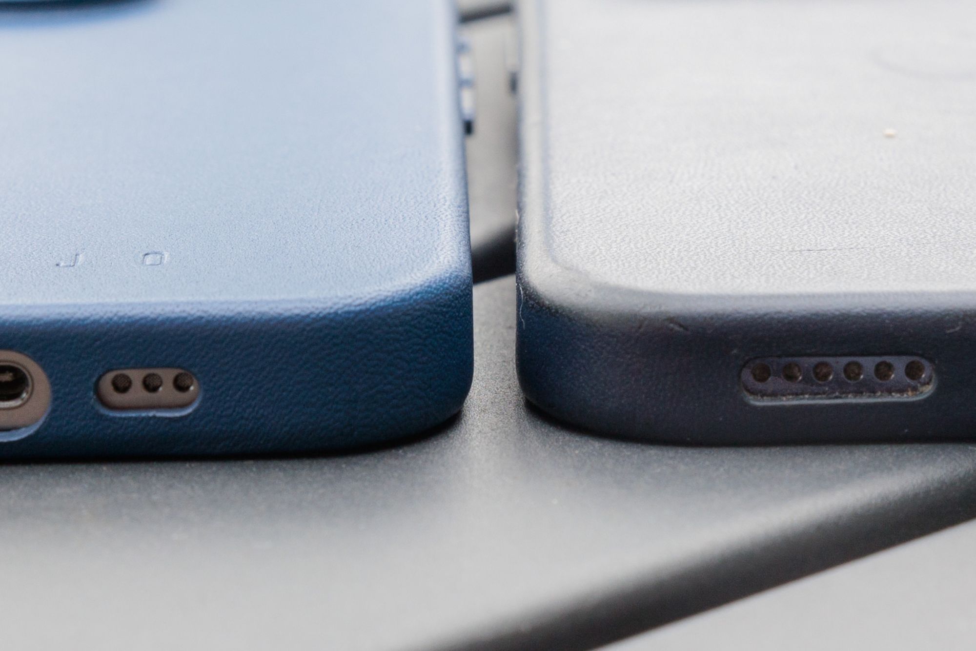
This one is hard to capture on camera, but the corners of the case are ever so slightly sharper than Apple’s case. I’m not totally sure if there wear down over the course of a year or not, though.
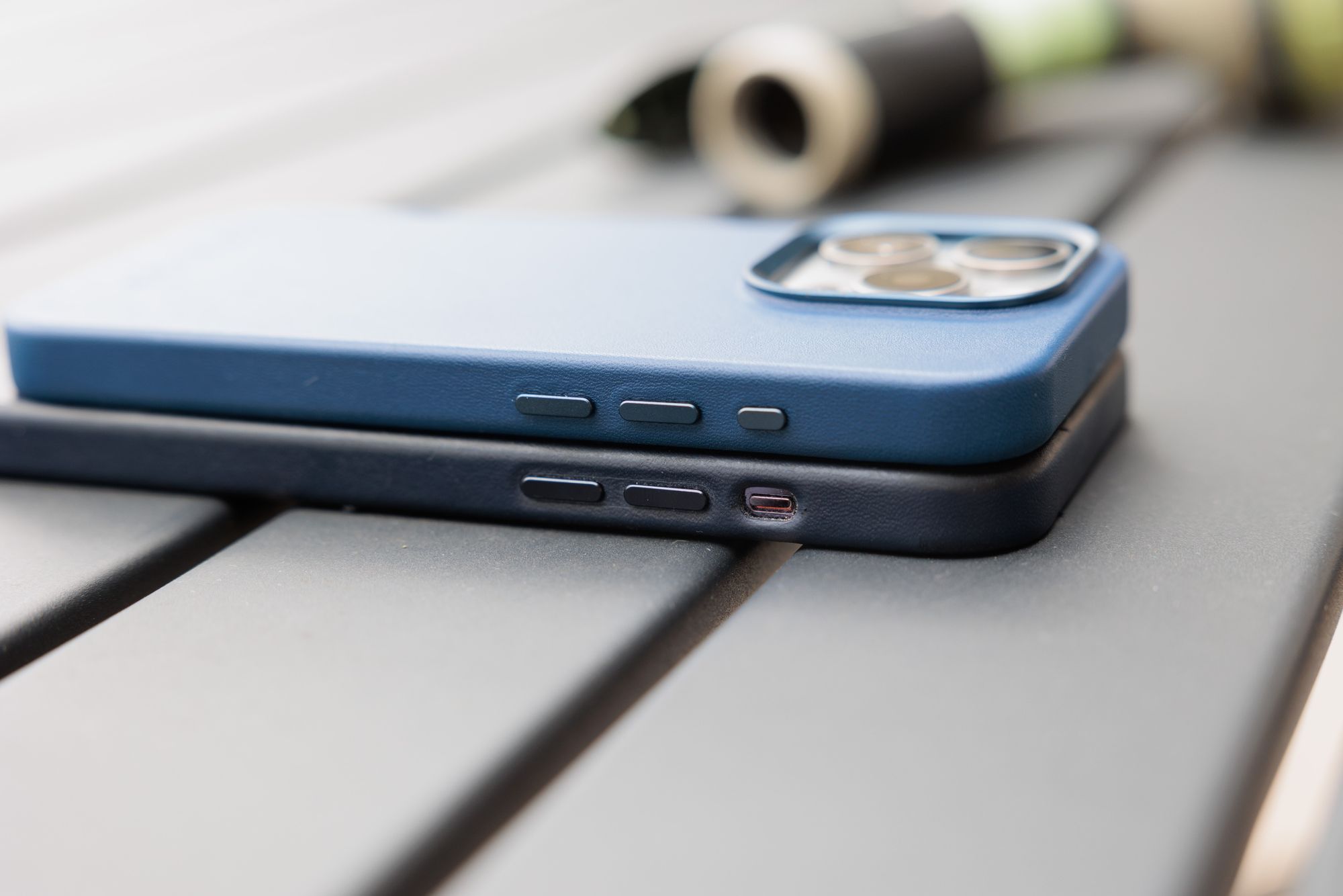
And yes, the action button does get an actual button! To be clear’s Apple’s FineWoven cases also have a button, both of which are an upgrade over the hole that had to be used on previous iPhones.
Recommendation
I feel bad recommending anything because each person’s budget and preferences are different. Also I haven’t tried a million cases to find the best quality-to-cost ratio out there.
With that said, if you were looking at this case as a potential successor to the Apple leather cases you’ve been using for years, I think you’ll be quite happy with it. I know I am.


