My review of the Apple Watch Ultra 2
Without question, this is the most minor Apple Watch upgrade I’ve ever experienced personally (the Series 7 to 8 upgrade was tiny as well, but I never bought the Series 8). There are a few upgrades here that I’ll knock out quickly, and then I’ll discuss my experience with the new double tap feature, which is the only reason I got this to replace my original Ultra.
The small upgrades
The Ultra 2 gets the new S9 SiP, and while I’m sure it is more performant, I can’t tell the difference in literally any task I use my watch to perform. Genuinely, I wore both the Ultra 1 and 2 on my wrist for most of a day testing things and literally nothing was faster on the Ultra 2. I’m not saying the processor is the same thing, I’m just saying that watchOS already performed all the tasks I ask of it quick enough that the animations might be the limiting factor in speed and not the chip actually processing the request, so I haven’t noticed anything. On the plus side, since the watch only gets a speed bump every few years, it’s usually good to buy into one soon after a chip upgrade so that you get better performance in future OS updates.
Battery life feels the exact same as last year, which is to say great. For me, I get about 2 full days on a charge, and I do absolutely zero work to save battery life. Always-on screen? Check. Maximum brightness? Check. All default settings for things like background updates and syncing? Check as well. The only thing I don’t do much is use the watch on cellular, since my phone is basically always with me. The bottom line is that the battery is about twice as good as the normal Apple Watch, which is the same as last year’s Ultra.
The screen is generally the same brightness as last year, but it can get up to 3,000 nits (up from 2,000 nits in the first Ultra) in rare cases.
One thing I think is worth noting as our computer displays get up in the multi-thousands of nits max brightness is that perceived brightness increases logarithmically, so as we get to higher brightnesses, the differences become harder for us to perceive. So while going from 500 to 1,000 nits is going to be easy to detect, an increase from 2,500 to 3,000 is going to feel like basically no difference.
Finally, when you ping your iPhone 15 from the new Ultra, you can also see an interface on the watch that shows you how far you are from the phone, much like using Find My on an iPhone to find an AirTag. It’s nice.
Double tap might be my let down of 2023
Oh man, what a bummer! After the Ultra 2 announcement, I turned on AssistiveTouch on my Ultra 1 and was kinda blown away by how convenient it was to do some things with a pinch gesture. It was definitely a bit fiddly, but when it was at its best, it was spectacular. How much better would a more refined version of this with better pinch recognition be on the Ultra 2?!
Turns out, better and worse.
On the plus side, pinch recognition is absolutely wonderful, and is effectively 100% for me. I’d put it up there with Face ID in terms of success rate, which is to say basically 100%.
On the downside, this feature is very half-baked right now. The short version of my criticism is that it doesn’t do as much as you want, when it does something it often does the opposite of what you want, and you never know when it’s going to work or not because the UI is basically non-existent.
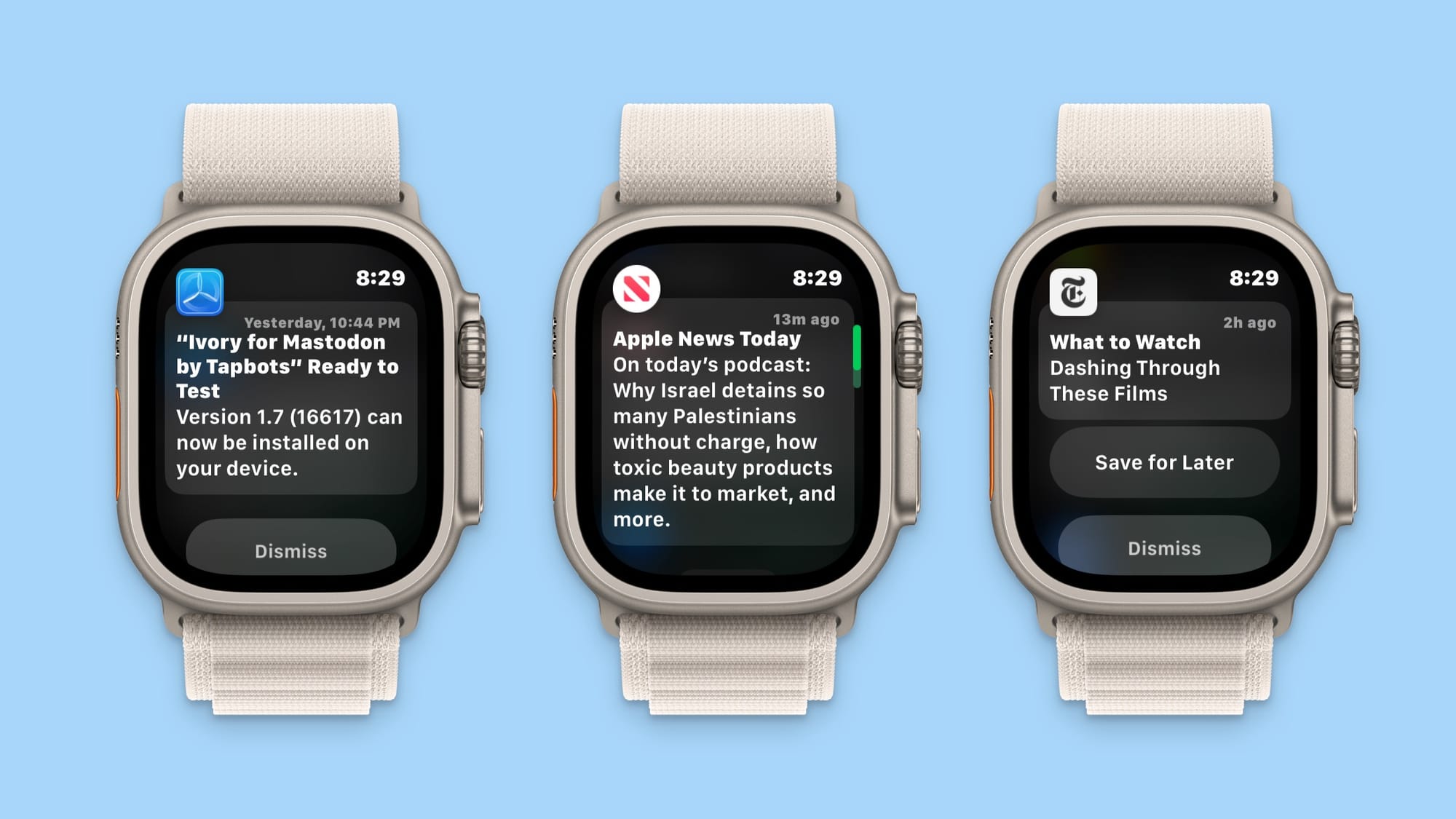
To illustrate this, let’s take a look at 3 different notifications:

What do you suppose would happen when you double tap when each of these notifications come up? Here’s what the same gesture would do:
- The TestFlight notification would be dismissed
- The Apple News notification would scroll down
- The New York Times notification would be saved for later
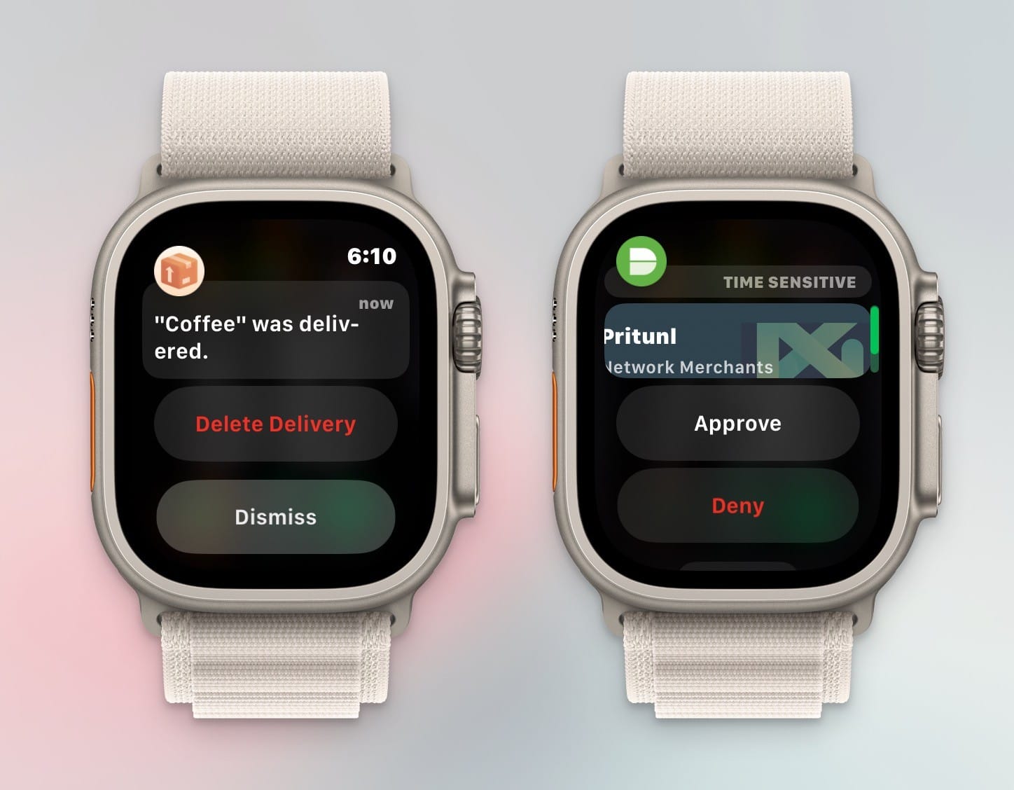
As a bonus, here are two more notifications. What do you think double tapping does for these?

Basically the logic is that double tapping on notifications will dismiss the notification, unless there is a positive action available, in which case it will perform the first action it sees, but if that first action is destructive (red button) then it will dismiss the notification.
And like, I get the logic here, but that’s not super intuitive unless you mentally whiteboard the flows in your head, and it’s a decent amount of mental gymnastics to perform every time a notification comes in. And I’m a nerd who’s willing and able to do a little more effort here, so I’m not sure most people will be more forgiving here.
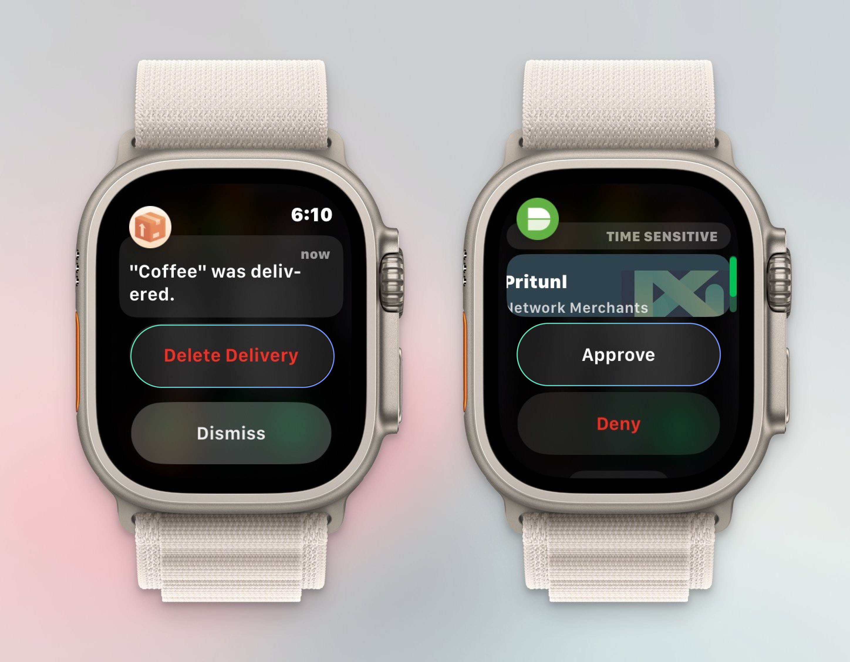
I think the solution here is to add just a little UI affordance that shows the user what will happen when they double tap. Here’s a very quick mock up of what this could look like.

You don’t have to blow up the watchOS interface or do something as chunky as AssistiveTouch, but something would be nice. It’s not just notifications either, some of Apple’s apps let you do things with double tap as well, but it’s rare, and you can’t really know at any point what will work and what won’t, which means I’m often randomly double tapping my fingers together wondering if anything will happen. That’s not great.
Another issue I have is that there’s effectively no configuration for double tap, so if you don’t like what it selects for you, too bad, deal with it. As a very basic example, when you get a call, double-tapping answers the call. I appreciate that this might be the right choice for some people, but it’s not for me since I almost never answer my phone. It’s a similar situation with Messages, where I almost never want to reply from my watch, but that’s what double tap does for those notifications anyway. What this means for me is that double tap is positively useless for those key use cases, and worse, I have to be very careful not to accidentally double tap lest I answer the phone for a telemarketer or totally legit place that wants to talk to be about my car warranty.
What this ultimately means for me is that I use double tap about once per work day to approve the push notification from my work’s VPN, and that’s it. It’s more complicated than it should be, it’s usually unclear what it will even do in most situations, it doesn’t do that much to begin with, and I can’t make it work how I want. It’s a bummer and I hope they make a lot of changes to this in watchOS 11.
Final thoughts
I don’t get review units from Apple, so I buy every Apple product myself, and I’m honestly really bummed by this upgrade. There’s absolutely no way this blog post is going to earn nearly enough to make this a profitable endeavor, so when I look at this just from a personal level, I don’t think I got the $300 value ($800 for the new watch minus $500 I got selling the old one) I hoped for.
Of course as we all know, basically no one upgrades their Apple Watch annually, but I would say that the difference right now is so unbelievably slight between the two Ultra models that I think a lot of people (most people, even) would be quite happy buying last year’s Ultra at today’s discounted prices. The original Ultra is currently anywhere from $520-600 new from places like Target and Amazon, and you can get a lightly used one on eBay for closer to $400. Do I think the Ultra 2 is better than the original Ultra? Of course. Do I think it’s twice as good as a lightly used Ultra 1? No way.
The only thing that really gives me pause is the SiP upgrade, which could mean the Ultra 2 performs better in the future and might get features in watchOS updates that the original Ultra doesn’t. Of all the things different about these models, this is the one thing that would give me pause and tell people, “if you have the money, it might be safer to get the newer one.” Of course one should not buy a product for the promise of future upgrades (especially ones the manufacturer hasn’t even promised), but I don’t think it’s wild to suggest there will eventually be features that this gets that the first Ultra won’t.
Ultimately, I think the Apple Watch Ultra is a great product, and it’s simply so good that I can never see myself going back to the normal Apple Watch line. I just think this year’s model is a pretty subtle update over last year’s, and I really think a discounted Ultra 1 is quite a compelling purchase going into 2024.


