Notifications in iOS 12: A Dream
I talked a lot about notifications on Twitter today and I figured it was high time I make a mock up for what I was hoping for in iOS 12. Pardon the hasty design, I did this in less than an hour, but this is a direction I’d be very happy for Apple to take in iOS 12.
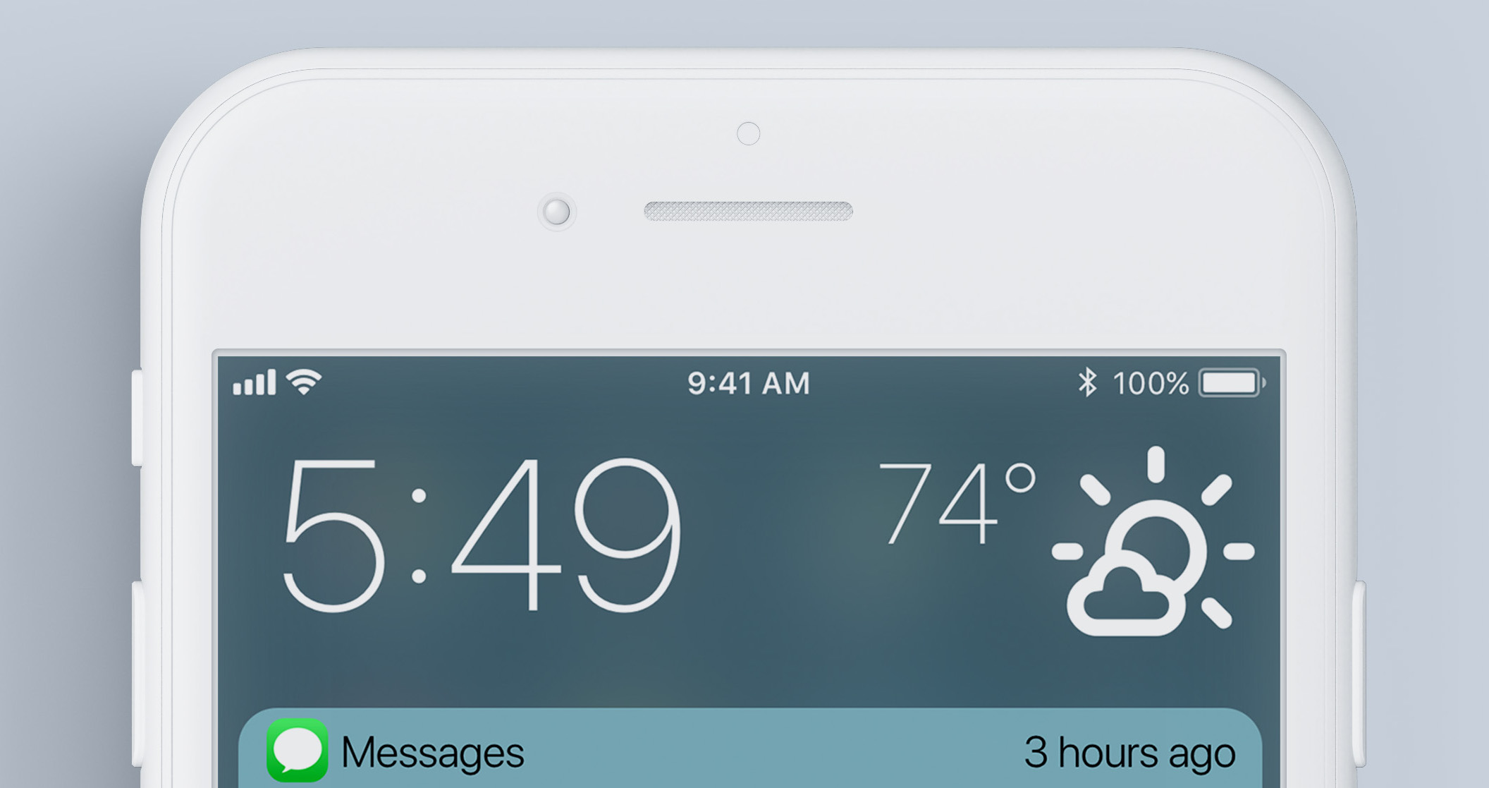
Right at the top we have a smaller time indicator1. The current implementation takes up almost half the screen which seems like a total waste of space.
This also adds the current weather because who doesn’t like to see the weather at a glance?
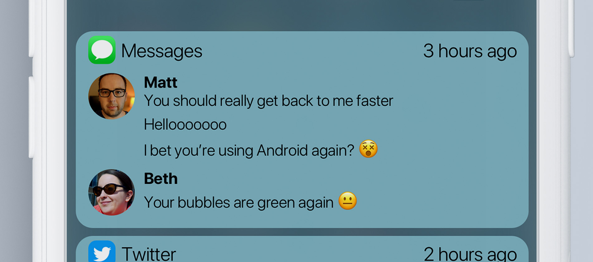
Moving down, we have what I consider the most important changes to the whole operation. First, we have bundled notifications 🎉
Bundling notifications from a single app together means your brain doesn’t have to phase shift all the time when scrolling through your notifications. In this case, we have 4 messages from 2 people together in one space. This would normally take up far more space and be far less efficient than making each one of these their own notification and making me scroll down until I get to the oldest so I can start reading the conversation in reverse.
I can swipe this whole app’s notifications away at once, or I can press in to see each notification on its own.
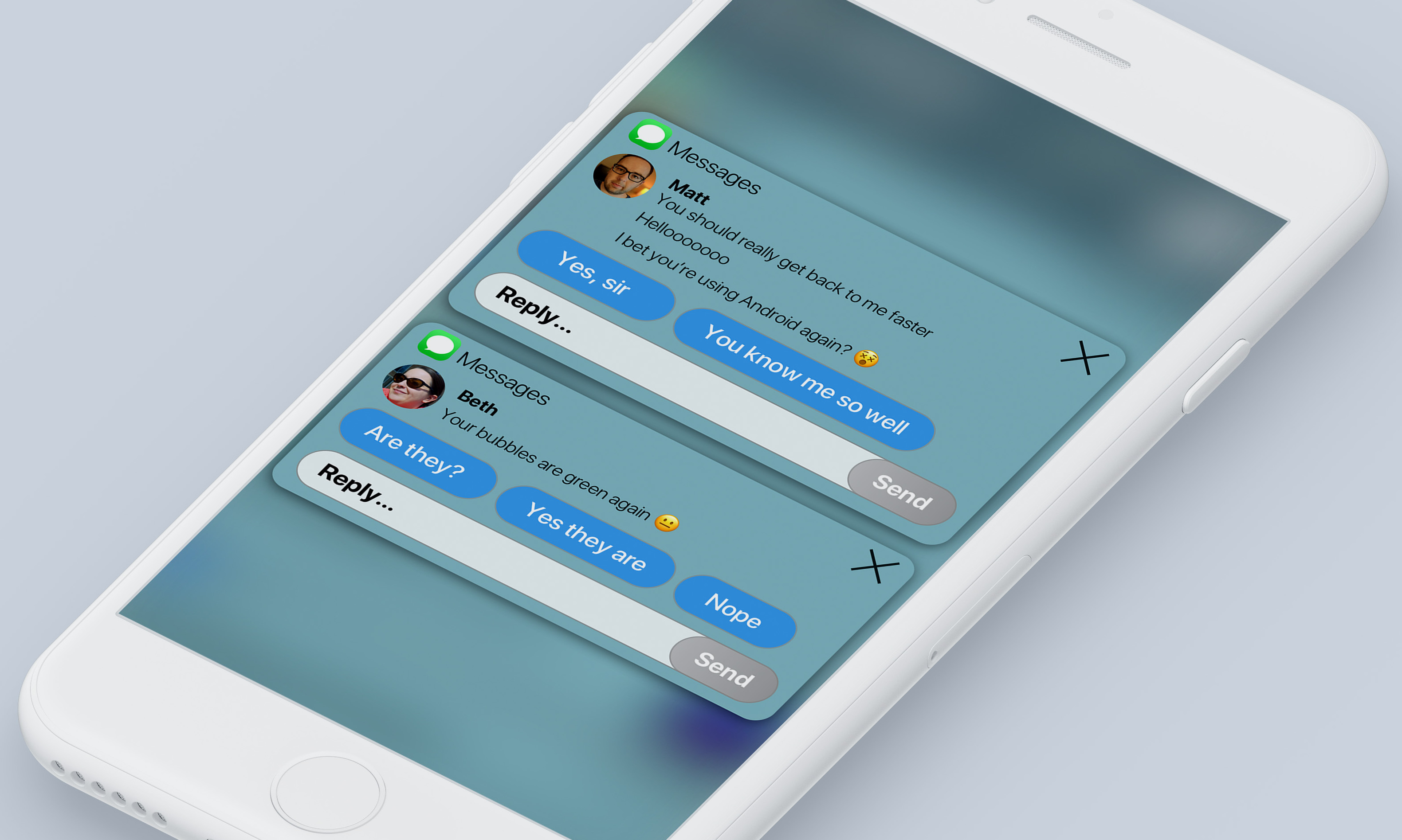
When looking at the detail view, I can close single chats, send automated replies, or type in a message right from here.

The Twitter app is doing a similar thing, displaying part of the notifications and condensing them into a smaller area. It explicitly tells me I can press on the notification to see the rest.
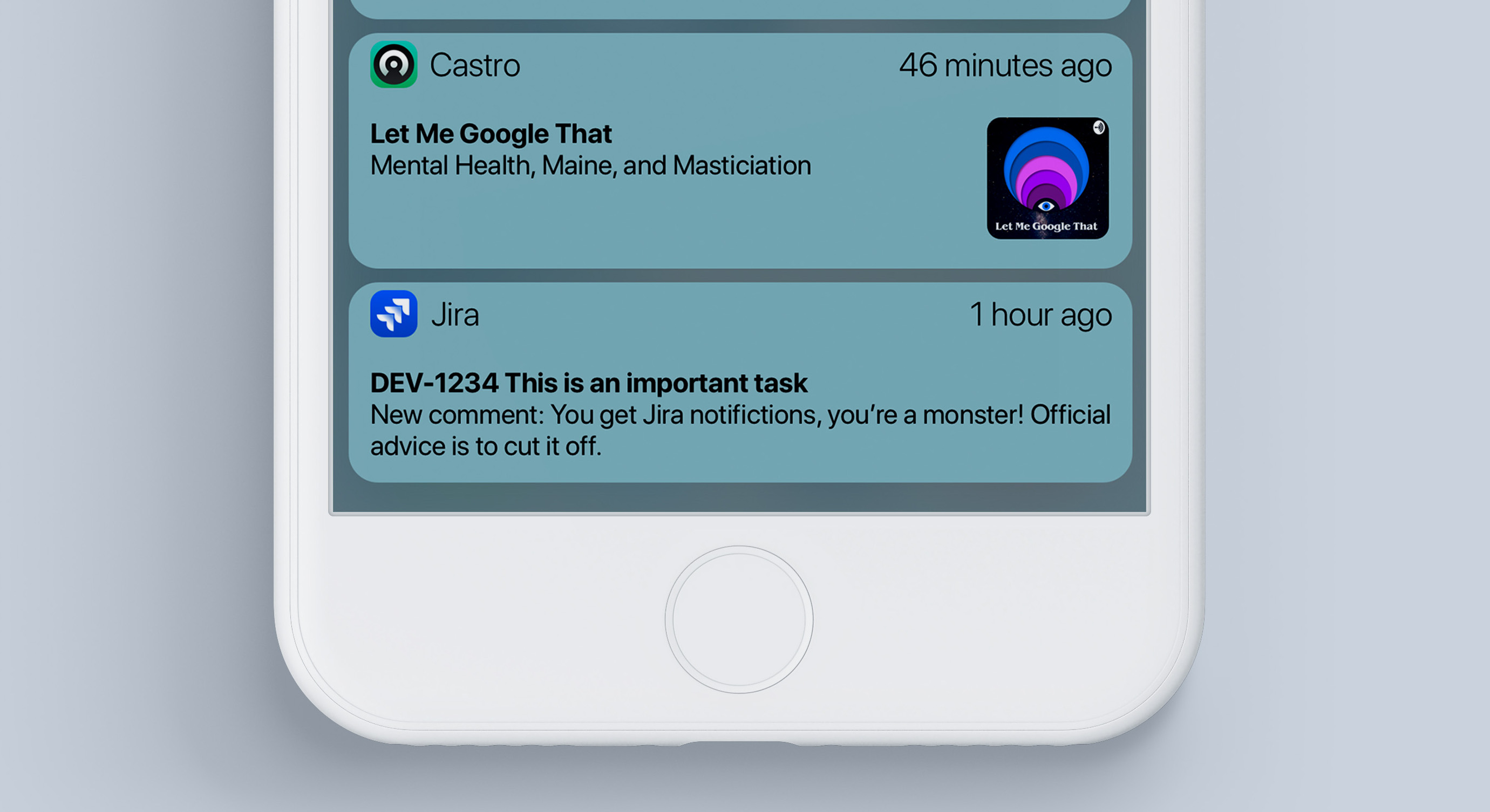
And these are just normal old iOS-style notifications. These apps haven’t given me much to work with so they get treated like they always have been treated.
One thing you my have noticed is the times are all out of order on this screen: that’s by design. Because the most recent notification isn’t always the most important, iOS should rank your apps based on how often you act on their notifications and maybe even let you rank them yourself so that the most important stuff always floats to the top of the notification pile.
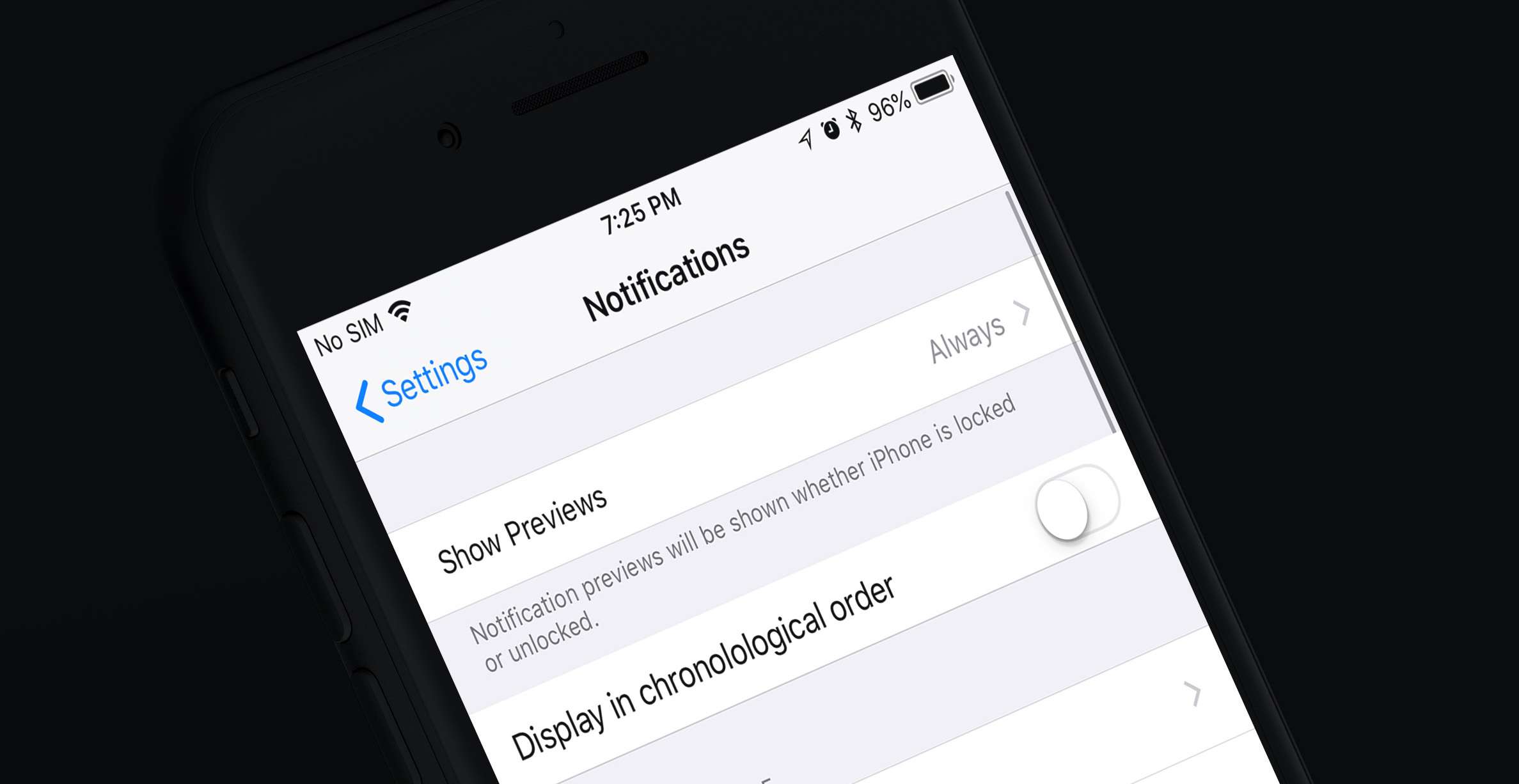
And because some people seem to like the current style, maybe include a setting where people can opt into the old method. I don’t like it myself, but it’s incredibly hard to make a single notification system that works for everyone, so a great default with some serious options is a good thing.
Again, this was put together in an hour and is honestly closer to the Android implementation than we’d ever get in real life, but I think something like this would be great to see from Apple this year. We’re less than 2 weeks away so we’l know soon enough if they have made any meaningful changes to notifications.
- You could throw the date up there too if you wanted. ↩
