One More Tale of Discoverability Oddness
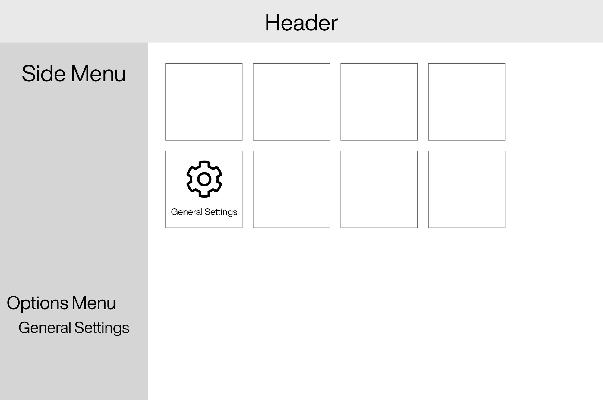
Here's an interesting anecdote about discoverability. Below is a very rough mock up of a web app I manage at work:

The only things you need to know are the two places you can get to "General Settings."
- A menu item which is hidden on page load and is only made visible by clicking on the "Options" item, watching some more options animate in, and then clicking on General Settings. This has been this way for the better part of a decade.
- Click the big old General Settings button on the home page which is immediately visible and takes one click to get to the same place. This was added about 2 years ago.
Currently, the vast majority of users who were using us 2+ years ago and had gotten used to the old way of getting to this page still use the two click method that's objectively slower and less discoverable.
The vast majority of newer users who have always had the home screen icon available use that because it's faster and more obvious on screen.
I was concerned about this behavior when we originally rolled this out because we spent all this time making the things people did all the time one click away, but so many users continued to do it the older, slower way. Some of them even reported not noticing they could do it from the home screen because they just know how the menu works. Even after being told why the new way was easier, most didn't change their behavior.
Again, this is not that the new feature was worse, it was better, and our data on people who had the choice from day one clearly shows they prefer it, but people were not willing to change to save themselves a click and a second or two.
So if and when you hear someone tell you that something is inherently more discoverable than something else, remember that there is a whole lot of personal experience and bias behind that ascertain. We can do our best to be objective, but it's not really possible, and you certainly can't use a sample size of one to assert "I didn't know this existed, therefore it's not discoverable."


