One UI 2.0: The BirchTree Micro-Review

Alright, let’s do this thing! I’m calling this a micro-review because there actually isn’t a ton to say about this update to Samsung’s Android skin. But hey, it’s rolling out to Galaxy S10 devices now, with S9 phones coming soon, so here are some of the highlights from my 2 months in the beta.
Overall Feelings
The biggest change here is the upgrade to Android 10 under the hood. Check out my Android 10 review to see what I liked and didn’t like about that release, but the TLDR version is:
- The new navigation gestures are a complete rip off of the iPhone ones, and they work 90% as well.
- Dark mode is a nice addition
- Tons of updates to privacy mean the system will ask you allow apps to do more than before. This is a good update, and again makes it basically like iOS.
- Focus mode is cool and is similar to iOS’s “downtime” but more easy to toggle on demand.
Screen Recording
This is a huge update for me since I use this feature pretty regularly on my iPhone. You can trigger this from the notification shade toggles and after a 3 second countdown, you get a video of the happenings on your screen. As this is Samsung, there are more options than iOS’s version of this:
- 1080p vs 720p recording quality (why you’d choose 720p is beyond me)
- No audio, just the media audio from the phone, or media and microphone audio.
- When recording, you can have an insert of video from the front-facing camera so you can show your face while doing the things you’re recording.
- When recording, you can draw on the screen to highlight specific things happening.
Ultimately, this works well, and my only complaint is that it seems the video plays back at 30fps, not 60fps like it does on the iPhone and iPad.
Dark Mode

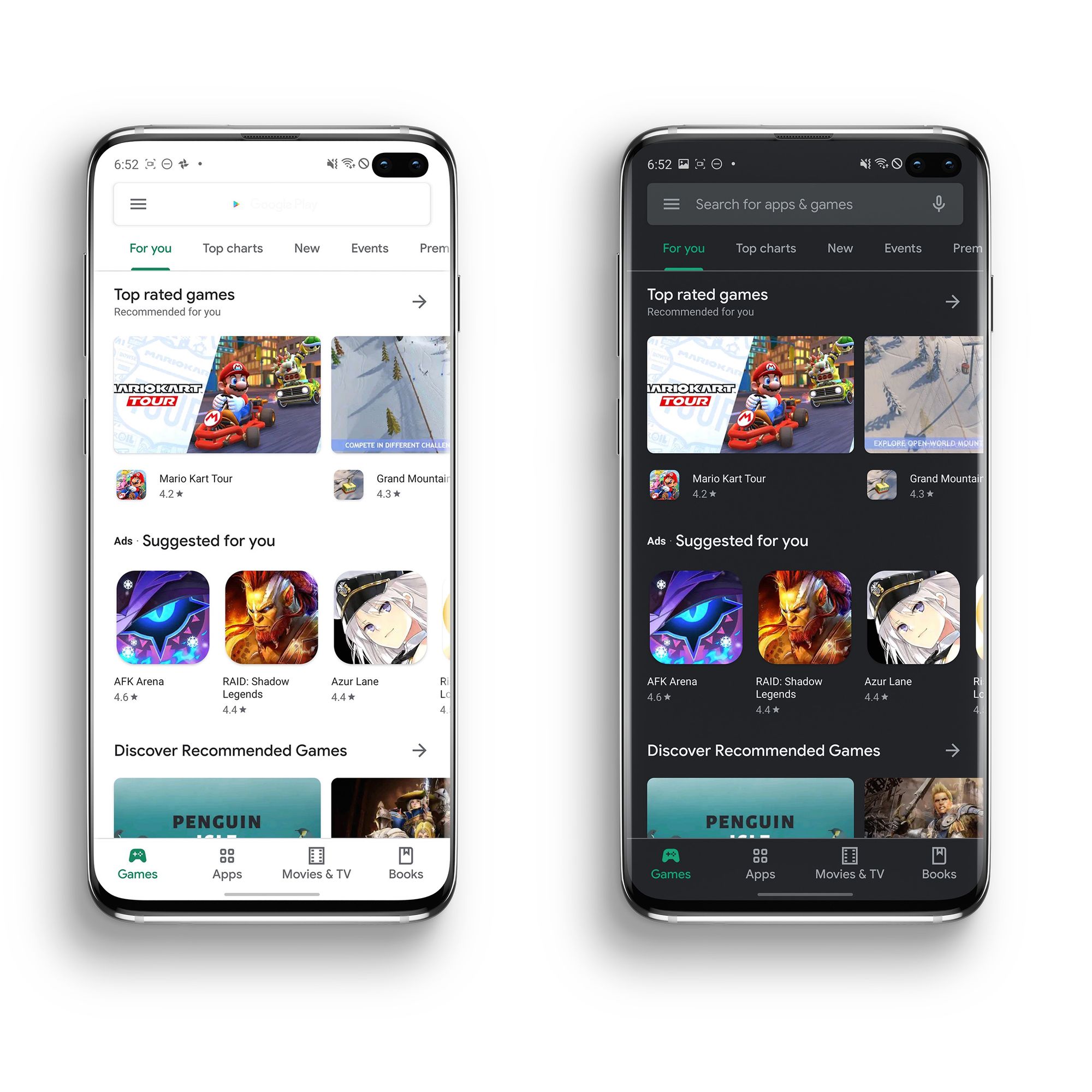
One UI previously had a dark mode, but it was Samsung’s own custom mode that only worked with Samsung-made apps. This lead to an inconsistent dark mode that largely made it a disappointment to turn on for me. One UI 2.0 adopts Android’s native dark mode, which is to be expected since Google now does the hard work for them, and all Google and third party apps going forward will implement this dark mode if they support it at all.
And unlike stock Android 10, you can schedule dark mode to turn on and off on your own schedule. I do this on iOS, so it’s nice to be able to enable it on an Android phone running the latest OS. I have to imagine Google will add this natively to Android 11 later this year.
Camera Changes
Outside of some minor UI tweaks to the app overall, my favorite change is the ability to customize what camera modes are displayed front and center when you launch the app. Previously, you can make certain modes available or hidden, but now you can drag and drop modes behind a “more” option, which makes it easier to hide modes you rarely use, but access them easier on those rare cases you need them.
Oh, and Samsung added slow motion video to the selfie camera. So if you were “upset” with Apple for adding this “stupid” mode to the new iPhones, now you get to be mad about the whole S10 and Note 10 line having it now.
Finally, sort of related, Samsung has added an option to have the native Gallery app sync with OneDrive, giving you a non-Google option for syncing your photo library online. Yes, you could have done this all along with the OneDrive app for Android, but I found that to be less than a seamless experience, and building it into the stock app means it should get more adoption.
Conclusion
Amazingly, we’re at the end of this micro-review, in large part due to the general lack of changes this year. Again, this update takes the foundation of One UI from Android Pie to Android 10, so you get a lot of changes there, but if you’re looking for changes only Samsung users will get, the list is pretty short.
There’s some changes to the layout and arrangement of settings pages, and the power share feature now lets you disable the feature at whatever battery percentage you want (used to be just 20%), but I’m hard pressed to think of anything else.
My overall impression of this update is that I didn’t feel nearly as much of a change as I was expecting. If you have never used Android 10, then you’ll have a good time experiencing some of those updates, but the stuff Samsung added on top of that is very minor. Basically, if you liked One UI last year, you’ll still like it this year. If you didn’t like it, then this didn’t do much to change your mind.


