The Fundamental, Iconic iPhone Design
Why great design is timeless – On my Om
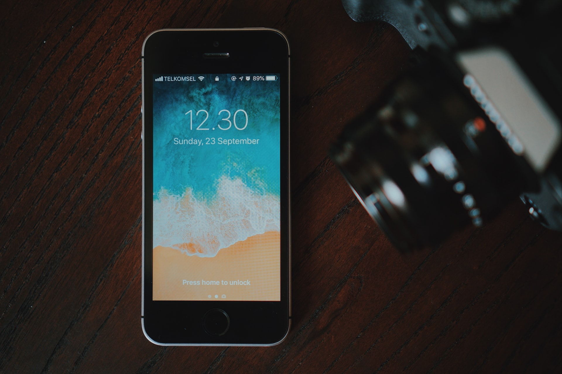
It takes a lot for something to be instantly identifiable because of its design language. And it is particularly hard in the phone business. While Porsche has had the advantage of being in business for over seven decades, the iPhone has been around for just over 13 years, and even then, it has been imitated and replicated. But it is still very identifiable.
And:
I would say that the iPhone 4 was Apple’s equivalent of the Porsche 911. And iPhone 12 is a return to those roots.
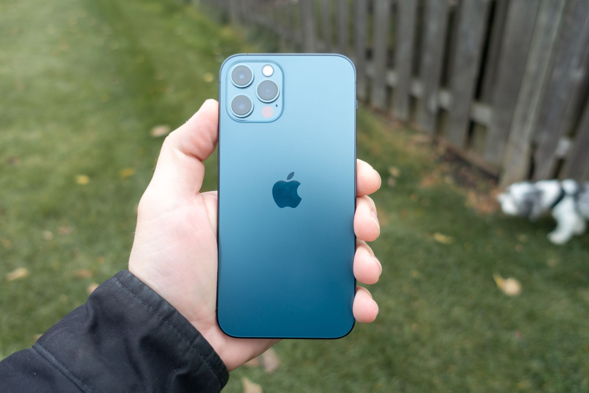
The iPhone 12 certainly harks back to the iPhone 4 and 5 generations of phones, and while most of us would say that is a “quintessentially Apple” design, it strikes me that most of their phones do not use this design. The original, 3G, 3GS, 5c, 6, 6s, 7, 8, X, XS, 11, and SE (2020) all use the more rounded design of the first iPhone. If we’re keeping count, it’s 11 generations rounded, 4 generations squared off (I’m not counting the SE models, but they split the difference anyway).
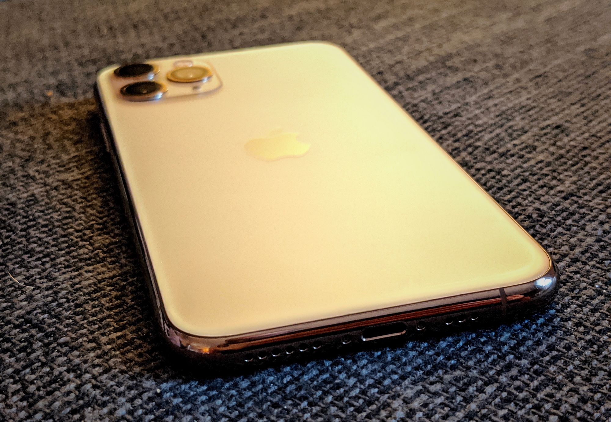
But despite these two competing design styles, the iPhone still manages to always look like, well, an iPhone.
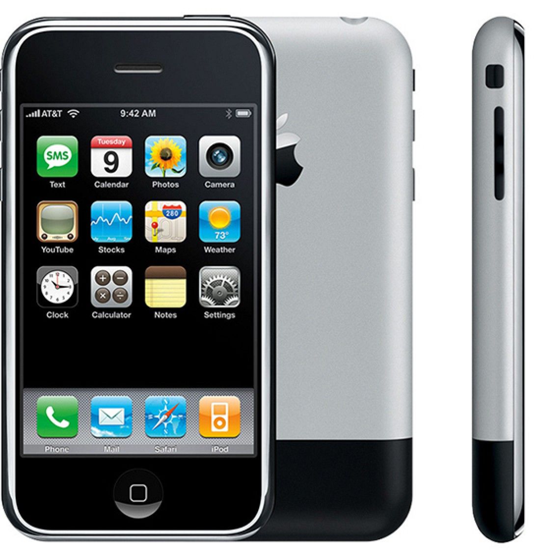
The original iPhone is iconic, bringing us into a new era of computers. While the Macintosh is iconic to people like you and me, everyone knows the iPhone. And for a decade that front panel looked the same: a big old screen, equal top and bottom bezels, and a circular home button at the bottom. It changed ever so slightly, but even when the phones got bigger, the shape remained recognizable. And while many phones aped the style, none of them would be mistaken for an iPhone (no, not even Samsungs’ early Galaxy phones, which tried their best to do just that).
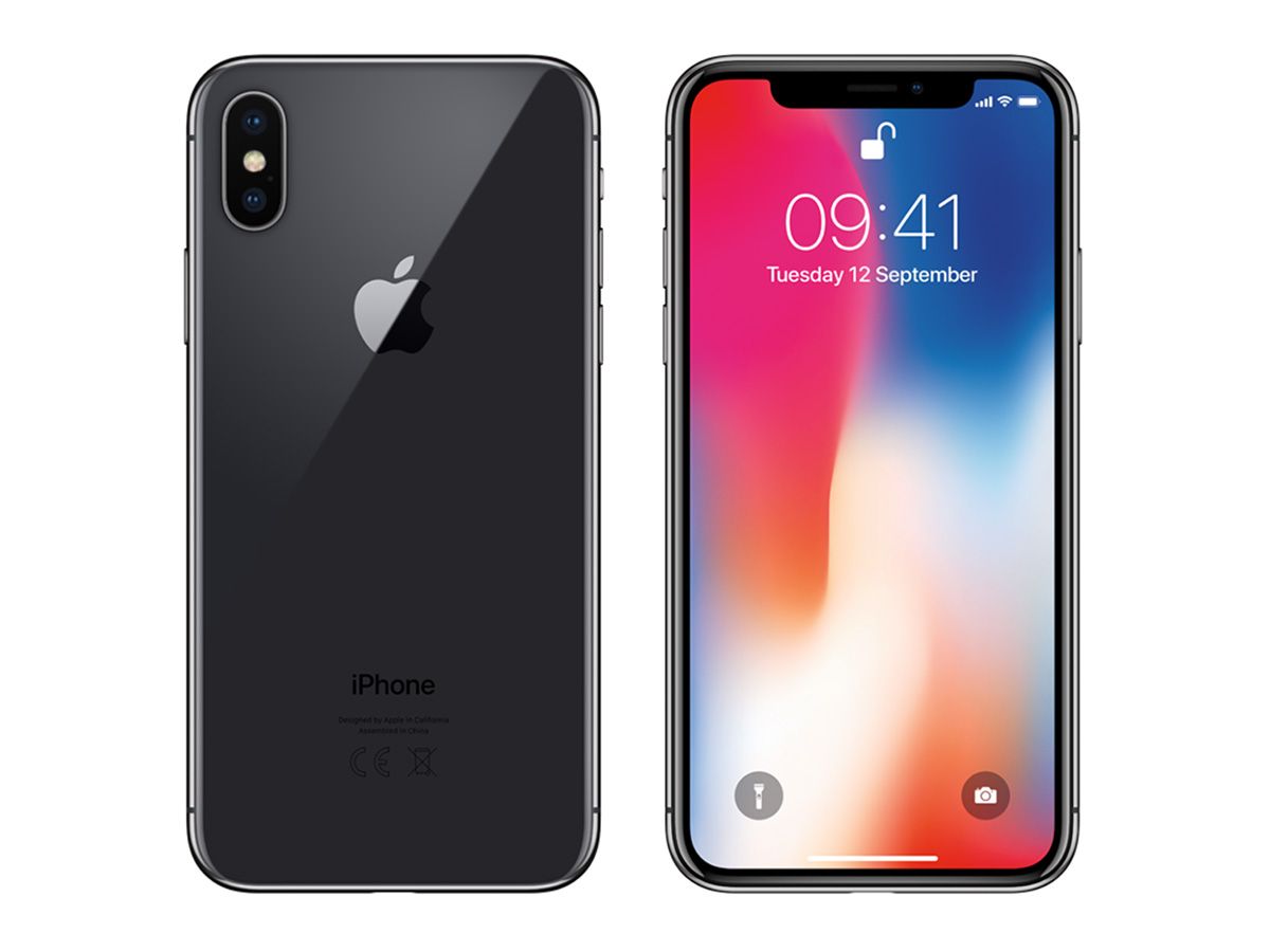
And then there was the iPhone X, which threw out that original design and created something new. Now the screen was bigger, the bezels were largely gone, and the home button was replaced by the notch. Say what you will about the notch, but you can see that notch and you immediately know what phone you’re looking at. I know a lot of people have been hoping for the last 3 iPhones that Apple would “reduce the size of the notch,” but I don’t think that’s on their radar at all. Get rid of it entirely? Sure. Make it smaller? To lose their iconic look with the only discernible gain being satisfying the screen-to-body ratio obsession among a few tech pundits? Nah.
It’s a testament to the original iPhone, as well as Apple’s commitment to the long game that they have been able to modernize the iPhone without losing itself.