The Google Pixel 2 Case (mini review)
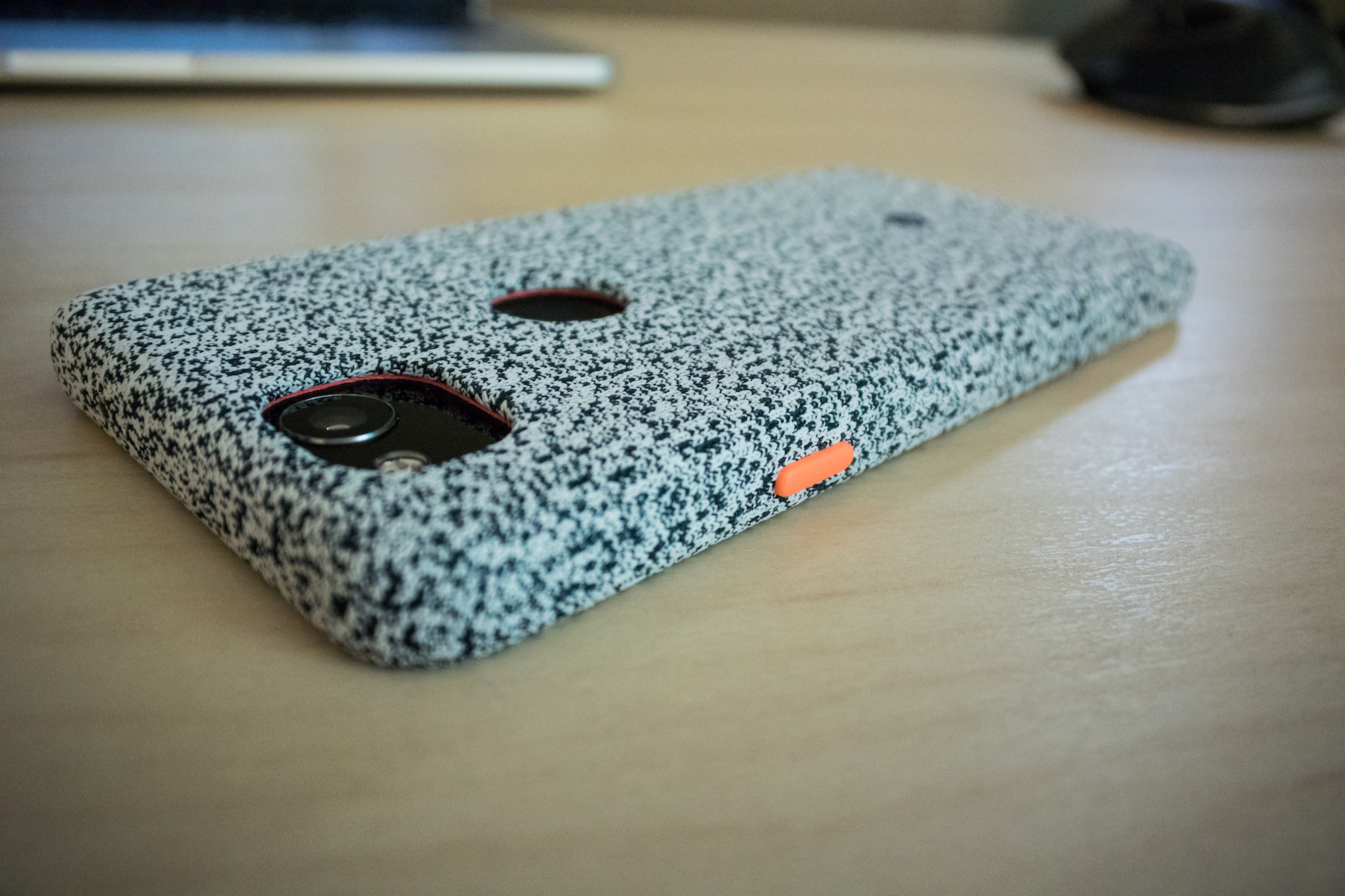
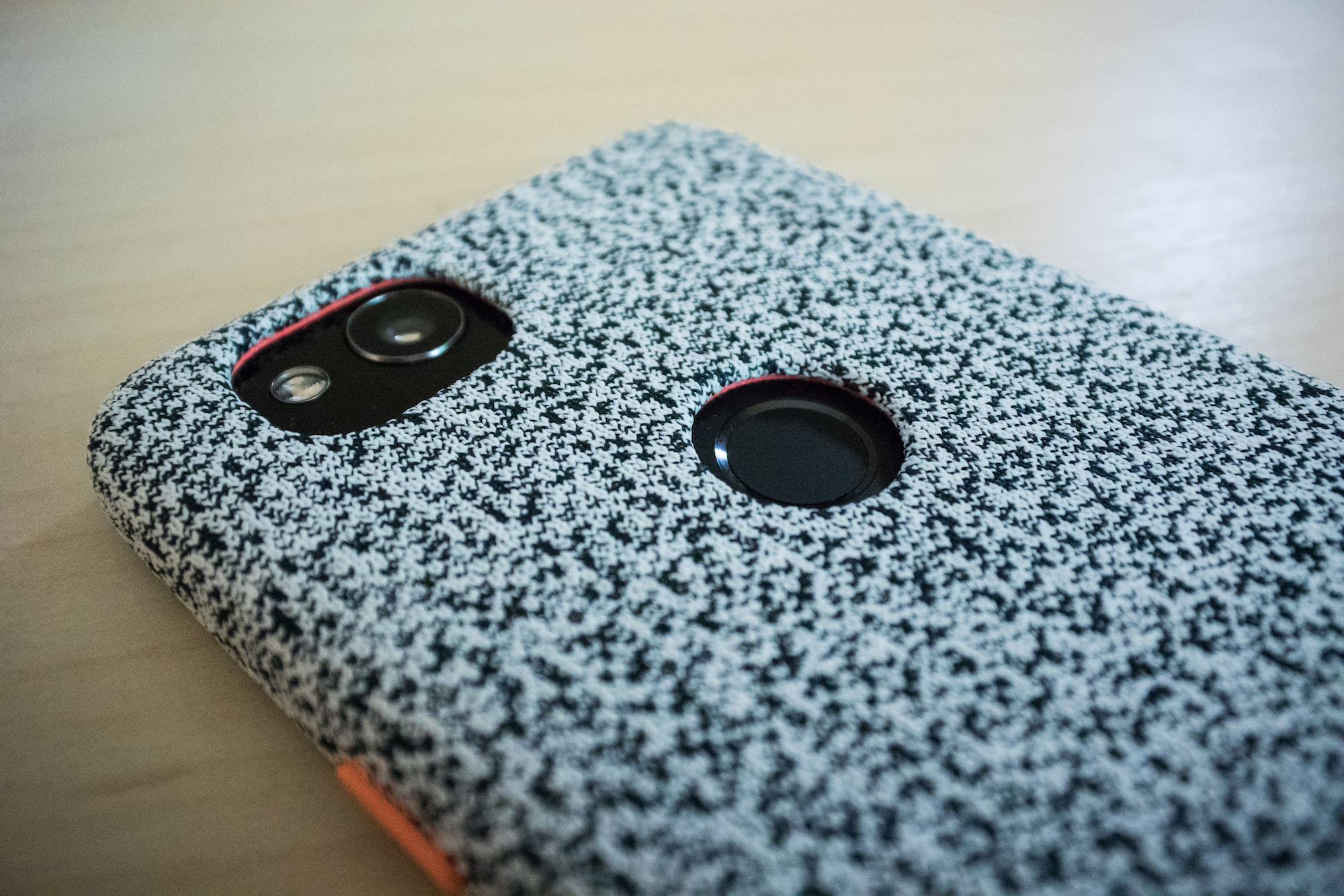
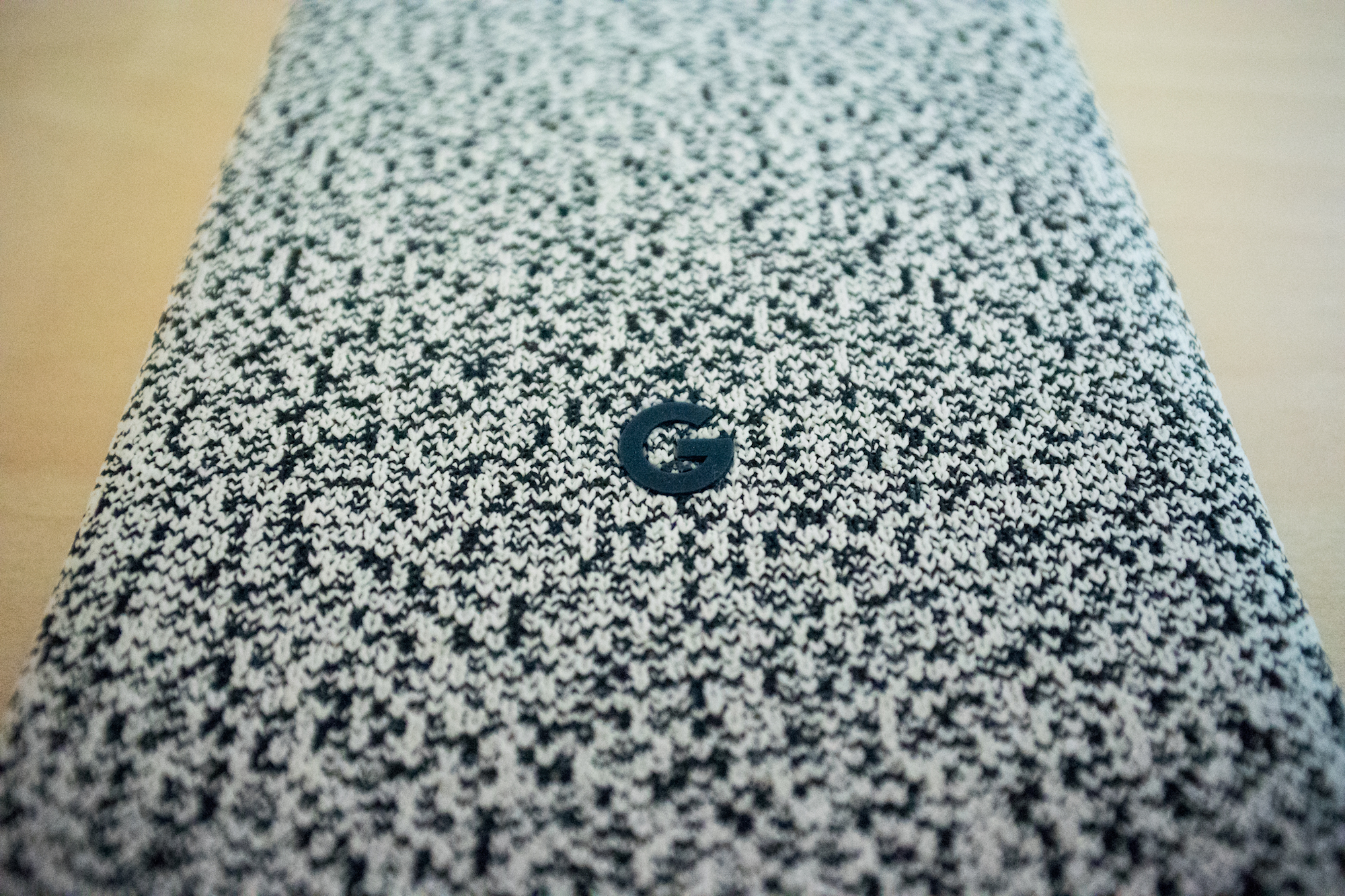
Google is really going all in this year with fabric designs, and their official Pixel 2 case runs with this aesthetic as well. There are 4 designs for this one, and I of course went with the weirdest one. I’ve been told it looks like a sock and I actually don’t disagree with that. It looks like a nice wool sock that I’d wear on Christmas morning 😄
The Good

I like how this case looks, despite it being a little sock-like, and I especially like the orange accent color on the power button. I think this case gives the phone a lot of character, and has already resulted in numerous people asking what the hell that case is. I’ve never had a case where people as to touch it, but this case makes people do that.
I also like the buttons on the side. The Pixel 2 has kind of mushy buttons, and somehow the buttons on this case make powering off the screen or adjusting the volume feel more tactile as the buttons just feel like they click a little more.
Finally, this sock-like fabric adds a good amount of grip to the phone, so I can more securely hold it in regular use.
The Bad
The case is a little bulky, and I do notice the difference in size of the phone with it on. It’s not the worse case in this regard, but it’s a little bulkier than the Apple leather cases for the iPhone, which are my favorite phone cases out there.

The added thickness also makes one of my least favorite hardware features of the Pixel 2 even worse; the fingerprint sensor. There is of course a cut out on the back of the case for the fingerprint reader, but it’s now sunk so low below the outside of the case that it’s an even bigger pain to reach. I don’t like the back fingerprint reader, and the case makes me like it even less.
Is it Worth It?

Yeah, I’d say this case is worth it. It’s $40 from Google so it’s not the cheapest case out there, but fit fits well, feels good, and gives your phone a distinct look, so I think it’s worth the cash.


