The iPad wasn’t supposed to have this until it did
I was researching for my last article when I stumbled upon this post from John Gruber in 2011 where he responds to a bad article on Time.com about Windows 8. What was interesting to me was this bit about how Excel on an iPad with the ability to open files from an external drive “doesn’t sound like the iPad.”
And so what happens to the version of Excel that’s running in the background when you unplug the mouse and keyboard and go back reading an e-book on the device as a tablet? Does it somehow stop consuming resources? The difference between iOS and Mac OS X is far more than touchscreen vs. mouse-and-keyboard.
And what happens if in addition to a mouse and keyboard, you plug in an external hard disk? And it’s on that volume where the Excel spreadsheet you’re working on resides? What then when you unplug to go back to tablet use? Will the volume still be named “D:” or “E:”, for that matter, just like the floppy disks from a 1981 PC? That doesn’t sound like the iPad.
As I often find myself as the “people always argue against the iPad getting anything more powerful, but whenever Apple does add more power they enjoy it” guy, it was nice to randomly come across an old post doing just that. In 2024, Excel for the iPad is a powerful app that works with touch, with a mouse and keyboard, and with a mix of both. And it of course can also open files from an external drive plugged into your iPad. It embraces the numerous interaction interfaces iPadOS supports, but it is also closer to matching the Windows version of the app than ever before.
The bad post Gruber is linking to was actually a response to this post from Gruber that also talks about Excel and apps that are unique to iPads, where Gruber says:
Microsoft’s demo video shows Excel — the full version of Excel for Windows — running alongside new touch-based apps. They can make buttons more “touch friendly” all they want, but they’ll never make Excel for Windows feel right on a touchscreen UI. Consider the differences between the iWork apps for the Mac and iPad. The iPad versions aren’t “touch friendly” versions of the Mac apps — they’re entirely new beasts designed and programmed from the ground up for the touchscreen and for the different rules and tradeoffs of the iOS interface (no explicit saving, no file system, ready to quit at a moment’s notice, no processing in the background, etc.).
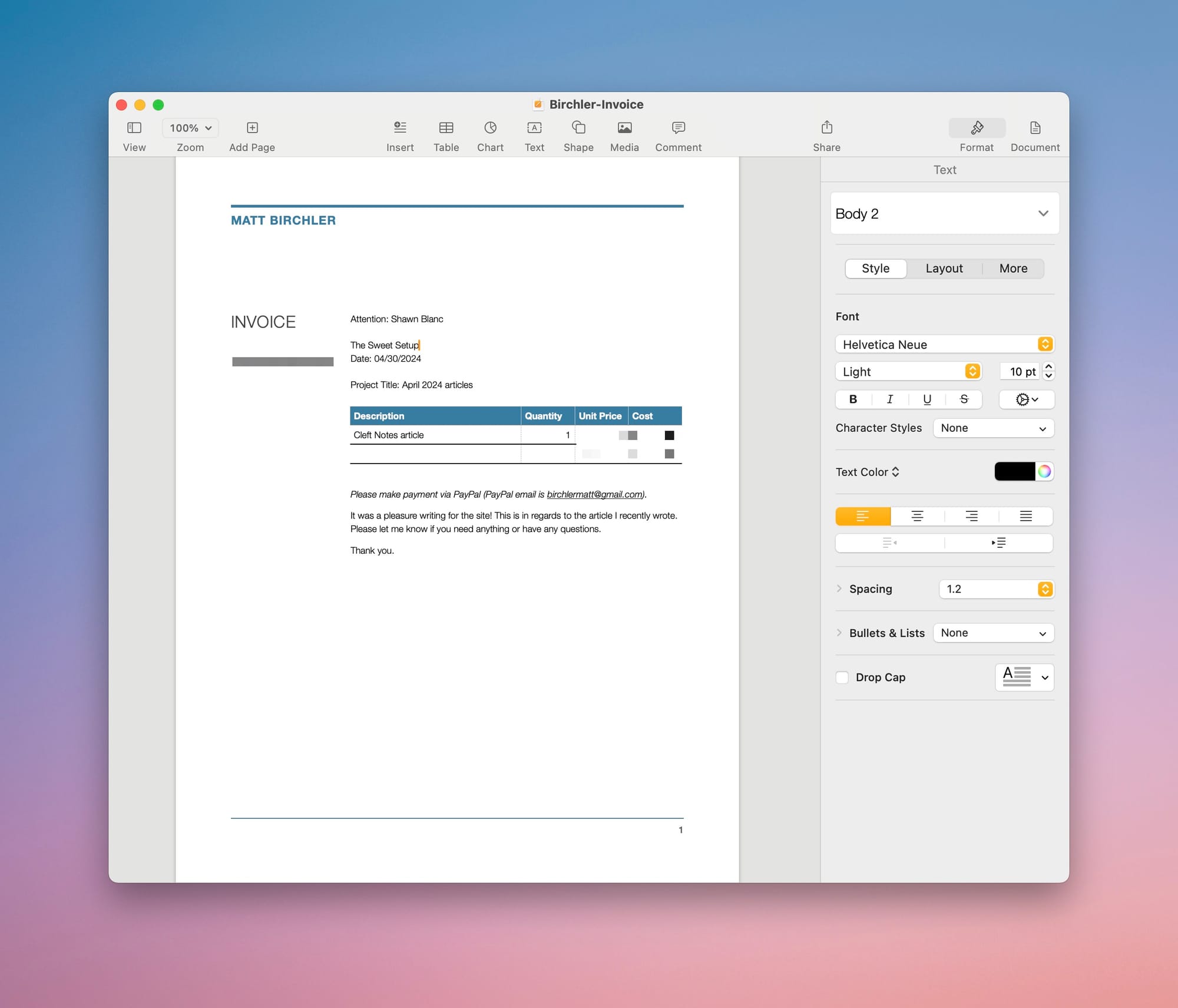
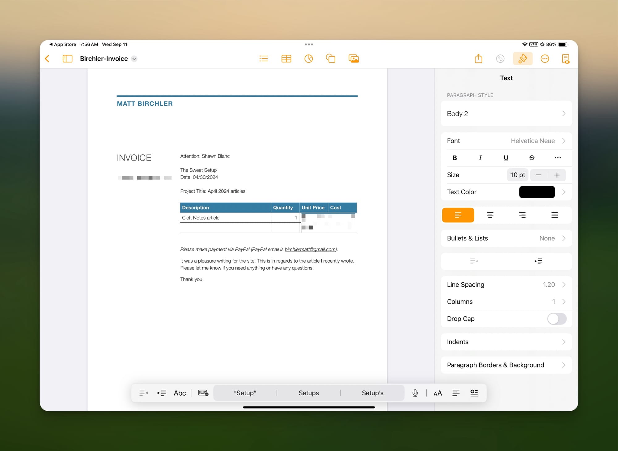
It’s worth noting that just 2 years after this post, Apple would proceed to quite closely unify their iWork suite of apps to have uniform experiences across the Mac and iPad versions. If you look at the same app on a Mac and an iPad today, you’ll see the iPad version is simply a slightly more touch-friendly version of the Mac app’s UI. Here’s the Mac version of Pages today:

And here’s the iPad version:

“The iPad versions aren’t “touch friendly” versions of the Mac apps” may have been true in 2011, but that’s not true today, and I don’t think anyone would want to go back to those less capable iPad apps. With the benefit of hindsight, it’s very clear that apps of the time were limited because the OS was limited and developers weren’t able to port all of their features there yet. Some apps lean more into the iPad than others, Final Cut Pro being a good example, but even these apps I would argue tend to evolve over time to be more similar to their desktop predecessors.
Looking at Apple’s developer tools in the years since 2011, their introduction of Catalyst was an explicit attempt to make it easier for developers to bring their iPad apps over to the Mac with minimal changes, and SwiftUI went all in on the idea of writing one app that presents its UI to fit the device it’s being run on, whether that’s a phone, a tablet, or a desktop PC. Not to mention that Apple silicon Macs are able to run straight up iPad apps with zero modifications from developers. And of course the last couple years of iPadOS updates have included Apple bragging about “desktop-class apps” coming to the iPad. My point is that in 2024, the iPad and Mac still have their own identities, but the software they run is more alike than ever before, and the gap keeps closing.
Of course, this isn’t to criticize anyone for not being able to see the future, it’s just to point out that these lines we draw in the sand about what each operating system is supposed to do always change with time. I’m sure you’re tired of hearing this from me, but the iPad wasn’t supposed to have a file manager until it got one, the iPad wasn’t supposed to be used with a mouse and keyboard until it did, the iPad wasn’t supposed to have overlapping windows until it did.
