The iPhone Mini is a Fun Phone That's Not for Me

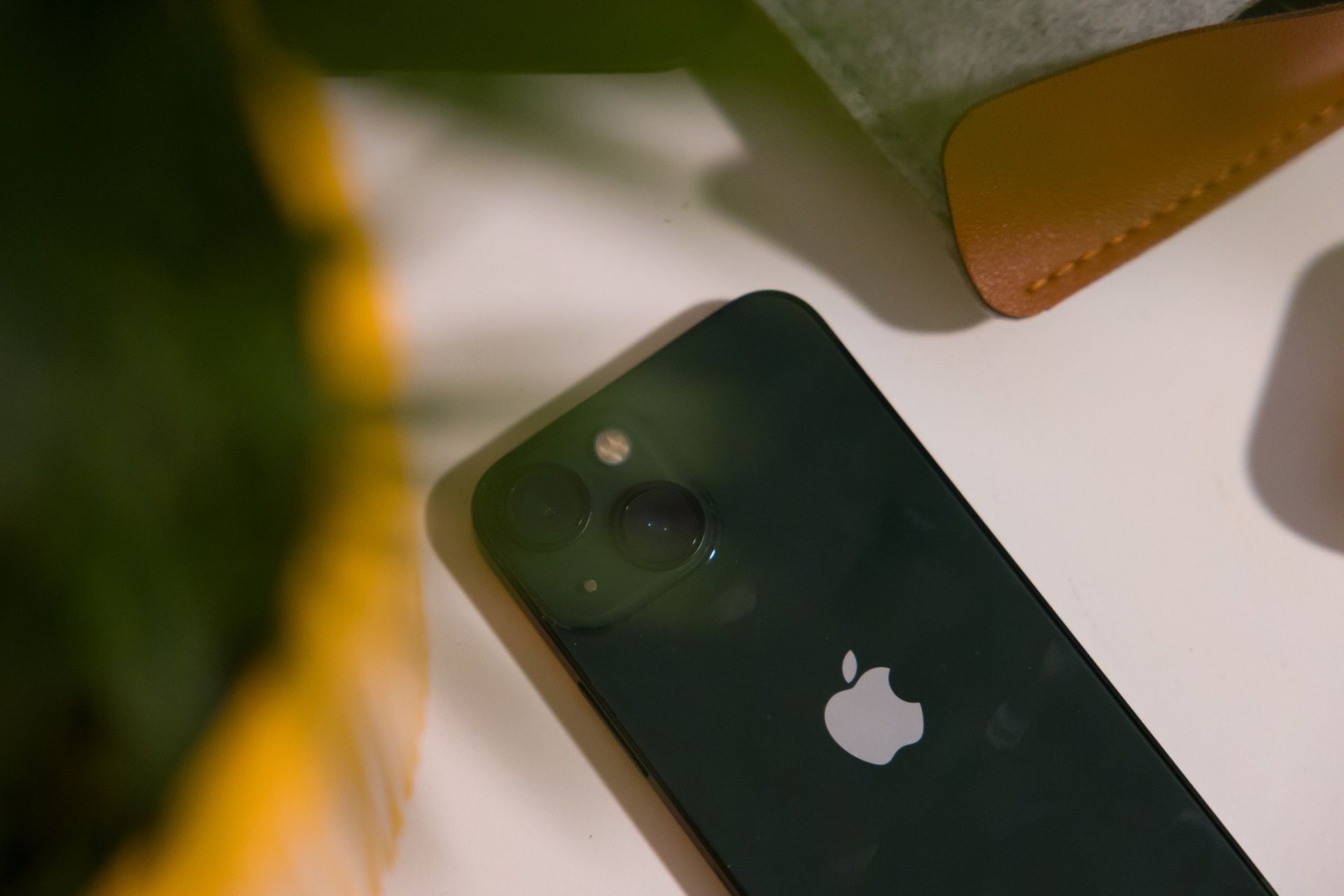
I've been using the iPhone 13 mini and it's the first time I've ever used a mini in my life. In fact, I'm more of a Max phone guy, but people love the mini lineup and I had to know what was up. So I've set my iPhone 14 Pro Max side for a week and have gone all in on the mini lifestyle. Here's how it went.
I also went down to the Apple Watch Series 7 (from the Ultra). My thoughts on that will be at the bottom, but they're far less interesting.
Size
The size difference from what I'm used to is immense. The mini is positively microscopic compared to the Max. Truly, there have been many occasions where I think, "oh no, my phone fell out of my pocket," only to reach down and find it's there, I just can't notice it.
This is a huge win when running, as I don't have a giant brick banging against my thigh when I'm out there, doing its best to pull my shorts down the whole time.
The reduced size and weight also help me appreciate the flat edge design introduced in the iPhone 12 lineup. I disliked it straight from the start with the 12 Pro, and I hated it when I went to the Max for the 13 and 14 generations. It looks great, but digs into my hand to the point it feels like this phone was made to be as uncomfortable as possible. The lower weight, smaller size, and slightly rounded corners on the 13 mini solve all my issues and it feels great in the hand, even without a case.
But all this good comes with some downsides.
Software Quirks
Apps generally work fine for me, but everything is shrunk down to the point it’s harder to read or interact with accurately. I've got perfect vision and my thumbs are pretty nimble, but it’s absolutely more effort to do everything on this phone for me. I have more typos since the touch targets are smaller, and it’s generally uncomfortable to hold a phone so small to do any meaningful typing.
Now you can blow up the UI or the text size, but that just causes pain. As Lee Peterson has point out on several occasions, boosting these causes UI bugs and simply reduces the amount of space on screen to show content. I haven’t been able to find a happy middle ground, so ultimately this just means I do less meaningful tasks on my phone and wait to use my iPad or Mac. That's not the end of the world, but my iPhone 14 Pro Max feels like a little pocket computer and my 13 mini feels more like a pocket communicator. Still useful, but a little less than.
And that doesn't even get into the ergonomic issues I've had using this damn thing. Using it with one hand and reaching all corners of the screen is great, but doing anything 2 handed feels terrible and my hands are in pain when I try to type even a moderately long series of text messages. Truly, I hate it.
The best way I can put using a mini iPhone is that it feels like going to the Grand Canyon and looking at it through a straw. Yes, you can eventually see it all, but it's not as pleasant and just isn't as good as looking at it with your full field of vision. All my content is small, I'm squinting to see things (especially in Safari), and if I blow up the UI or text size, it makes it so even less fits on screen and causes some layout oddities.
Battery Life
There's no polite way to say it, the battery life flat out sucks compared to what I'm used to. One of the benefits of using a phone with great battery life is that you don't have to worry about it most of the time, but the mini's margins are so low that I'm constantly tempering my usage to make sure I survive until I'm close to a charger again.
Yes, I could get a battery pack, but I'd personally rather have a phone that's bigger and can do what I need without an accessory.
For what it's worth, Apple's comparison page suggests the 13 mini has about half the battery life of the 14 Pro Max.
Screen
This is a big one, as the mini loses out on a few things from the 14 Pro line:
- 60Hz refresh rate
- No always-on display
- No dynamic island
- Lower max brightness
The big miss for me here is the lack of ProMotion (aka 120Hz variable refresh) in the 13 mini. You do get used to the lower refresh rate relatively quickly, but it's never as good, and color me spoiled, but I really don't prefer it. The good news is that on a screen this small, the UI animations cover a smaller physical distance, so the effect is minimized.
I also have been waiting years for an always-on display in an iPhone, and losing it just makes my phone feel broken. I know not everyone agrees with me, but being able to lay my phone on my desk as I work, glance over at it, and see the time and any important notifications instantly is a quality of life feature I liked years ago on my Android phones, and I continue to love with my iPhone.
The dynamic island is a bit of a toss up, honestly. Sure, I miss live activities up there, but I don't miss them a ton. One of the reasons I've long preferred hole punches to the iPhone's notch was that they took up less space. Apple's implementation, which required Face ID tech as well as a normal camera, just doesn't make much more space, so it's really an aesthetic thing, so I could see why different people would prefer one over the other or vice versa. I personally still prefer the island, but whatever 🤷♂️
Oh, and the lower max brightness (800 nits on the mini vs up to 2,000 nits on the 14 Pro Max is something I didn't even notice until I looked at the spec pages. Your results may vary, but doesn't move the needle for me.
Cameras
There are 3 major downgrades to the camera compared to the 14 Pro Max, and there's exactly one for each lens.
The main (wide lens) loses the 48MP sensor. That means I lose the pixel binning, 2x crop zoom, and 48MP RAW photos.
The ultrawide lens loses autofocus, and therefore loses macro mode.
There's straight up no telephoto lens.
All in all, these really don't bother me much. I'm in a unique situation where I have a fancy camera (Canon R6) that I use for the important events in my life, so I just need something good on my phone. The 13 mini has a very good camera setup, and stills I take with it look stunning most of the time.
The thing I miss the most are macro photos, which it turns out I use quite often to get fun photos, but also boring-ass photos of things like serial numbers.
Ultimately, despite being the thing I used to like most about getting a new iPhone (better cameras) has turned into something that's plenty good enough to not bother me when downgrading one generation.
Apple Watch Ultra to Series 7
I think the Series 7 looks a lot better, feels a lot better, and has a 10x better crown, but the battery life is brutal once you are used to the Ultra. I miss the action button too, but truthfully, I’ll take the better looks and feel over the added utility of the action button. Shame about the battery life, though.
Final Thoughts
The phone is fine for what it is, but it's just not the product for me. I do wish that Apple had room in their lineup for 3 iPhone sizes (plus the SE), but it just doesn't seem to be something they want to do.
If you're someone who loves the mini, then I can now more confidently say that I understand what you dig about it, even if I'm personally looking for something else in a phone.
