The three dots that "prove" macOS could never work on a touch screen

Turns out I'm not done with this topic…
A couple days ago I saw this post pop up on Threads and it’s the “checkmate” move people like to bring up when dismissing the idea that macOS could ever work on a touch screen device. “How would you press these tiny buttons?!”
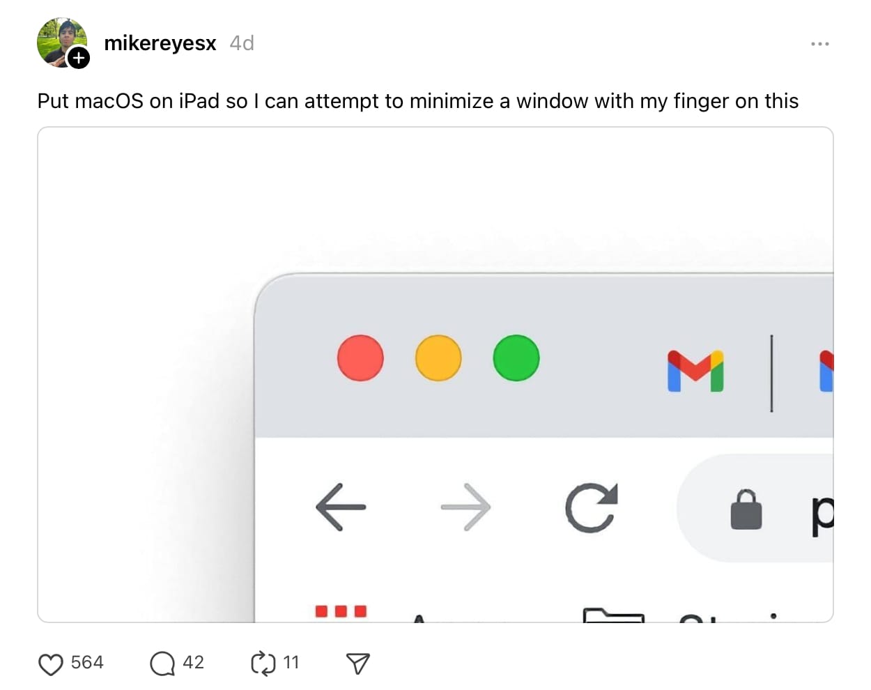
Now, macOS’s UI isn’t as small as you think, SwiftUI is fundamentally built around the idea of letting the OS modify UIs to work in different contexts, and you can literally run touch-first iPad apps on Apple silicon Macs, so a lot of UI elements are already good for touch…but these 3 dots still aren’t and that’s why they’re always the example used these days.
Here’s the thing though: Apple has already solved this problem on iPadOS; with Stage Manager enabled, these three dots are at the top of every window.
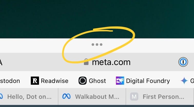
Tap this icon and you get a menu with some options that should be familiar to macOS users:
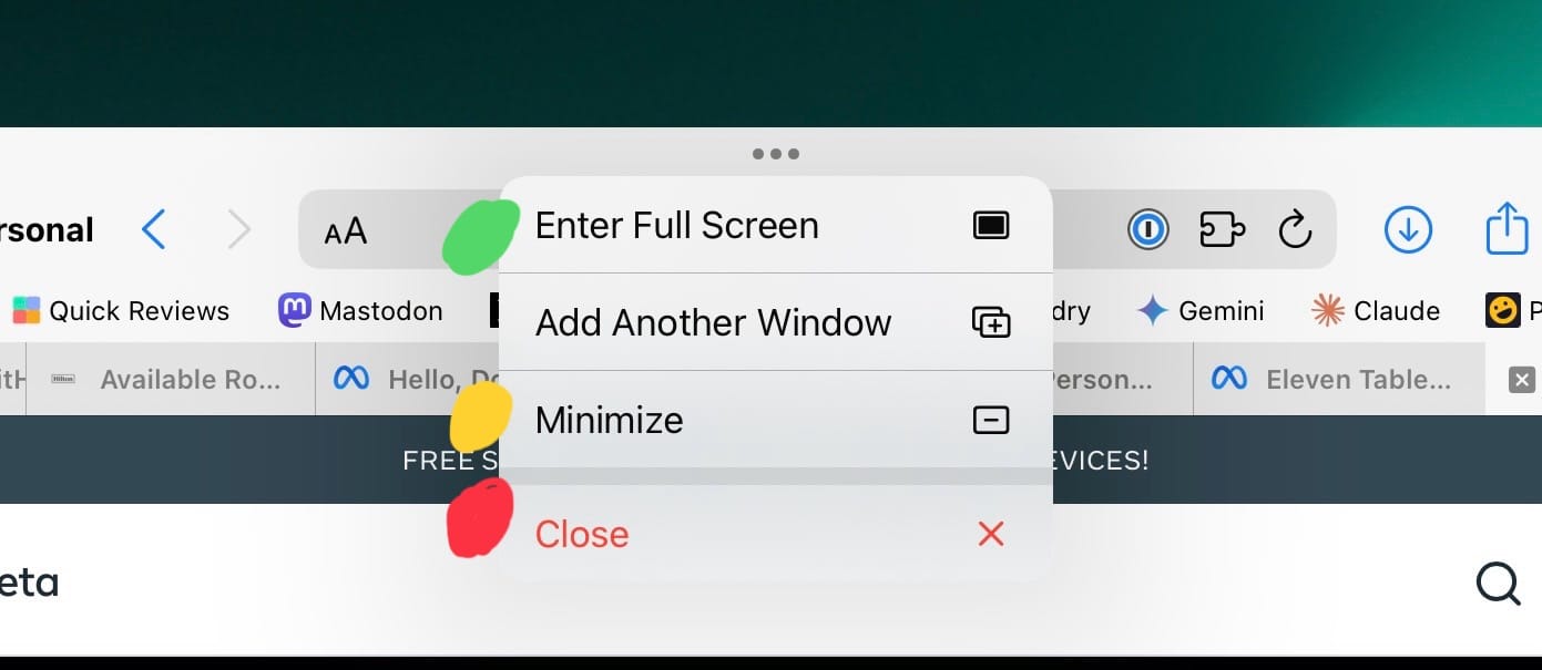
For clarity, I’ve added colored dots next to each option that aligns with the macOS options.
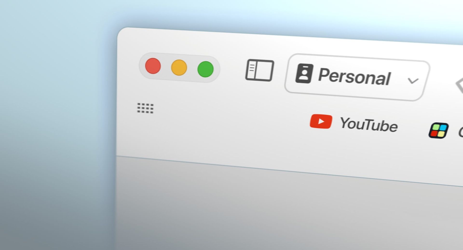
Quick mock up of how this could work with touch
So if Apple were to make macOS usable with touch, maybe they’d do something similar with the existing red/yellow/green buttons at the top left of every window. They’d still work how they do today when clicking them with a mouse, but if you tap it with your finger then it would display the iPadOS style menu. This would align their operating systems from a UX perspective and it would also mean that they don’t need to make the 3 unique touch targets bigger, which would avoid messing with the layout of some apps that rely on those red/yellow/green dots being a specific size.
Not for nothing, but this mocked up button would also be a larger touch target than the one on iPadOS, making it arguably more touch friendly than the same element on iPads. Just saying 😉
I’ve said it before and I’ll say it again, I think there is a general lack of imagination out there from the ardently anti-touch-on-Macs crowd out there. It feels to me like they’re pointing to what they think are “impossible” problems and immediately throw their hands in the air as if nothing can be done. I'm not saying this mock up is perfect, but it is an attempt to actually address the issue rather than throwing in the towel at the first sign of any challenge.


