The Windows 11 Trash Party
Thomas Bandt was setting up a new computer for his kid, and it gave him the opportunity to really look at what Windows has become over the years. Here's what was showing by default in the Start menu:
First, there was news about a mass shooting that had occurred only recently. In the middle of the search menu. The menu which was supposed to be one of the first touch points with that computer for the kid. Not okay.
I can attest to this being the case, and if you want an idea of what stories show up here, they're pulling from the MSN home page, so give that a browse for an idea of the "high quality" content bundled into the Start menu. I won't even take a screenshot of what it has now since I know whenever you click it you'll roll your eyes at whatever's there.
Now, you can turn this off, but don't worry, MSN comes for us all…
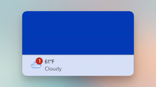
Windows can show the weather in the bottom left of the task bar, which is nice. It can show weather notifications too, like this one from a few days ago on my computer:

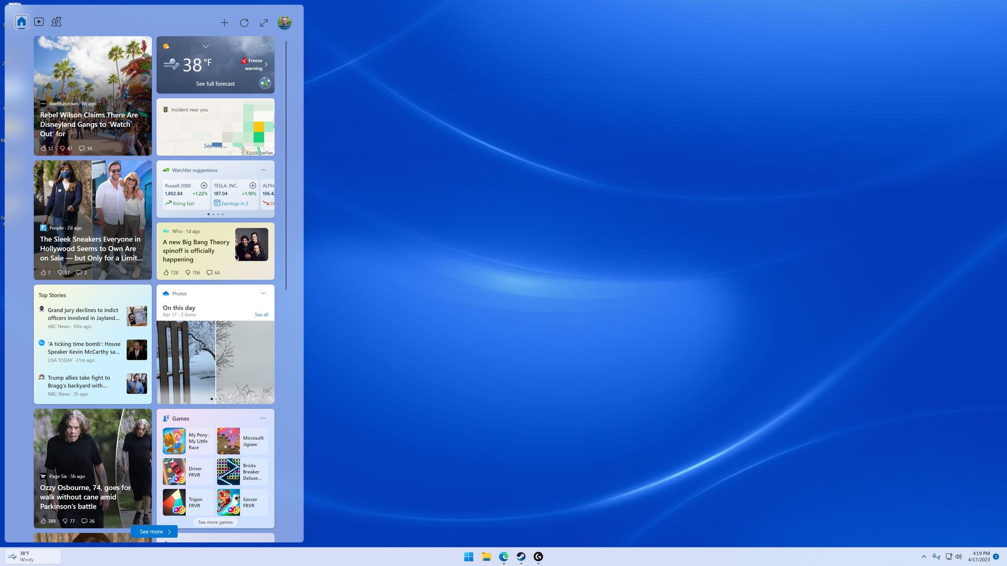
You might expect clicking that would bring up more weather data and info on the alert, and you would be sort of right…

The weather info you clicked on occupies 4% of the pixels (I actually counted), and the rest is devoted to garbage from the MSN home page. And don't worry, it does infinitely scroll, so you can browse this bullshit to your heart's content.
And no, there is no way to turn this news feed off. The best you can do is "manage interests" which kicks you out to msn.com to have you tell it what topics you prefer. If you can believe it, my preferences say I only care about sports!
Oh, and to be clear, this isn't some OEM addition, this is core Windows…you can't escape this with a Surface device: this is the Windows experience as Microsoft sees it.
I use Windows to play games, but it truly feels like a trash party most of the time. I highly recommend reading the rest of Thomas's post to hear about more trash in the OS (like social media apps and games that can be challenging to uninstall if your PC maker would rather you didn't). Sure, macOS ain't perfect, but Windows continues to blow me away with this sort of thing.
Obviously, you don't have to have the weather down in your task bar, you can just open the included Weather app (or I'm sure third party apps), but product decisions like this are indicative of many parts of the Windows experience, and that's a shame.
