Unread 2: RSS That Looks Nice, but I Wish Did More

Unread is one of those apps that just has an incredibly loyal following. It’s not the biggest player in the RSS space, but so many people I respect love it that it is always an app on my radar. Despite this love, Reeder has remained my go-to RSS app for iPhone, iPad, and Mac. I use Reeder for a few specific reasons:
- I subscribe to a lot of feeds and Reeder has a UI optimized for getting through lots of content quickly.
- The app simply looks wonderful and has a style that has naturally evolved from its pre-iOS 7 days without losing it’s personality.
So Unread 2 sparked my interest, but I didn’t think it would take over Reeder’s spot as my favorite way to catch up on the news of the day. Ultimately, I think that is still true, but I see a place for Unread 2 in my life.
RSS Service Support
Because this review becomes immediately useless to you if you can’t sync your feeds with it, here’s the list of services you can use with Unread:
- Feed Wrangler
- Feedbin
- Feedly
- Fever
- Inoreader
- Newsblur
There is no option to sync over iCloud, if that’s your jam.
What’s New
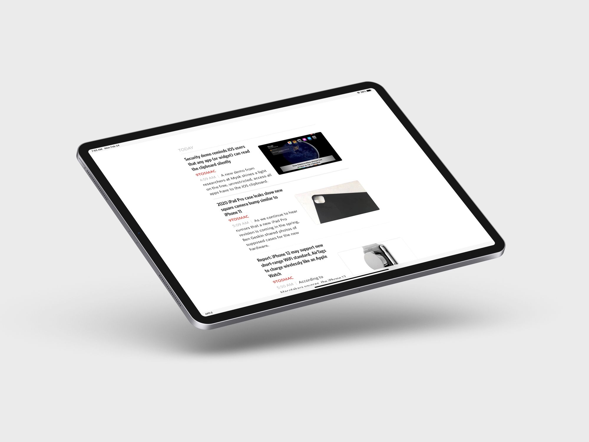
Fundamentally, Unread is the same app as it was before, and as someone who doesn’t use it that often, it was hard to notice the changes at first glance. If you enjoyed how the old app was laid out, then you’re not in for much of a surprise here, and you’re still going to enjoy it. This is an app that simply looks fantastic, and it does a great job of making you enjoy your time in it.
The headline feature for me is being able to manage your feeds from inside Unread. The previous version of the app required you to add feeds in your syncing service’s website, but now you can add them from within Unread and put them in whatever folder you have set up.
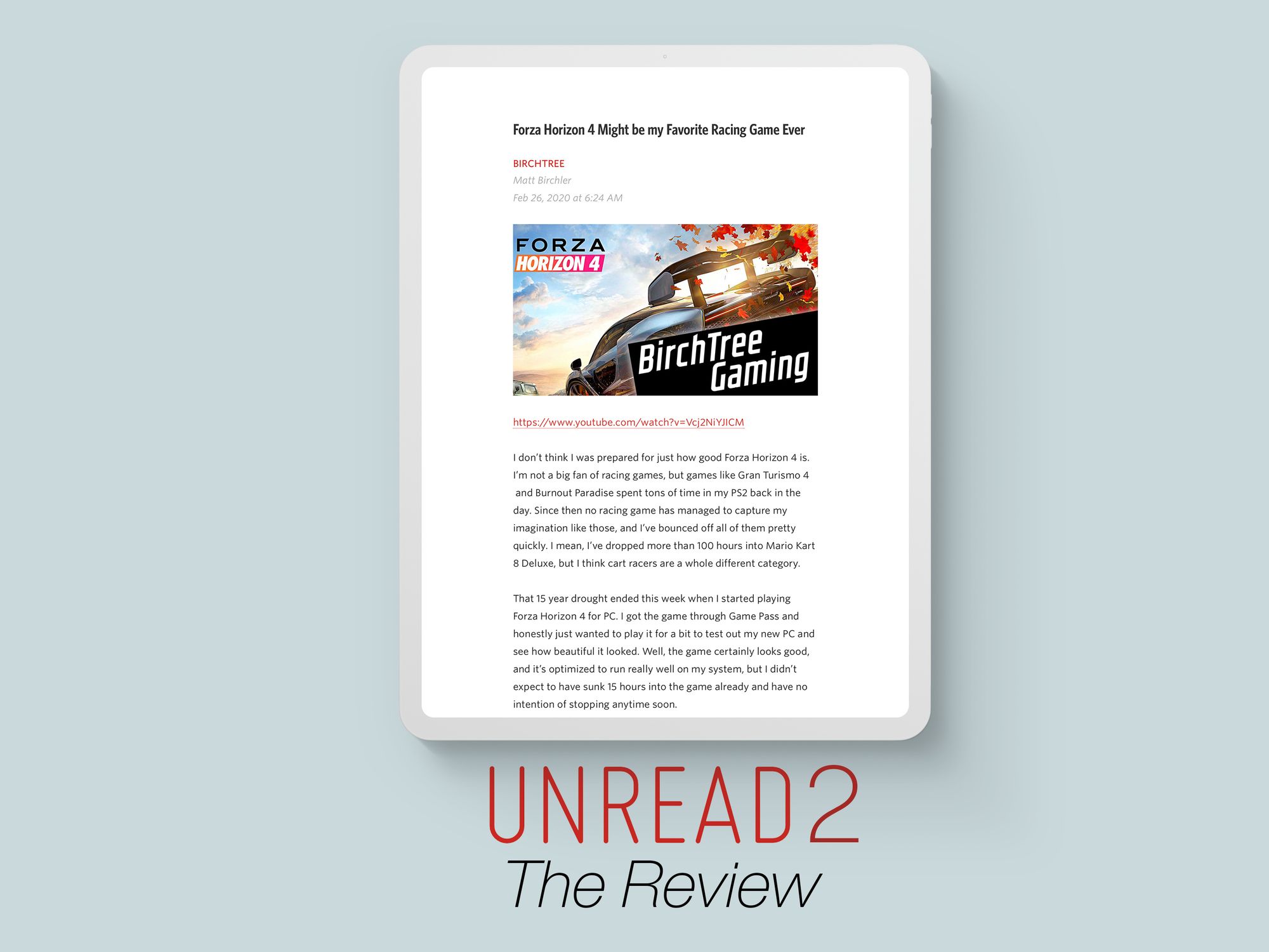
Another big feature is that Unread will attempt to display full text articles for feeds that truncate the content in their RSS feeds. For example, the 9to5Mac feed is truncated, but Unread shows you everything in the app, which is nice. There is some UI weirdness where the app will flash the full website on screen for a moment and then display the text nicely, which is a little distracting, but is also nice since it’s loading the source URL and giving the publication the page hit they want from the truncated feed, but the user gets the nice in-app reading experience.
And then there are a few other changes that are smaller, but mostly welcome. They have integrated to the big read later services, so you can save to Pocket, for example with one tap less than before. They’ve added a “double-tap” gesture you can use to save to read later, mark unread/read, or star an article (I have this mapped to saving to Pocket).
Form Over Function
There were numerous times in the beta period where I thought the app was unable to do something because I couldn't find a control for it. All of the user interaction items are hidden behind gestures with no indications of where you can do said gestures. For example, I like to sort my feeds from oldest to newest, and I went through the settings for list view in the app settings page but didn't see the option to change this. I was about to submit a feature request before seeing in the release notes that this could be done by swiping left on the article list view and toggling it there. Why this one view setting is broken out from the others, I don't know.

There has been a lot of talk lately about discoverability and intuitiveness on the iPad lately, and I think Unread leans too far in the “custom and undiscoverable” end of the pendulum. I believe this is a case of not wanting to mar their admittedly beautiful UI, but now we're at a form vs function debate. You don’t want a cluttered UI, I get it, but buttons are not the enemy.
Pricing
I’ll get dragged over the coals for this if I didn’t bring it up, so here’s the big thing for a lot of people. Unread is now a subscription app and it will run you $19.99 per year.
Unread 2 is a new app on the App Store, so if you're happy with Unread 1, you can just keep using it. I don't believe the old app has any web services it relies on, so it should work well, it just won't get updates going forward.
If you bought Unread 1 after Jun 1, 2019, you can get the first year of the new app for free. This expires June 1, 2020, so if that's you, you probably want to make sure you get that redeemed on time.
Did It Steal Me Away from Reeder?
Sadly, I still don’t think Unread is the reader for me. I think it looks great, and if you have a small number of feeds, it’s great, but my needs are more intense and I don’t think Unread keeps up.
For example, their iPad app got some love this year, adding keyboard shortcuts and multi-window mode. These changes are welcome, but the keyboard shortcuts are not standard so you'll need to learn all of them from scratch, but the more glaring miss is that the UI is precisely a blown up iPhone UI. Again, this is maybe more of a me thing, but the UI does not take advantage of the 13” screen in running it on and that's a shame.
If my primary reading was on an iPhone, it would be more compelling to me personally, but I don’t think it’s the right option for me on the iPad.
Recommendation
My review skewed a little negative, but I don’t think this is a bad app by any means, I just don’t think it’s the app for me, and I worry that some of its UI decisions make it hard to understand for new users. John Gruber recently complained about a UI element (that is typically a “set it and forget it” feature, but whatever) on the iPad that was hidden and he therefore went years without knowing it was there. Unread hides 90% of it’s interactions behind non-standard gestures, and for me that’s not a good design choice. The app looks amazing, and when I’m casually browsing a few items, it’s really delightful, but the choices they made don’t line up with what I need from an RSS reader.
But if you enjoy that design and are used to the gestures, then this could be your favorite app in the world! This review was strange to write because I know this app is adored by many, but it still doesn’t quite click for me.


