watchOS 4: The BirchTree Review
Last year's watchOS 3 was met with glowing reviews as it was a jam-packed release that drastically improved the Apple Watch experience. My own review was one of the most complete reviews out there, and even at over 6,000 words, it didn't hit everything Apple added. watchOS 3 was a stellar release, and singlehandedly changed the conversation about the Apple Watch itself.
Today we have the release of watchOS 4 and I will say up front that this is not the same type of giant update like we got last year. While I have to acknowledge that it's unreasonable to expect massive changes every year, watchOS is still a young platform and has a lot of room to grow. This contrast sums up much of my feelings towards watchOS 4. This is a satisfying update that improves on the previous version in almost every way, but it doesn’t move the needle as much as some, including myself, would like.
And it’s not just a matter of quantity over quality. watchOS 3 sported a huge list of improvements and I would argue 99% of them were objective improvements over what came before. watchOS 4 has a shorter list of new features, but I don’t think Apple’s success rate is as high as it was last year. They didn’t “blow it” on any specific feature, but there are definitely some questionable choices made this year that made me grumble more than a few times.
Of course you should update your Apple Watch if you own one, it’s free and makes the Apple Watch a better product than it was yesterday. But set your expectations properly because this release will make your Apple Watch better, but it will not change your life.
Siri Watch Face
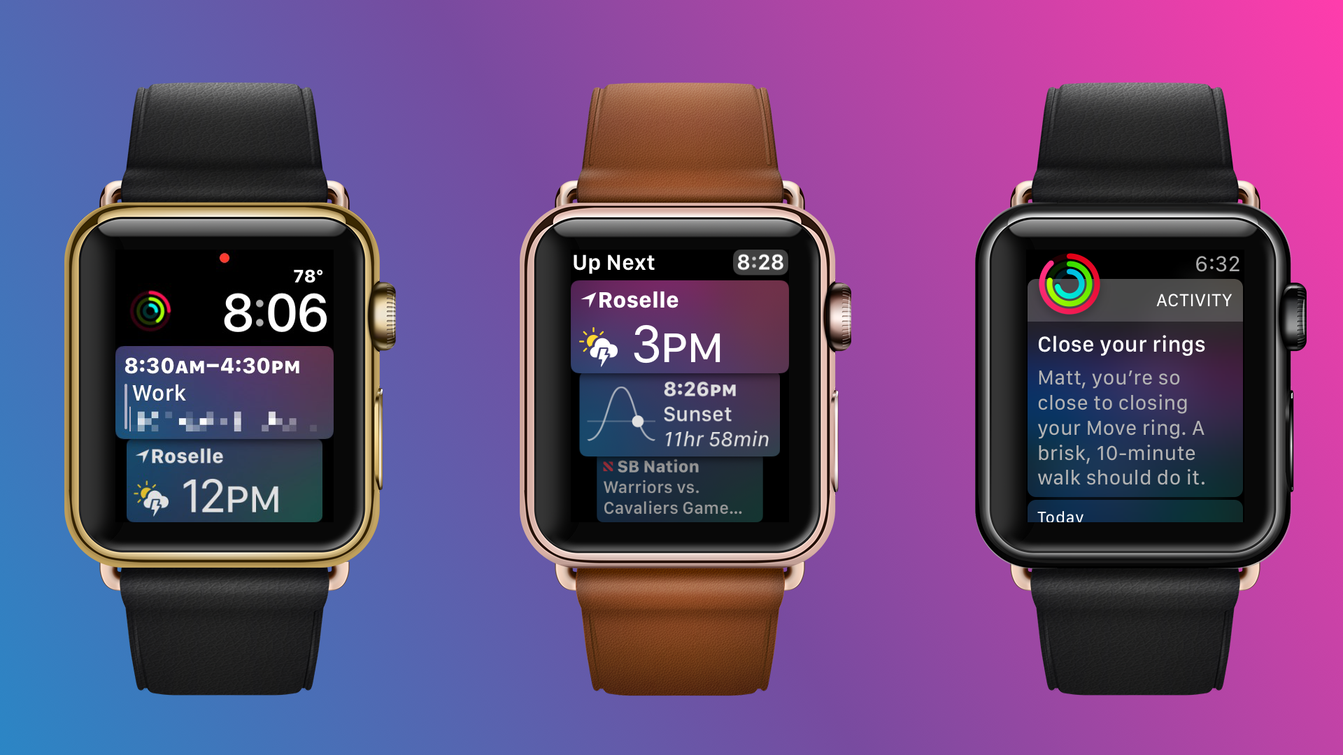
The most impactful update in my opinion is the addition of the Siri watch face. This is a watch face that only lets you set two complications on the top left and top right, shows the time, and devotes the rest of the watch face to Siri. This is not just a Siri button, but a whole new version of Siri. It's a brand new Siri who tries to help you before you even ask.
In very broad strokes, the Siri watch tries to show you the information you need exactly when you need to see it. This is the biggest thing I have been hoping Apple would do with watchOS for the past year, and it's great to see them move in that direction with this watch face. A good assistant doesn't just hang around for you to ask for things, it gets things ready for you so you don't even need to ask. The Siri watch face is a statement from Apple that they think Siri is up to the task. While this is a great new feature, and Apple has done fantastic work here, it's not perfect and they have a lot of room to grow in this space.
This watch face works with a card system, displaying a stack of “cards” for the things you have coming up on your schedule or things that the watch thinks you would like to see right now. If you have used something like Google Now or a Pebble smart watch in the past few years then you probably have a good idea of what this is like. For those who haven’t this system is basically a timeline of content relevant to you.
This watch face gets me excited because it brings the Apple Watch one step closer to being the smart assistant we’ve all wanted it to be since its launch in 2015. It’s also something that Android Wear has arguably done better than watchOS until now. Surfacing what you want to see before you ask for it is an important goal for any smart watch (and maybe any operating system, for that matter), and I’m very happy to see Apple move in this direction with watchOS 4.
Passive Notifications
The Siri watch face introduces a concept I’m calling “passive notifications.” Passive notifications are things that you have not explicitly said you want to know about, and they don’t buzz your wrist like regular notifications, they just appear on the watch face throughout the day if they have something interesting going on. A simple example of this is the Stocks app. I don’t care that much about stocks myself, and I don’t have the iOS Stocks app tell me anything most of the time. I have, however, added a half dozen of my favorite companies in the Stocks app on my iPhone and check their value from time to time. With the Siri watch face, I will sometimes see one of those companies’ stocks appear on my watch face when they have a particularly good or bad day. If I were investing in these companies I could see that being very valuable information, but even for me, this is a subtle nudge that I should probably check the news for that company to see what happened today to make their stock move.
The above example is not terribly exciting, but that’s kind of the point. I don’t want to be disturbed by stock news, but if you give me a hint that something interesting has happened, I may take the time to look into that. If I decide not to take action then it’s no difference to the watch; the stocks card in the list will just disappear in a few minutes to be replaced by more pertinent information for me.
Here’s what you can see on the watch face:
- Alarms
- Upcoming alarms will appear.
- Breath
- Everyone’s favorite breathing app can give you passive suggestions to breath throughout the day.
- Calendar
- Events on your calendar will appear in order, and include location information as well.
- Home
- It’s listed, but I’ve never seen one item on the watch face in months of testing. It’s a bit of a mystery right now.
- News
- Passive news alerts based on your favorite news sources. These are not to be confused with breaking news notifications you can already get via the iPhone app, but smaller stories or just an option to look at the top 5 stories of the moment. I use this one a lot.
- Now Playing
- Quick access to the Now Playing screen to access media controls. This can appear whenever media is playing. This nicely shows the artwork for whatever you're listening to.
- Photos
- Passive reminders to look back on some memories Apple Photos has created for you.
- Reminders
- Your upcoming reminders will appear shortly before their scheduled notification.
- Stocks
- Notable daily changes in the stocks you follow in the Stocks app. More often then not I got to see the DOW go up or down more than 100 points.
- Stopwatch
- If the stopwatch is running but has been moved to the background it will appear as the top card on the watch face so you don’t lose track of it.
- Timer
- Like the Stopwatch functionality, the timer will appear at the top of your cards while any timer is running.
- Wallet
- I’ve seen a Starbucks card appear once or twice here and tapping it brings up my Starbucks barcode. This is not consistent though, and it does not appear every place that the Wallet app for iOS shows a persistent notification.
- Weather
- There seems to be no rhyme or reason to this one, but sometimes I’ll see the weather appear here. Once it was for rain that was coming in 2 hours, but I think that was just a fluke. I could be wrong, but this appears to just show you the weather sometimes and I can’t tell what triggers it.
- Workout
- If it’s late in the day and you have not filled your activity rings, this card will show you what sort of workout could get you to your goal. These workouts are tailored to the types of workouts you actually do, so if you run and walk all the time, you won't get something silly like a suggestion to go rowing to meet your goal.
Now while that list is rather extensive when I write it out like that, you may have already noticed an Achilles’ Heel here, which is that the Siri watch face does not support third party apps. This means my Reminders will appear on the watch face, but not OmniFocus or Things or Todoist. Apple News can give me hot news, but Feedly can’t do the same. I can see my Activity progress, but MyFitnessPal can’t show me my calorie count for the day. I can see the Weather from Apple’s app, but not my own Today’s Forecast, Dark Sky, or CARROT. I think you get it.
To be truly useful to everyone, Siri is going to need to start supporting non-Apple apps. During this beta I have moved more of my workflow to Apple apps so that I can get more value from the Siri watch face, but I shouldn’t have to change how I work to get the most out of this feature. It seems like we’re on the cusp of Apple opening Siri up to more and more app types on iOS, and I can only hope that will be followed in suit by Siri on the Watch. The Siri watch face is a very exciting advance in watchOS, but it still has a lot of room to grow. It has become my go to watch face for when I’m at work and have a lot to keep track of. Having calendar events and todo items appear here as needed has been fantastic, but I crave more.
Apple is really onto something here, and I'm already looking forward to next year to see what their next step is here. Next year should be all about fitness (like always) and Siri as the best damn assistant on your wrist. They can do it, they just need to let thing parties help them make this thing amazing.
Music
One of the core functionalities I think the Apple Watch should really excel in is music. The company recently killed the non-touch iPods, and some have suggested that the Apple Watch can fill the gaps left by the tiny iPods of yore. I’m happy to report Apple has made some helpful changes to the Apple Watch that make it a more useful music player, as well as a better iPhone media companion for all apps than ever before.
Media controls are finally easy to use
The first big change to music (and media in general) in watch OS 4 is that the system will now automatically launch media controls for anything you start playing on your iPhone.
🎆🎆🎆🎆🎆🎆🎉🎉🎉🎉🎉🎉🎊🎊🎊🎊🎊🎊
Why the fireworks? Well, this has been something I’ve been complaining about since the very first watchOS 3 beta last June! It’s simply too hard to bring up media controls on the Apple Watch, and it’s something that should be stupid simple. I know that everyone uses their Apple Watch for something different, but I would put a lot of money down that every single Apple Watch user uses it to control their music, podcasts, or audiobooks.
Now in watchOS 4 whenever you start playing audio on your iPhone, watchOS will automatically launch media controls so they are accessible to you the next time you raise your wrist. In practice this means that if I start playing a song in Apple Music (or Spotify) and decide midway through the song that I want to skip ahead, all I have to do is raise my wrist and tap the next button. The controls are already on screen, and I don't have to find the right app to do this. In watchOS 3, I would have had to find the Now Playing app either in the dock or in the app honeycomb launcher, wait for it to launch, and then tap. watchOS 4 is so much better than this it's stunning.
Apps that have a native watchOS app will launch to the controls page of their app, so an app like Overcast will launch Overcast on the watch. But other apps such as Audible that do not have a watch app will just launch the Now Playing app. This requires no effort from the developer, so you don’t even need to wait and hope that your favorite apps will update to do this, they’ll just work.
This solution is clever in its simplicity, but it’s also a little frustrating and could use a little fine tuning. While I appreciate that Overcast and Pocket Casts have built Watch apps, I also have to recognize that their apps are not as responsive as Apple’s Now Playing app on the Apple Watch. Tapping on the skip forward button on Overcast typically works well, but I somewhat regularly get delays where nothing seems to happen when I press the button. Sometimes nothing will happen and other times it will skip forward after 10 seconds and I go “what just happened?!” I would love it if Apple gave me the option to always choose the Now Playing app when media starts playing.
Another serious downside to this feature is that because third party developers don't have access to volume controls from their apps, launching into Overcast feels even more hampered. As someone with AirPods that don't have volume controls, I really love being able to spin the crown on my Watch to change volume quickly. The Apple-made Now Playing app lets me do that, but third party apps can not. I've actually uninstalled the Overcast app from my Watch so that I can just use the Now Playing app instead. While this is a decent workaround, it would be better if this feature made me install more apps, not fewer on my Apple Watch.
I should also mention this happens for all audio in non-game apps on your iPhone. That means that even that freaking frustrating auto-playing video on CNET will make your watch pull up Now Playing. This is a little obnoxious as it’s not really what I would expect to happen, but it hasn’t been a major pain for me.
Apple Music enhancements
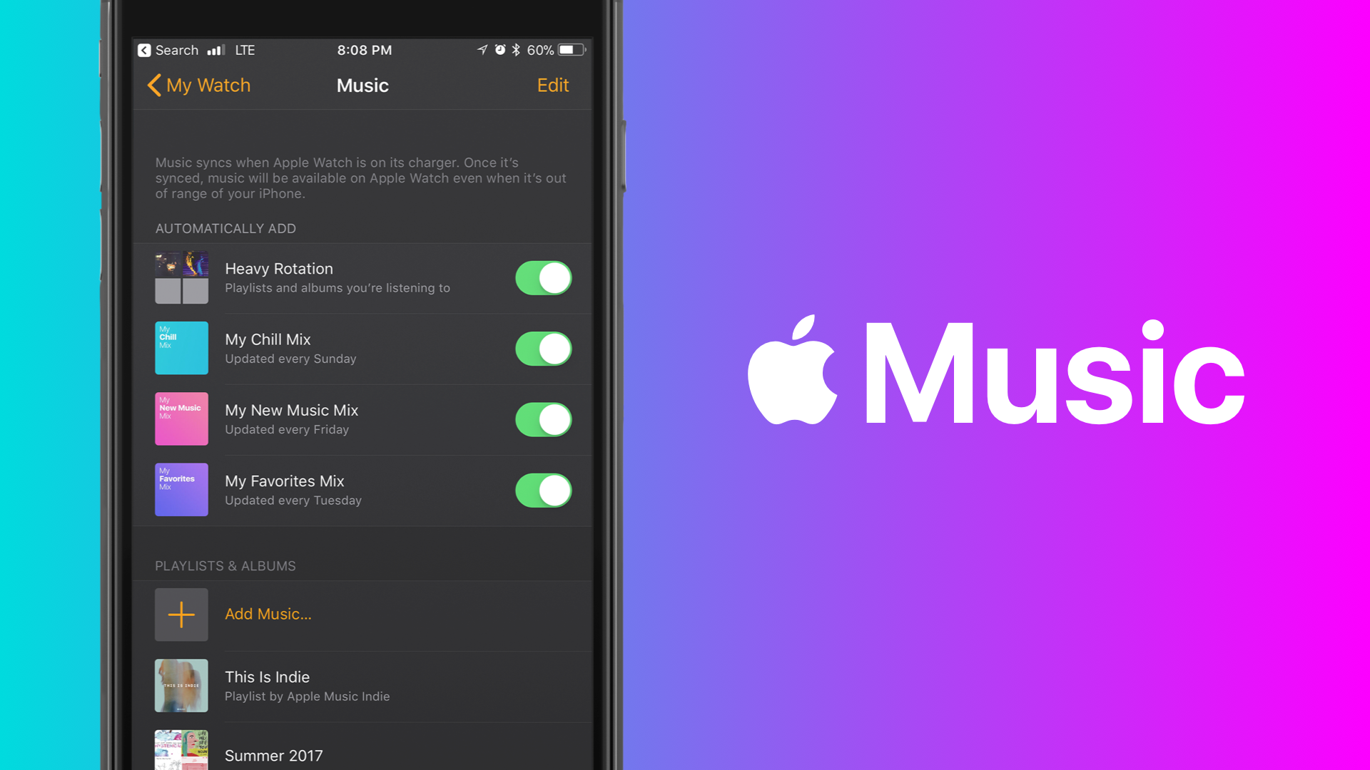
The other side of the coin is Apple Music, which has gotten some important new functionality since last year. A major limitation of Music support on the Apple Watch since version 1.0 has been only being able to sync one playlist to the watch from your phone. For those unfamiliar, a synced playlist can be accessed when you are not connected to your iPhone. This essentially forced you to sync one giant playlist to the watch and hope that it has everything you want.
Now in watchOS 4 you can sync as many playlists as you would like (up to 2GB total). watchOS will automatically suggest syncing your heavy rotation, new music, favorites, and chill mixes. I’ve left all of these on because it means I always have a fresh set of music synced to the watch for iPhone-free listening. Now that we have an LTE Apple Watch coming very soon, there are going to be more instances of people going iPhone-free with their watches, so this enhancement is very welcome. You can also sync over specific playlists, artists, albums, genres, or compilations that you want synced over.
Note that watchOS still limits you to 2GB of music stored locally on the watch, so this update won’t let you send more music, but it will make it easier to do so.
Finally, I have to admit that I have no idea what time watchOS and iOS talk to each other to sync this music between them. My suspicion is it happens overnight and/or when the watch is on the charger, but I can’t guarantee that. All I know for certain is that I always had the music I expected on my Apple Watch when I went to listen to it.
Activity Updates
watchOS 3 saw a lot of improvements to the Activity and Workout apps, and Apple has continued to make meaningful updates to these essential apps this year.
Online Sync 🎉 🎉 🎉 🎉 🎉
Now Apple didn’t give me the full Activity website I was hoping for, but they have added the ability to sync your activity and workouts to iCloud.
I’m going to stop and let that sink in for a second.
…
…
…
I know, right?! No longer does restoring your iPhone result in you losing all of your health data! Maybe this doesn’t come up that often to most people, but I restore my phone a few times a year (for betas and testing a bunch of things) and because of that my Activity history never goes back more than a few months. No more!
All you have to do is go to your iCloud settings on your iPhone and check to see if Health is syncing to your account. If it is, then you're good to go. You don’t have to turn this on if you want this data to stay on your device only, but I turned it on immediately and deeply appreciate this feature.
Better Notifications
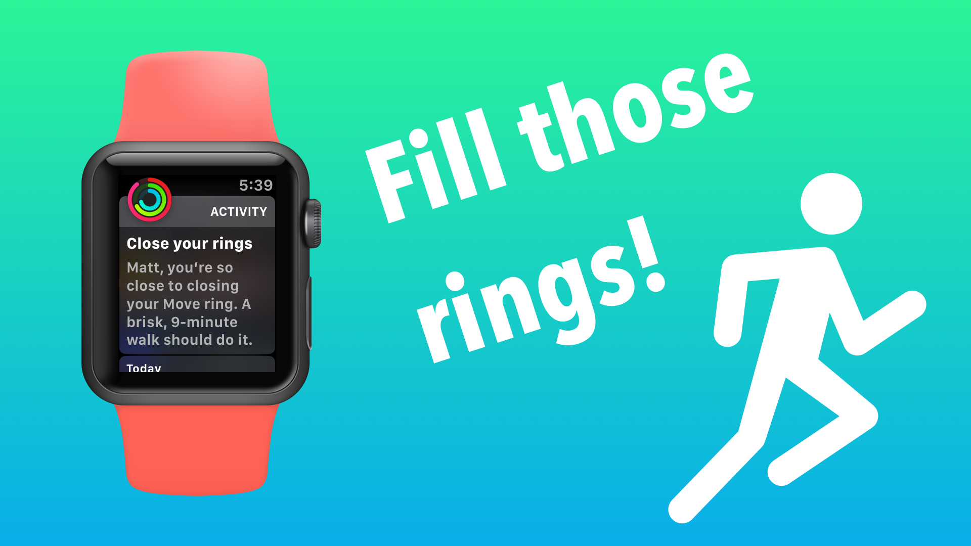
Apple has done some work this year to send better notifications that you might actually find helpful. Previously all activity-released reminders were relegated to stand and breath notifications. In short, you’d be notified at the 50 minute mark of each hour if you had not stood up that hour, and the breath notification would happen a few times a day (however many you asked for) at regular intervals.
With watchOS 4 Apple is getting a little more fancy with activity notifications, and I think they’re better off for it. First off, you will now get notifications in the afternoon to early evening with suggestions for how to achieve your daily calorie goal. If you have just a few calories left to fill that red ring then you might get a recommendation of a 13 minute walk. Or maybe you’ve been a bit of a couch potato all day and your rings are in miserable shape. In that case the watchOS might suggest a 35 minute run.
I have found these reminders to be quite welcome for two reasons. First, they let me know if I’m about to fail to fill my rings before it’s too late. I’m not as obsessive as some people about building a huge streak, but it’s nice to get that push of “hey, are you aware of how much you exercised today?” at a time where I can actually do something about it. Sometime no, I don’t know how little I’ve moved around and a little nudge to do it is welcome.
The other reason I like these notifications is that they are specific. “Go forp a 13 minute run” and “do strength training for 18 minutes” are actionable items and are more easy to respond to, even if that response is “no thank you.” It’s like how “do you want to eat at XYZ tonight?” is a much easier question to answer than “where do you want to go for dinner?” These suggestions seem to be based on the workouts that I personally do, which is much appreciated. The watch has never suggested I use the rower or go swimming or use a stair stepper because it knows I don't do those and probably don't want to do them now.
These notifications also extend to monthly challenges. I’ll get notifications about how I’m doing compared to last month and they will include motivating messages to get me to achieve longer term goals than just filling my rings today.
New Workouts App
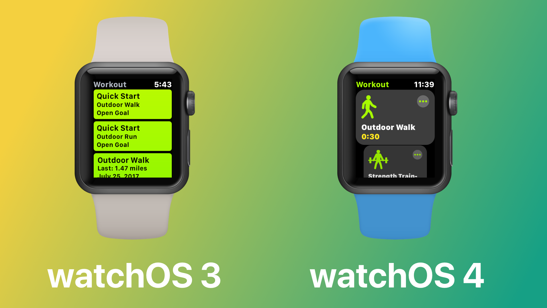
The Workout app has been completely rewritten this year, but don't worry, it will be familiar to anyone who has used the previous version. The new interface is built around getting you into and out of workouts faster than before. watchOS 3 brought quick start workouts, and watchOS 4 extends that concept.
There is now no difference between quick start options and the regular workouts. Each workout type on the list is a quick start by default, so tapping onto the main part of the workout card will begin a workout immediately. For workouts that you have done before, it will set the same goal you had last time. Workouts that you have not done before will just start with an open goal.
However, if you tap the little dot-dot-dot icon in the top right of a workout’s card, it will load a screen where you can set a specific goal for yourself. Depending on the workout type, you will get up to 4 options for a goal: open, calories, distance, or time. The rest of the interface should be the same as before.
I like this change since I tend to do similar workouts every time. I have a routine, so I do a 30-40 minute run each time I go out, so letting me automatically select a 30 minute goal each time is perfect. Good workout apps remove friction, and this is another step towards making Workout the absolute best app for exercise tracking I see out there (minus some power user features).
And Apple has added more options for exercise tracking from last year. Swimming has been improved with the ability to track laps, something not possible before. Additionally, they’ve added Tai Chi, hand cycling, and high intensity interval training which appears to be the cool workout type people do to get “ripped” but I personally take no part in. I was not able to test the swimming tracking since I don’t have a Series 2 Apple Watch and my one attempt to do the “HIIT” workout seemed fine, but it didn’t really track any differently than a normal strength training workout.
As a final nice touch, you can make Workout start a specific playlist every time you start a workout. If you have a “KICK OUT THE JAMS 2007” playlist (I’m not saying I do, but I bet that would be rad) that you listen to all the time when working out, then this new feature can save you the step of going to Apple Music and starting that playlist.
Thankfully, this feature is smart enough to know that you probably don’t want to switch away from what you’re currently listening to when a workout starts, so it won’t do anything if you’re in the middle of something else when the workout begins. Unfortunately the playlist will always play in order, which some people may like, but I would have liked the option to have the playlist shuffle automatically instead. I don’t really use this feature in large part since I don’t want to listen to the same 30 minutes of music every time I go out.
Apple News
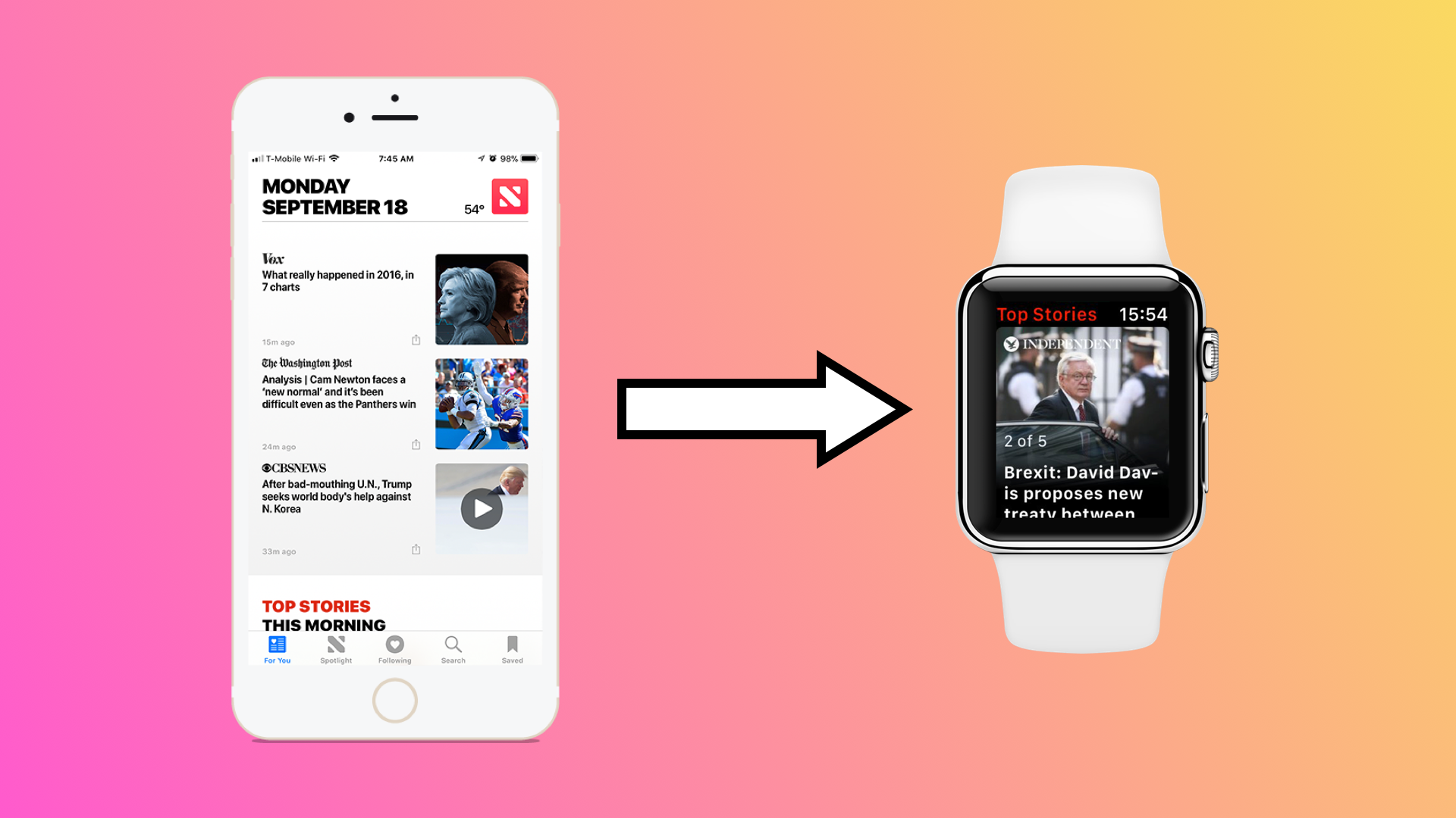
I really love Apple News, and now there is an official Apple Watch app for the service. The app is somewhat limited, but I don’t fault it for that. It really breaks down into a few sections:
Siri watch face: Apple News headlines of note will appear on the Siri watch face as “passive notifications” and you can choose to look at them or ignore them. These tend to be general news stories, so you may or may not want to turn this functionality off (Watch.app > Siri watch face > Data Sources) depending on your tolerance for Trump news. This feature does seem to respect your Apple News subscriptions, so you probably won’t get news stories from totally random sources.
Breaking news notifications: You’ve always been able to get Apple News notifications on the Apple Watch, but now that there is a native watch app the notifications have become much nicer. They now include images and better article summaries. Again, these are tied to your Apple News settings, so only your publications you’ve given permission to do this will appear in these notifications.
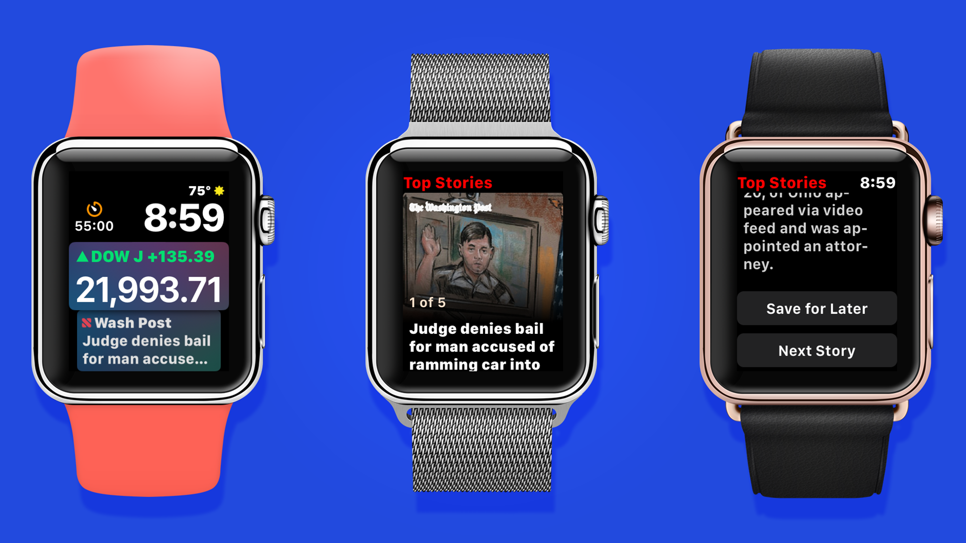
The app itself: At any point, you can launch the Apple News app itself and look at the top 5 stories right now. These are the same 5 stories that would show up at the top of the iPhone/iPad app if you were to launch it at the same time.
I find this feature to be really nice, but my one suggestion for next year would be to let me read the whole article on the watch if I really want to. I almost never want to do this, but there are certain cases where it would have been convenient to read at least a little more than the headline and summary of a new story. I know, I know, reading a full article on my wrist sounds like exactly the sort of experience I would say your watch app should not encourage, but what the hell, I’d like to have it!
The New Dock
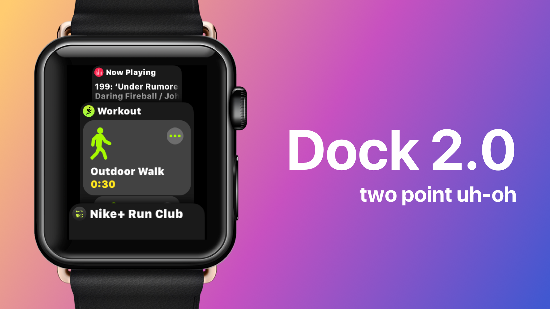
While I think most of watchOS 4 is a modest improvement over what we had before, the Dock is something that has moved decidedly in the wrong direction. watchOS 3 brought the concept of the Dock, which was a way for you to essentially pin up to 10 apps on the side button for easy access. Not only would these apps be accessible from a more decipherable interface than the app honeycomb, but those apps are also “always running” on the watch and launch instantly. Last year I called the Dock “the single biggest innovation to all of watchOS in this release” and I still believe that’s true. I know numerous people who are still using their original Apple Watches because the Dock made their experience so much better. Sadly, the Dock in watchOS 4 is far less usable.
The cardinal sin of the Dock is that it now has a different default behavior. After upgrading your watch to watchOS 4, your Dock will now be more of a “task switcher” like you have on iOS. The last 10 apps you have used on the watch will appear in reverse chronological order. On the face of it this seems like a rejection of the concept Apple introduced last year, and I bet a lot of people reading this today will not like this change. I certainly don’t. I have two main concerns with this change.
Concern 1: The Ever-Changing Dock
First, it removes all muscle memory from the Dock. My Dock in watchOS 3 had a selection of 8 apps ordered exactly how I wanted them and I never changed that. This meant that I always knew where my favorite apps were and allowed me to see whatever I wanted very quickly. Using this default behavior completely breaks this and requires me to scroll through a list of apps, a list that will be different every time I use it. And if an app I want to use is no longer on this list, well then I guess it’s back to the app honeycomb for me. Ugh.
This is wildly frustrating since it makes me think more about every interaction with my watch. The Dock is now an unpredictable mess.
Concern 2: The Dock is No Longer Glanceable
Apple does give you the option to switch the Dock back to the old mode, and you would think that this solves my problems, right? Nope.
The other problem with this new Dock is that because it’s now an overlapping cards interface, I can not see full previews of the apps in my Dock without actually tapping into them. One of the things Apple bragged about last year was that the Dock allowed you to get updates from your apps without even needing to “launch” them. They were always updated, so you could scan the apps in your Dock and see everything you needed. I personally kept a few apps in there that gave me weather, subscriber counts, web analytics, and more, and I added them to the Dock specifically so I could scroll through the Dock and get an update on my day. This workflow is hindered quite a bit in watchOS 4.
Apps are always overlapping, and this means my view is always obscured. I can fiddle with the digital crown to line the apps up juuuust right so I can see the app I’m looking for, but it should not be this hard.
Why Apple Did This
My theory as to why Apple made these changes is that many people just weren’t using the Dock as intentionally as I was. It’s very possible that the Dock went unused by millions of users, and the amazing work Apple did last year to speed up watchOS 3 was never realized by many Apple Watch users. Considering most Apple Watch users only use a few apps on their watches in the first place, a Dock that shows the last 10 apps may in fact provide more value to people who don’t want to set up the Dock themselves. Additionally, since docked apps are kept in a “running” status, they continue to update in the background and users will get performance improvements they would not have seen in watchOS 3 had they not added these manually to that Dock.
I have no inside info on if this is indeed the case, but it make sense to me. Many people never even customize the apps on their iPhone home screens, so why would they organize the Dock on their watch?
The Little Things
Before we close this thing out, we must look at a bunch of the little things in watchOS 4 as well. Some of this will be a big deal to you, and some things may not be of any interest at all, but I could not call this review complete without mentioning them.
Battery life
I wish I had something more interesting to say than this: battery life is basically identical to what it was on watchOS 3. I get about 24-36 hours of normal use which is exactly what I got before. This just means I charge my watch for about 45 minutes every morning while I'm getting ready for work and it never dies on me.
If your battery does get low and you feel you need to put it into low power mode, that is improved this year. Just like in watchOS 3, you can wipe up on the watch face to bring up a few system toggles. One of these is the current battery percentage, and tapping it will bring you to the battery app, and you can switch to low power mode from there.
Overall performance
watchOS 4 feels very similar to last year’s software, although I do think they performance has taken a small hit with this release. Certain actions like swiping between watch faces and navigating workouts screens feels ever so slightly slower than they were before the update. This is more in regards to animations chugging a little more than before, and not actually doing anything slower, so it’s not the end of the world.
To counter balance that, some things that I’ll talk in depth on below make the overall Apple Watch experience seem faster. Quicker access to media controls, better Siri performance (much less ‘I’ll tap you when I’m ready” than last year), and docked apps actually make the watch feel faster.
Overall it’s a wash. If you were happy with the performance of your Apple Watch yesterday, you’ll be just as happy after updating. Just don’t expect a “THIS UPDATE WILL BREATH NEW LIFE INTO YOUR OLD APPLE WATCH” like we had last year.
New pairing interface
This may be something you never see on your Apple Watch if you just restore from a backup, but the new pairing interface is a little nicer than before. Similar to AirPods, you can start the pairing interface by holding the watch and phone close together and they will see each other. You still have to hold you phone’s camera up to the watch and match the swirling images, but you don’t have to dig the Apple Watch app out of whatever folder you stuck it in years ago to start the process.
Another small nicety is when the installation starts up, it will walk you through a few things you can do with the watch. The stuff they demo in this sequence of screens may not be super exciting to experienced Apple Watch users, but it’s a much better on boarding experience for new users.
[gallery type="slideshow" ids="3504,3505,3506,3507,3508,3509,3510,3511,3512,3513,3514,3515"]
Smart heart notifications
I haven’t been able to test this yet, but Apple mentioned on stage at their Apple Watch Series 3 reveal last week that the new Watch will be able to send you a notification when your heart rate rises significantly and the Watch doesn’t detect you are being particularly active. This could be very helpful in letting people know they have a problem before it gets too serious, and I’m very excited to see this in action…even though I hope I personally don’t see it myself.
Apple Heart Study
The Apple Heart Study is something Apple has also announced that has not been enabled yet, but this will be an app you can download from the App Store later this year and opt into help collect heart data. Apple is partnering with Stanford and telemedicine company American Well to analyze the data they collect, and the goal is to make the Apple Watch the best and most popular device for tracking, and diagnosing heart conditions such as AFib.
This combined with Apple’s open source ResearchKit makes Apple’s health angle with the Apple Watch truly best in class.
Kill the app honeycomb, use a list instead
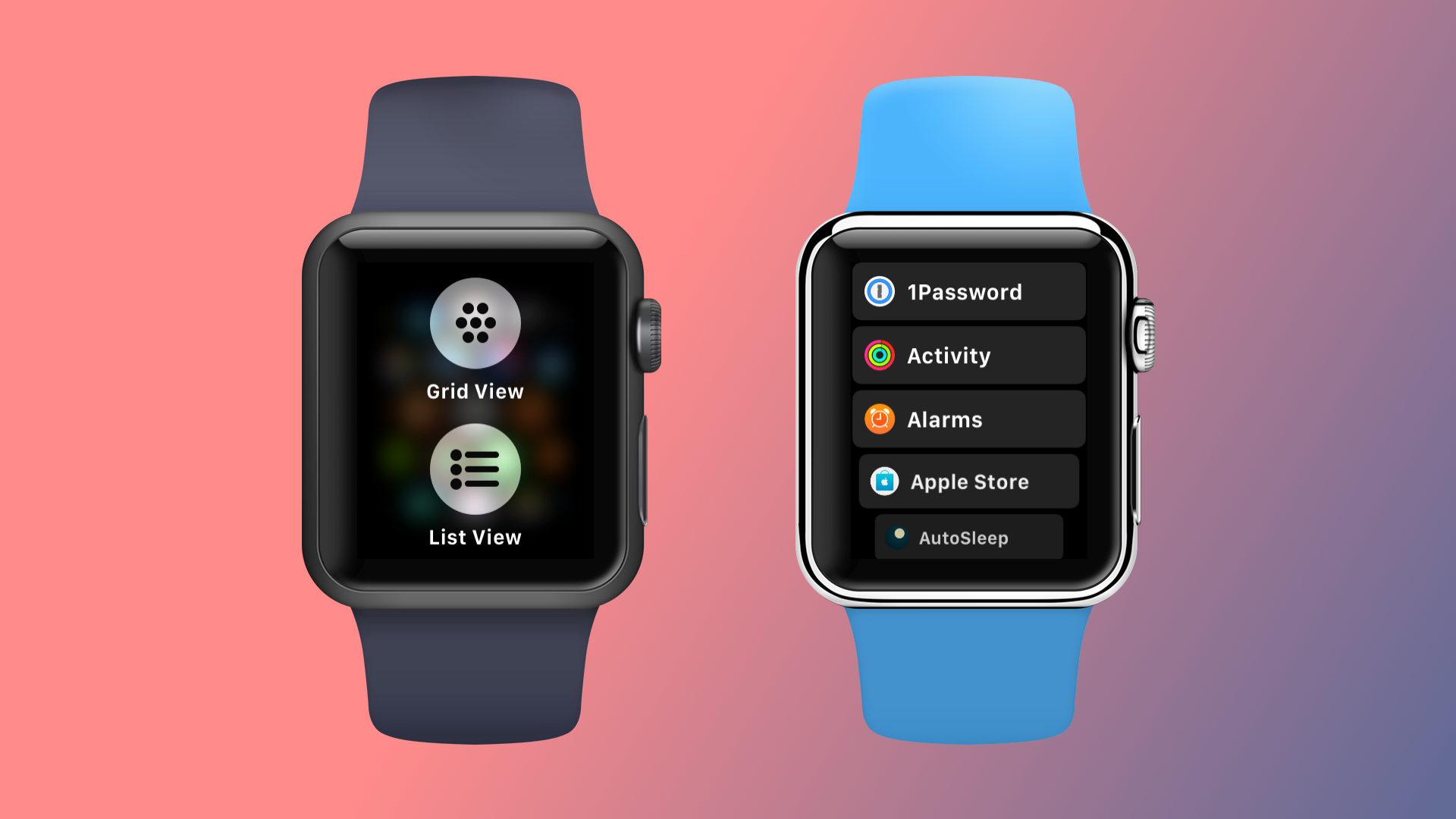
If you hate the “app honeycomb” screen as most people, then you might be interested to hear that the honeycomb layout can be removed and replaced with a scrolling alphabetical list of all your installed apps.
I won’t personally use this since the honeycomb allows me to cluster all my frequently used apps together near the center of the page for easy access, but I'm sure there will be many people who will call this a major improvement over what we had before.
Make kaleidoscope faces from your photos
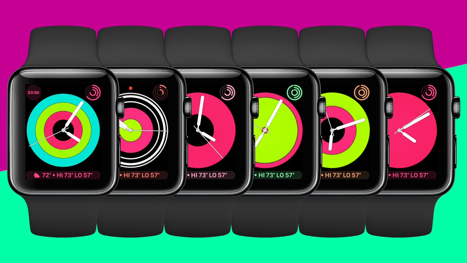
The kaleidoscope watch face is controversial at best and horrific at worst (I’ll let you guess where I stand on that), but the good news is that you can make any image into a kaleidoscope watch face from the iPhone.
Simply go to the image you want to use in the Photos app, hit share, and choose the make kaleidoscope option. This will create a new watch face for you and it’s either going to be pretty cool or pretty horrifying, you never really know until you put it on the watch.
You can download 15 images I think make for great kaleidoscope wallpapers here.
Toy Story watch faces
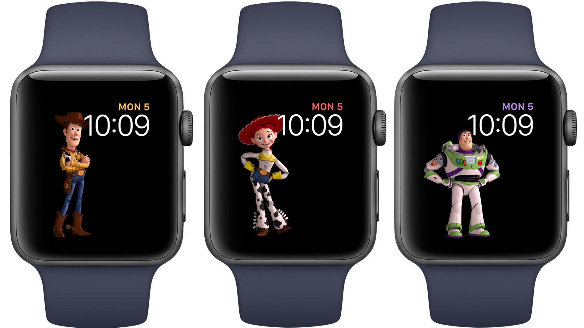
There is a certain type of person who these watch faces are made for and I am not that person. While the Micky and Minnie Mouse watch faces embrace the uh, classic(?) look of Disney watches, the Toy Story watch faces embrace the 3D animation this series pioneered. Woody, Buzz, and Jessie all animate in fun little scenes, but they don’t really do much for me. I love the series…like, really love it, but I don’t want cartoon characters on my watch face. Sorry, I’ll try to be more fun.
Keypad in the phone app
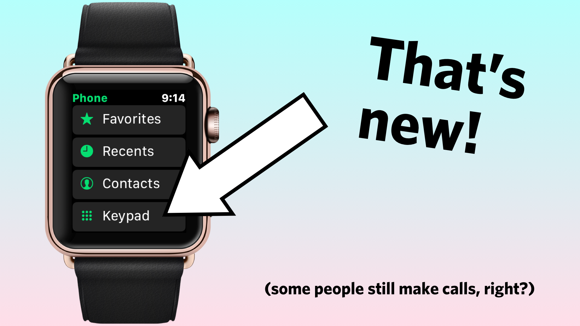
This is a smaller one, but one that might be very important if you are using your Apple Watch without a phone nearby, or have one of Apple’s fancy new LTE-enabled watches. The previous Phone app on the Apple Watch allowed you to take and make calls, but you were limited to people in your contacts. With the addition of a keypad, this allows 2 important things:
First, this lets you call anyone in the world from your watch. Want to make a customer service phone call to a number you obviously haven’t saved to your contacts? No problem at all! I know it’s 2017 and like nobody makes calls anymore, but this is a nice thing to add, and something that it’s a little surprising we were totally fine with not being there before.
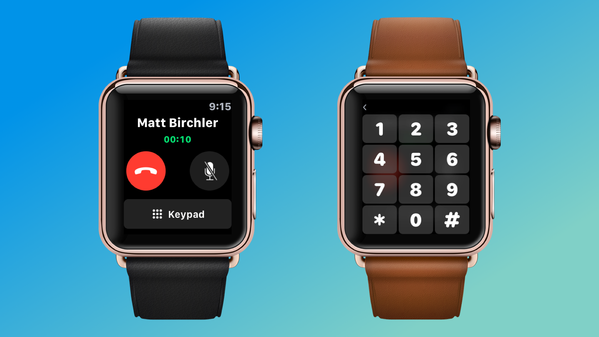
Second, this keypad is available from inside the app while you’re on a call, so you can interact with automated systems that require you to “PRESS 4 TO TALK TO A HUMAN”. This again is not required functionality, but it removes some of the limitations the watch used to have when making phone calls.
The 25 people who make phone calls with their Apple Watch will be very happy about this update 😉.
Timer updates
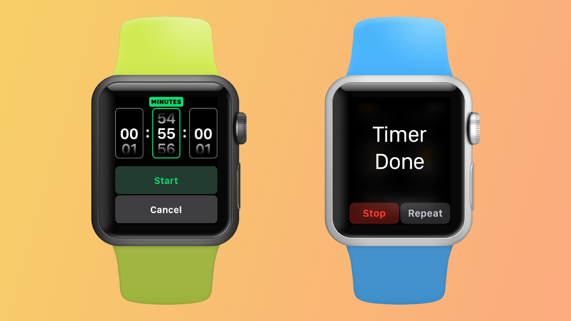
There are also 2 small updates to the Timer app this time around. The first is that you can now set timers for hours, minutes, and seconds (seconds are new this year), and the second is that you can repeat a timer as soon as it finishes.
The addition of seconds speaks for itself, but the repeat function is something I wasn’t asking for but I find myself using more than I expected. This can be good for when you’re exercising, and I’m a little surprised that it didn’t make it into the Workout app this year. I do some light weight training and meditation, and I’ve been using the repeat function in the timer to time my reps. It works great, and it’s one of the best small updates to this year’s watchOS update.
Flashlight
Add this to the list of things I thought were silly to add when I saw them at the reveal in June, but have proven to be welcome additions. The flashlight can be activated from the control center on the watch face, and I’ve actually found it to be a very nice indoor flashlight. It’s not nearly as bright as the iPhone’s flashlight, but by turning the Apple Watch’s screen to full brightness, you get more than enough light is most areas to at least move around.
It should be noted that Series 2 and 3 owners will get a markedly improved version of this feature since the screen on that model can get brighter (1,000 nits) than the Series 1 and original models (450 nits). I personally own a Series 1, so as good as it is for me, the Series 2 is likely twice as powerful.
As a nice clever touch, the brightness for the screen turns down a little when you turn the watch face towards your face so you don’t blind yourself and then will go back to full brightness when you turn it back away from you. Nice touch, Apple.
Messages complication is now somewhat useful
Instead of always showing a message bubble icon, the Messages complication will now show you the number of unread messages you have waiting for you.
Apple Pay enhancements
All the new Apple Pay features in iOS 11 are also here in watchOS 4. You will be able to give people money via Apple Pay and access your Apple Pay Cash card for purchases. Sadly this has not been activated by Apple for watchOS or iOS yet, so this is still something we're looking forward to using soon.
Connections to gym equipment
This is more theoretical at this point, but Apple has agreements with some of the major gym equipment manufacturers to enable Apple Watches to easily connect to them and collect data directly from the machine. This sounds like a much better way to track indoor workouts, but I sadly have not been able to test this yet since none of the gyms around me have this equipment yet.
Activity ring notifications mid-workout
This is a small one, but you don’t have to wait until after you ned a workout to know if it has gotten you to your goal for the day. Now as soon as you hit your calories or active minutes goal, even if you’re in the middle of a workout, you will get a notification right away saying that you achieved your goal.
This is great when you are doing a workout with the express intent of getting to your daily goal. You can work out as much as you need to and then stop dead in your tracks en you reach your goal. Or whatever, keep going because those rings don’t own you. I swear they don’t own me...
New tools for developers
Outside of the new features from Apple’s own apps, third party developers get a few new tools this year to make their apps just a little better. Here are a few highlights:
- Apps can now record audio in the background
- Apps can access your location
- The heart rate sensor is accessible to apps
- Full screen apps are possible
- Workout apps have access to the water lock feature
- Apps can enable auto-rotation so you can turn your watch towards someone and the screen with flip right side up for them
- And of course, general enhancements to the underlying system should make all apps launch faster and be more responsive to inputs
There are so so so many other tiny features not worth mentioning here, but those are the small but notable features. Now let’s get on to the big stuff!
Conclusion
So after all that said, how do I feel about watchOS 4? I think this is ultimately an update similar to watchOS 2. It’s a small update that makes some key features better, but it does not change the smart watch game in any meaningful way. I don’t mean that totally as an insult, but you should know that this update is not going to revolutionize the world of smart watches and make them something everyone just must have.
But while watchOS 4 is not a revolution, it is a good step in the right direction. This feels like a refinement year to me, which just means that you are going to enjoy your Apple Watch more than you did already. Media controls are a big win, as I now feel like my watch and my phone are more aware of what each other are doing. Workout is a more refined, faster app than before and has me tracking workouts even easier than before. The Siri watch face is the closest thing to a revolution in this release, and I feel like we are just a year or two away from it really coming into its own. The Siri watch face could very well change the way we think about smart watches, but we’ll have to wait and see if it achieves its potential later down the line.
For now though, watchOS is advancing at a modest pace. With Android Wear receding into the background and Apple Watch sales continuing to rise, I don’t think Apple feels a great need to blow out every release of the watch’s software right now. At this point we’re really waiting on more advanced hardware for Apple to cram into the Apple Watch to enable watchOS to do more than it does today. On my Series 1 model everything is relatively quick, but it’s clear that this thing is operating at 100% capacity right now. I’m really excited to see what Apple can do in the software if they have 2x or more powerful hardware to work with. I think we’re still in the very early days of smart watches, but I think we’re also on the cusp of some great things happening in this space. Give the watchOS team some higher end hardware to work with and I think we’ll start to see some larger steps start to be taken in this space.
Like this review? The best way to support my work is to buy Today's Forecast on the App Store. It's a couple bucks and is a pretty damn good looking app!

