watchOS 5: The BirchTree Review

Every September since Apple released the Apple Watch, we’ve seen a brand new version of watchOS come out that improves the experience. Here’s a brief recap:
- watchOS 1 (Apr 2015): way more functionality than needed, and super slow
- watchOS 2 (Sep 2015): slightly faster, and better APIs for developers
- watchOS 3 (Sep 2016): wow, major improvements across the board, especially in terms of speed
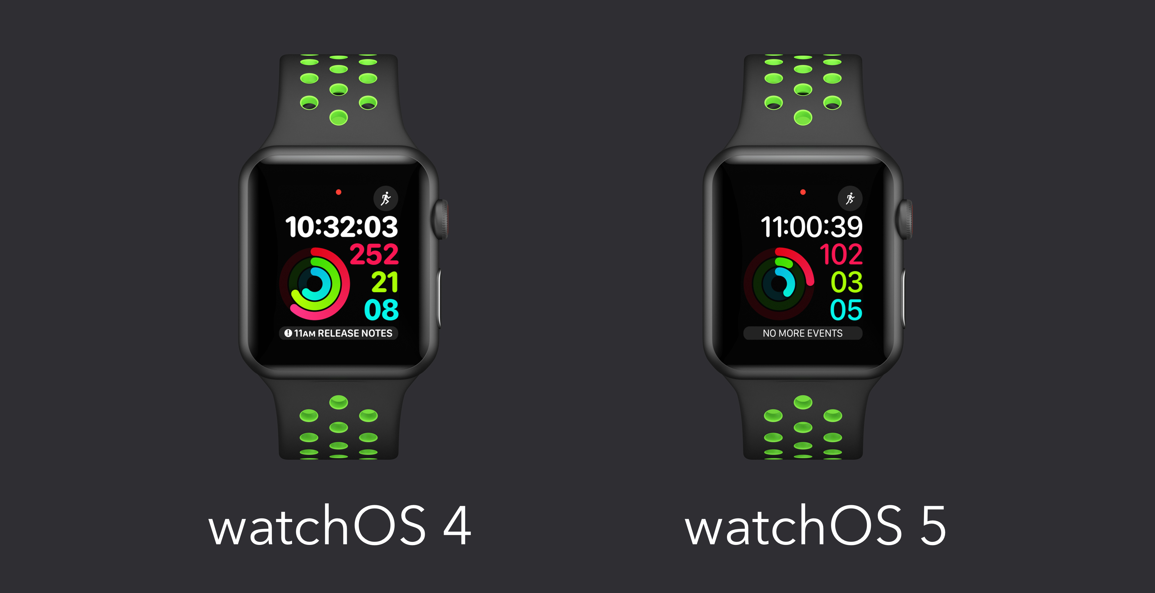
- watchOS 4 (Sep 2017): refinement year, but made everything already there better
Which brings us to this September and watchOS 5. This isn't as big an update as watchOS 3, but it’s probably the next biggest update watchOS has received to date. It combines everything great about the platform and makes most elements of it better, while adding a number of key features that people have been asking for. Oh yeah, and they had to spend a non-insignificant amount of time adjusting the whole OS to work on the new Apple Watch Series 4.
The Apple Watch journey has been all about figuring out what people like to do on their smart watches and optimizing watchOS to match. Those categories seem to have settled on activity tracking, listening to audio, handling notifications, communicating with others, and getting general information quickly. watchOS 5 addresses all of those categories and almost all changes are for the better. The worst thing I can say is that a good number of these updates require third party app developers to update their apps to use them. Given how much better this makes the watch experience1, I’d expect to see updates very soon that include these changes.
There are a lot of changes to activity tracking and workouts, including things that FitBit users used to be able to lord over the Apple Watch. Automatic workout detection is only the tip of the iceberg here, there's much more. The Siri watch face, my favorite new feature from last year, got the best update it possibly could: third party app integrations. This means that all your favorite apps, not just Apple’s, will be shown on your watch face. Podcast and audiobook apps can now make honest-to-goodness amazing apps on the watch, and they can even download content and play in the background. And if you don’t want to use a third party app, Apple’s brand new Podcasts app for the Apple Watch is quite nice.
There is so much more to talk about, so let’s get into the meat and potatoes.
The Little Things
watchOS lives and dies on the little things. Small interactions that create delight or frustration define how much people enjoy the Apple Watch, so let’s kick off with some small changes in watchOS 5.
watchOS 5 drops support for the original Apple Watch. This isn't so much a fun update, but it's worth noting up front that this update will only run on the Series 1 and newer models of the Apple Watch. While it is sad that the original model won't get any of these benefits, many of the changes listed below were only possible because Apple no longer needed to make everything work on the original model anymore.
Bold text mode is less bold than before. Not everyone will notice this because using bold text appears to be a relatively niche thing, but I personally love bold text and think it makes everything on the watch more legible. It's not a horrible change, but it's definitely one that I noticed right away.
“Hey Siri” is now optional. This is mostly cool, as I can just raise my watch to my face and say “remind me to XYZ.” This somehow feels less nerdy than prefacing every request with “Hey Siri.” On the other hard, this feature has been triggered accidentally quite a few times in my testing. I was stretching during a meeting at work once, and it thought I was talking to it, only to reply audibly to the room. It was annoying for me, but lead to a minute of “oh Siri, you’re so dumb,” comments from the room. This happened a number of other times outside of meetings, and while it was never as horrible as that one time, it’s always obnoxious.
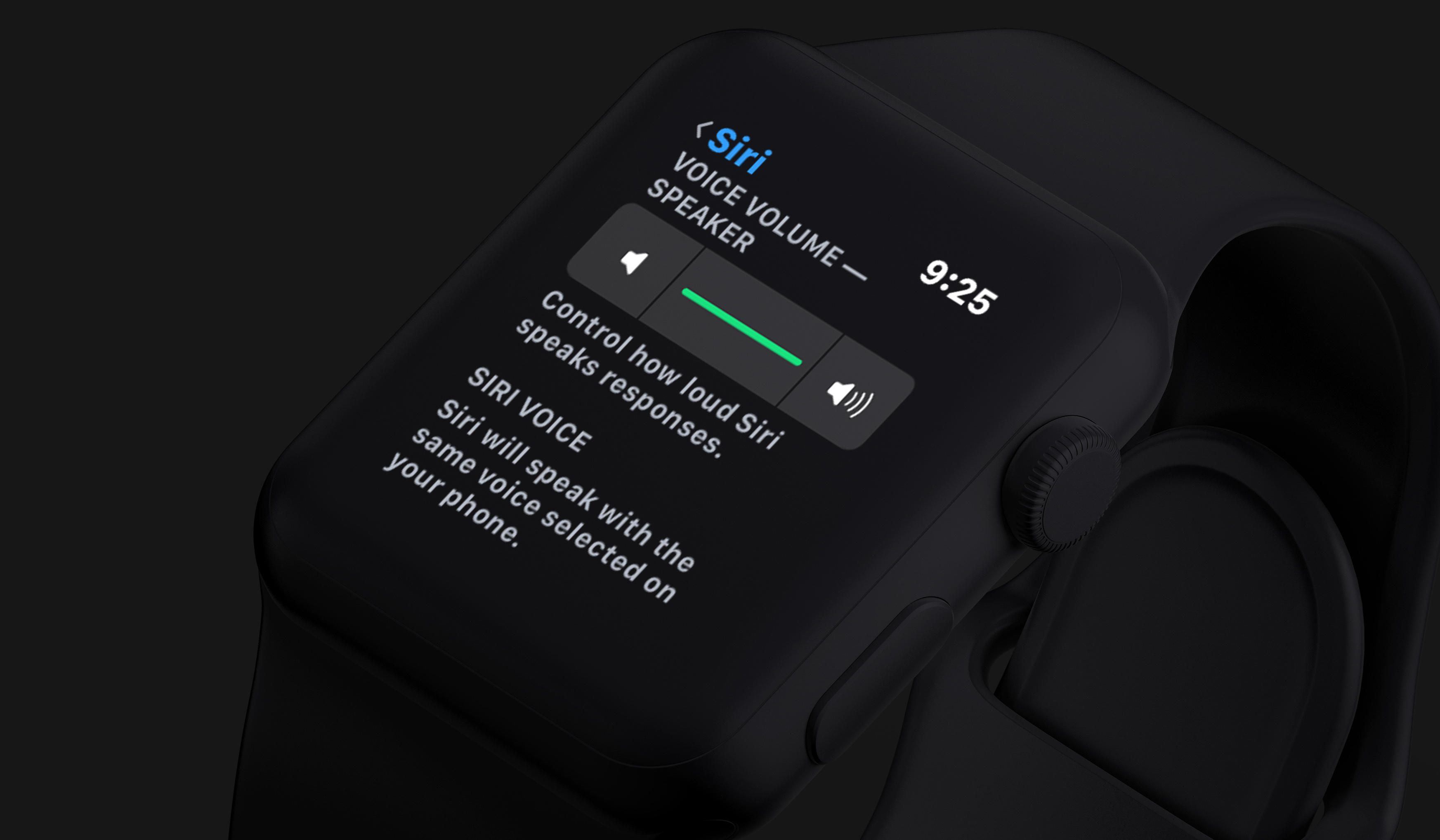
Series 3 and 4 users can change how loud Siri’s voice is. I love this myself, as I always want Siri to respond at full volume. Others can use a lower volume if they’d prefer, though. If you are using a Series 1 or 2 watch, Siri still will not be able to speak back.
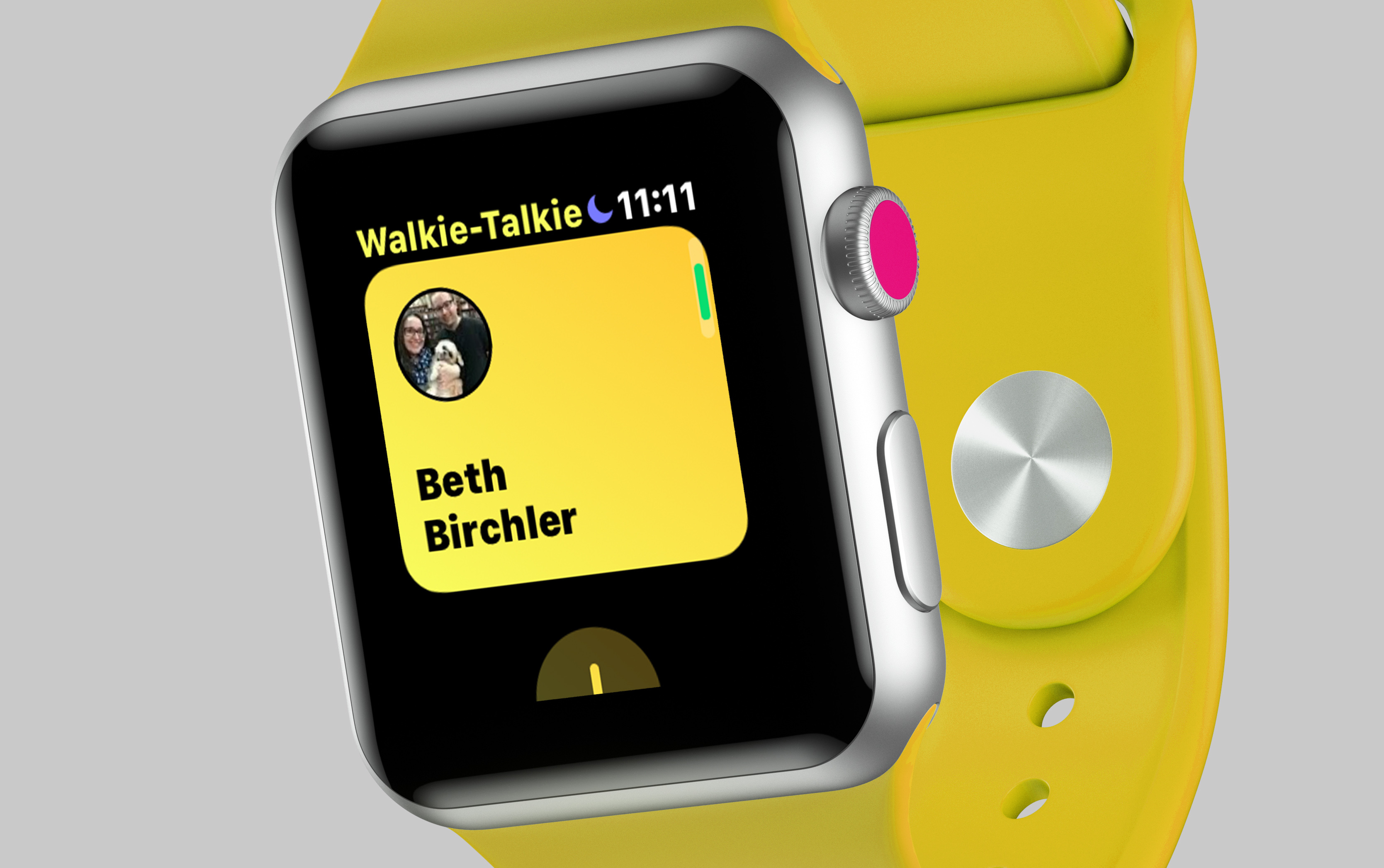
Walkie Talkie is here, and it’s good for very specific uses. You have to set a status for walkie talkie, and people can only reach you when you are set to available. This is necessary since you really don’t want to have people sending you real time audio messages just whenever. I’ve only used this a few times, but I got my wife on the beta late in the game and used it to talk to her when she was coming home from work so I could meet her by the car right when she got home. The voice message was in real time, and was a lot easier to notice than a basic text message, and required less interaction than a phone call. I get that many people won’t see the value in it, but every once in a while it has been something I enjoy having2.
You can quickly access the Now Playing screen from the watch face. Like Workouts before, Now Playing will appear on the watch face as a red icon whenever media is playing on your iPhone. Tapping it takes you to the Now Playing app, or the app for whatever is playing audio (Overcast, Castro, Audible, etc). This is way more convenient than the previous method of opening the app honeycomb and finding the app icon.
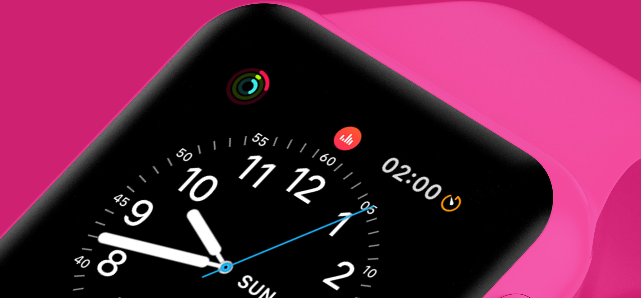
App developers can put the Now Playing screen in their own apps. This is big for workout apps, as they will now be able to show the now playing interface inline in their app, instead of having to build their own media controls, which were never as good as the stock option. Developers also have the option to style the widget with their own colors for a consistent experience with their app.
Non-Apple apps can now change the volume with the digital crown. This is the reason why I always deleted the Overcast/Pocket Casts/Castro apps on my Apple Watch before. I need to have auto controls on my watch and now that third parties can do what the Now Playing screen has always done, these apps will be able to come back to my watch.
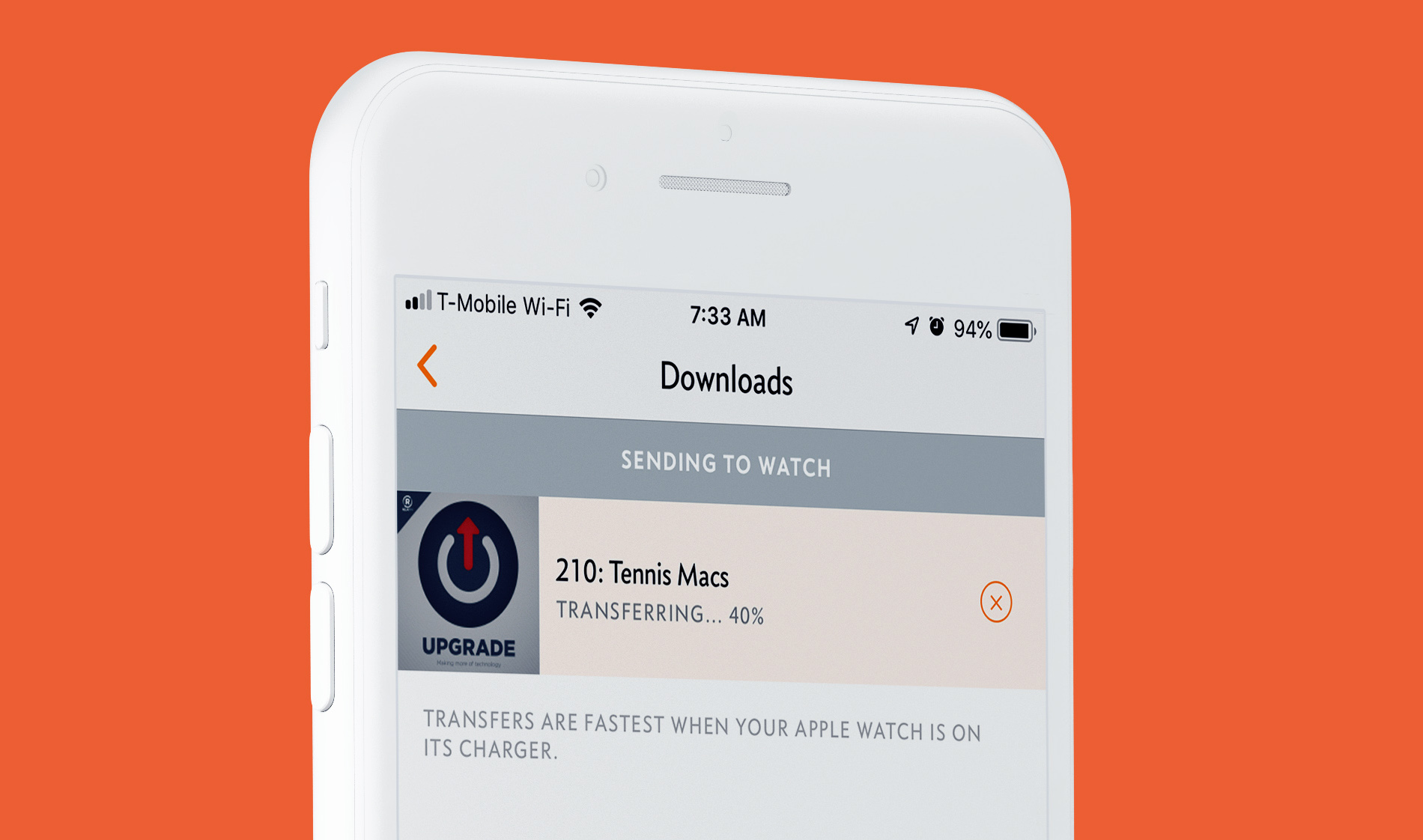
Transferring files to your watch is faster and easier to track. Transferring things from your phone to your Apple Watch was a major pain before for 2 main reasons. First, it took forever; so long that it actually felt broken most of the time. Transferring an hour long podcast to your watch could take well over an hour to finish. Second, and to make that process even worse, there was no way to see the progress of that transfer, so you never knew if it was still going, how much longer until it was done, or anything to even confirm it’s working.
Apple fixed both of those things in watchOS 5. Transfers are now much faster: I was able to transfer this week’s 87 minute episode of Upgrade to my Apple Watch in under 3 minutes. Not only that, I was able to see the exact progress of the transfer all the way through.
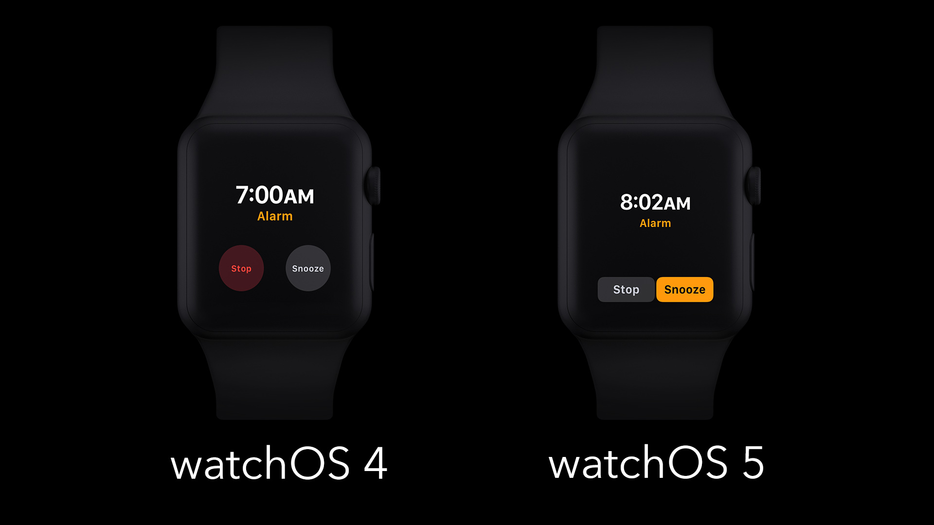
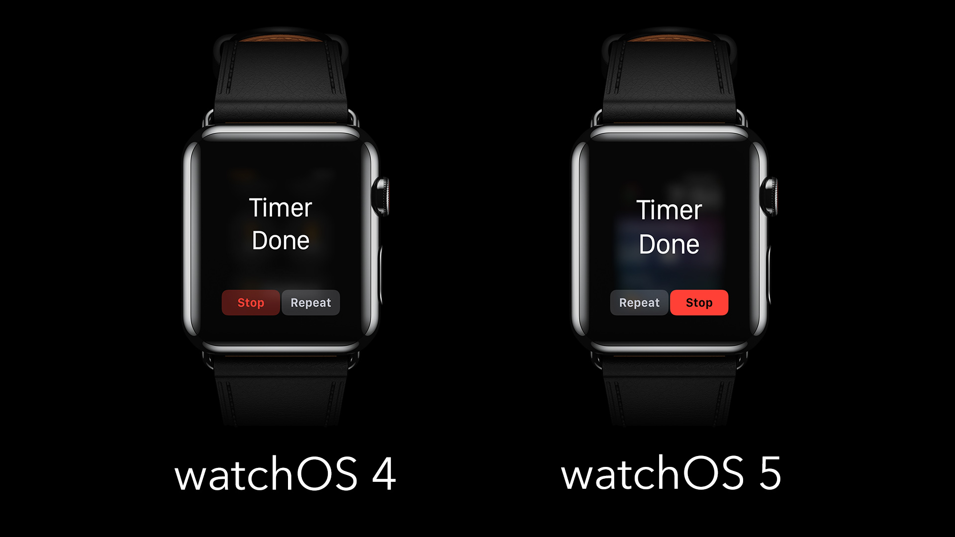
Timers and alarms have slightly different interfaces. These new apps have had their contrast boosted, a few buttons rearranged, and a few quick actions made easier. Here are a few comparisons.
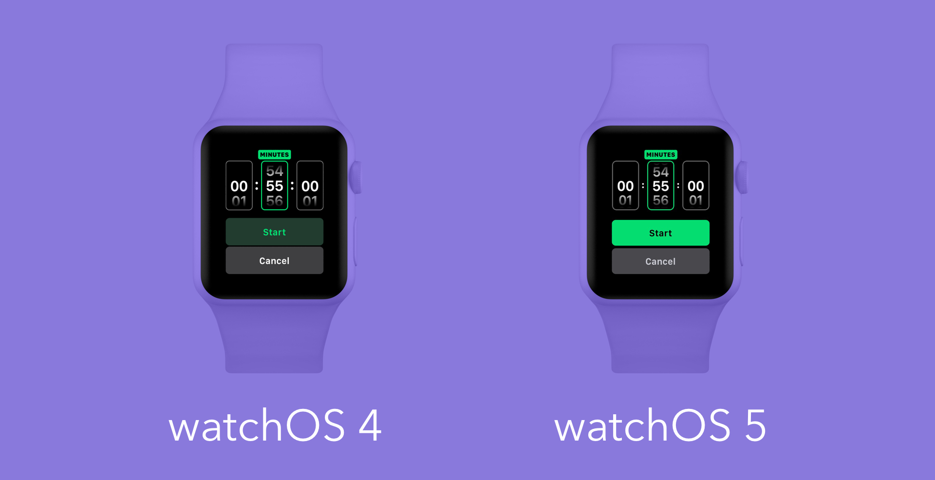
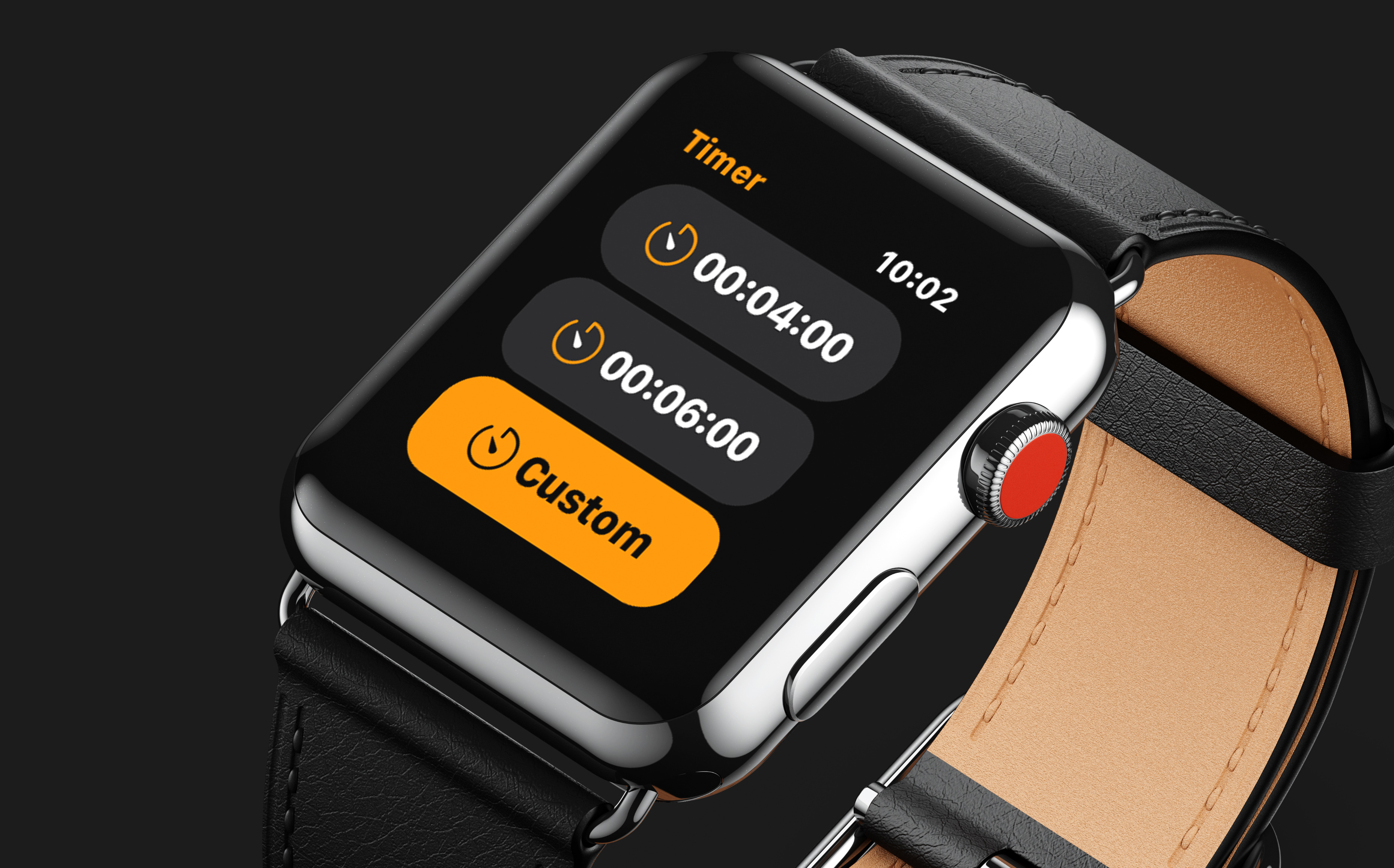
Your favorite timers are easier to set than before. Now, instead of just having the pre-suggested timers of 1/3/5/10/15/30/60/120 minute timers, you will also see up to 4 of your previously used custom timers when opening the Timer app. This will be particularly useful for those of us who use similar timers over and over again.
You can load full websites in Messages. Here’s what it looks like in practice.
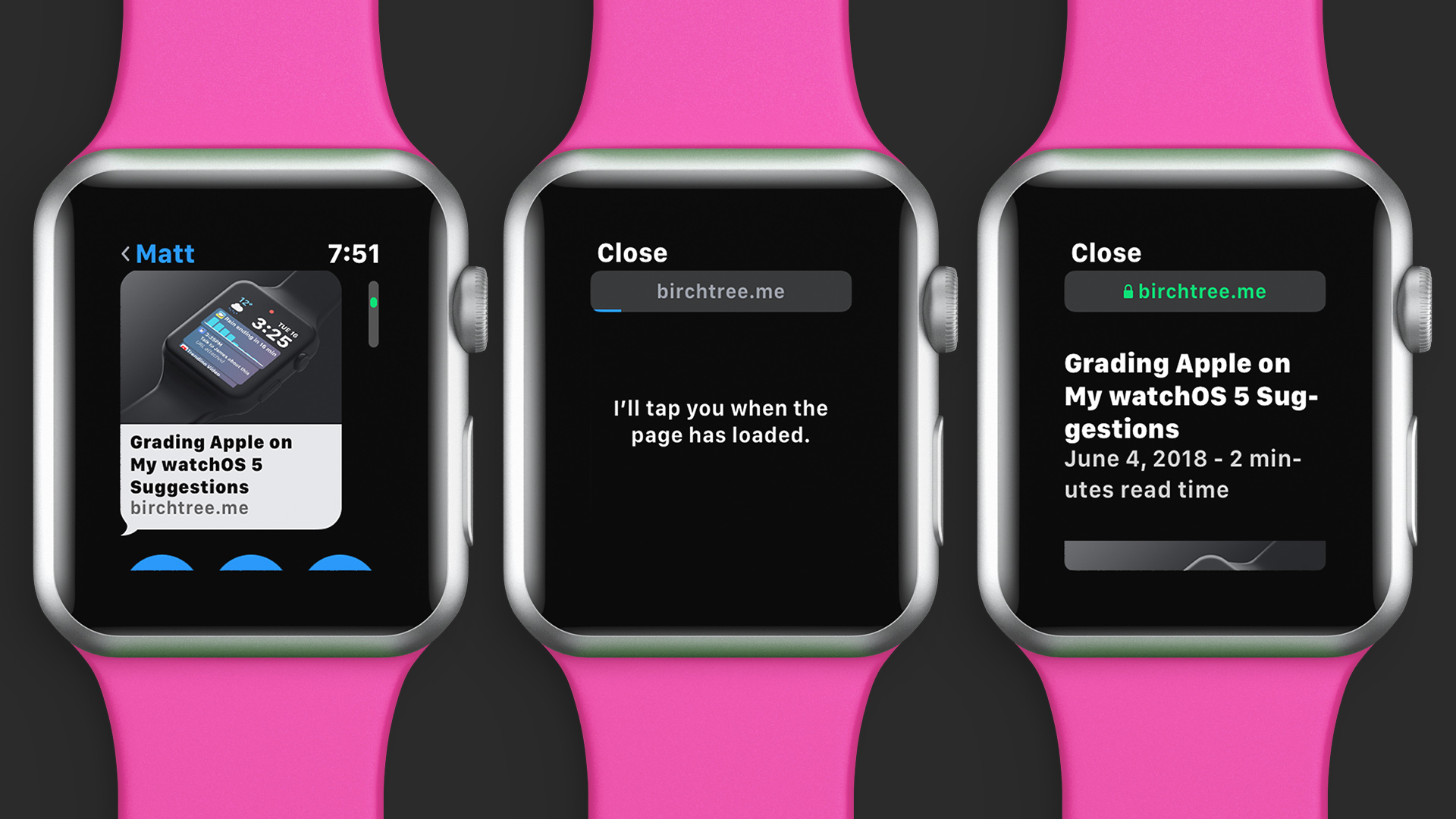
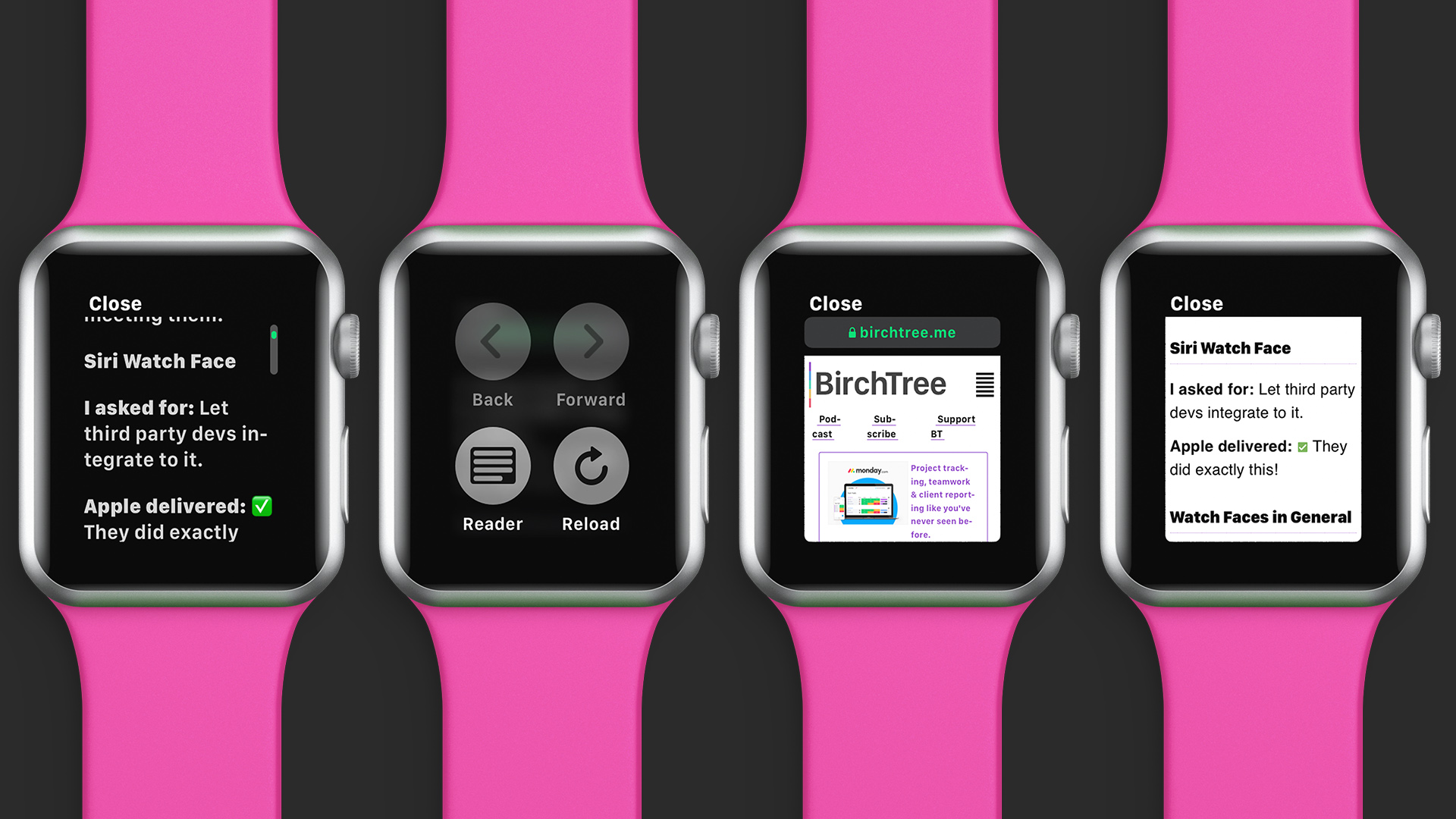
This only works in Messages and websites don’t look great in this view, but it is nice to have in a pinch. This is a full HTML web browser, so this is indeed a real website and not just a “screenshot” of the page that’s been rendered out for the watch. Yes, you can tap links and see things styled as they are intended.
There are of course limitations. One notable limit is that web fonts are not supported, meaning most websites (including this one) will not look exactly correct. Also missing are videos and service workers.
But the biggest hurdle is that websites just aren’t coded to look good on screens less than 320 pixels wide3. Apple’s solution is to display most pages in reader mode first, which will just render text and not the full styled page. In cases where this doesn’t make sense or the user overrides to the full page view, then it uses a logical pixel width of 156px and attempts to scale the content to resemble the site’s 320px width view as much as possible.
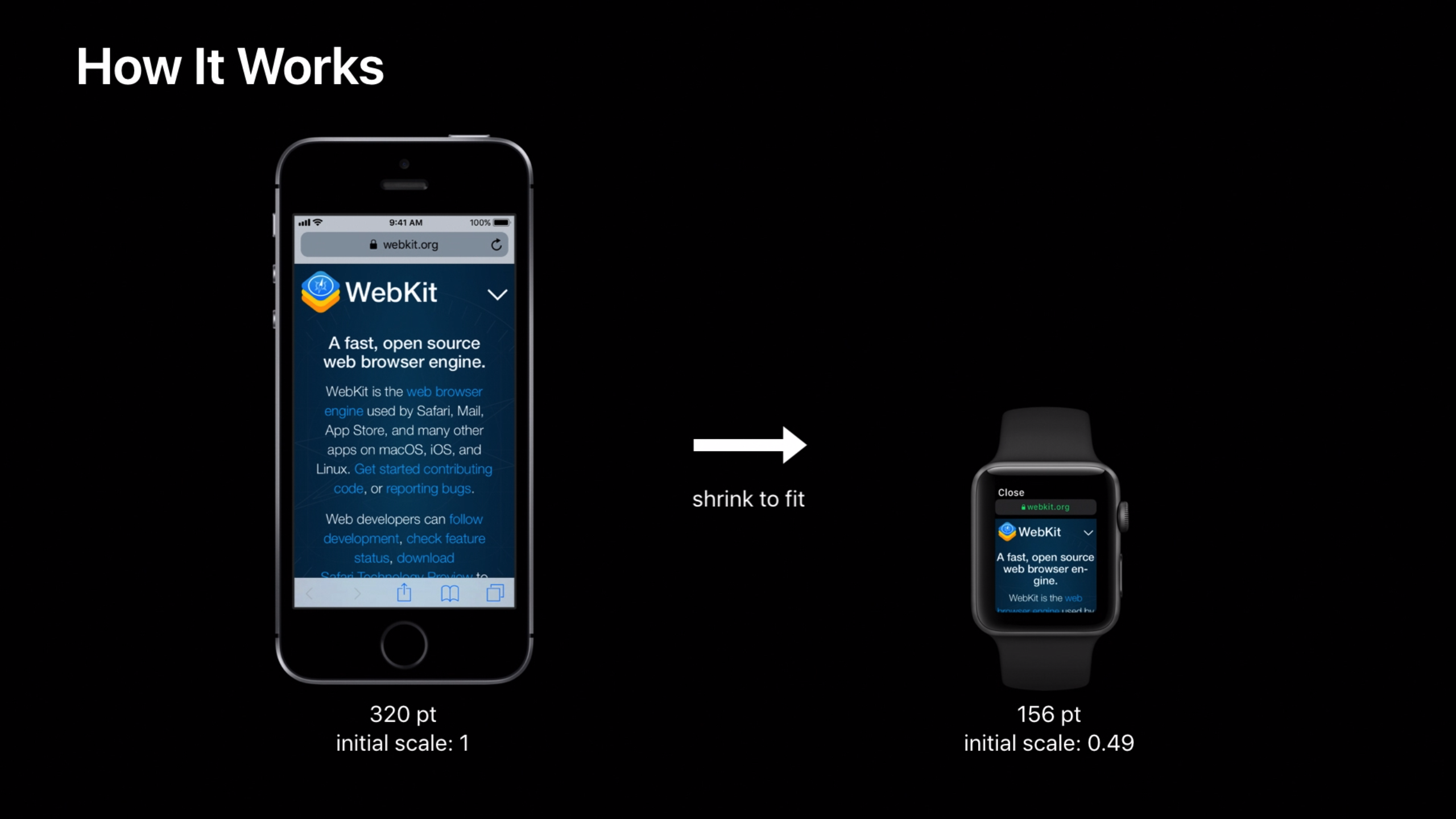
This is more or less successful in many cases, although I would never suggest browsing the web this way. It’s just a good way to see a little more content from your watch than you could before.
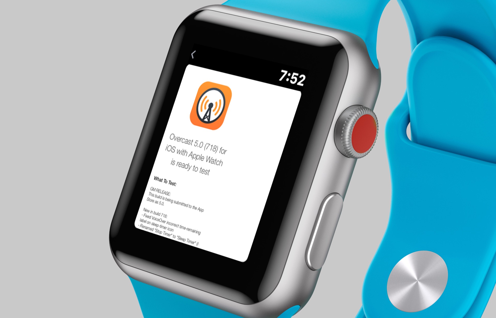
Mail can show HTML-formatted emails. Along the same lines, Apple Mail can now render HTML emails instead of just the text from them like it did previously. I actually found this to be more useful more often, as emails come in throughout the day and seeing them with a little more context is nice to see.
Control Center can be rearranged. This is a minor change, but one that you will probably use once and then never again. At the bottom of Control Center is an “Edit” button that allows you to shift these buttons around however you’d like.
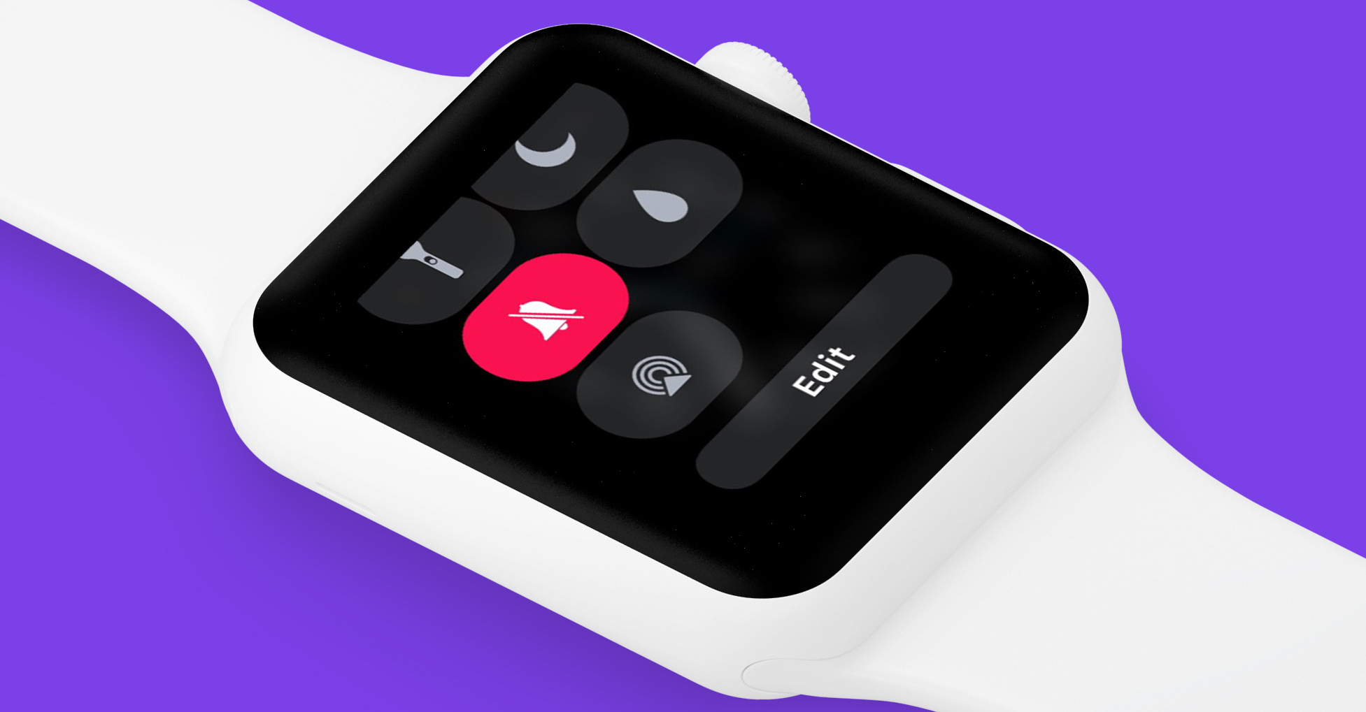
I used this to move sound, theater mode, and battery status higher on the page since I interact with these the most.
Updates will install overnight. This is not something I’ve been able to test in the beta, but watchOS 5 will give you the option to let the whole update process take place overnight while the watch is on its charger. This avoids the pain of waiting for the watch to update, which by the way is still as long as it has ever been, even on the Series 3 model.
There are some new watch faces that don't totally suck! The new ones are Breath, Fire and Water, Liquid Metal, and Vapor. The 3 latter ones have multiple color options, and you can have them randomly cycle through their variants or choose over version you'll see every time. These will go edge-to-edge on the Series 4, but they display in a smaller circle on the Series 1, 2, and 3 watches, presumably to not make it so obvious how big the bezels are on that device.
Check them out running on a Series 3 below.
https://twitter.com/mattbirchler/status/1040972426509733894
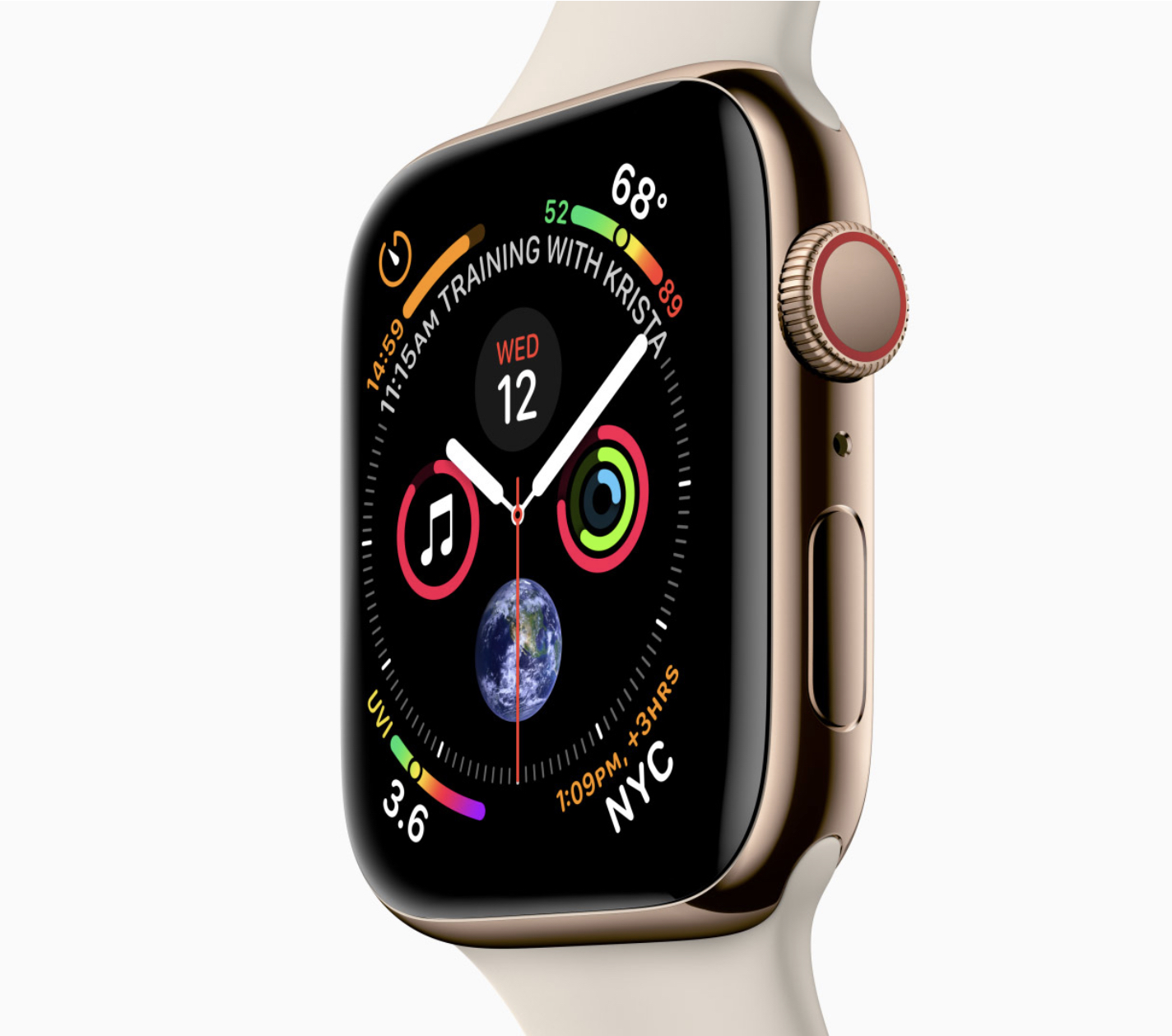
And then there are all those Series 4 enhancements, none of which I can include in this review, unfortunately. The recently announced Apple Watch Series 4 will include many changes to the user interface, and I'll certainly take a look at those when I get my hands on this new device later in the week. Oh yeah, and there is this rad new watch face:
Activity Updates
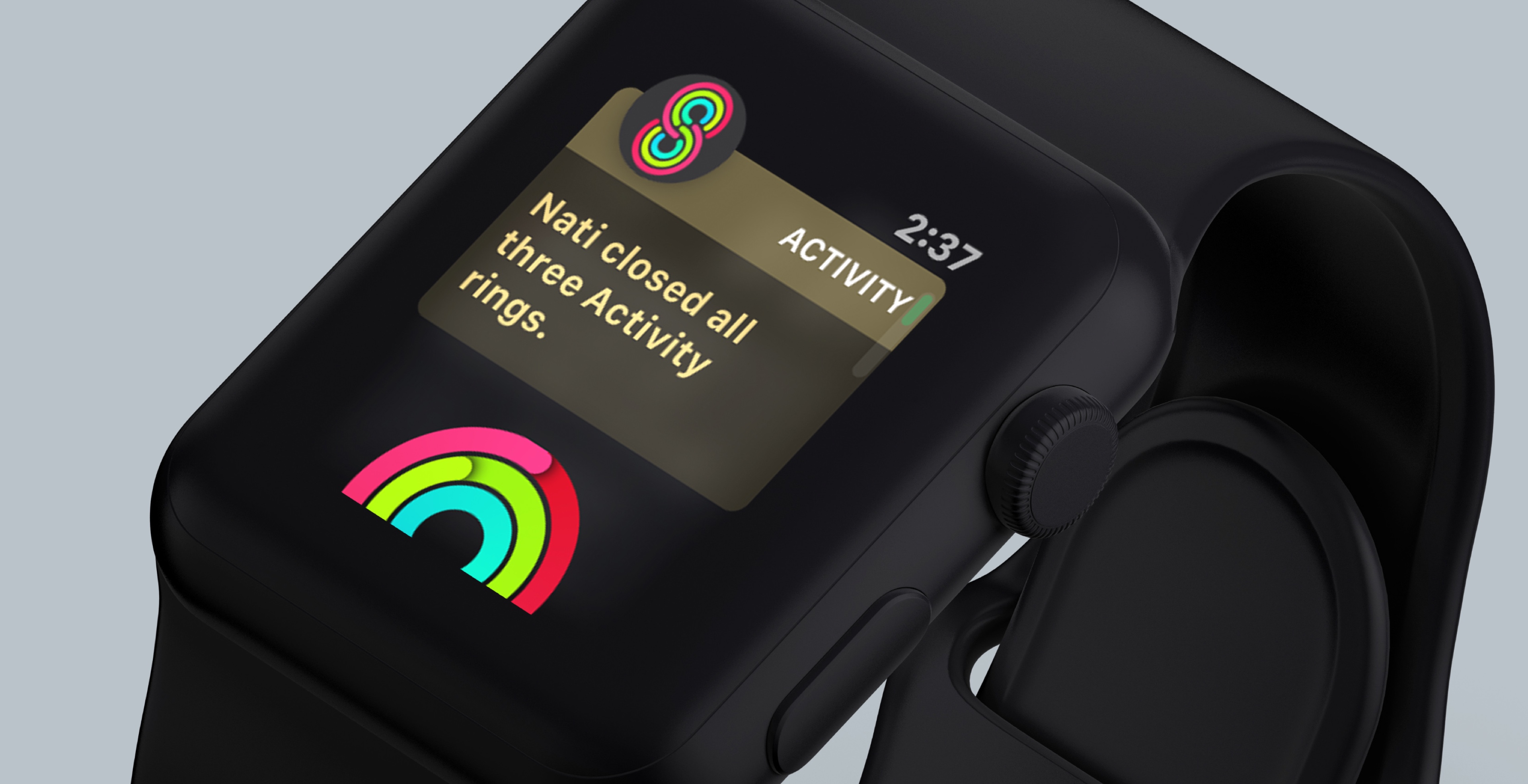
Apple put a lot of effort this year into Activity updates. As this is one of the major selling points of the Apple Watch, that just makes a lot of sense from Apple’s perspective. What does watchOS 5 bring to the table that will get people excited about the Apple Watch? Let’s take a look.
A New Workouts API for Developers (and Apple)
Trust me, this is a little nerdy but you care about this one! Previously, Apple had a workout API that third party developers could use, but it wasn’t super easy to use, was a little flaky, and was not what Apple themselves used for their own Workout app. This changes in watchOS 5, as not only has Apple created a new API for third party developers to use, but they have rewritten their own app to use it as well.
What does this mean for you, the end user? It means that third party apps like RunKeeper, Nike Run Club, Strava, and more can use the same data Apple uses. This is good because that data is easier to process so you are more likely to get better workout data from these apps.
Apple has also done something cool with how workout data is collected. To make sure that you never lose your workout data because of an app crash, they have updated the data collection this year so that even if your workout app crashes, the workout data is not lost. If you are in the middle of a run in RunKeeper and Runkeeper crashes, watchOS 5 will detect that, relaunch the RunKeeper app automatically, and feed it back the workout data so that it can pick up where it left off. It’s a really cool solution and one that workout apps get basically for free, so you can feel comfortable using whatever app you’d like now, not just Apple’s own.
Competitions
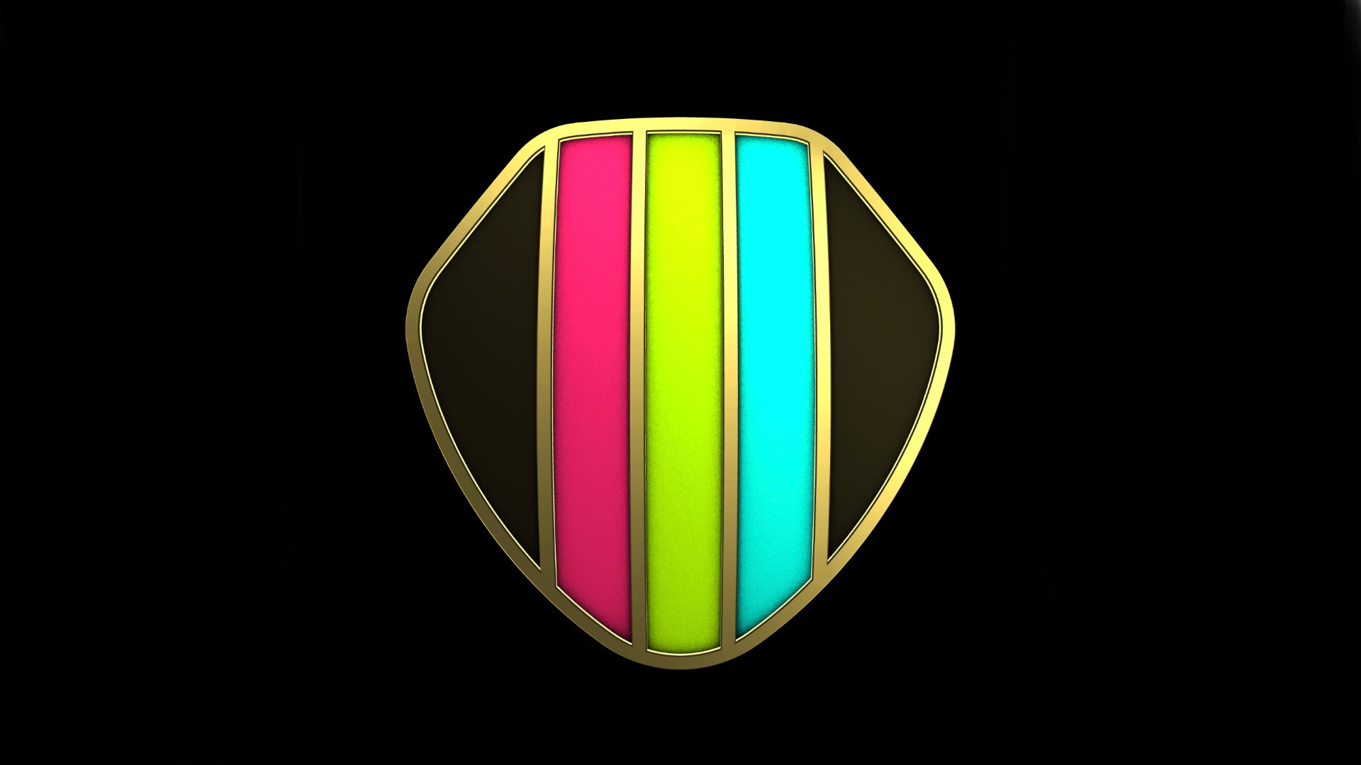
While the enhanced workout API is a great technical enhancement, the biggest user-facing update in my eyes is competitions, which lets people compete with one another to see who can be more active over a 7 day stretch. You can compete with anyone your have set up as a friend in the Activity app, and the competition is based on a point system, not your raw calories, active minutes, or steps taken. Essentially, points are the percentage of your daily move, exercise, and stand goals that you achieve. So if you do 120% of your move goal, 90% of your activity goal, and 100% of your stand goal, you’ll get 310 points (120 + 90 + 100 = 310). This acts as a good leveler so that the score is based on how you push past your own goals, not just who takes more steps. So if you want to challenge your marathon-running friend to a competition, you can stand a fighting chance, even if you associate the word "marathon" with Netflix more than running.
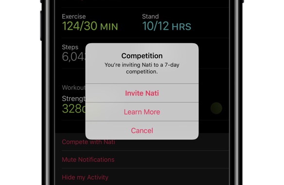
Inviting someone to a competition is easy enough, as you just need to tap their name in the Activity app on your iPhone and select the new “Compete with XYZ” button. The other person gets a notification on their watch that someone wants to compete with them and they can accept or reject the offer. If they accept, the game is afoot and the competition starts the day after they accept. Keep this in mind, as I once asked to compete with someone, saw they accepted, and went for a 10k run, only to find out that my epic run, which left my legs useless for a couple days, would not count in our contest.
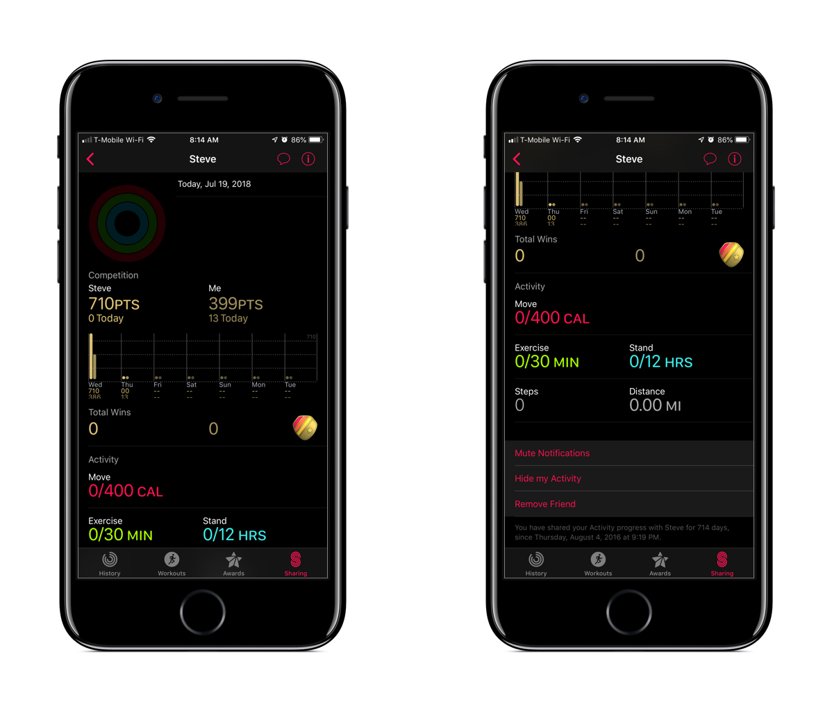
For the 7 days that the competition is running, you can check your progress in the Activity app on the iPhone. Somewhat humorously, Apple gives you an option to remove friends from Activity sharing right from the competition screen. So if someone is really trouncing you, you can…uh…cut them out of your life???
You will get notifications throughout the week to let you know how you’re doing compared to your competitor, and at the end there are awards to be handed out. You will always receive a badge for completing a competition, whether you win or lose, but the winner will get a second badge called “Victory over XYZ”. I don’t want to get into it too much, but there are quite a few people who have a “Victory over Matt” badge in their collection today.
One big miss with this feature is that you can’t do larger competitions. My favorite Fitbit competitions were where we had 8-10 people competing together. It was more fun than a one-on-one battle because you didn’t have to beat everyone to feel like you were doing well. With one-on-one competitions, you either win or lose, which isn’t as exciting to me.
I also wish you could configure your competitions more. Right now it’s always a 7 day competition with points as the metric. I’d like to be able to do one day competitions or even one month ones. I’d also like to be able to choose what metrics we’re competing on. How about something weird like a stand competition? Or just a competition on how many active minutes we can have, or an old-fashioned steps battle?
Auto Workout Detection
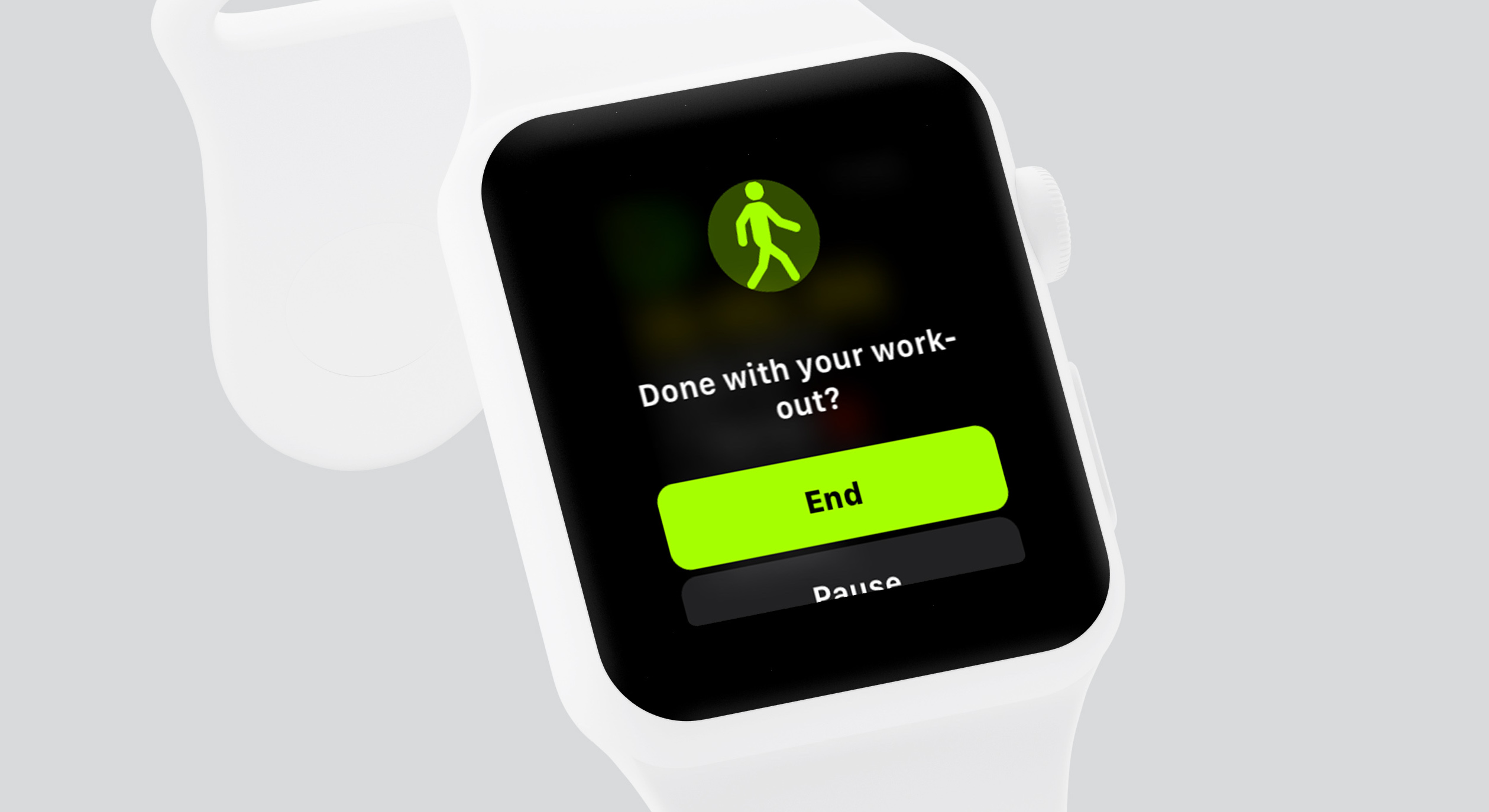
This is a really cool feature that I would have loved to see Apple prioritize earlier, but I’m happy it’s here now. The watch will now detect when it thinks you’re working out and will prompt you to start a workout. In my experience, it does a pretty good job of figuring out what type of workout I’m doing. Whether I’m walking or running, it seems to get it right every time. I also do strength training workouts and it has never detected those, so I’ve had to start those manually. Considering that workout is under the “other” category, I’m not really surprised it doesn’t figure it out.
Usually it just takes a few minutes of working out for it to notice that you’re doing something and present the notification. The good news is that it gives you credit for the entire workout, not just from when you confirm you are indeed working out. So when it asks you 5 minutes into a run if you are indeed in a workout, you get credit for the time, distance, and calories burned for those 5 minutes. It’s pretty slick.
On the other end of the spectrum, the Apple Watch will detect when you’re done working out. This is a little less magical, as it takes longer than I’d like to notice that I've stopped. Usually it takes 5 minutes or so from when I actually stop a workout to when the watch asks if I’m done. Additionally, when I tell it that I was done, it counts the workout as done when I tapped the confirmation, not when I actually stopped working out. I get that they probably don’t want to accidentally guess wrong and delete some of your actual workout time, but a little interface to choose how long ago I stopped working out would have been nice. This is really only a problem with getting an accurate pace for a run.
This is absolutely a win overall, though. The auto-start means that I no longer lose workout data when I forget to start one, and auto-stop means I no longer have accidental 3 hour walks in my history when I forget to stop them.
The Small Stuff
There are some smaller updates to Activity that might be notable. First, there are 2 new workouts, yoga and hiking. I don’t do yoga, and I don’t hike, so I’m not the target audience for these. Hiking is like an outdoor walking workout, but it also tracks elevation changes. Yoga acts basically like a generic workout (time and calories).
One feature I really enjoy is the recovery heart rate tracking, which will show you how your heart rate changed in the 2 minutes after your workout ended. It's interesting to see how quickly my body recovers from a hard workout. This will show up automatically on the Siri watch face once the data is collected, and it will be saved to the activty itself so you can always view it in the Activity app on your iPhone.
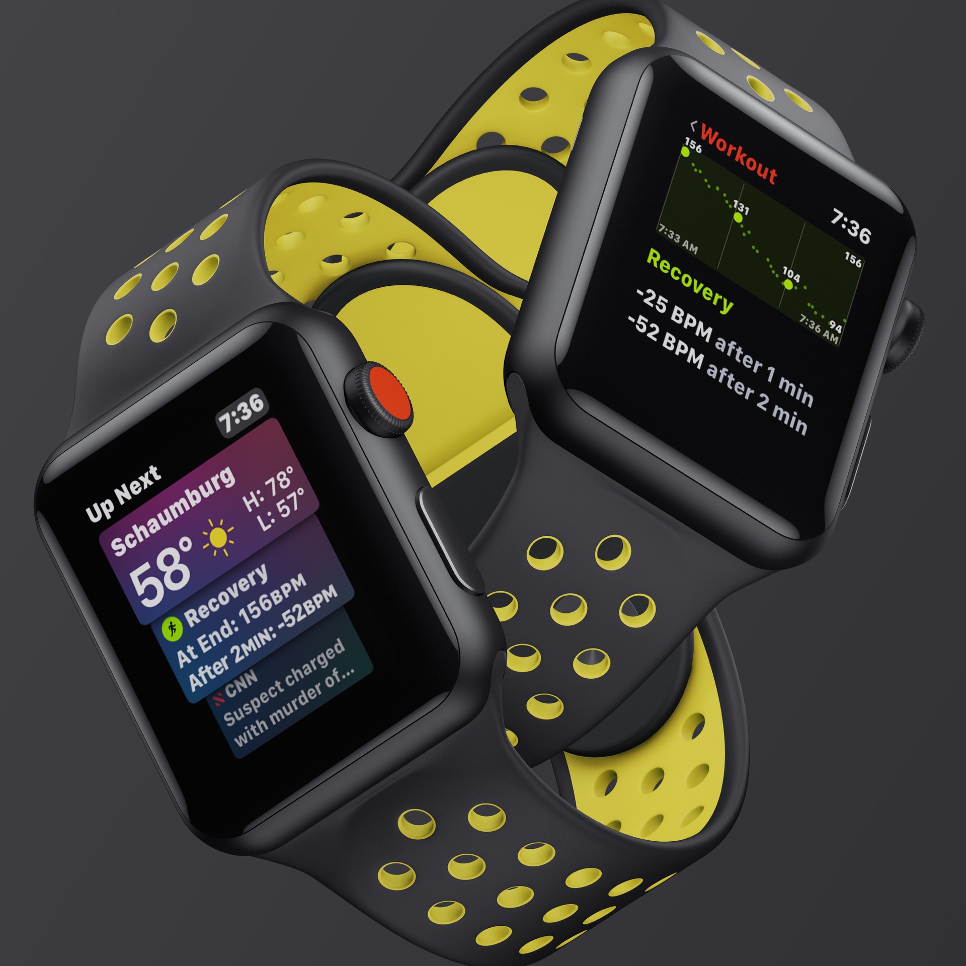
There are updates to running workouts as well. You can now show your cadence (steps per minute) during the workout, which is important to some runners, and you can also show your rolling mile (or km) time.
There are new workout and activity animations throughout the watch apps. There are new details in the stick figures that animate while you’re doing a workout, and there are new variants of the “you filled your move ring” notifications when you achieve 200% or more of those goals. They’re cool and unexpected, and I love them. Apple is definitely into particle effects, because they’ve got all of them cranked to 11 for this release. I could not capture these on video for the review, so you should go out and crush your move goal to see these.
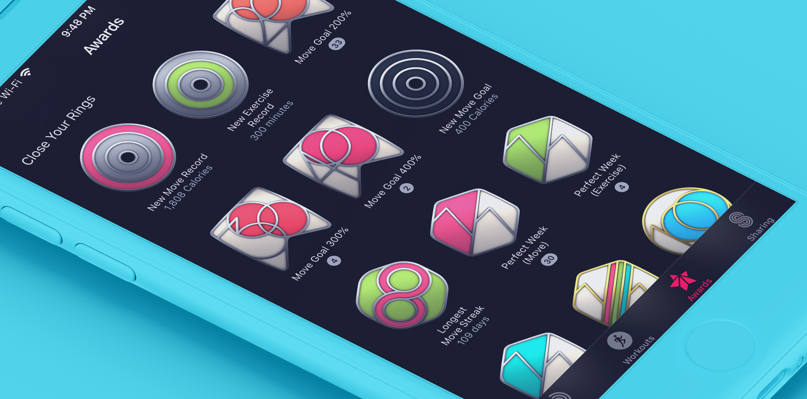
And finally, the awards page in the Activity apps got a small update. The page is much better laid out, with all of your badges organized by type. Your most recent ones are at the top, but then you have ones you earned from competitions, limited editions, monthly challenges, and the like. The page also shows you when you earned a specific badge, while “personal best” ones will show you what your best actually was (ex: 300% of your move goal).
Siri Watch Face
The Siri watch face was one of my favorite additions to watchOS last year, and I’m extremely happy to see that they addressed a bunch of my issues with that version in watchOS 5.
New Look
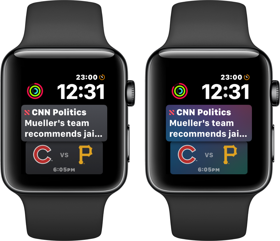
The classic Siri color scheme is cool, but it’s not everyone’s cup of tea. To combat that, Apple has added a grayscale theme for the face, allowing you to have a more subtle look. It's not a huge change, but it might get a few more people to feel okay about using this very cool watch face.
Sports
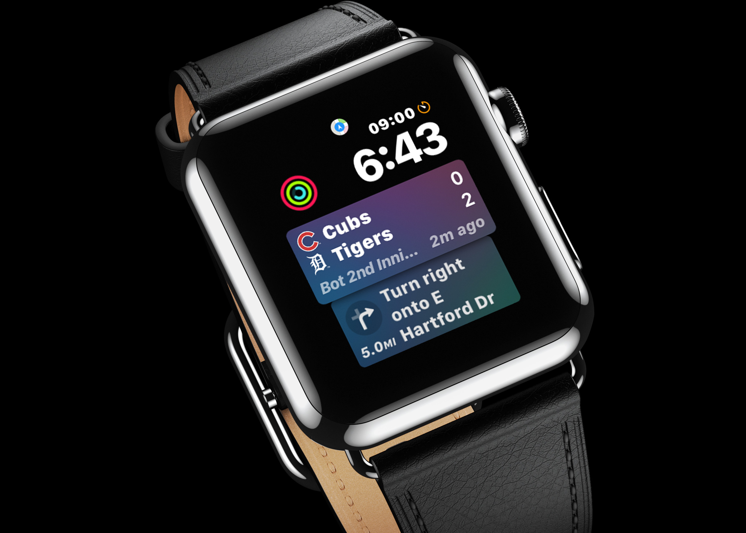
This is kind of a weird one, but I’m happy to see cards about my favorite sports teams appear on the Siri watch face. It’s weird because your favorite teams are set up in the…TV app. You’d think this might be in the main settings app or something, but yeah, any teams you have set as favorites in the TV app will show on your Siri watch face when they have games going on.
You will get cards that show when the next game is. It was baseball season during the beta, and because I told the TV app that I like the Cubs, I got cards showing when and who they were playing almost every day of the summer (because baseball’s crazy like that).
If you turn the digital crown to see further into the future, you can see upcoming games as well, which I find more useful now that the NFL season is upon us and I constantly ask “who are the Packers playing this weekend?” Siri can also tell me this, but it’s not always convenient to ask Siri a question, so having it easily accessible is nice.
Finally, and kind of the coolest feature, is that if my team is in the middle of a game, I’ll have a card near the top of the “pile” that shows the current score and time remaining. This isn’t a totally live score, as the card seems to update every 5-10 minutes or so. If you want to know what happens every moment, this won’t be good enough, but it’s perfectly fine for keeping tabs on a game. Fortunately, the card tells you how many minutes ago it was refreshed, so you always know how close to real time you are.
Third Party Support
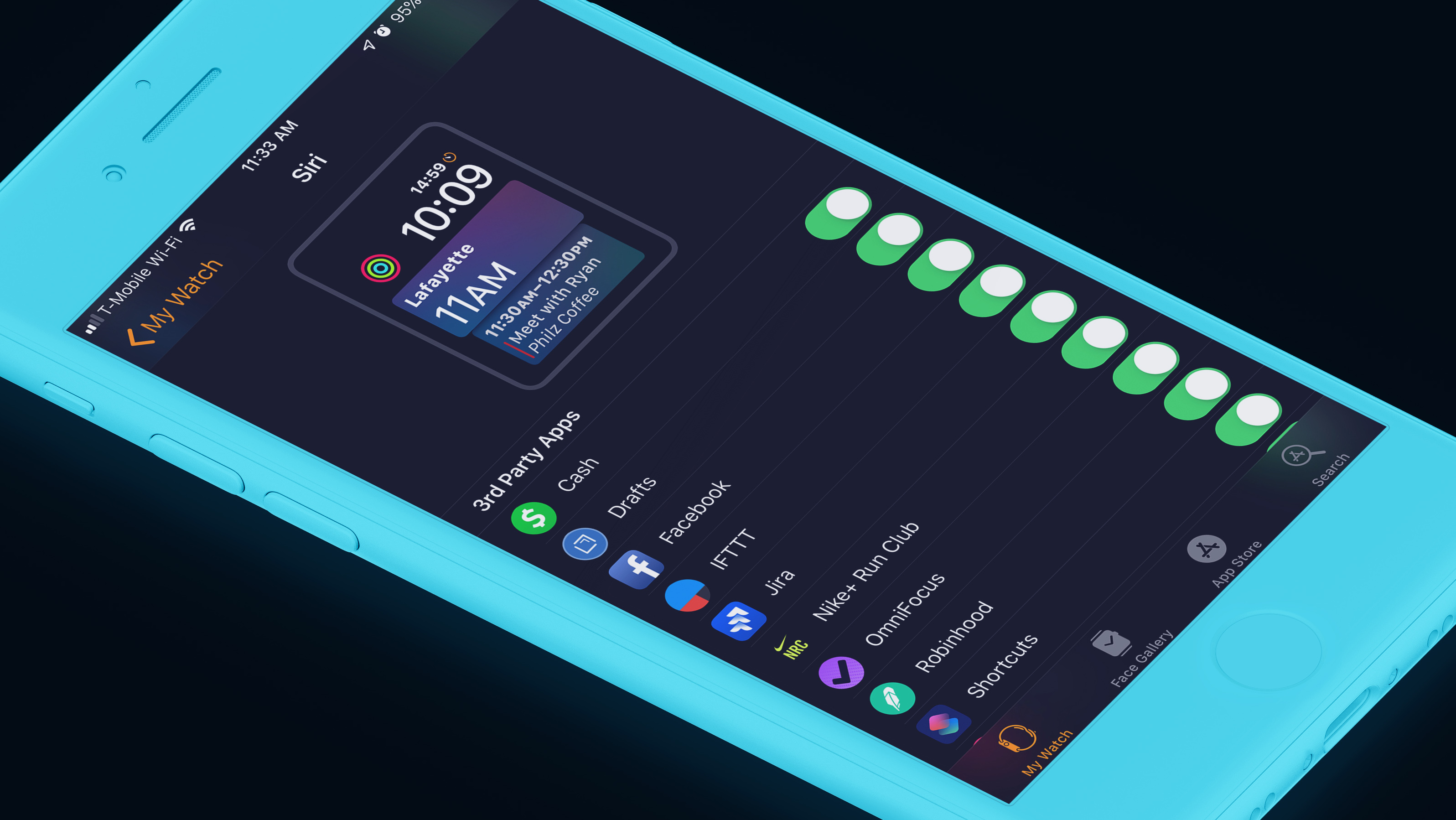
This is the real winner here, and it’s exactly what I was hoping for when I reviewed watchOS 4 last year:
To be truly useful to everyone, Siri is going to need to start supporting non-Apple apps. During this beta I have moved more of my workflow to Apple apps so that I can get more value from the Siri watch face, but I shouldn’t have to change how I work to get the most out of this feature. It seems like we’re on the cusp of Apple opening Siri up to more and more app types on iOS, and I can only hope that will be followed in suit by Siri on the Watch. [...] Having calendar events and todo items appear here as needed has been fantastic, but I crave more.
Happily, Apple felt the same way and has opened up the Siri watch face to basically any app that wants to use it. Even before the official launch of watchOS 5, I’ve seen over a dozen apps show up in the “data sources” section of the watch app on my iPhone. These range from OmniFocus, Facebook, Jira, Overcast, Shortcuts, WhatApp, and more. App developers still need to do some work to actually make their stuff show up there, but it seems pretty trivial to do so. Developers can’t force things to show up on the watch face, but they can tell the system “hey, I have something the user might want to see around 3PM” and watchOS will decide whether that thing is worthy compared to what every other app wants to show at that time.
The only third party app I’ve been able to use that does this already is OmniFocus, which just so happens to be the task management app I use already, and its integration is everything I wanted. If I have a task due soon, it appears on my watch face, complete with the name of the task and when it’s due. I can tap straight into the task from the watch face and mark it cleared quickly.
Apps can also make themselves appear based on your location. For example, Starbucks can have its card appear when I'm close to one of their locations and allow me to pay quickly. Siri Shortcuts work with this too, and I have seen my "At Work" custom shortcut appear when I pull into the lot at work in the morning. It's super slick.
Enhanced Functionality
Previously, tapping a card on the Siri watch face would launch the corresponding app. Now that Siri has “intents” and “actions” developers can streamline this process even more.
Cards can still take you into the app, but if at all possible, Apple is suggesting apps allow you to simply tap the card on the watch face and then perform the action. This lets you do things like toggling your "Good Morning" HomeKit scene when you wake up with a single tap on the watch face. Similarly, task managers could display a task that's due and then allow you to tap it once to mark it as complete.
Actions that involve things you may not want to do on accident can display a confirmation message on screen that shows you a little more detail and lets you approve the action. For example, you could have a Starbucks card that says “Order your normal coffee.” When you tap this, you probably want to confirm the order, so Starbucks can have a pop up that shows a picture of the drink you're ordering, some text describing the specific drink and size, and buttons to approve or cancel the order. When you approve, the pop up simply drops out of view and you’re back on the watch face.
Podcasts
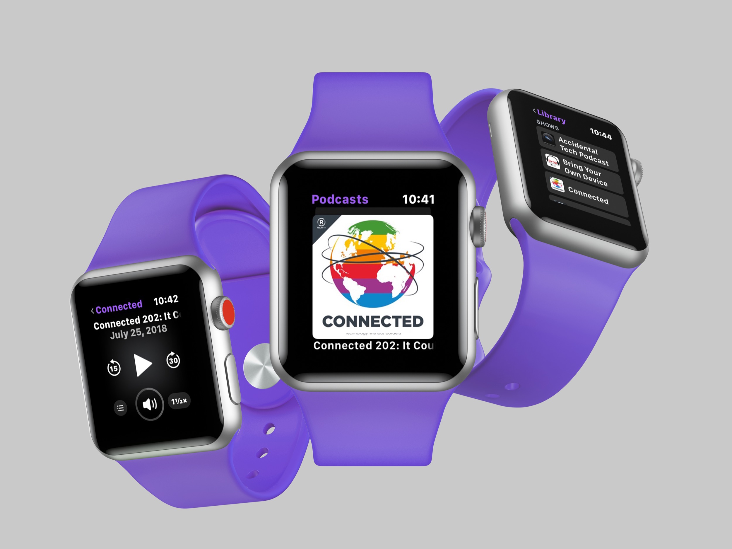
Apple added some really nice features for apps that deal with “long form audio” in watchOS 5. Part of this is Apple is finally bringing their own Podcasts app to the Apple Watch, but they’re giving all developers the tools they need to make truly top-class apps themselves.
Native App
The big news for most people is that the native Podcasts app, which is by far the most popular app in the world for listening to podcasts, is now installed on the Apple Watch. The good news: it works great!
The Podcasts app is my 4th favorite podcast app for iOS (behind Castro, Overcast, and Pocket Casts, in that order) but using its Apple Watch companion over the past few months has been almost uniformly excellent.
If you have used the Apple Music app for watchOS then you know what you’re in for here. Like Apple Music, you can browse your collection (of podcasts, in this case) and easily pick a recent episode to listen to. iOS and watchOS will coordinate while you’re on WiFi to sync episodes over to the watch so you don’t have issues if you lose internet access. The sync is not immediate, and as with all iPhone-to-Watch communication, this takes a long time.
The good news is that the Podcasts app for Apple Watch has full internet access and can stream episodes if you have not synced them already. This is nice on the standard Apple Watch, but it’s amazing on the cellular model. I have taken up the habit of going fo runs with just my Apple Watch and AirPods. I don’t worry about syncing first or anything, I just know that my current queue of shows will be there. If they haven’t synced yet, no problem, they’ll just stream over LTE and I won’t even notice the difference.
In addition to shows you have already subscribed to, you can also ask Siri to play any episode you’d like from the iTunes Podcast library4. Just like on the iPhone, it’s hard to get a specific episode to play besides the most recent episode, but I have found I have almost always been able to play whatever I wanted with Siri.
In terms of controls, Podcasts really only lets you change the playback speed in the app. Chapters and episode notes are nowhere to be found. I get that notes aren’t there, but I really wish there was a way to skip to the next chapter with a tap or two. Hopefully third party apps will get updates to support some more advanced podcast features for people like me.
For most people, this new app will solve the podcast problem with the Apple Watch. It’s not perfect, but it’s good to see Apple’s first effort here turn out quite well.
Third Parties Can Actually Make Good Podcasts Apps!
As mentioned above, Apple has also added hooks for developers to use to build their own first-class podcast apps. There are a few keys here:
First, apps can now play background audio and know that the system will not kill them a few moments after the user’s screen turns off. It will also let these apps access the standard watchOS system process of playing audio. That sounds a little weird, but the gist of it is that your favorite non-Apple podcast apps can now make apps that work great when your iPhone is not around.
Transferring data between the iPhone and Apple Watch has traditionally been terribly slow. It was slow for smaller files, but it was excruciatingly slow for larger files like podcast episodes. There were apps that let you sync audio files to the watch, but the process was so incredibly slow, and the user never knew how far along the sync process was. You basically saw when the transfer started and then when it ended. The problem is that these transfers took upwards of 30 minutes sometimes, and it was impossible to know if it was still going or if it was stuck.
As mentioned in the "little things" section of this review, transfer speeds are much faster than before. Because of that, I'm now able to sync an hour long podcast to my watch in a few minutes rather than an hour or more. Overcast, the popular podcast app, takes advantage of this improved speed and also displays the transfer progress so you know exactly how far along your sync is.
Overcast had syncing to the Apple Watch for a few months last year and the feature was removed because users hated it and there was nothing the developer could do to make it better. Syncing now works far better and I think users who were let down by the feature the last time it was added to Overcast will be very happy with this implementation.
Finally, podcast apps now have better media control options and they can even control system volume with the Digital Crown. This is far better than the previous custom playback controls apps had to make, all of which were too limited and slow for most people. Now, developers will be able to make better media controls. Or if they’d prefer, simply drop in the system Now Playing screen into their own apps and let Apple handle everything. I used to uninstall all podcast apps from my watch because the apps lacked volume control and were slower than the standard Now Playing app. Now I'm using the native apps and they're working great for me. Playback controls are just as fast as the Now Playing app and volume controls are just as easy to use.
Notifications
Many of the updates that notifications got in iOS 12 have also been applied to watchOS 5. Grouped messages, muting, do not disturb, it’s all here, as well as a few watch-only bonuses.
Grouped Notifications
Notifications from the same app will now have their notifications grouped to save you space and improve the overall organization of what’s coming into your watch. I like this feature a lot, especially when it comes to things like Twitter, Activity, and Messages notifications, which tend to come in quite fast sometimes. Having each type of notification grouped together means I can more easily find what I’m looking for instead of scrolling and scrolling and scrolling and…
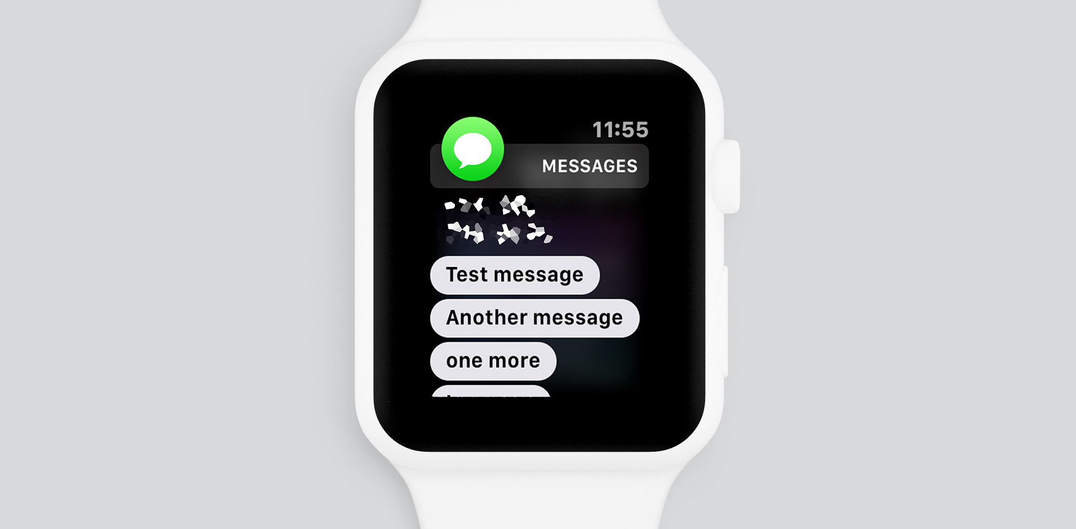
Another related improvement is that when you are looking at a notification and another one for that app comes in, the new notification will be appended to the one you’re already looking at. This is more noticeable in messaging apps where I can be looking at the last message someone sent me, a new message can come in, and it’s just added below what I'm reading. Previously, this would take over the entire screen as a new notification, making it hard to read in some cases. Apple's Messages app did this before, and now all messaging apps can do it as well.
Managing Notification Access
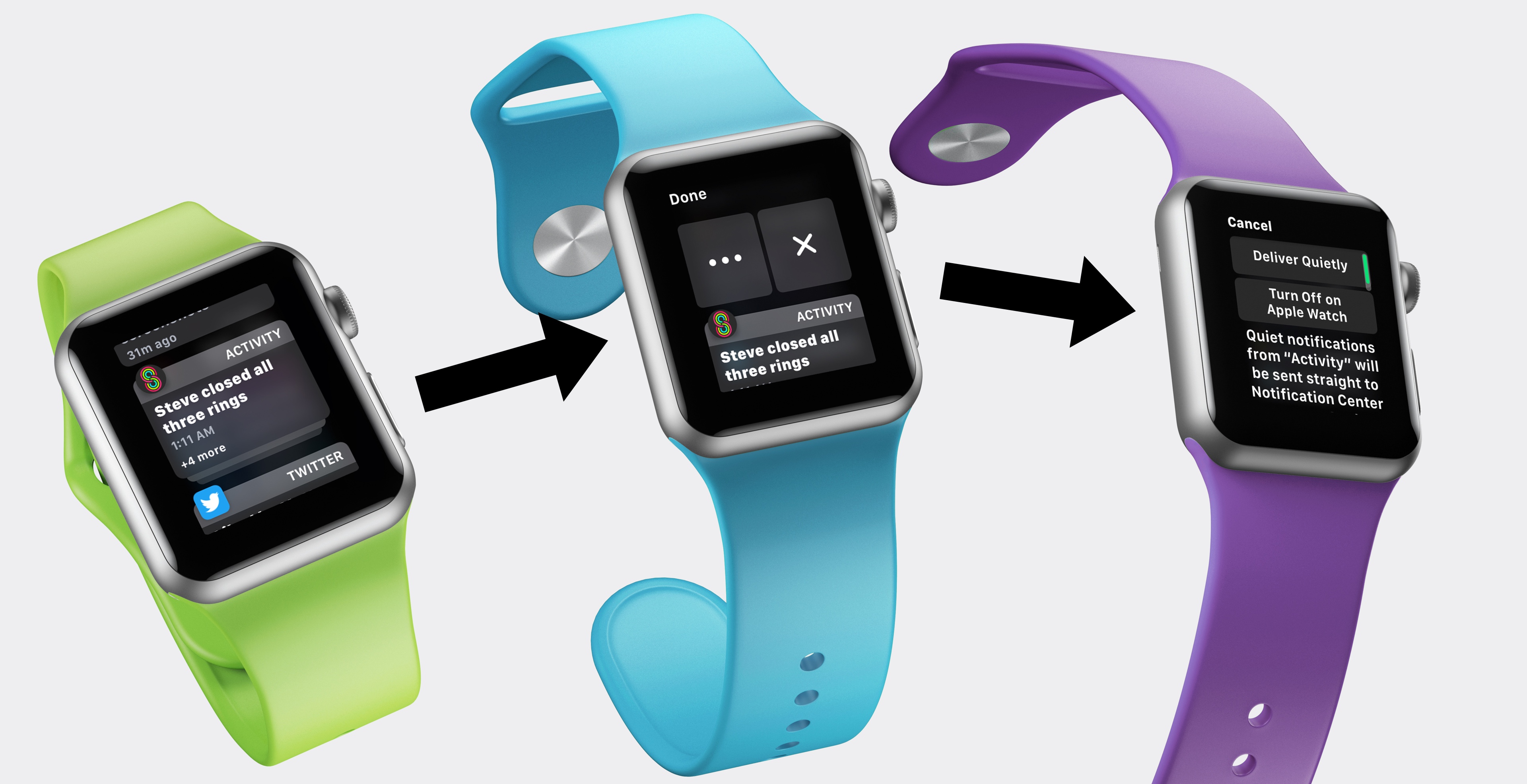
Also new is the ability to manage specific app notification permissions from each individual notification. Simply swipe left on a notification and tap the 3 dots to change its permissions. You can say “deliver quietly” which will make it appear in your notification center on the watch, but it won’t buzz you or make noise when it comes in. Alternatively, you can select “turn off on Apple Watch” which will simply make it so that app never even gets to your wrist. This doesn’t turn it off for your phone as well, so keep that in mind.
Critical Alerts
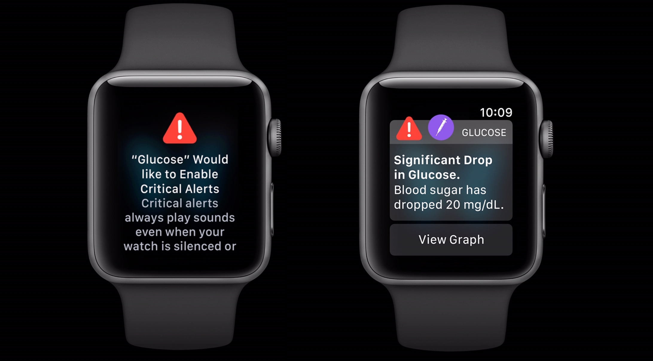
”Critical Alert” is a new notification type that will do a more prominent buzz to get your attention, and can even make noise even if the watch is silenced. You need to approve each app’s ability to do this, and it’s a separate permission from normal app notifications.
Most apps should not need this, but it can be useful for things like health apps which may want to give you a critical alert when your heart rate starts doing something unexpected. I could even see some task managers using this to really, really let you know that it’s time to do something.
Inline Actions and More Dynamic Content
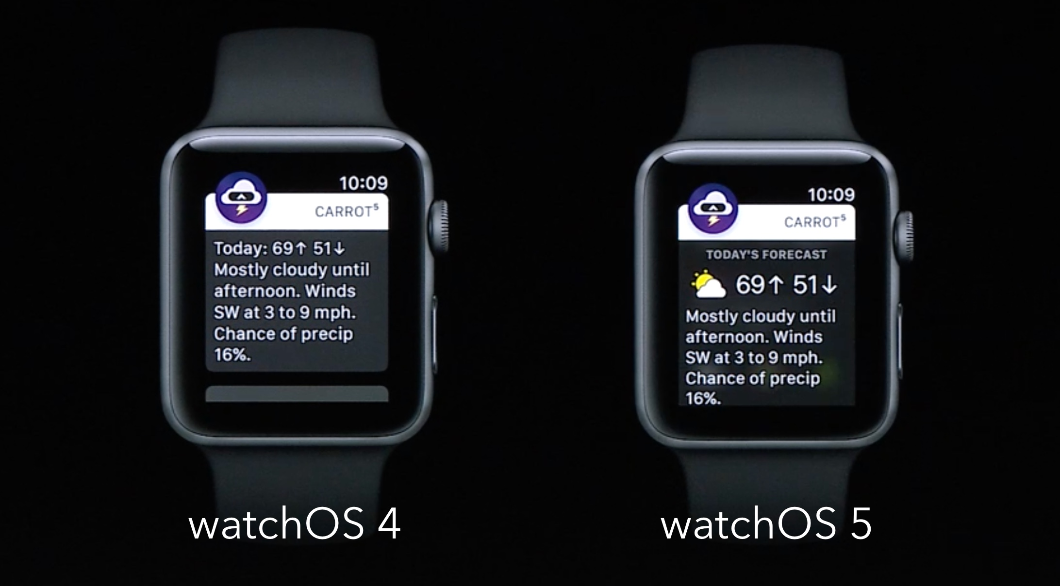
Apps have always had to include text and some basic images in their notifications, but this year Apple is allowing even more here. Apps can now display interactive content in notifications, including things like buttons that the user can use to execute actions. Previously, doing something like this would send the user to the watch app and the action could actually take place, but this year developers can indicate they just want to perform whatever action the user wanted right from the notification and not launch the app at all.
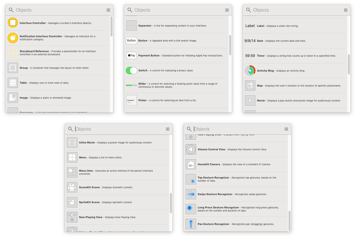
Additionally, apps can present more elaborate things in their notifications. Instead of just text with an optional header image, there can now be video, dynamic text sizes, custom fonts, and even some interactive UI elements like buttons, payment options, sliders, and gesture recognizers.
These functions were specifically called out by Apple as a reason that watchOS 5 no longer runs on the original Apple Watch models. The computational power needed simply wasn’t there. By knowing they’re only running on newer devices, they were able to blow out notifications a ton.
What’s Missing?
Apple hit most of the big things people were asking for with this release, and I’m struggling to find much to be disappointed about, but there are a few things that I wish we had seen.
As ever, I’d like to see more watch face options, specifically by allowing third parties to build their own. I wish I could freshen up the look of my watch more often.
I also wish that there was some sort of always-on functionality with watch faces. The OLED screen on the Apple Watch is primed for always-on faces and the battery on my Series 3 lasts about 2 full days, and I’d love to be able to use these to see the time even if I don’t turn on the screen.
More workout types would be great too. Moving the lawn and shoveling the driveway seem like ones that could get lots of use, but for now it’s setting a generic workout type for another year.
I wish there was sleep tracking and some sort of “rest day” feature where I could take a day off without breaking my workout streak.
I wish the dock, which shows your recently used apps, would convert to a grid system so I could see more apps at a time. I often have to scroll longer than is convenient to get something I used recently.
These aren’t crazy asks, and some of them have been requests for years. Apple keeps chipping away at what the Apple Watch can do, and I’m happy to see more and more people come to the watch because of that. But it’s not perfect, and it’s not complete yet. We have a long way to go.
Conclusion
watchOS 5 is a strong update for all Apple Watch users5 and no matter what you use your watch for the most, you will almost certainly have numerous updates that make you enjoy wearing this smart watch even more.
I do feel a little like I'm not able to address all of the notable changes to the platform yet since the upcoming Apple Watch Series 4 brings a bunch of changes including a new hugely customizable watch face, a modified UI for all system apps, additional heart and activity tracking features, new complication types, and more. But even without those new features enabled by the new hardware, watchOS 5 is a strong update to a constantly evolving platform.
Personally, I find the enhancements to podcasts to be a game changer. I can finally, finally leave my iPhone at home when I go for a run because I can take my podcasts with me. Even more, the surprising fact that I can stream any podcast in existence over LTE just by asking Siri to play it for me is huge!
Beyond that, the Siri watch face is even better this year, and as a devout user of it already in watchOS 4, the addition of third party apps makes it the only watch face I have eyes for anymore. The updates to activity tracking makes the official Workouts app and all third party apps better, and competitions are a nice way to compete with your friends (even though I wish they would add group competitions badly). And of course, notifications are more powerful and easy to use than ever before.
Apple did nothing to address the “app honeycomb” which remains a less-than-perfect UI and the omission of third party watch face support, but overall I think they did a very nice job of making changes that needed to be made. watchOS 4 was already the most advanced, user friendly wearable operating system out there, and watchOS 5 made notable refinements to extend its lead. Install this update immediately.
Thank you for reading! My annual watchOS review takes more time and effort to create than anything else I do all year for BirchTree. If you are able, it would mean a lot to me if you considered supporting my work on Patreon and sharing it via whatever social networks you enjoy.
- And how fast Apple Watch sales seem to be growing. ↩
- Or earlier in the beta season, wish I had. ↩
- Presumably this will be slightly higher on the new Series 4 watches, but I’ll have to learn that when I have the new watch in hand. ↩
- AKA basically ever podcast in existence. ↩
- Except Series 0 owners, in which case watchOS 4 was the end of the road. ↩

