watchOS 6: The BirchTree Concept

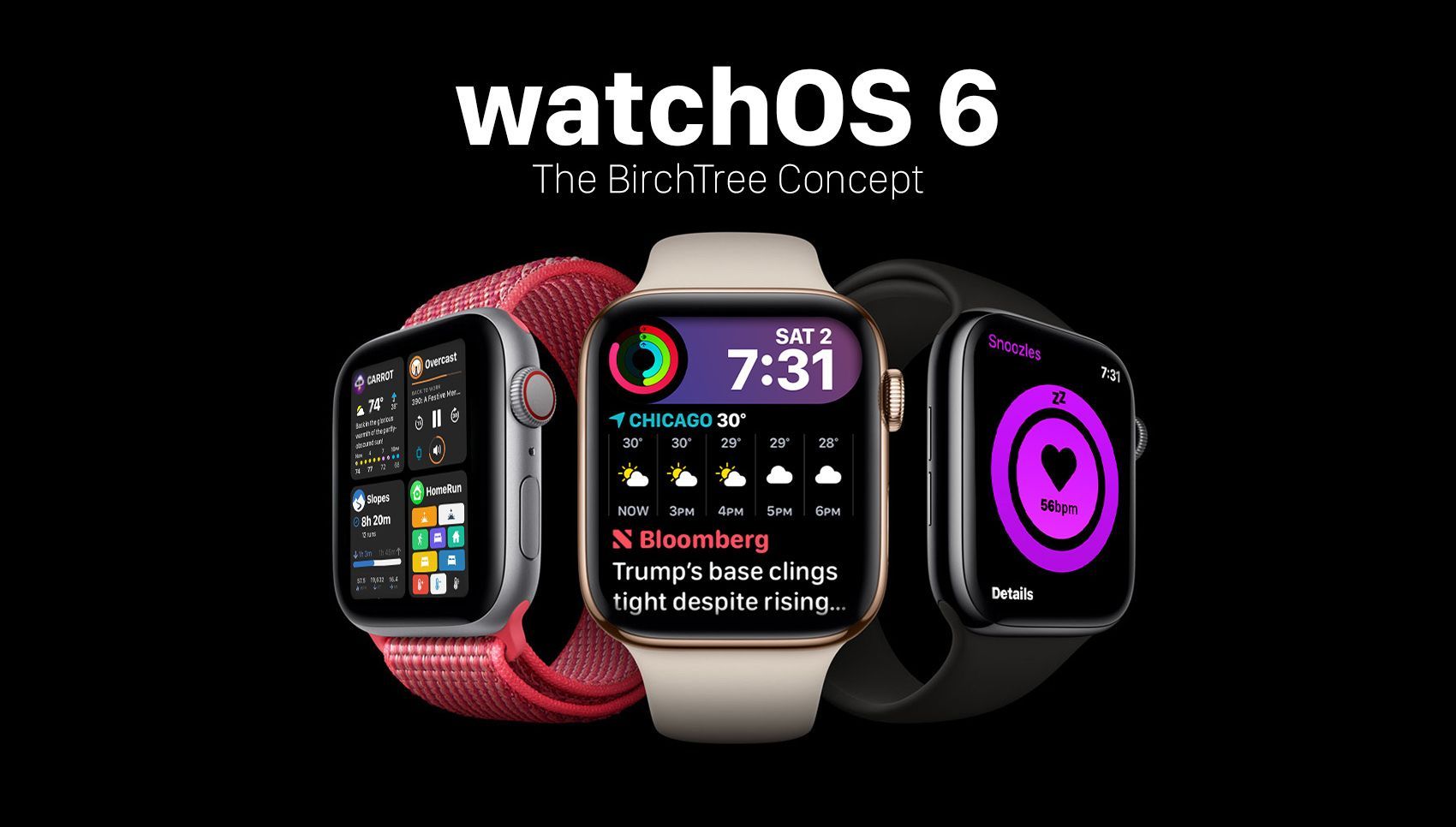
We're very likely 3 short months from seeing what Apple has in store for the next major version of watchOS, and as has become tradition for me, I wanted to take this chance to go through some of the things I hope to see in this next update to the platform I love so much. watchOS 6 is likely to be a smaller update, as the odd numbered watchOS versions has tended to be bigger, while the even numbered ones have been more iterative. With that in mind, most of my suggestions are enhancements to things that already exist and not major game-changers.
I hope you find things here that you'd enjoy as well. If I missed anything, I am more than willing to keep this as a living document and update it with more ideas, so let me know on Twitter if you think there's something awesome I missed.
New Siri Watch Face

The Siri watch face was one of my favorite additions to watchOS 4 and it remains one of my go-to faces in watchOS 5. But I think it's time for an update to this watch face's UI to make it a little cleaner and a little more useful.
This new version of the watch face keeps the same card metaphor as today, but instead of using the blue/purple cards that many people don't love the look of, instead this should use the new modular infograph complication style. This will let apps show more customized UIs on this page, as well as remove a lot of the color that turns people away from the current version.
Sleep Tracking and Well Being Rings

Sleep tracking is one of those things the Apple Watch does quite well, but as my friend Mark Miller has lamented, the apps that track your sleep don't do a great job of turning that sleep data into easily-parsable information. My mockup doesn't do much in this regard either, but this seems like the sort of thing that Apple could do and likely will tackle.
I expect this to either be a totally separate thing from the activity rings we all know and love. It may be a bit of a reach, but I would not be surprised to see Apple create new "Well Being" rings that includes sleep information as well as meditation. They've had the Breathe app for a couple years and the addition of sleep might give them a reason to include it in this new ring. People are addicted to "filling their rings" and getting people to sleep more and meditate even for a bit more than today is not a bad thing at all. Excluding it from the current activity rings also means you don't have to feel like you're missing out on something if this new tracking isn't something you're interested in.
Grid Layout for the Dock

I’ve never been fully satisfied with the dock on the Apple Watch. I liked the original variant when it was a horizontally scrolling list, and felt it was a slight regression to go to the vertical card system we have today. I get that vertical scrolling makes more sense on the watch, but it’s such an inefficient use of space.
My proposal is to convert the dock to a grid system, at least on the Series 4 and newer models. The 44mm model especially has more room than ever, and those pixels could more effectively be used to show full previews of your recently used apps and let you get into them with bigger touch targets.
In my mockups, I was able to get 4 apps on screen at a time and still easily make out the contents of the app and tap into it with ease. The list should still scroll, of course, and your last 8-12 apps should show here.
This change would also take us back to the original idea of the dock. It was supposed to be a place to quickly get info from your favorite apps without actually launching them. With this change, the ability to see the contents of these apps would get that back to us, all the while making it a better app switcher for people who prefer to use it like that.
New Watch Faces
This is kind of a given, but I hope to see more focus put on adding new watch faces, as well as updating the existing watch faces Apple already has. Most of the watch faces we have in watchOS 5 are the same, or slightly modified versions of what we had in the very first version of watchOS in 2015. Now that we have larger watch faces and new design elements, I think it’s time for Apple to spruce up the classics.
But let’s not stop at updates to the current watch faces, let’s get some new blood in there too. We got 2 new faces exclusive to the Series 4 watches, and both of those are very data-dense. I hope to see some new watch faces that are more about looking nice than getting as much data on screen as possible. I know this is very vague, but last year’s infograph watch faces showed Apple is still happy to experiment with design here.
iPhone Continuity and Companion Apps
Audio players and workout apps already have this, but I’d love to see the concept of keeping your iPhone and Apple Watch in sync be able to grow out a bit. For example, when I open the camera app on my iPhone, either open the companion app automatically on my watch, or add a one-tap button that takes me to it when I raise my wrist. Similarly, if I start a stopwatch on my iPhone, start the same one on the watch so I can keep track of it there as well.
This really speaks to the idea of the iPhone and Apple watch behaving more as a unit and not individual products that have their own things going on. My favorite moments with the Apple Watch are when it seems to know what I want before I even ask for it, and something like this would make those moments more frequent.
Better Data Transfers for 3rd Party Apps
One of the major pain points of watchOS is getting data from your phone to the watch. Sometimes it’s pretty good, with say a podcast syncing over in a minute or so, but often it is terrible, with sync taking many minutes, hours, or simply not working at all. This inconsistency is frustrating and makes you trust the feature less. I have a WiFi-only Apple Watch and I hardly ever bother to try and sync things like podcasts or music to it because I don’t trust that it’s going to get the job done. This means all of my workouts involve me taking my iPhone with me even though I’d much rather leave it at home.
The best I can tell this seems to be something to do with transferring data over Bluetooth and not WiFi, and watchOS makes weird decisions on which one to use at times. WiFi is supposed to be faster but use up more battery, which is why it often switches to Bluetooth, but here’s my thing: just use the damn WiFi all the time. Any battery advantages Bluetooth has must be somewhat offset by a shorter transfer, not to mention people actually using the freaking feature because it no longer feels like using a 56k modem to load The Verge.
The Little Stuff
As I have asked for over the past few years, please bring always-on watch faces to the watchOS. I’ll accept this as an opt-in feature and will check a box that says “I know this will make my battery life worse.” I just want to be able to see the time 100% of the time when I want to, not 95%.
Another repeat request is the ability for third party developers to make their own watch faces. I would even accept a super-strict approval process from Apple where they only accept faces they deem acceptable, but we need to get more designers working on digital watch faces. Here’s my idea from last year and I still think it looks nice.

Improvements to auto-workout detection is a must. The watch does a good job of guessing when I’m done with a workout and asking me if I want to stop it, but I still end up with 3 hour strength staining workouts from time to time when I miss that notification and it goes “well, I guess I’ll keep this going forever then.” Especially when it’s a walk/run/bike workout and I haven’t moved in 10 minutes, just close out the workout.
Let me see my iPhone’s battery life from the Apple Watch.
Let me read full articles in Apple News.
There should be more “domestic” style workouts. Snow shoveling, lawn mowing, yard raking, construction, and furniture building are all physically taxing, but can’t be tracked easily. I don’t need anything crazy like “pounds of snow moved” or anything, but some way to track this besides “other’ would be nice.
Finally, this is more a note, but I think we’re getting very close to the Apple Watch being able to operate entirely on its own. Much like iOS 5 let you finally set up and manage an iPhone entirely without a PC involved, we feel like we’re getting to a similar point with the Apple Watch. There’s still too much that would need to be decoupled from the phone, but the idea of an Apple Watch being set up and used entirely without pairing it to an iPhone seems like something Apple could make happen in the next year or two. I don’t know if they want to do this, as the Apple Watch helps keep people from switching to Android, but if Apple finds a good reason to want these to sell to more than just iPhone users, then this could be something we see relatively soon.
Conclusion
I think watchOS 7 next year will be about time for Apple to introduce some more fundamental changes to the Apple Watch, but for now I think the changes above will help make the Apple Watch more useful to those who already have it and entice more people to jump on board and get one for the first time.
We don’t know what Apple is going to show off at WWDC this June, but regardless of how close they adhere to my hopes and dreams, I just hope they still feel like they are treating watchOS as a priority and grow it beyond where it is today.


