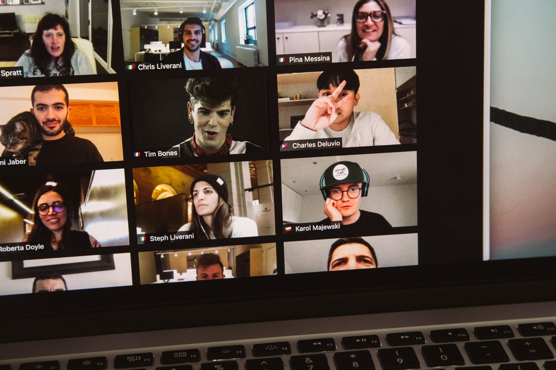
Zoom’s UI Problems are Amplified by Remote Learning

Zoom is failing teachers. Here's how they would redesign it
The company quickly rolled out a series of security upgrades. But it has been slower to address workaday complaints about its UX. Classes were already underway at school districts across the country on August 20 when Zoom finally released improvements critical to educators, such as a way of including ASL interpreters and more control over muting. Many other important features remain unavailable. So we asked teachers—ranging from elementary school teachers to college professors—how they would redesign Zoom to work better for themselves and their students.
My wife is a high school teacher and she’s been teaching remotely this fall. It’s only been 2 weeks with the kids, but I’ve heard her complain countless times about Zoom. Zoom’s UI and UX have been rough from the start, but that was okay because it had strengths around getting anyone into a call with very little friction, as well as generally reliable streams have made it compelling for a lot of people. As time has gone on though, the UX limitations of the app are becoming more painful. The kids are confused, it’s hard to monitor what you’re presenting when you’re sharing your screen, and more problems come up on a daily basis. Oh, and the automatic text transcription in Google Meet and Microsoft Teams are desperately needed for the education space.
My wife used Google Meet for one class last week and said it was way, way nicer than Zoom (and I agree). If Google Meet added breakout rooms, she’d have no reason to use Zoom.
Header image by Charles Deluvio