Concept: Using Maps to Fix Safari on iOS 15

It would be fair to say I'm pretty skeptical about Safari's new design. There are issues across all platforms that I hope Apple addresses before the app launches to the public this fall, but today I wanted to take a stab at improving the iOS experience.
Pain Points
When I use the new Safari in iOS 15 on my iPhone today, these things bother me the most:
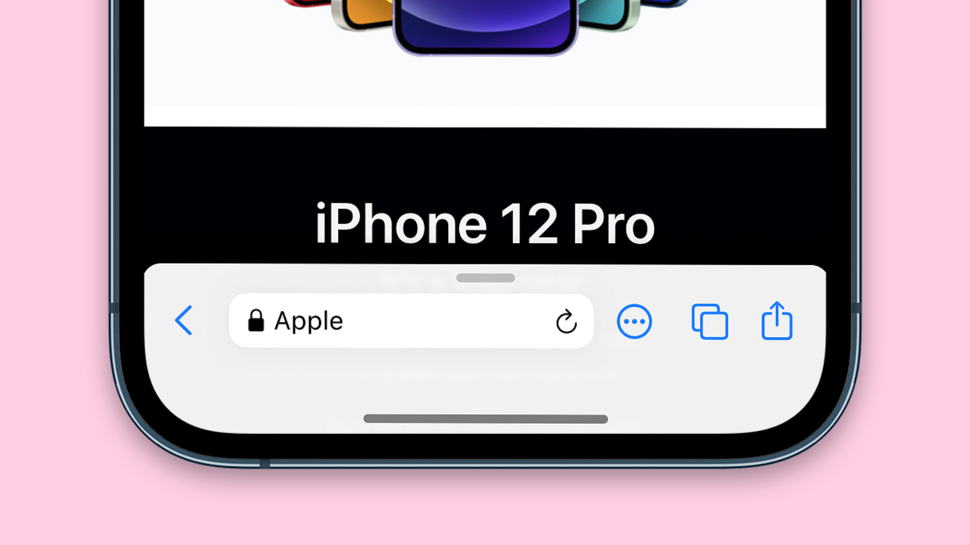
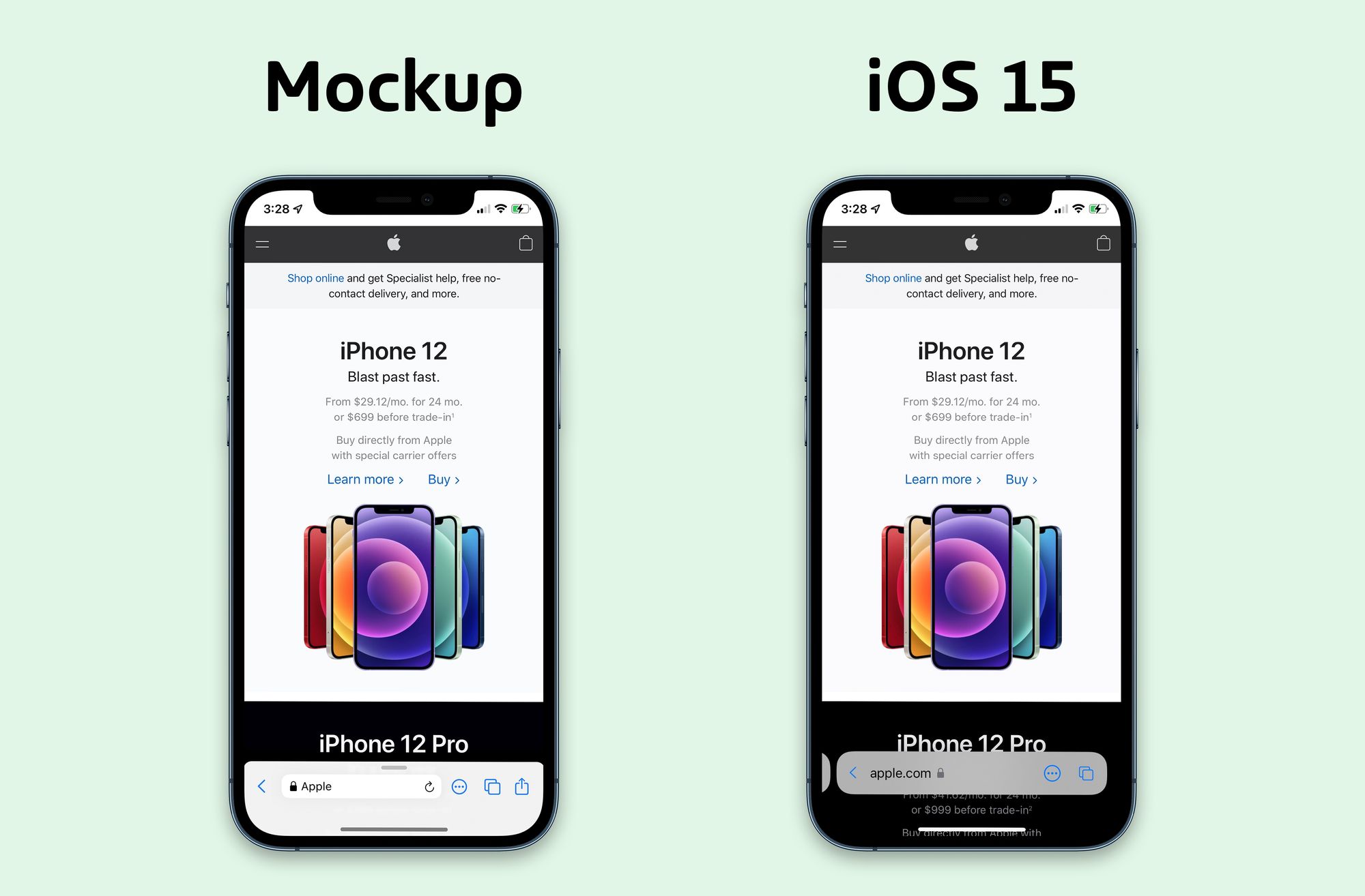
- The address bar alternates between covering too much of the site and then disappearing entirely.
- Websites with bottom navigation are wrecked. Asking every site in the world to update for this is not reasonable, especially in the short term.
- It's too much work to share anything.
- It's a pain in the ass to reload the page I'm on.
Taking Inspiration
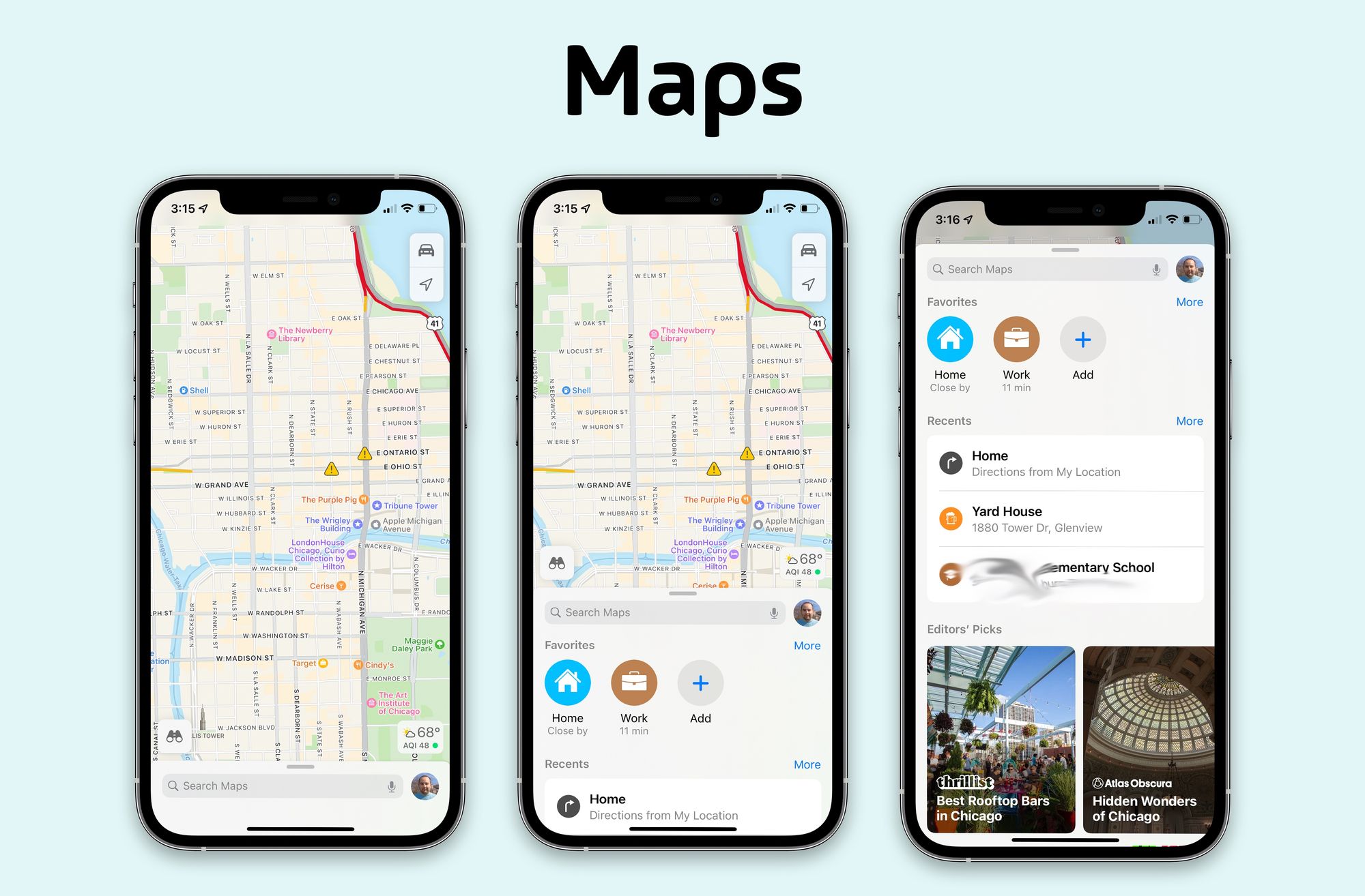
Apple's own Maps app has a similar UI where they've moved the search field and bookmarks to the bottom of the UI, while letting the content (the map) occupy most of the screen. The search bar is always visible, a small swipe up reveals your favorites, and a full swipe up brings up the full functionality of that app's "start page".
Is this as adventurous as the new Safari UI? Nope, but it sure didn't spark the frustration that Safari has caused either.
Applying Maps to Safari
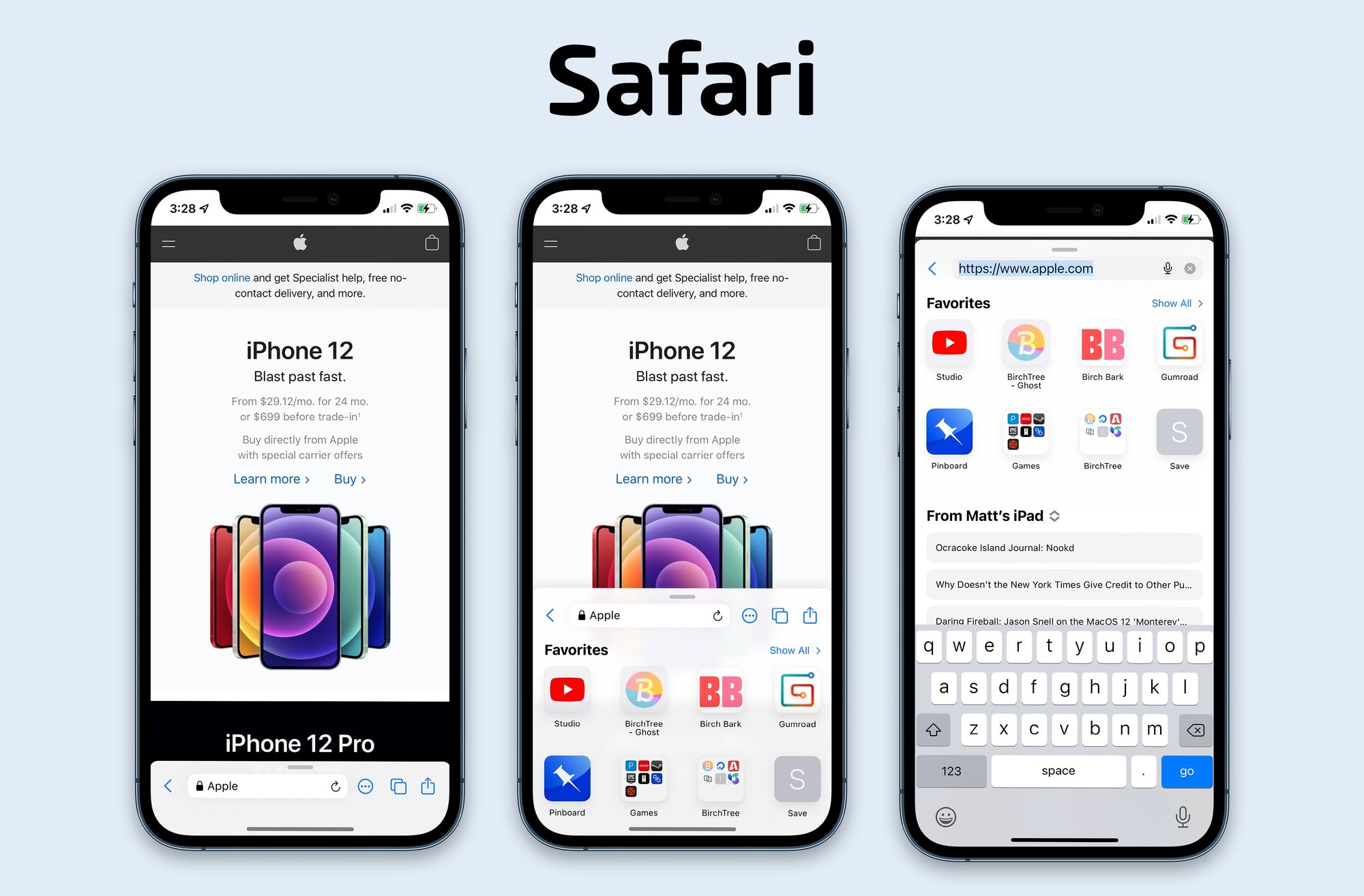
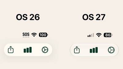
With the disclaimer up front that I did this in an hour and didn't do months of research that would have been expected for something like this, this was my attempt to basically paste the Safari features onto the Maps UI. Here's my layout vs the one that ships in iOS 15 beta 2:
Now a few things I should note that you may already be asking:
- When you scroll the page, the bottom bar could minimize just like it does in the real version of the app, and then expand when you scroll up, also just like the real app.
- A forward button would appear if you could go forward, just like the real app.
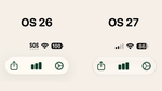
- Yes, the address bar is a little smaller, but Apple's already showing very little data there, so what's the loss?
- The reload button is back on the right side of the address bar, just like it has been for a decade on iPhones.
- The more, tabs, and share button order is negotiable, but that made sense to me.
- The "Favorites", "From Matt's iPad", and keyboard are all exactly the same as the real app, so if you have complaints with those, don't look at me 👀
Final Thoughts
Again, this was a quick mock up, and I'm sure there are things that could be improved if I spent more time with it and gave it to testers. The point of this exercise was to take a UI that appears to solve similar problems and see how it worked in Safari. I think it looks pretty good on the surface, and given how the UI was pretty universally celebrated when it came to Maps a few years back, I think there's something to be learned from it.