6 Things That Annoy Me About the OnePlus 6
Earlier I shared 6 things I really like about the OnePlus 6, so it’s of course time to look at the things that bug me about this phone.
Garbage menu bar
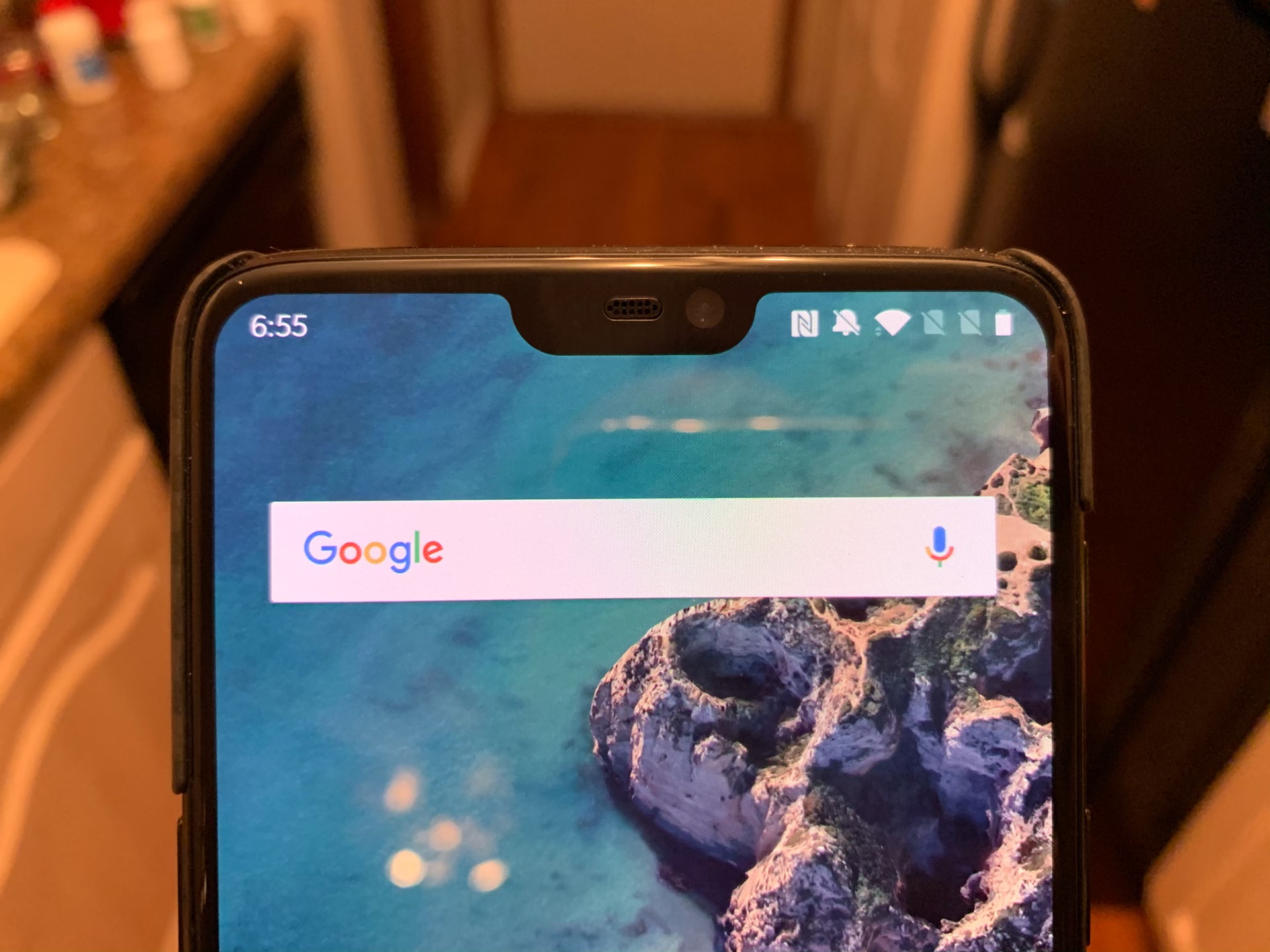
I wrote about this already, but I’m still annoyed how the top right of the menu bar is chock full of junk that never gives me any useful information.
Alignment is all off everywhere
Check out the clock in the menu bar:

It seems randomly aligned and is awkwardly placed in the curved corner of the screen. Also, the full set of icons on the right side of the notch is not centered in that space either, it’s too far right.
The rounded corners of the screen are also all over the place. The screen itself is equally rounded on all 4 corners, but many apps black out the menu bar and either have sharp corners on top or, even worse, have artificially rounded top corners that are completely different than the bottom corners.
This is really a picky problem, but it bothers me.
The speaker is straight up terrible
Reviewers commented on how the speaker was a little lackluster, but I think they gave it too much credit. This speaker is bottom-firing and can be totally muted by putting a pinky finger over it. Worse, it’s so quiet I can hardly hear it from across a room, and it feels like 0-50% volume is basically muted.
And worst of all, the quality of the sound this produces is basically unusable. I listened to my own podcast on it and thought I needed to go delete the episode because the audio quality was so bad. I listened on my iPhone’s speakers to confirm and realized it was indeed just the speakers on the OnePlus, not my show that sounded so bad.
The screen is dim
The screen on the OnePlus 6 is plenty high resolution (1080px across) and it looks good, but it’s so dark. You can boost the brightness up to 100% and it looks pretty good, but if you use auto-brightness like me, it likes to set itself to 10-20% brightness all the time, even when I’m in a well-lit environment.
Android Pie’s adaptive brightness feature is supposed to learn how bright I like my screen and adjust brightness according to my taste, but I’m seeing nothing of the sort here.
The gestures are a trove of compromises
The OnePlus 6 has 3 navigation options, none of which are particularly good.
(1) You can have the old school 3 buttons, which I find hard to use after getting used to gestures on the iPhone.
(2) You have Android Pie’s gesture navigation, which I have used since May and still think is bad. It’s actually somehow worse than it is on the Pixel 2 which I was using before, too. The animations are not as fluid and it just feels unresponsive much of the time.
(3) OnePlus’s custom gesture interface, which is essentially swiping up to close apps and swiping up from the left or right bottom of the screen to go back. This one is okay for closing apps, but bringing up multitasking is slow and you lose quick app switching. Also, the “pull up from the bottom right/left to go back” gesture is completely unnatural and throws me every time.
Android itself
Yes folks, as is the problem for all Android phones, I just don’t find the software itself to be terribly compelling. Android still has iOS beat in terms of managing notifications, but but I prefer basically everything else on iOS. The quality of apps I’m used to on iOS simply aren’t here and Android makes getting these apps to work together for me to get actual work done much harder.


