An Android Review for iOS Users: All the Little Things (Day 4)
This is part 4 of a 5 part series on Android from the perspective on an iOS user.
- Part 1: Third Party Apps
- Part 2: Home Screens
- Part 3: Notifications
- Part 4: All the Little Things
- Part 5: Conclusion
We're going to take a little detour today from major features and shift focus to all the little differences I experience every day and just felt were worth noting. Before you get grumpy about something on this list, I'll note that this is the most opinionated piece in this series, as basically everything on this list could be taken the other way by someone else. So while I think third party apps and notifications are objectively better on iOS, and home screens are objectively better on Android, let's talk about our feelings!
I miss having swipe from the edge of the screen perform a back/forward action in 99% of apps like it does on iOS. Most apps either don't support edge swipes at all, or they use it to pull out a hidden menu from the side of the screen. Neither of these is particularly useful in my use. There are some apps that have swipe to go back, but they feel like they're using custom actions, and are not playing nice with the system.
I didn't know how much I loved this feature until I lost it on Android. The back button is good, but it's not a sufficient replacement for me.
One of my favorite folks over at TWiT, Jason Howell tweeted about how stupid it is that back buttons are always at the top of the screen where they're not conveniently accessible:
https://twitter.com/jasonhowell/status/823650895657209856
He's totally right that navigation at the top is dumb for the size phones we have these days, but the fact that I can always swipe left to go back in any app makes me not even notice this is a thing.
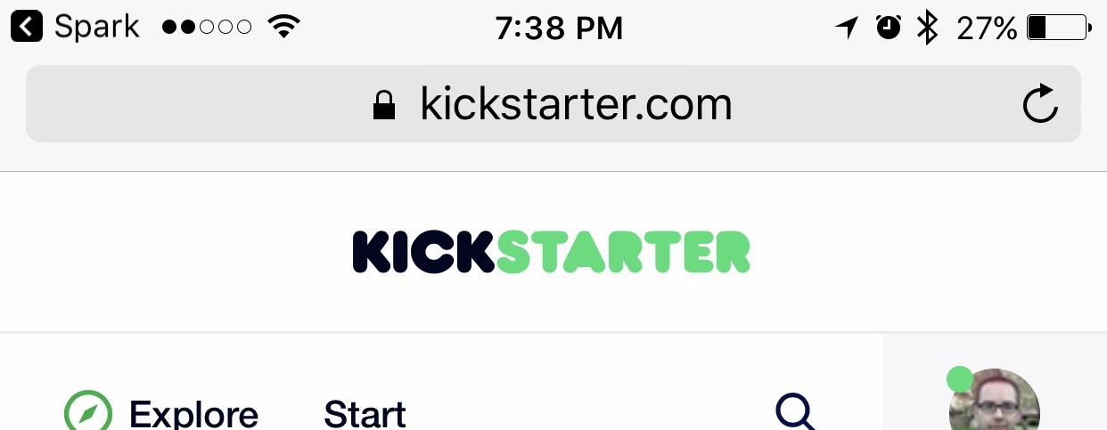
Speaking of back buttons, iOS recently added a "Back to XYZ" button at the top of the screen when one app shoots you over to another. I like having this so I can hop back to the app I was using quickly. A daily use case for this is going through my emails in the morning. I tap every link in my emails one at a time, and each link opens Safari over my email app. That "Back to Spark" button lets me zip back and forth between the apps quickly and then read everything in Safari once I'm done.
Android instead has a system back button that will always take you back to the last screen you were on. People say this creates confusion since sometimes it takes you back one page in an app, sometimes it takes you to a whole other app, and other times it takes you to the home screen. While that sounds complicated in writing, it's always quite clear what will happen in practice. I never find myself confused about what will happen when I try to go back.
Android gets the edge here since the back button is a larger target, is easier to reach, and works in all situations, not just when going from app to app.
I miss the smooth feeling of iOS. I know I'm using a Moto G4, which is not a high end phone, but my problems have nothing to do with load times or frame rates, and everything to do with "feel" (I told you were were going to talk about our feelings).
The best way I can describe the difference between the two platforms is to say that Android feels like you're giving instructions to a computer to move the content of the screen up, down, left, or right, while iOS makes you feel like you're manipulating something physical. The momentum of scrolling a simple list in iOS just feels so much more natural than Android's cold, erratic motions. Scrolling to the top of my Twitter timeline on iOS, and having it stretch and settle into place is always satisfying, even though we've had this same animation for 10 years. The way you can accelerate your scrolling by flicking the screen in rapid succession feels right, and moving objects around the screen always feels just a little more smooth.
Even when Android is rendering everything at a buttery 60 frames per second, everything still feels artificial somehow. I'm sure many people prefer Android's way better, but for me it's not even close. I'll take the feel of iOS any day.
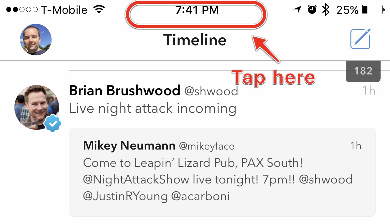
You never know how wonderful tapping the top of the screen to scroll to the top is until it's gone. I can't believe Android hasn't stolen this tiny, perfect feature.
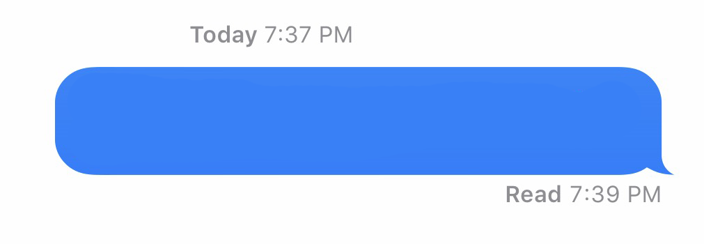
Messaging is a mess on Android. iMessage, despite its flaws, is worlds better than what Android has going on. If 100% of your chats run through WeChat or Facebook Messenger, then either platform will work, but I'm guessing you still send regular old text messages to more people than you'd like.
iMessage has been here for years, and is probably one of my top 5 favorite things about iOS. It's definitely one of the things that it hurt the most to lose when going to Android. The simple fact that my iMessage conversations and SMS conversations live in the same app is brilliant. This allows me to have Apple's best messaging platform and their legacy SMS app in the same package. I don't have to think about whether I'm sending a message to someone with iMessage or SMS because if I have their phone number, iMessage figures out what one they can use and decided it for me.
The story is different on Android though, as this mixing of SMS with regular messaging is not brought together the same way. Google's newest messaging app is Allo, which released late last year and…well, no one uses it. But it is Google's premier messaging app and it has all the latest and greatest features from Google built in. This is their much hyped AI-powered chat app with Google Assistant built in. It can help you get dinner, give you the news, or do a whole host of other things, but it's completely useless to me because literally no one I know uses it.
Instead I can choose from a host of messaging apps from Google and third parties that will handle my SMS messaging for me. My phone defaulted to Messenger, but I could also use Google's own Hangouts app. Hangouts is as close as you can get to an iMessage-style merger of SMS and non-SMS chat, but again it's only useful if people you know use Hangouts…I'll bet you can guess how many of my friends/family do.
What's really cool about Android is that third parties can also build apps that will handle your SMS messages, and I tried a bunch. Textra was my favorite, and is what I usually use, but it's SMS only. You can set up Facebook Messenger as your SMS app, which could be good if you use Facebooks messaging platform.
Then getting those SMS messages synced to any other device was a nightmare. Having my iMessage and SMS messages synced instantly, and reliably to my iPad and Mac is something I take advantage of daily, and hated giving up. Pushbullet tries to do a good job with this, but too often it would get confused about what messages were sending and which were not. I had messages show once in Pushbullet's interface, but they sent twice, and I had other sequences of messages show up as delivered in Pushbullet only to learn they were never sent at all.
Ultimately, iMessage is a better product for me in just about every way. And with iOS 10's enhancements to the platform, it it's just a fun app to use with the people in my life.
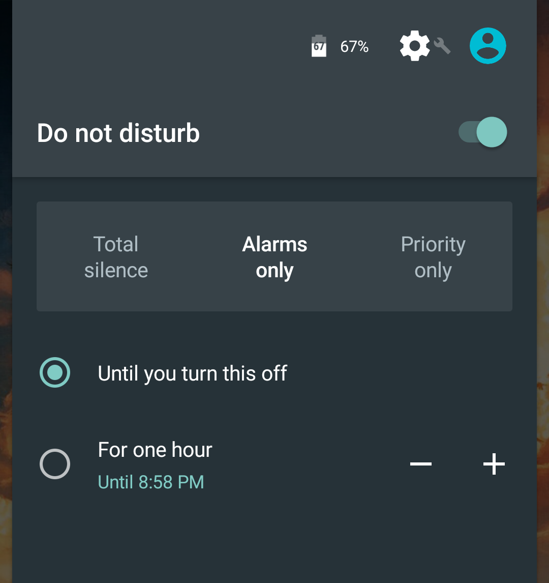
Do Not Disturb is way better on Android. It blows the doors off of iOS, actually. You can schedule DND to happen at certain hours, just like you can on iOS, but it goes deeper than that. I can set DND on a timer, so I can set it to go DND for 30 minutes while I'm in a meeting and I don't have to remember to go off DND afterwards, my phone does it for me.
Going further, Android has a really convenient option to go DND until the next alarm. This is great for when you're done with your phone for the night, but want it to go back to normal in the morning.
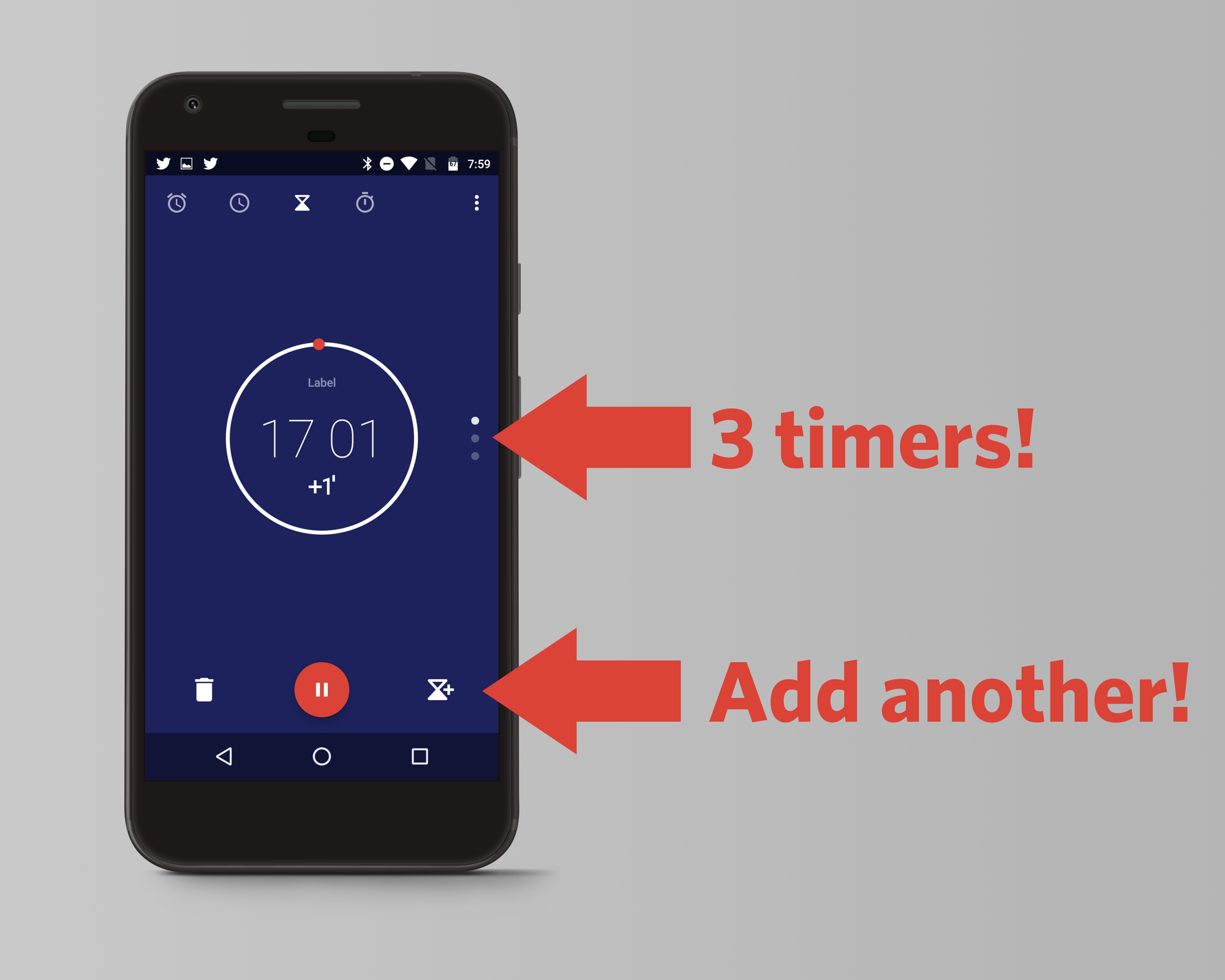
Android also wins when it comes to timers, and it wins exclusively because you can set multiple timers at the same time. It amazes me that iOS still only lets you have one timer going at a time. It's madness! Android lets you set as many as you would like (or at least as many as I have dared to create!).
Notifications are a little more sticky on Android's lock screen. When you get a notification on iOS, it will appear on your lock screen until you unlock your phone. Then it's in your notification drawer until you clear it, but it will never appear on your lock screen again.
On Android, your lock screen notifications and your drawer notifications are the same thing. In a way you would think it's annoying, and it sometimes is, but it's also a good way to force you to triage your notifications regularly instead of letting them pile up in a drawer you don't always check.
I hate on screen buttons the way Android does them. The home, back, and multitasking buttons are all on the bottom of the screen, and I accidentally hit them about 1000% more often than I do the home button on my iPhone. I dream of these buttons being there with iPhone 7-esque pressure sensitivity to avoid these errant taps.
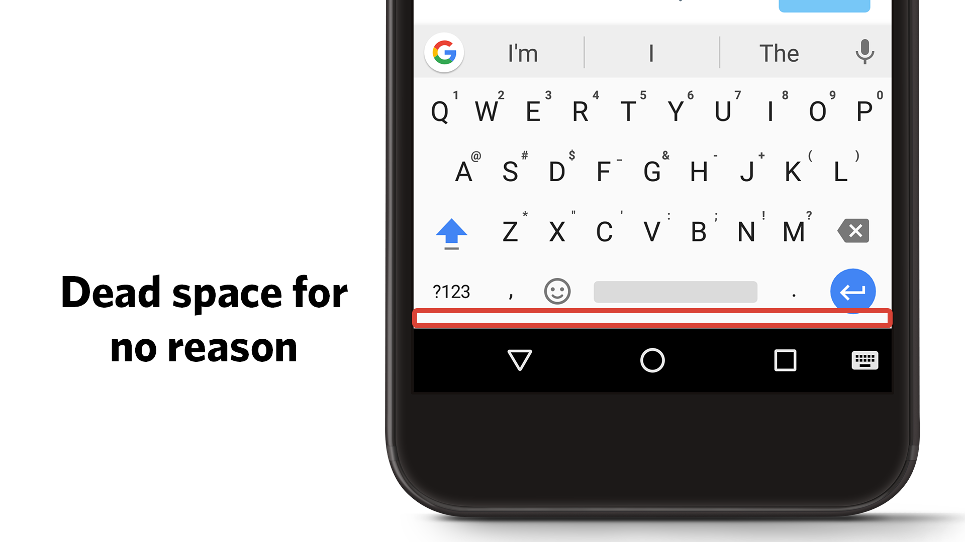
Related, but equally frustrating, is that there is a weird dead space between the home button and the space bar on the Gboard keyboard that I hit more often than you'd believe.

I miss the health and home automation stuff that iOS has built in. Love or hate the Health app on iOS, it's leagues ahead of what Google is doing on Android. Google has an app called Google Fit that I really don't enjoy. And iOS's HomeKit features are not as universally compatible as I would like, but they are at least there. I can't use Google's voice assistant to control anything in my house. Google Assistant is getting more support, but again, Assistant is Pixel-only at this point…
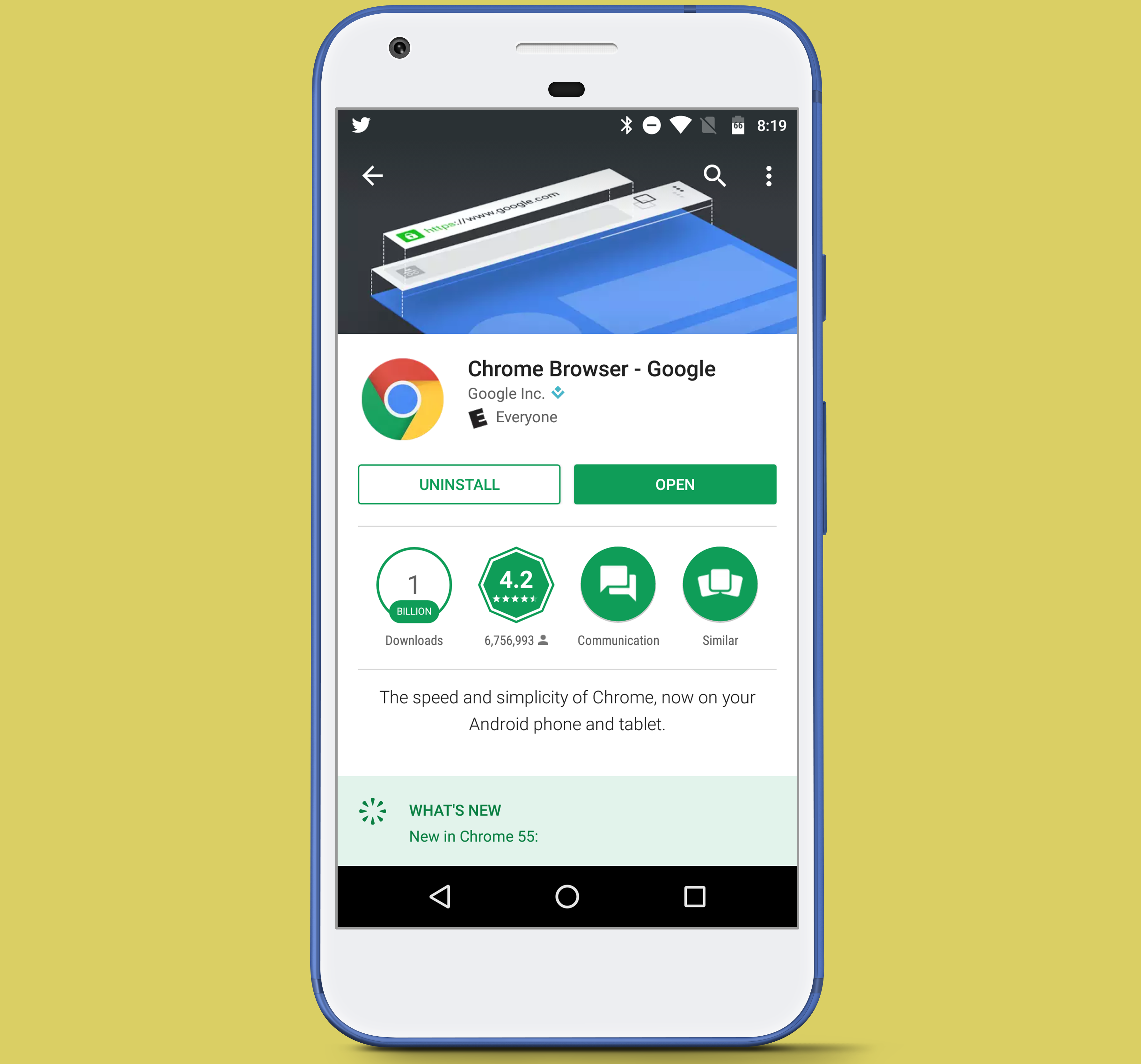
Google's apps are all in the Play Store, and the company updates them all the time. This is a big difference from iOS where system apps are tied to system releases, so for example Safari will only get updated when iOS has an update. On Android, Google can roll out updates to Chrome whenever it wants.
A big reason for this is that Google knows most of their Android users never get system updates at all, but that doesn't take away from this being a nice feature.
Day 4 wrap up
If you are a big Apple fan, you're probably a fan of the little touches in software that make it a delight to use. The deeper I look into Android, the more I see just how few of those things Android has in comparison. Don't get me wrong, there absolutely are some nice little touches in Android that I would like to see Apple adopt, but the list is not terribly long. Most importantly, while I spent most of my time with Android pining for those things I love in iOS, now that I'm back on iOS I hardly think about these things I miss in Android.
I would be very curious to hear what little things you enjoy about iOS or Android, so hit me up on Twitter if you think I missed something delightful.

