An Android Review for iOS Users: Notifications (Day 3)
This is part 3 of a 5 part series on Android from the perspective on an iOS user.
- Part 1: Third Party Apps
- Part 2: Home Screens
- Part 3: Notifications
- Part 4: All the Little Things
- Part 5: Conclusion
I know that this piece may come under some criticism for being a comparison of notifications in iOS 10 vs those in Android Marshmallow, and I agree that the comparison is not as complete as it could be, but I also know that 99.3% of Android devices are running 2015 Marshmallow release or older, so while it's not the most state of the art, it is what basically everyone who isn't on a Google-branded phone is using today.
With that out of the way, let's talk about notifications on iOS 10 and Android 6.0 Marshmallow.
The basics
Android and iOS share quite a bit in common when it comes to notifications. Many apps have them, and their ultimate functionality is quite comparable. Which ones you prefer seems to be a matter of taste. Like iOS, Android lets you set per-app settings for what apps can do with notifications, you can dismiss them with a swipe, you can clear all with a single tap, and you can perform some limited actions right from the notifications themselves.
At a basic level, you know what you're getting into here, as notifications will behave quite like you're used to.
Google's own notifications
Google does this really cool thing where they deliver notifications that you never asked for…and I love them! These are based on your Google Now setup, so you'll see stuff like local traffic conditions here around travel times, you'll see sports scores when a team you like is playing, quick access to navigate home, and even some relevant information about the very building you are standing in.
Here's a few of them:
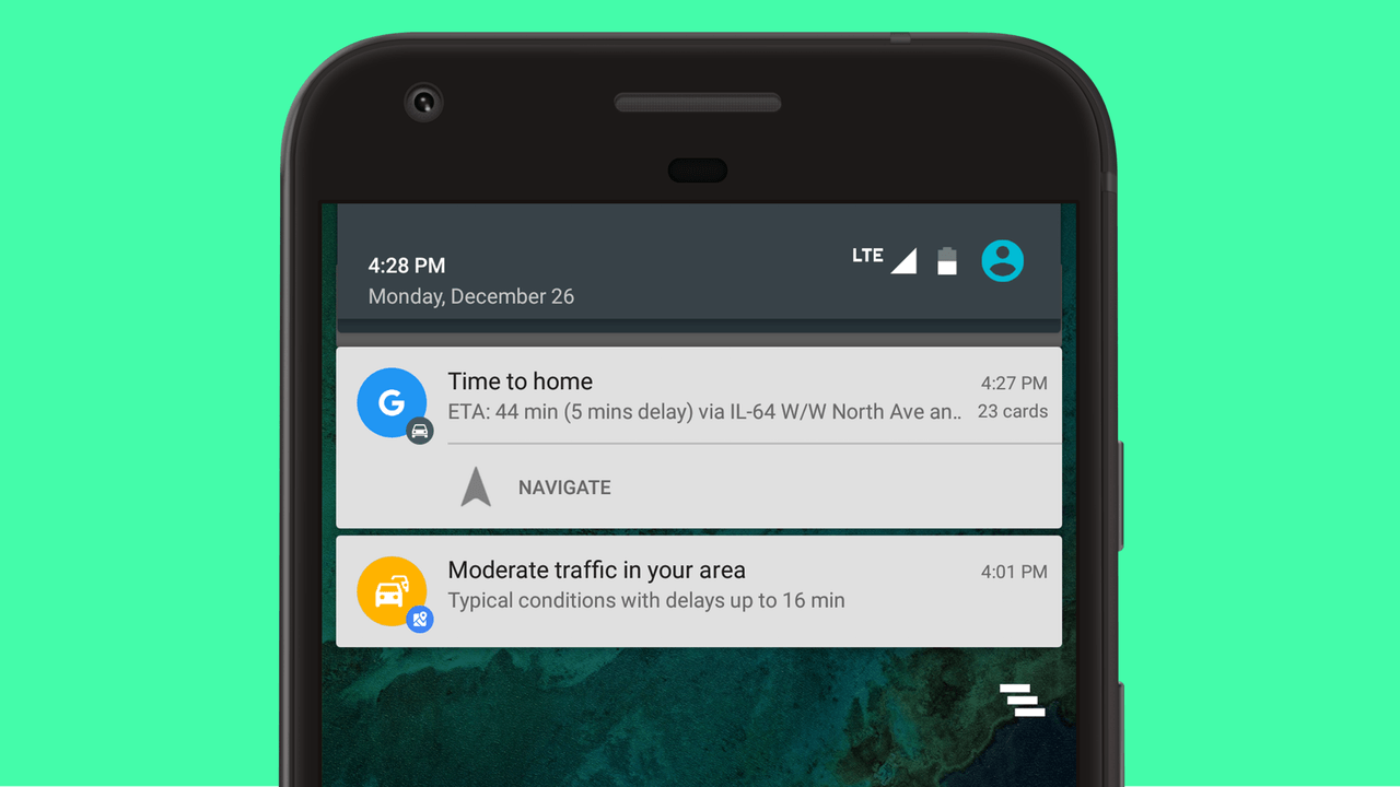
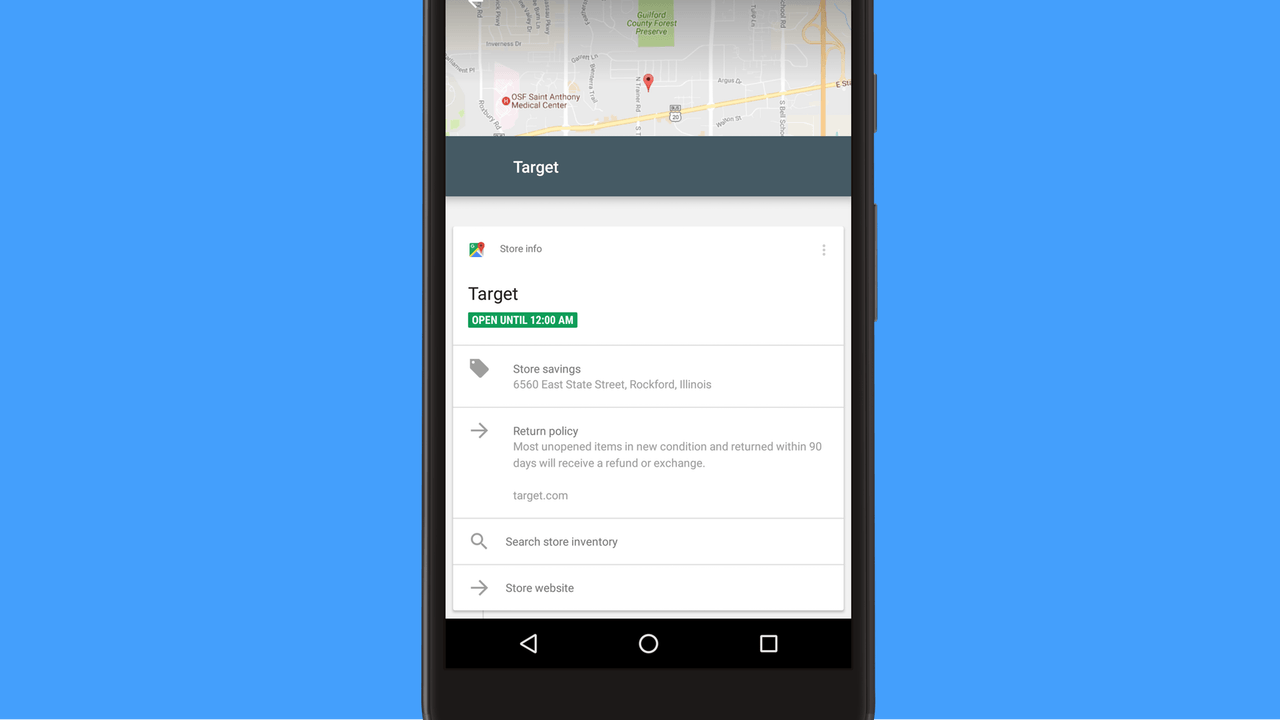
You don't have a ton of control over these, but I don't find myself ever being annoyed by them. This is a prime example of Google putting it's vast web of information about you to good use. Apple talked about proactive features in iOS 9, but Apple has not done a lot with this, mostly being able to predict what apps you want to use at a certain time. Google's ability to know where I am and what information might be relevant to me at a specific time is pretty impressive.
I find myself missing these notifications now that I'm back to using my iPhone, and wish there was a way to integrate them into iOS somehow. Maybe Apple should try to get a little smarter with what they're collecting.
Bundled notifications are almost perfect
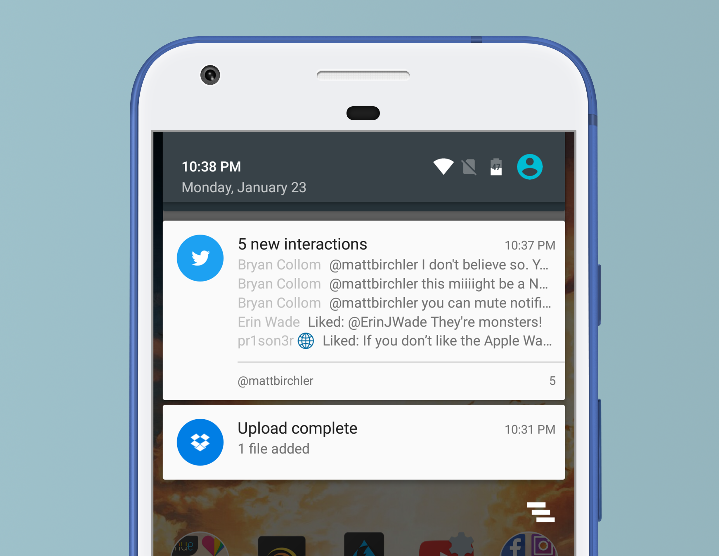
One thing I really do like about Android's notifications is that it bundles each app's notifications together, which makes it easier to parse your notifications at a glance. All my Twitter mentions are together, and my SMS messages are on their own. iOS 10 adopted a simpler, chronological list of notifications, but I find this approach to always lead towards madness.
I personally prefer the bundled method, and don't understand why Apple decided to totally remove that as an option in iOS 10 since they had bundled notifications in iOS 9. I get that you ideally want to see the newest stuff at the top, but Android's system works better for me in this regard.
That said, there is a down side to notifications getting bundled up like this. Like iOS, Android allows apps to let users perform certain actions straight from the notification itself, but once 2 or more notifications get bundled, those options disappear. So if I get one email in Google Inbox, I can archive or reply to it right from the notification, but if a second email comes in (and oh yes, they will come in!), then I can't because those two notifications are bundled together. It's just obnoxious.
The only way I have seen to get around this is for the developer to build their app not to take advantage of bundled notifications, so each one is actionable on it's own. So ultimately you can have one of the cool features but not the other. Not ideal, but not a deal breaker.
iOS 10's rich notifications are unparalleled on Android
This is something I've raved many times about since summer last year, but iOS 10's rich notifications are just stupendous! I could go on for a bit about how great these are, but let's look at some of them in action.
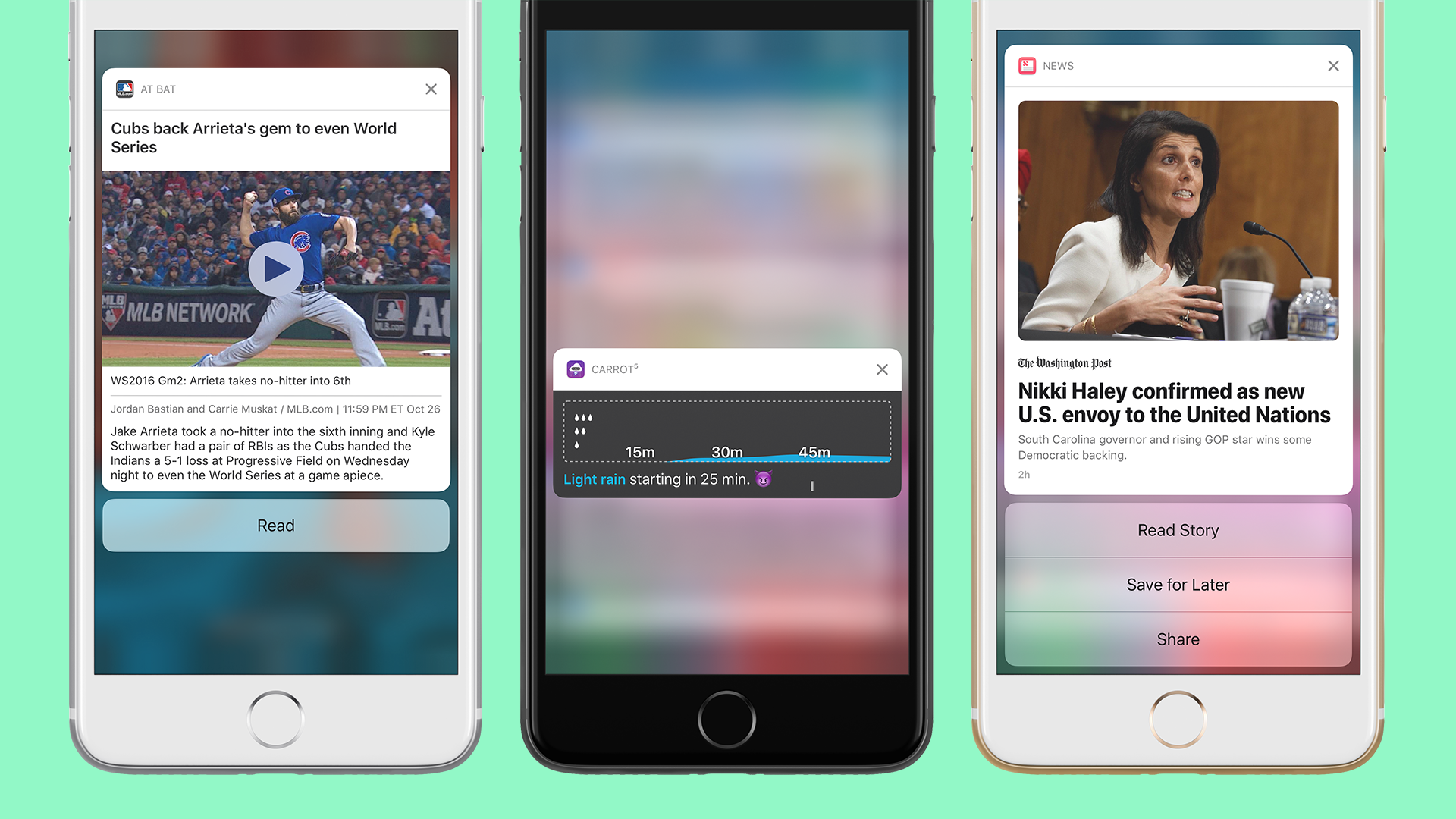
Not all apps have adopted these notifications, but a good number have, and they are one of my favorite new things about iOS in this latest release.
Android Marshmallow doesn't come close to this, and Nougat is a little better, but doesn't really touch what Apple is doing here in terms of power for developers, as well as convenience for users.
Level of control
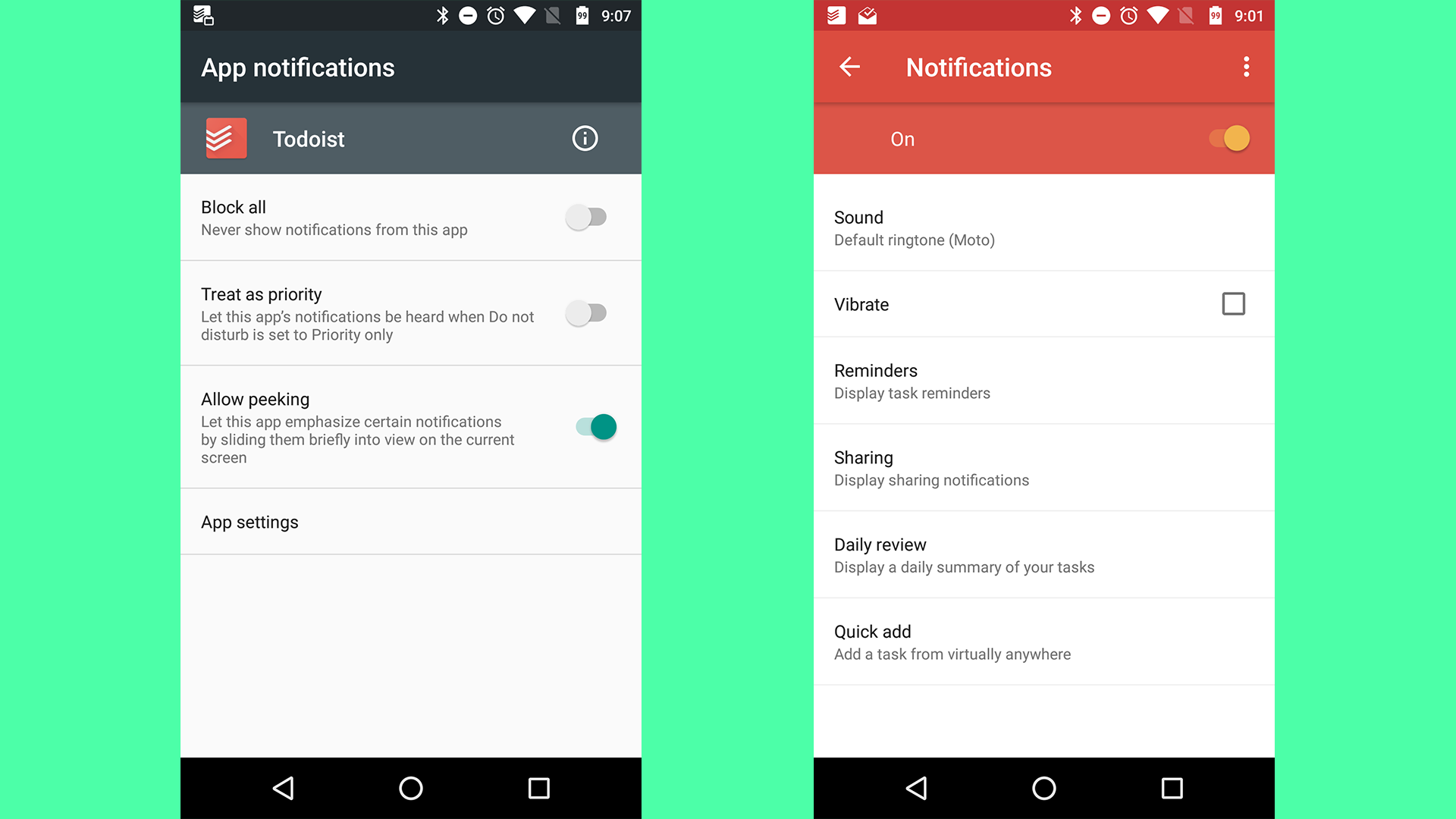
iOS also leads Android in the amount of control it gives you over how each app handles notifications. Here's a comparison to the notification settings I have for Todoist on iOS and Android:
Android
iOS
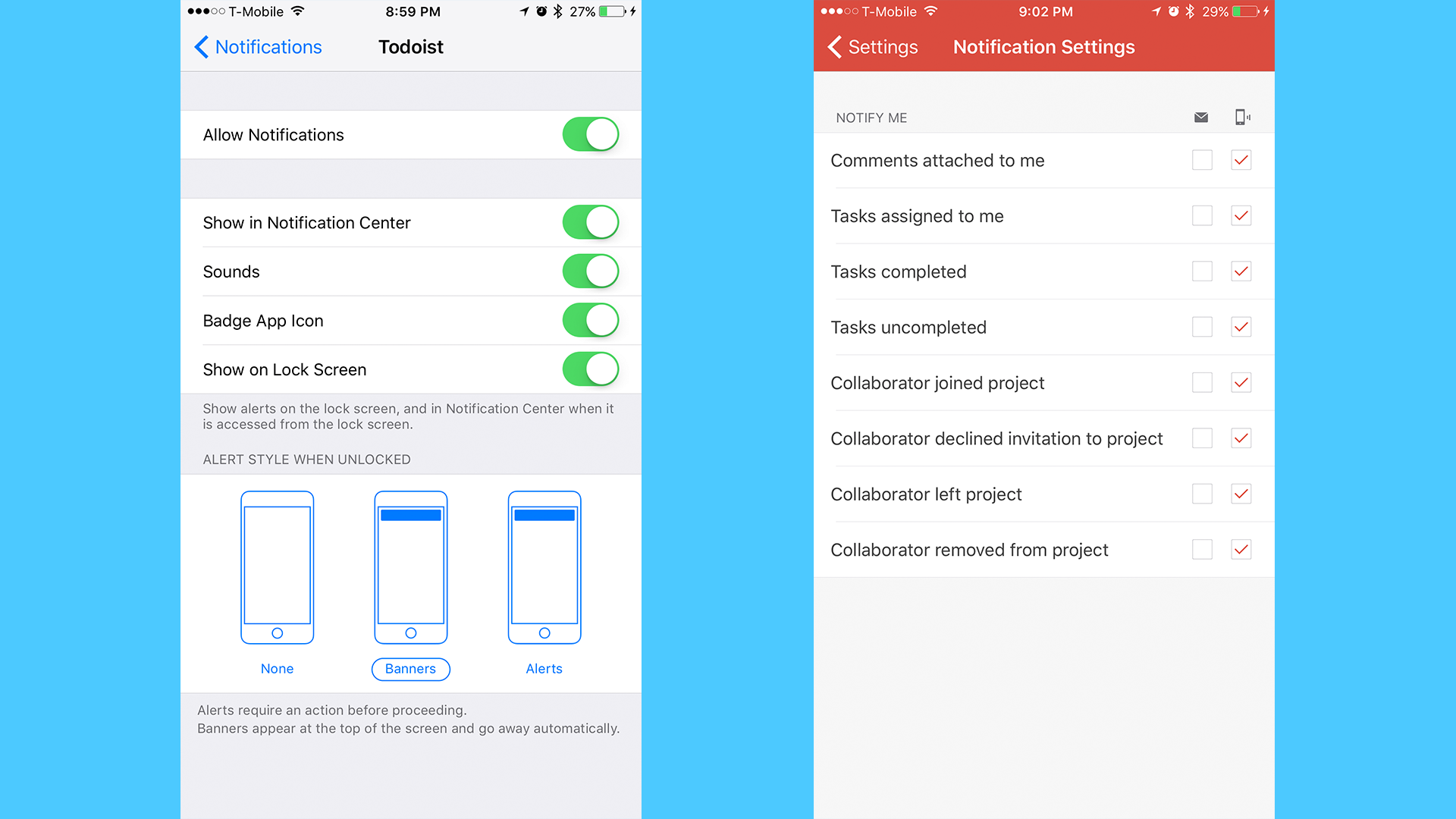
iOS lets me toggle notifications on or off in the first place, what sort of display style to use, whether they should show in my notification drawer, if they should make noise, if they should show on my lock screen, and whether they should badge the icon on my home screen. Phew!
Android has some good settings as well, such as the ability to set an app as a priority so it can still buzz you when in do not disturb mode, as well as whether you want them to display a pop up when the screen is awake, or just go straight to the notification drawer without obstructing your view.
But while those features are nice, badges are not a thing in Android, if the app can take up room in my notification drawer, if they should make a sound, or if they can be displayed on the lock screen. The two things that Android does better than iOS don't make up for all the things it lacks for me. In general, I feel much more in control over what apps can and can not do when it comes to notifications.
Screenshot notifications are beautiful
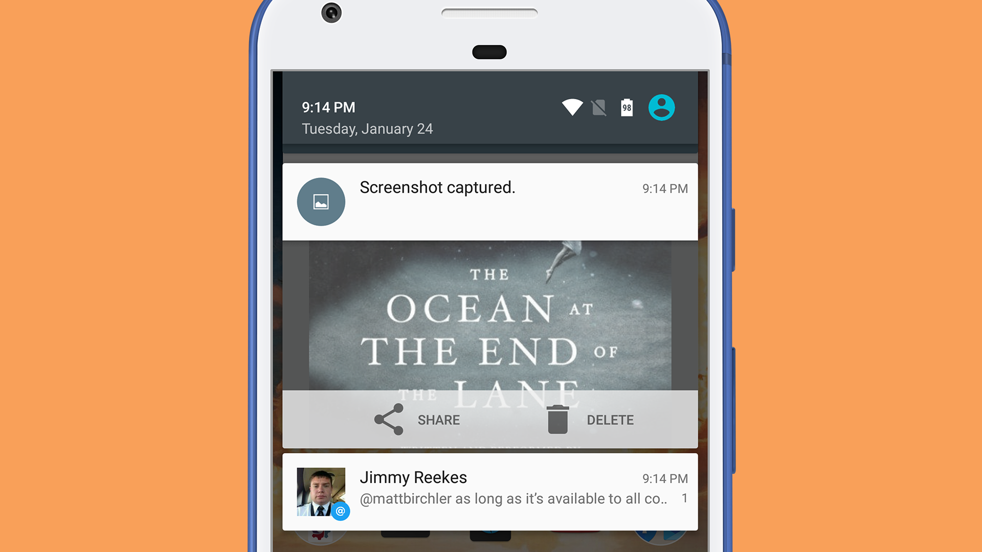
One feature that Android has had for a long time, and I think really speaks to how well they understand their users is the fact that you get a notification every time you take a screenshot. I can already hear you saying "that sounds annoying" but it's not, it's beautiful.
See, whenever I take a screenshot on my phone, it's because I want to do something with that screenshot like, right away. ON iOS I have to go to the Photos app, select the screenshot, and then share it wherever it's going, but Android cuts out a couple steps. After I take a screenshot, I simply pull down for notifications and the top one will always be that most recent screenshot. From there I can share it directly to wherever I want it to go.
This is great for sharing things to Twitter when they're funny, or directly to a developer via email when a bug pops up. My only request (and maybe this is me being greedy now) is that I wish I could set screenshots to delete themselves from my device once they're shared.
How much do you value a clean menu bar?
When you let an app give you notifications, you have control over whether it shows those on the lock screen or whether it makes a sound/vibrates when it comes in, but if you say "yes, please give me notifications" then you're giving that app permission to clutter up your menu bar with its icon. One app isn't that bad on its own, but notifications add up fast, and my menu bar is constantly full of icons.
The idea of these icons is to give you an idea of what apps have notifications, but once you have more than a couple up there it's completely useless. I find myself clearing all notifications not always because I've read them all, but because I want to just clear things up. I doubt that's Google's intention here.
I like this idea in the abstract, but I'd love to have the ability to pick and choose what apps get to show their icon in the menu bar. I want to see SMS notifications, missed phone calls, and a few select task management/todo apps up there. I like the idea of this menu bar space being reserved for "VIP apps" who I really want to know have unread notifications.
Day 3 wrap up
Android has a very solid notification system, and one that rivals iOS. Depending on your taste, you could easily prefer one or the other and I wouldn't call you crazy either way. I personally think iOS has more power in their notifications, and offers a little more control over wrangling them.
The killer feature for Android is it's Google Now notifications, which were one of the most surprisingly delightful things I have found in Android. It's something that shows off Google's edge over Apple in stark detail. It makes you feel like your phone is looking out for you and trying to help you out before you even ask.
On the other hand, iOS has a lot more power available to developers where they can display a ton on information in their notifications. 3D Touch makes these even more powerful, to the point where the MLB app actually has full video clips in their notifications. It's something special.
In the end, if you're used to iOS notifications, Android's will be immediately intuitive, although a little more limited in scope.

