Apple Vision Pro: The Birchtree Review
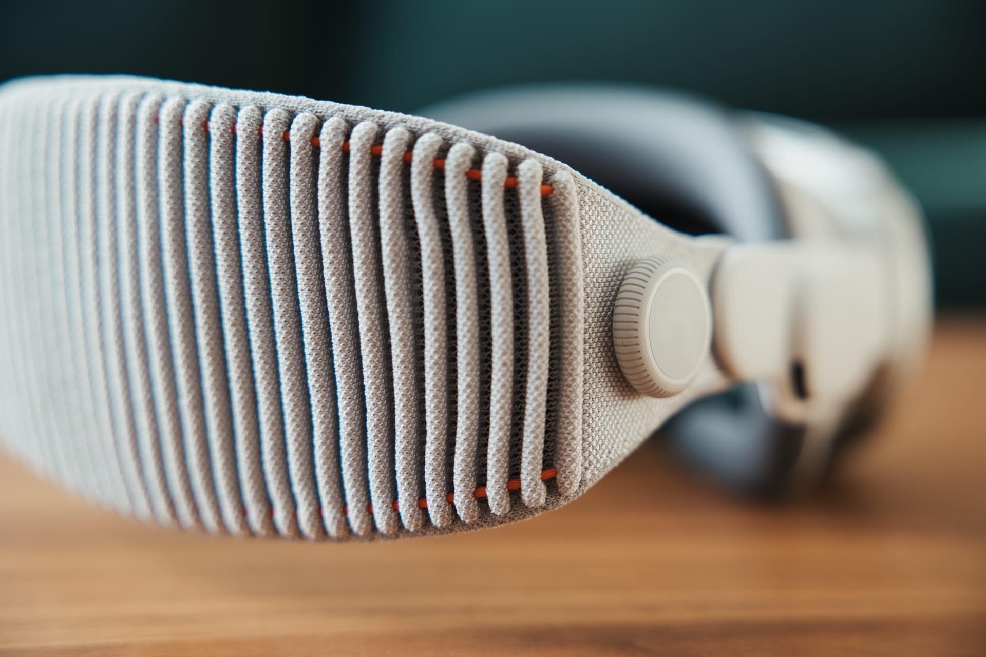
I’ve been using the Apple Vision Pro for a bit over a month at this point, and while I’ve gone deep on a few key use cases of using the product already, I thought it was high time I collect my thoughts on the product in one place. When a new smartphone comes out, you can tell within a few minutes what 80% of your opinions on that phone are: it runs a familiar operating system with familiar apps all in a form factor that’s very familiar. Reviewing the Vision Pro is not like that at all. While I do think it’s fair to call this a VR headset, it’s being sold with different use cases than other headsets on the market and to an audience who very well may have never used a headset before. This is why I’ve been taking it slow in gathering my thoughts into what I’m happy to call a “review”. As I think Nilay Patel put very succinctly in his review, “it’s magic, until it’s not.” I feel you need to get past the “magic” phase to get to an opinion with a bit more context.
Let’s kick this thing off with some potentially eye-raising opinions I have about the Vision Pro right now. I promise I’ll explain and justify each of these statements throughout the review.
- The Vision Pro is far less useful for me as a computer than my Mac, iPad, and iPhone.
- The Vision Pro can deliver fantastic media experiences.
- The Vision Pro is appropriately priced for the technology it delivers.
- The Vision Pro is fundamentally held back by the fact that wearing headsets sucks.
- There are many better ways for almost everyone to spend $3,500-4,000 on computer hardware in 2024.
- For the right sort of person, the Vision Pro is a product they simply must own.
A lot of this review is going to get subjective, so let’s talk about some of the basic features of this hardware and software. As always for my reviews, I’m less interested in laying out tech specs and am more interested in the experiences these specs enable, and how they compare to other products on the market.
The hardware is stunning
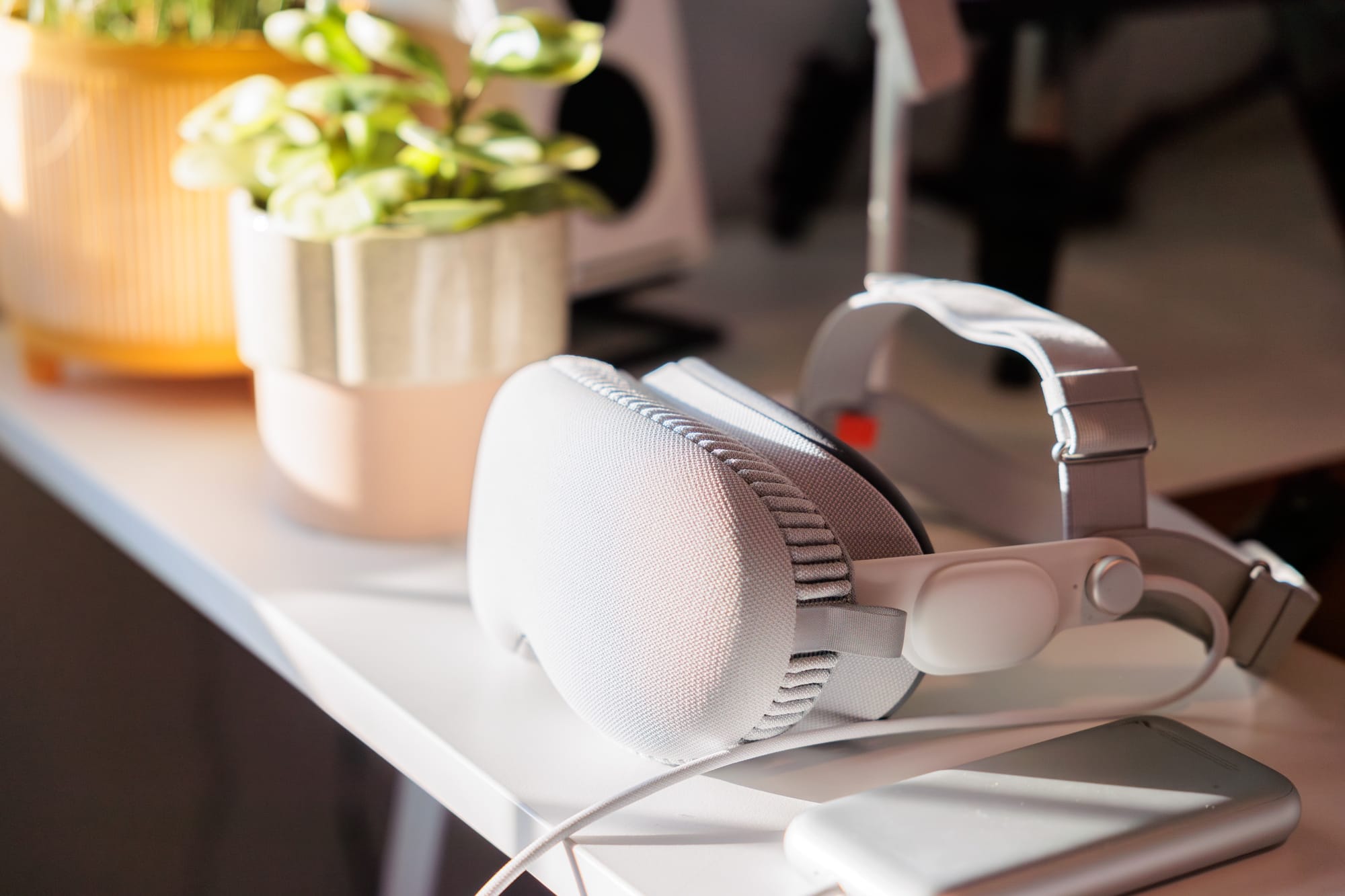
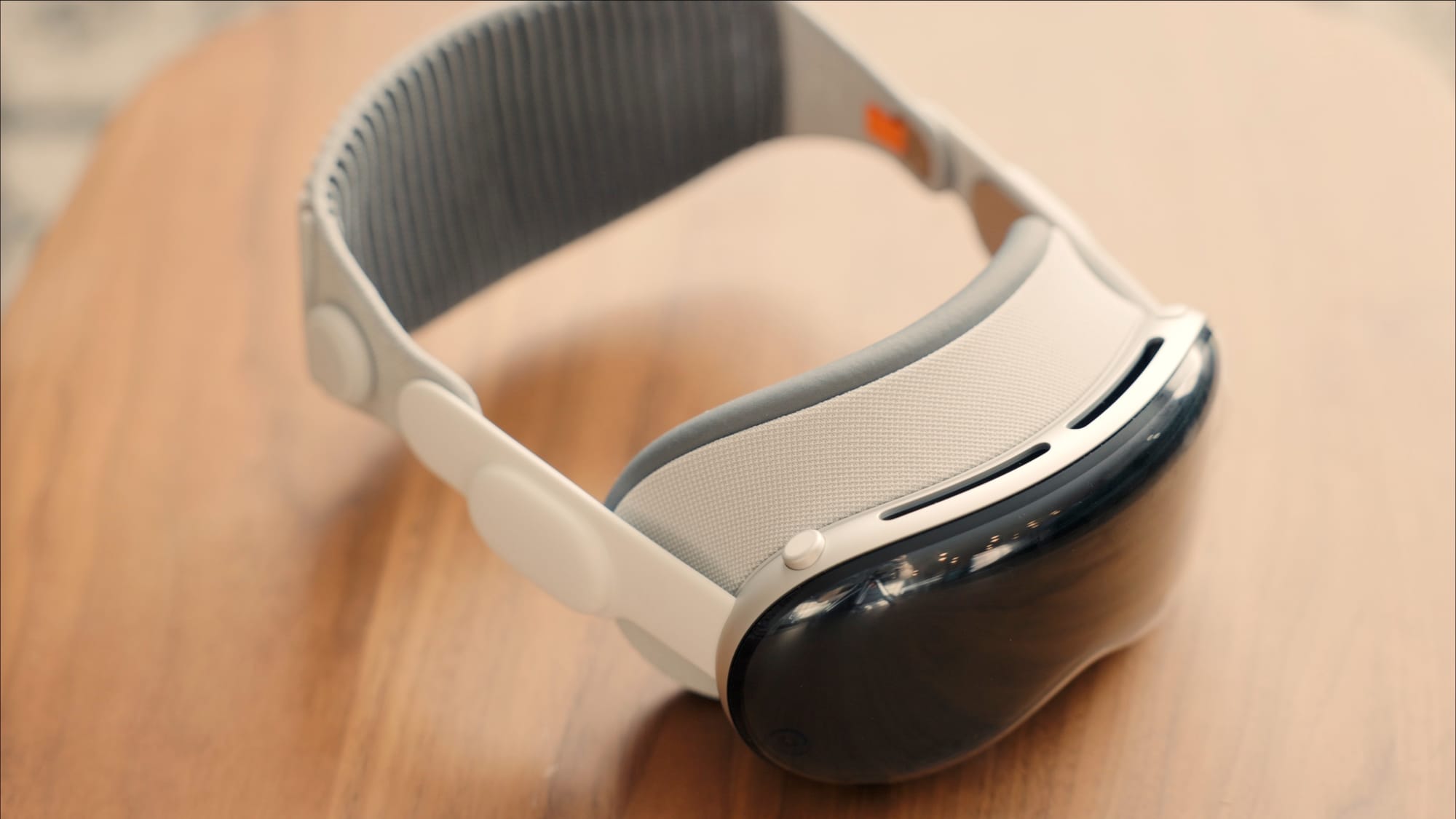
First up, the hardware itself is pretty incredible, and I just find it to be a very satisfying object to look at. As I said in my initial impressions, I don’t think there’s another company that could make a consumer product like this today. It’s a beautiful piece of kit.
The Vision Pro is powered by the M2 processor and the R1 companion processor. The R1 is new to the Vision Pro and is responsible for most (all?) of the the head/hand tracking and passthrough video logic. From what I can tell, the R1 is a triumph, as the real time tracking in the Vision Pro is basically always spot on. The M2 on the other hand is doing great work, but it’s immediately clear to me how more processing power will help future generations of the product feel better to use. Performance is generally fine, but you really see it being pushed in things like scrolling. If you’re “60fps or bust” for scrolling on your devices, then the Vision Pro is going to bum you out a bit.
Also, based on the titles available now, simple visuals are the name of the game, with more advanced visuals like we’d see on PC and Mac, or 4-year-old VR games like Half-Life: Alyx simply aren’t here yet. Even Quest 3 games like Asgard’s Wrath 2 are far more visually ambitious than what I’m seeing on the App Store right now. Part of that is surely just time, so we very well may see higher end games running on this model of the Vision Pro, but we’ll have to wait and see.
Finally on the performance front, the Vision Pro makes heavy use of foveated rendering to only show the thing you’re directly looking at in full clarity, and everything else at a much lower resolution. Apple's of course not the first to use this tech in VR (PlayStation VR 2 and Meta Quest Pro use it, as well as 2019's Valve Index), but it's a smart feature and our eyes naturally do this a bit as well, but it’s done to a pretty extreme level on the current Vision Pro and it’s plainly obvious to see at all times. One example of this being problematic is when watching movies. I find I can’t make the digital screen quite as large as I might want because it gets to a point where only part of the movie is in focus and it degrades the experience for me. This is another example of the M2 processor simply being pushed to its absolute limit, and more powerful hardware would make this aggressive foveated rendering less necessary.
The displays are world-class
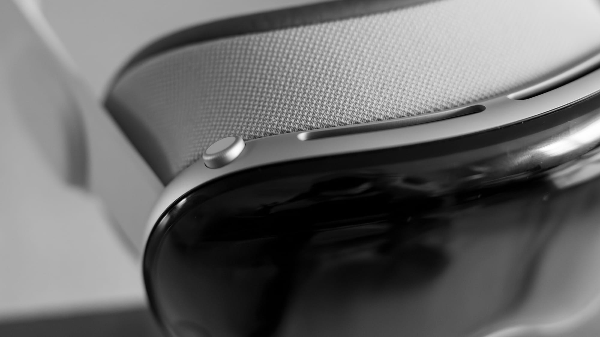
The displays are pretty stellar, and are more clear than anything else you can buy today. That said, they’re also one of the areas of the Vision Pro that I can easily see getting far better in future revisions. I wrote about this at length in this post, so let me just quote the relevant bit from there (emphasis added):
We care about points per degree of vision. In short this is how many pixels are in every degree of horizontal distance you perceive in the headset. In VR we don't care about PPI or DPI, we care about PPD. Using this measurement, the Vision Pro's display is about 34 PPD, which is higher than the Quest 3 (25 PPD) or the PlayStation VR2 (19 PPD), so major improvements there, but how does that compare to the effective PPD of a 4K monitor 24 inches from my face? According to this site, my monitor has 74 PPD, or a little over twice that of the Vision Pro. For those of you with a 5K monitor, you're around 98 PPD at the same viewing distance. In fact, the 34 PPD of the Vision Pro is closest to that of a 1080p 27" monitor when viewed from 24 inches.
So yeah, viewing digital content in the Vision Pro is very much not “retina” by the definition we’ve used for displays over the past decade and change. It’s more crisp than any other headset you can get today, but I think this will be much like the original iPhone’s screen: impressive for its time, but will look archaic within a few iterations.
In much the same way, pass-through video of the world around you is the best I’ve seen on a headset so far, but it’s still far from perfect. Here’s a still from Linus Tech Tips’ review of the Vision Pro giving you an idea for how muted and grainy the real world looks compared to digital content:
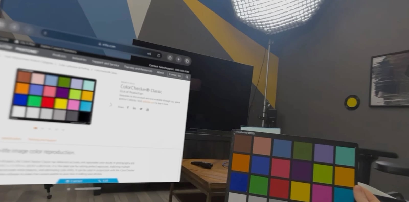
Again, this is the best I’ve seen in a headset myself, and the distortion is less than I see on the Meta Quest 3, but it’s still an area where there is clear room for improvement in future versions.
Eye tracking is super impressive
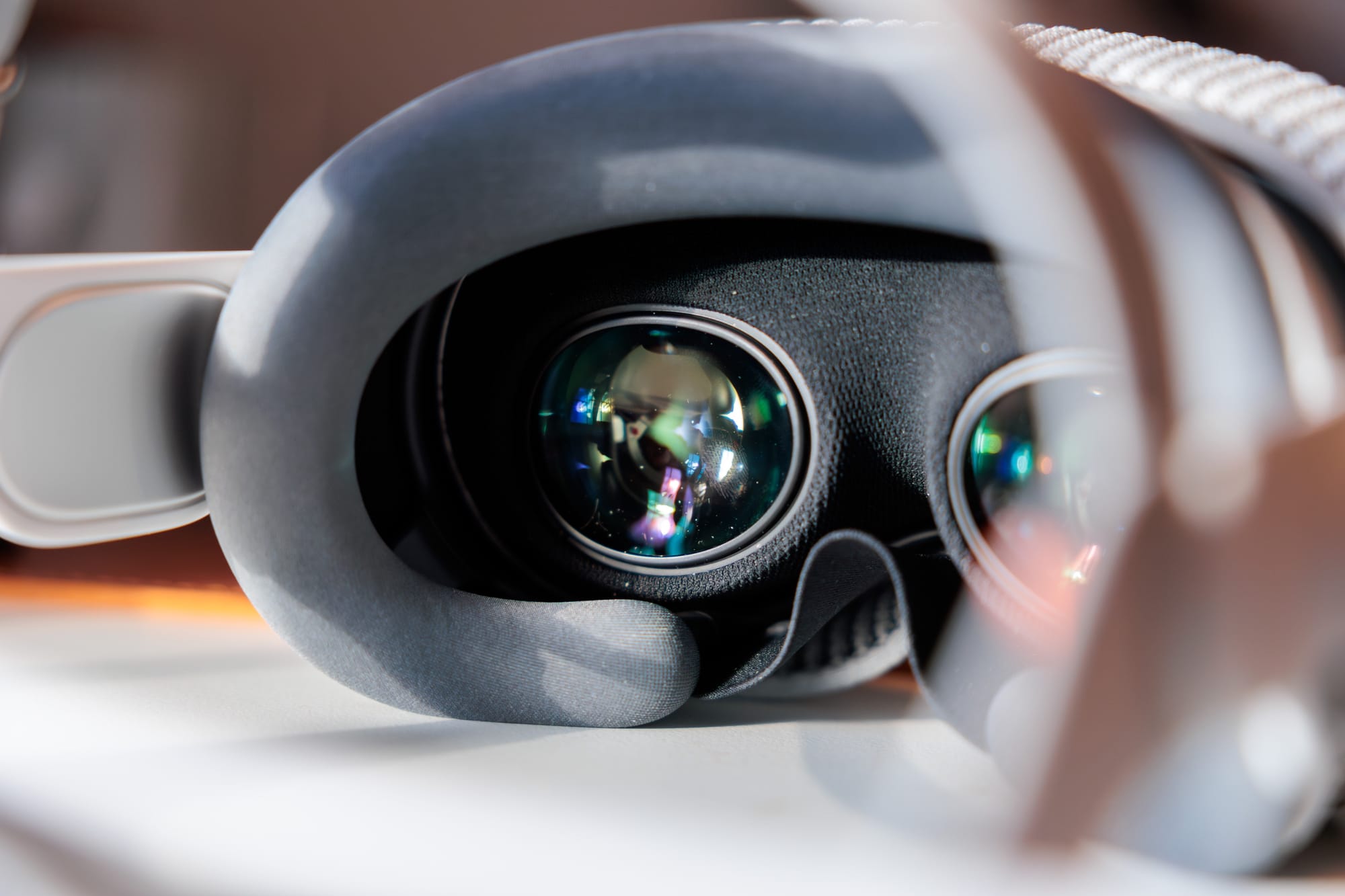
Eye tracking is generally pretty great, and it’s one of the “wow” moments I had early on with the product. If you have any issues with it, I suggest going through the calibration steps again, this time going very slowly through each step. I sped through the configuration my first time and things weren’t quite right, but redoing it helped me a ton. I will say that there are some cases where UI elements are close together and it’s frustrating to try and properly select the item I want. I’ll talk more about eye tracking further down in the review.
Personas ain’t it (yet)
All I will say about personas is that they just aren’t right and I would never use them in their current form in any professional or personal situation. And yes, I have installed visionOS 1.1 and made a new one, but these are simply not ready for use in the real world for me.
In fairness, they are a clever solution to a fundamental problem with wearing a headset, but as we’ll get into below, a lot of visionOS is working to offset the fundamental problems with wearing a headset on your face.
EyeSight doesn't do much for me
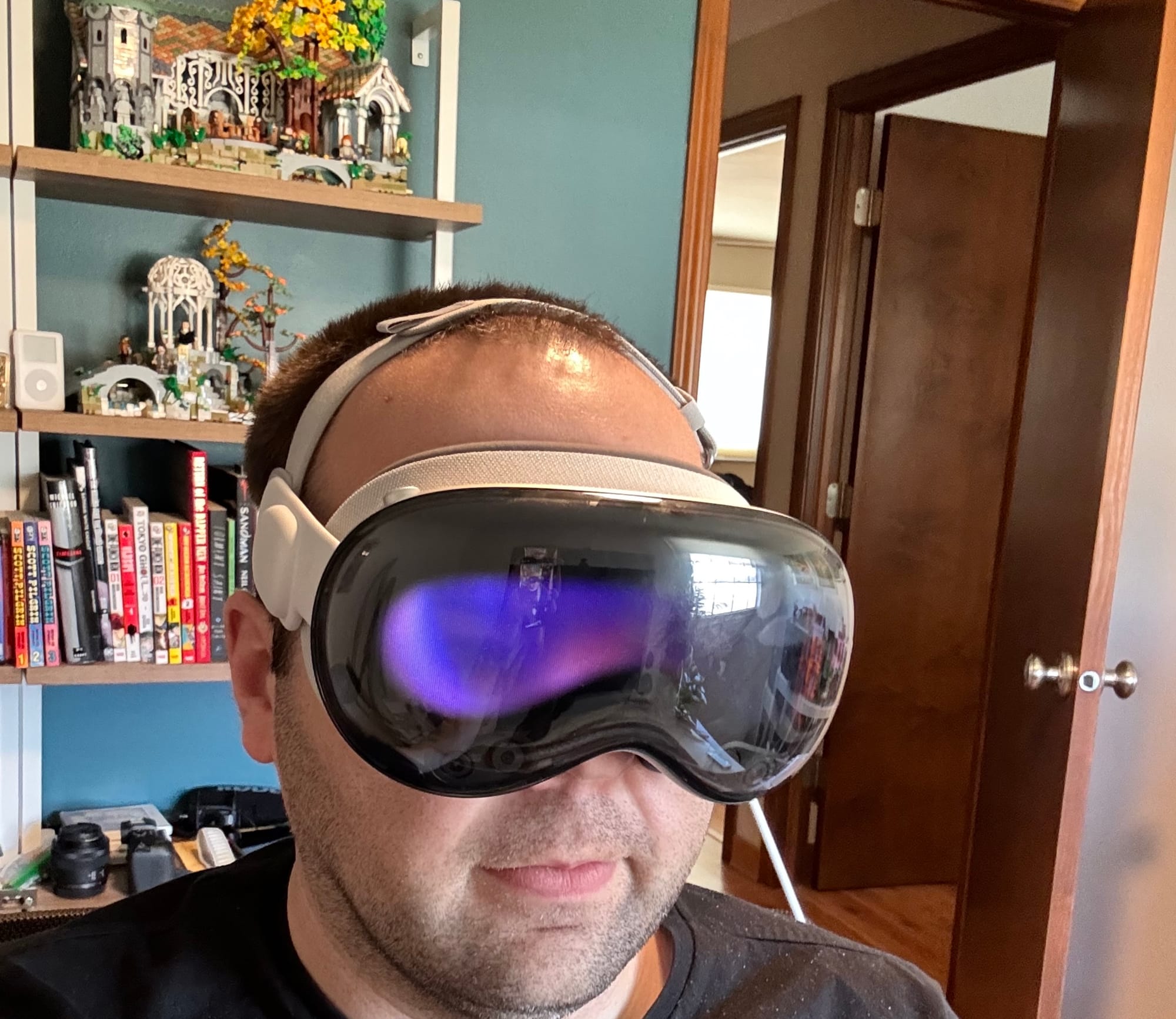
Apple seems to think that EyeSight is an important feature, but I think it’s kind of a miss. Per Apple’s docs, there are 3 modes people can see from the outside, and I think it’s a lot for someone else to remember what each state means.
I don’t have a ton of experience with this feature since I only really use this product while I’m alone, but the outer screen is dim enough and the effect is subtle enough that when I asked my wife what she thought about the feature, she said she wasn’t even sure the screen was showing anything she was supposed to be paying attention to. This is anecdotal, but from her perspective, if I am wearing the headset, I’m somewhere else and a couple digital eyes don’t really change that for her.
Guest mode needs some work
This is also a good place to mention guest mode, which lets you give your Vision Pro to someone else so they can try it out. It’s relatively well thought out, as it does things like asking if you want to mirror the display to a nearby AirPlay receiver so you can see what the other person is doing. It also lets you choose whether the guest can only access the current app or if they can freely navigate the system.
The tricky thing about this mode is that it takes a long time to set up. The guest puts on the headset and they need to align the lenses and go through the eye tracking calibration steps. I understand why this has to happen, but it does mean that it takes a few minutes of un-fun work to get someone to the fun stuff you were trying to show them. What’s worse is that the moment the guest takes the headset off, everything is immediately reset and they need to go through the setup again.
This is one thing when I’m trying to give someone a one-time demo, but it’s really annoying for trying to share the good experiences the Vision Pro enables with my wife. As it stands now, she doesn’t want to be bothered with seeing photos or spatial videos because it’s so much work each time. That’s a real bummer and it’s a real missed opportunity for Apple who I would guess wants families sharing this thing so that once it gets cheaper, additional family members want to get a headset of their own.
What I’d like to see in an update is the ability to create multiple users, but given Apple seems to have no interest in this on any platform created in the past 20 years, I’d suggest being able to mark a guest as a “VIP” so that their lens alignment and eye tracking calibration settings are saved and automatically used when you indicate that you are entering guest mode for this VIP user.
The virtual keyboard is better than I expected
The virtual keyboard got a lot of criticism in the early reviews, but honestly I find it pretty good considering the limitations inherent to the VR space. You can look at keys on the virtual keyboard and pinch to hit them, or you can reach out to them in 3D space and press them that way. I find the second method to be quicker most of the time. I would never write a blog post that way, but for entering a password or search term, it’s fine.
Battery is alright
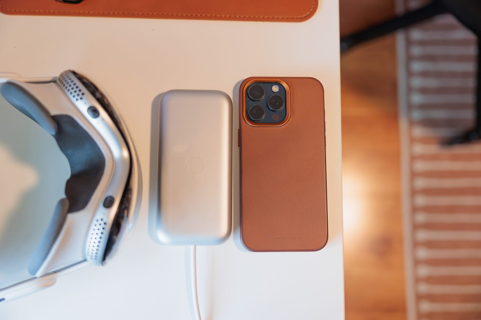
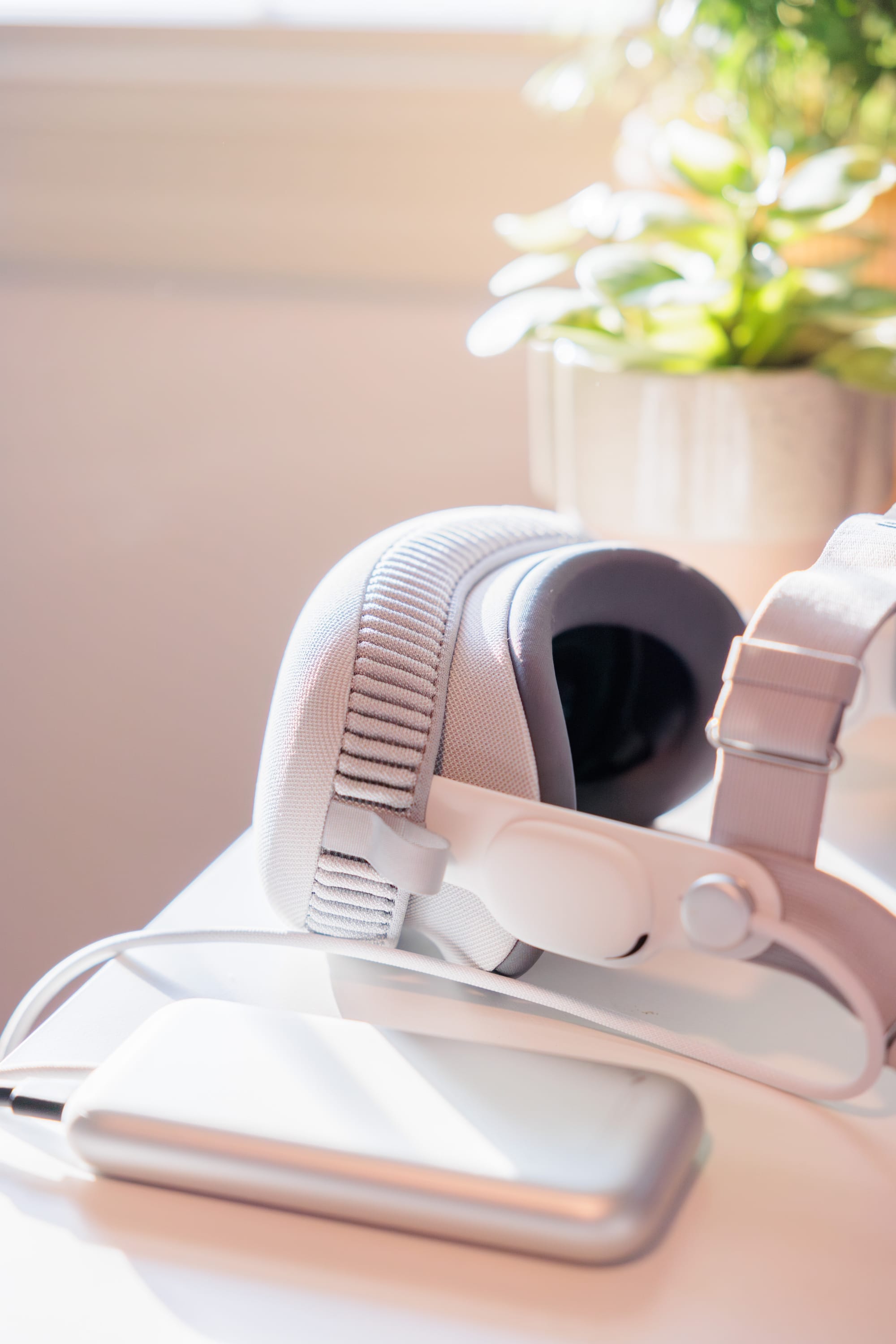
The external battery is definitely a little annoying, but you do manage to get used to it relatively quickly. I do still get hooked on things like the arms on my office chair, snapping my head that direction unexpectedly, but more often than not it's just a minor annoyance. It really makes me appreciate the Quest 3's completely wireless operation, but it's not the end of the world either.
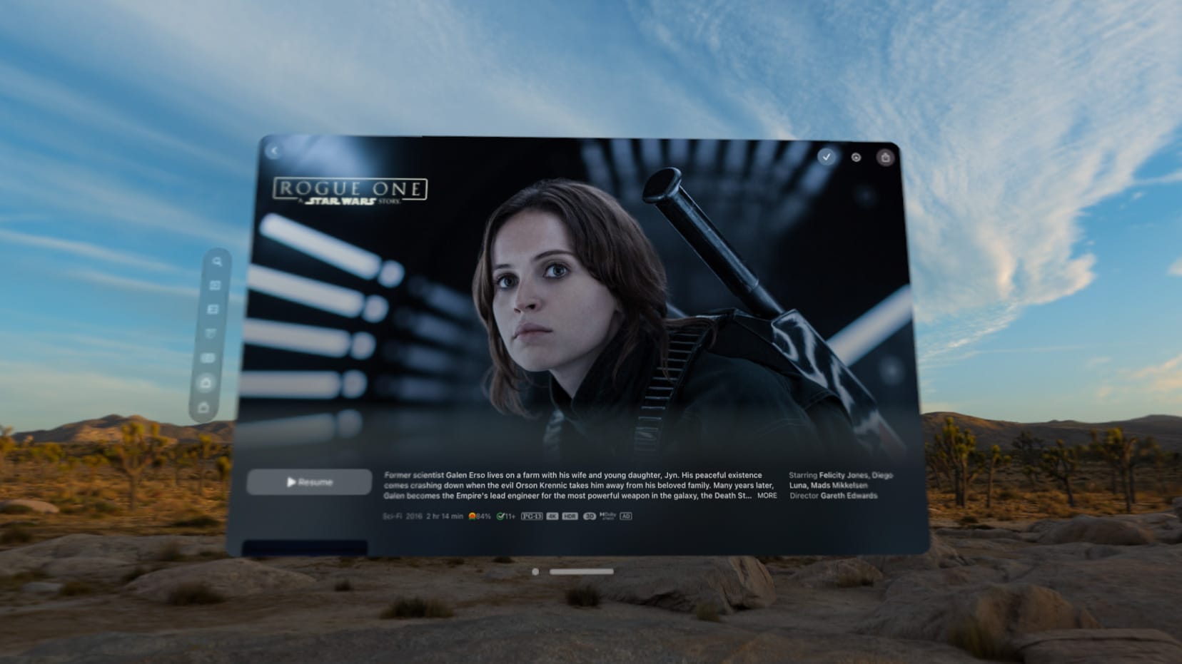
In terms of battery life, I seem to get a bit over 2 hours when watching a movie. Rogue One is 2 hours and 13 minutes and I just made it through on a full charge. Anything longer and I'd make sure I could plug in while watching. I don't have any great battery tests to share for doing productive work because frankly I haven't worn it for more than an hour or so at a time.
One last quirk is that while we have become used to Apple devices having pretty insane standby battery life, that's not the case with the Vision Pro. If I charge this thing up to 100% and just let it sit for 2 days, the battery will be dead or close to dead when I pick it up again. I guess the device is just more "alive" when it's sleeping than other devices, but it was a bit of a surprise. If you want to leave it for more than a day, just unplug the battery from the headset.
Audio quality surprised me
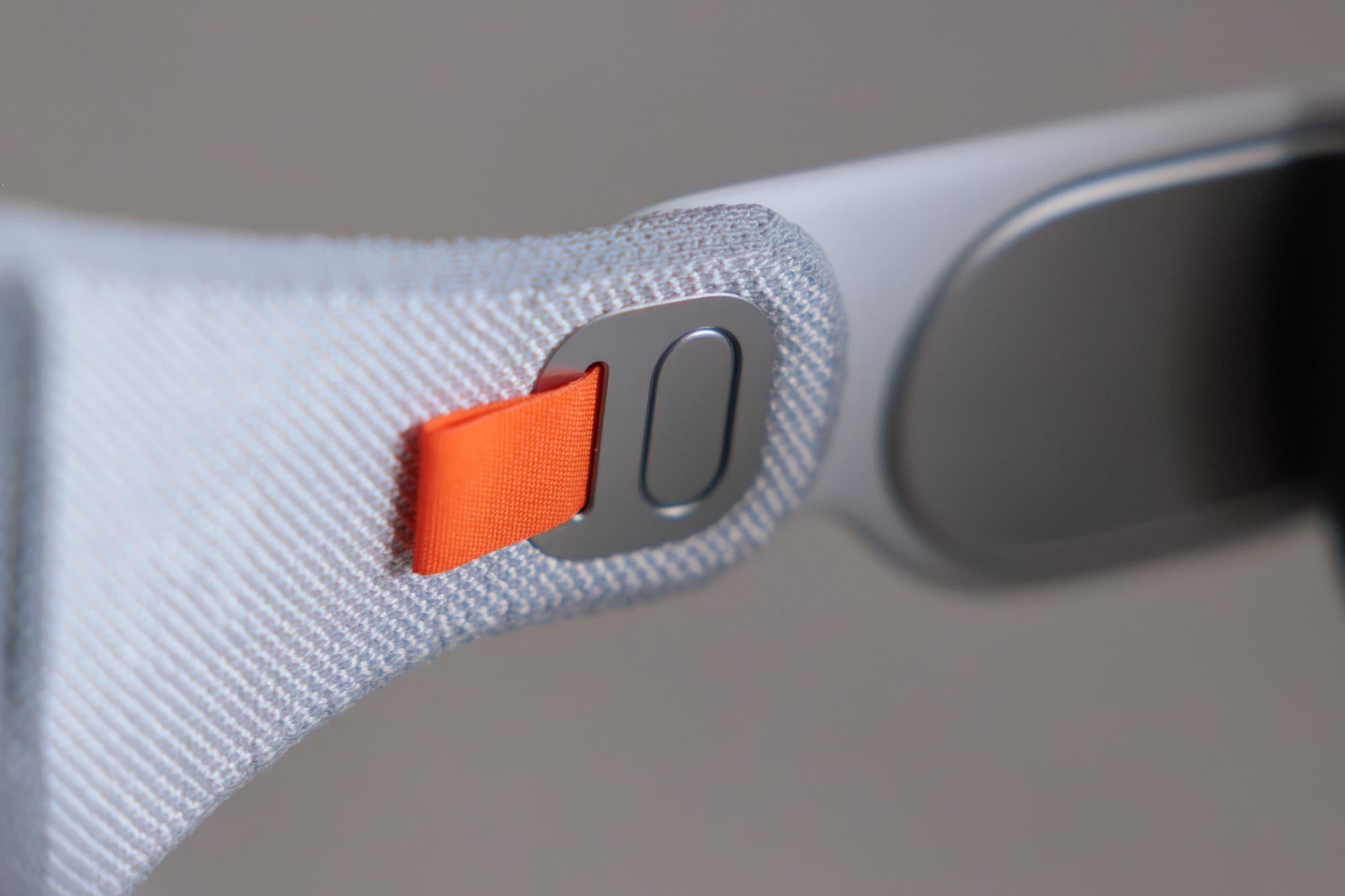
The built-in speakers are surprisingly excellent. John Gruber called them better than any headphones he’s ever used, and while I wouldn’t go that far, I do think they’re pretty excellent, and if I’m watching a movie on the Vision Pro, I’m always using the built-in speakers rather than popping in headphones because they sound so good (and I don’t want to add even more bulk to my head).
I’m not an audiophile by any means (AirPods and AirPods Pro sound the same to me, lossless audio sounds the same as any old MP3, etc.) so take this with a grain of salt, but color me surprised how fantastic these little speakers sound.
Value for money
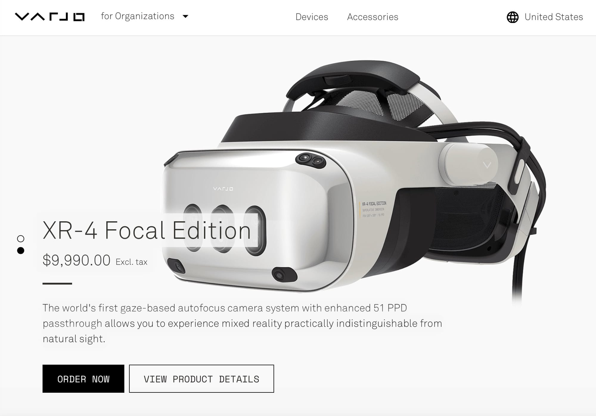
If tech specs are your jam, then I think the Vision Pro is an absolute banger in terms of value. It’s delivering absolutely top of the line specs basically across the board, some better than anything we’ve seen before, and it’s doing it at lower prices than remotely comparable devices. I compared it to Varjo’s products, which sell for $4,000 all the way up to $10,000, and those are useless without a very powerful PC attached to them to drive the visuals. The fact Apple’s device is delivering similar or even better specs to those devices at $3,500 is impressive. I even talked to someone who has used a Varjo headset in the past year and they said the Vision Pro is more clear to their eyes.
Whether you want to pay for the highest end product available is a whole other story, of course. I’m not going to sit here and tell you that my Chevy Cruze is more capable or faster than a Porsche 911, but that’s irrelevant because my needs don’t require the best car money can buy (also I literally can’t drop six figures on a car 😂).
Ok, now we’re going to get more into the subjective, higher level stuff.
The headset problem
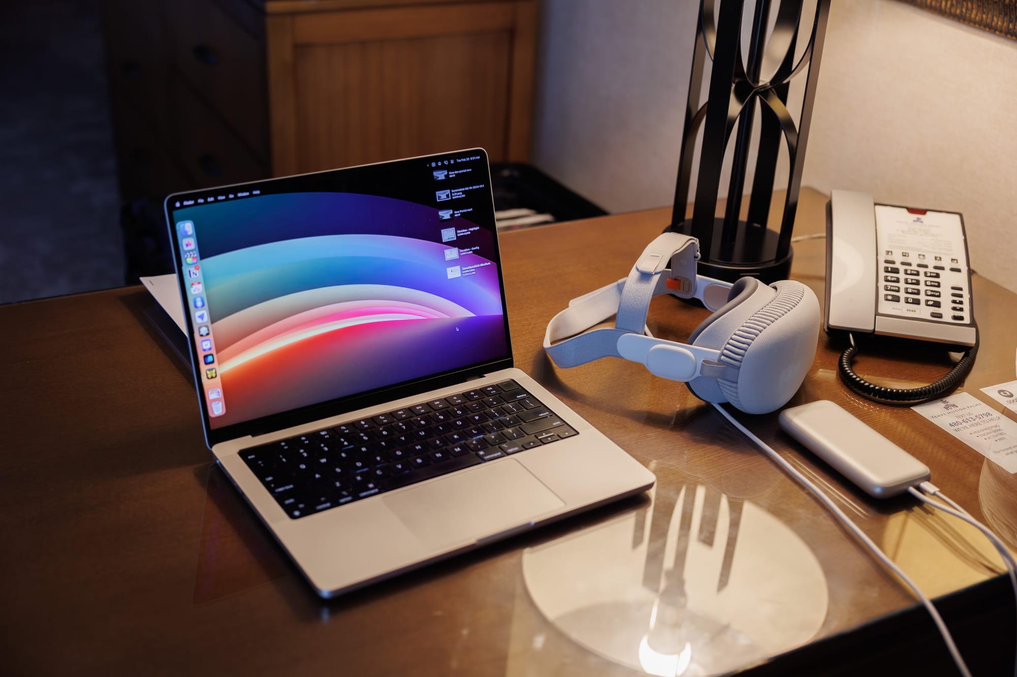
The fundamental problem I have with the Vision Pro is that I just don’t like wearing a headset. To be clear, I'm not saying it's the absolute worst thing in the world, but there is no situation where I am more comfortable wearing a headset than not wearing one.
The strap messes up my hair and it’s so heavy that I either need to let it rest on my nose until it’s sore or pull it so tight against my face that I have red marks around my eyes for 20 minutes after taking the thing off. And when I’m wearing it, I’m less able to move around freely, I’m trapped looking at a digital screen, and interacting with the real world is worse than if I was working with any other computer.
That’s harsh, but it’s simply the way I feel.
But plenty of tech hardware is not ergonomically ideal, you say! An iPhone is a large rectangle which is not exactly the most ergonomic form factor for something you hold in your hands. That’s true, but I would say that the physical challenges for me are far less than those I experience with a headset, and the utility of smartphones makes the trade-offs worth it. The smartphone has proven basically from the start to be so unbelievably useful in so many situations that it easily overcomes any physical hurdles most people have with them. Obviously it wasn’t as robust as it is today, but using an iPhone was a pretty clear upgrade from anything else someone was using before (most people were coming from a flip phone).
This is just how it is for every product: do the benefits outweigh the costs? While I say using the Vision Pro is uncomfortable, messes up my hair, leaves red marks on my face, and makes interacting with my surroundings worse, all of that can be pushed aside it if the product delivers something compelling enough. I would say that so far for me the Vision Pro has not cleared that bar. After the famous VR honeymoon ends and seeing apps in 3D space is no longer novel, I don’t find myself drawn to using the product for work almost ever because it never feels like the best tool for the task.
In fairness, a part of this is that the product is very new. Not only are third party apps far more limited than they are on Apple’s other platforms, but the OS itself is very fresh-out-of-the-oven. I’m not one to complain about “beta testing” software that’s new, but this is one case where it almost feels like this is visionOS 0.1. So many things aren’t here yet, and some parts of the interface definitely still feel like they’re ironing out the kinks in real time. Honestly, I’d prefer Apple nail down the basics and then expand the platform out from there, so I’m not mad about this, but anyone considering buying one of these today should definitely be aware that there’s not a ton in the OS right now.
All of this comes back to the fact that putting on a headset is annoying, and you need to have compelling reasons to get people to overcome those annoyances.
To Apple’s credit, the apps that they have built for visionOS so far are quite good. I’ll get into some of the more compelling experiences in a later section, but for now I’ll say that the quality of the software isn’t really my issue, it’s more the fact that I find myself gravitating towards doing these same tasks on a Mac or iPhone, largely because I find using those devices more comfortable.
Quick aside here that some people seem pretty confident that Apple will have this sort of functionality in a normal glasses form factor pretty soon, but I would really temper expectations there. Maybe Apple will release glasses, but those will be far less capable than the Vision Pro. Shrinking the current components down to glasses is going to take over a decade in my estimation, and that’s not even taking into account the fact we need a better processor, better cameras, and better everything else to keep improving this product. My estimation is that headsets that cover your face are here to stay for this product line.
Eye tracking’s double-edged sword
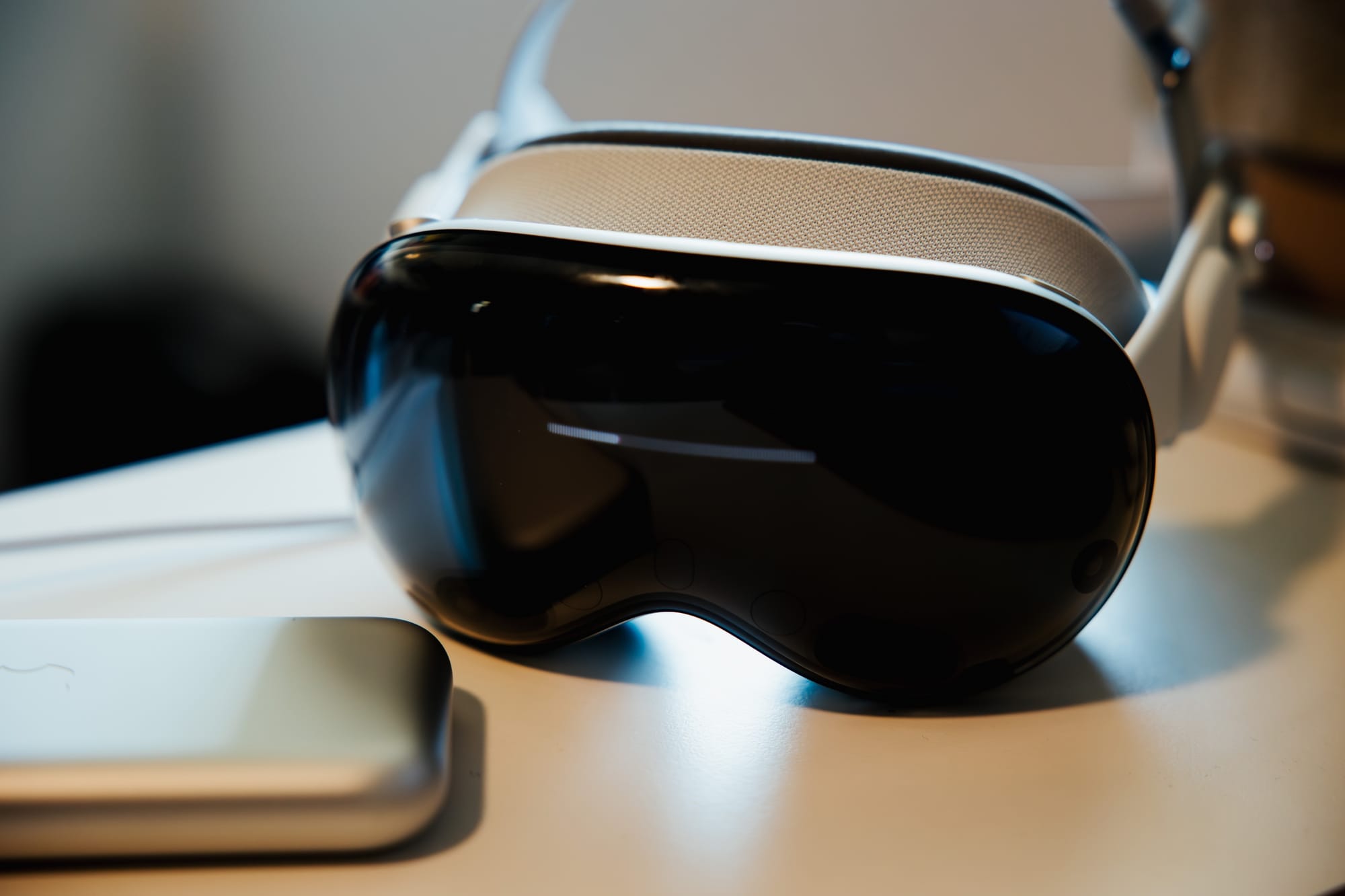
I mentioned earlier that the eye tracking is very accurate, and that’s absolutely true. Many other pundits have praised this eye-based UI to high heaven and suggested everyone is going to copy this going forward, but honestly I don’t love it all the time. It’s technically impressive, but god damn do I find it exhausting to use for extended periods. Maybe this just takes more time training my eyes to have more endurance, but I find visionOS to be a bit “heavier” to use than Apple’s other platforms.
Using this interaction model makes me think about car interfaces. A lot of modern cars have moved to touch-based interfaces, eschewing physical buttons for many common tasks. People have widely criticized this change as it makes it harder for them to perform actions without moving their attention to those digital buttons. visionOS is similar to this but goes even further; if you’re not looking directly and perfectly at a button, you can’t use that button.
I’m not suggesting that Apple needs to go back to the drawing board or anything, but using visionOS has made me appreciate how often I’m doing things on my computer without staring intently at the thing I’m interacting with.
It’s also made me appreciate how I don’t feel any of this while navigating the Meta Quest 3 UI with physical, 3D-tracked controllers. I really hope Apple is working on some version of physical controllers themselves, as this will give more interaction options that will be very welcome. The Mac supports a billion inputs, iPads do as well, so it’s totally reasonable to think visionOS will get more than what it has today.
A UI that demands mobility
There is a contingent of Apple fans that says Apple will and should never make a touch screen Mac because it would be too much effort for someone to have their hands on the keyboard and mouse, and then raise their hand to touch the screen sometimes. Setting aside the fact this view omits the freedoms that open up once you have a Mac you can touch and use without a physical keyboard, it’s very funny to me that few of these same people have any seeming complaints with visionOS, which is an operating system built fundamentally on you moving your body around quite a bit as you use it.
Yes, you can hold your hand mostly still and pinch to “click” things in the operating system, but that’s a single interaction, it’s far from the whole experience. For example, when you open a new window, you likely want to move that window where you actually want it, which means grabbing it with a pinch and then moving your arm potentially a few feet to get it where you want it. Or if you fill your digital space with windows all around you, you’re going to have to move your head more than you would with any other computing platform to work with all those windows. Then again, I’m a one monitor guy which means I never need to physically move my head to see everything on my screen. If you have 3 monitors surrounding you and you are constantly turning left and right to see things, maybe this won’t be as big a change for you.
Just like the eye tracking bit above, I don’t think this is a deal-breaker, but I do find it to be something that makes using the platform feel more intentional than the comparative chill I get when using an iPhone or iPad.
The challenge of getting stuff done
I’ve written a little of this review in Ulysses on the Vision Pro, but I wrote most of it on my Mac. Part of this is that I can’t pair my preferred (wired) keyboard to the headset, another part is that editing text is not as easy as it is on my Mac, and the third is that I’m more comfortable not wearing a headset for extended writing sessions.
I say all this to explain my general feeling about being productive on the Vision Pro. The Mac, iPad, and iPhone already give me pretty fantastic ways to get my work done, and they do it at higher fidelity in more mature operating systems and with far more software options.
Here’s what I said Apple needed to show me with the Vision Pro to make it worthwhile to me:
- Something I can’t do today with my iPhone, iPad, or Mac
- Something I can do on my other Apple devices, but in a way that’s clearly better than what I already have
I do think they did this with media (see next section), but I really haven’t had this experience with anything productivity-related yet. Apps like Things and Fantastical which have made native visionOS versions of their apps are just the same experience with visionOS’s UI elements. Meanwhile, more of my apps are available as their iPad versions which are just harder to use in visionOS than they are with touch input on a physical iPad. And then there are the many, many apps that aren’t even available at all on visionOS in any form.
The sorts of apps that give me a taste of what could be useful are actually a few tiny utility apps such as DayPeek (ABC video) which puts a tiny little box on screen counting down to your next calendar event. There’s also HomeUI (MacStories feature) and Shortcut Buttons (Matthew Cassinelli write up) which let you pop little HomeKit controls and Shortcut buttons around your space. These are pretty cool and lean into the concept of making something that only makes sense on visionOS.
The challenge for me is that these little apps are not worth the trade-offs I listed above (uncomfortable thing on my head, messed up hair, blurry real world, heavier interactions, etc.) for doing productive work in the headset, so I find myself rarely working in the headset.
To move the needle here, I think we need to see some more adventurous apps that figure out how to elevate their experiences beyond simply using visionOS UI elements on their iPad apps, and we need Apple to give developers those tools in visionOS itself.
I’d also really like to see Apple greatly improve window “session” management. Right now, I basically start from scratch every time I put on the Vision Pro. I need to open each app one at a time and move it to where I want it to be. I’d really like to be able to configure a few windows and then save them as a “session” or “workspace” and then pull up that configuration on demand in the future. I’d also like to see the ability to permanently put windows like the HomeKit and Shortcut ones mentioned above at specific points in space and have them never move from there ever again. For example, when I place a HomeKit switch on the lamp in my office that I can look at it and pinch to turn it on and off, let me pin that button to the lamp so it’s always there no matter what. This sounds like an evolved version of Stage Manager, huh?
The incredible media experience
Here’s a section that I can be mostly positive about! Enjoying images and video on the Vision Pro can be excellent, although there is a specific caveat. I went deep on this in a previous post, so I’ll summarize the main points here.
Watching movies on the Vision Pro is pretty spectacular. Despite the lower PPD resolution than watching on a 4K screen in your living room, movies look fantastic in the headset. 3D movies aren’t really my thing, but if you enjoy them, this is the best way to watch them we’ve ever had. You don’t lose brightness by wearing glasses that kill half the light coming off the screen, and the 3D is simply more clear than I’ve ever gotten in a theater.
There are not all the major streaming apps on visionOS yet, but Apple TV, Max, and Disney+ are here now. If you have a movie collection on Google or VUDU or somewhere else, I’d highly suggest signing up for Movies Anywhere, which is free and syncs your library across all the major movie stores. Take the Vision Pro out of the conversation entirely and this is still something I recommend you try anyway.
Random aside, but there is no YouTube app yet, which is definitely annoying. You can watch in the browser, which is what I’ve chosen to do, but that also means you can’t download videos due to Safari limitations and the UI is not optimized around eye tracking, so “tapping” the right thing in the UI can be tricky. Some folks swear by Juno, but it doesn’t really work for me (can’t save to watch later, doesn’t track history, is just a thin layer over the web UI).
Then there are photos, which can be awesome to look at in the Vision Pro; they just look beautiful. Panoramas are a special treat as well. I was in Colorado last summer and saw some incredible sights while I was there, so I took some panos. When I look at these on my phone or even my Mac's external display, they just fail to capture the grandeur of what I saw on the day. When you open a panorama in visionOS, the image takes up your whole view and it was the first time I looked at these photos and finally thought they captured the feeling of scale I felt when I was at this place.
Then there’s spatial video, which if I’m being honest, I don’t really get yet. I think it’s an interesting novelty, but for me I’d prefer to have nicer looking 2D video of my memories for now. It’s like early days of portrait mode where the photos you got were notably lower quality, but they had a gimmick that was cool sometimes. I hope Apple improves spatial video capture so that I can capture everything in it and not feel like I’m sacrificing quality. Maybe I just haven’t captured the right sort of video yet, or maybe I’m a heartless bastard, but it just doesn’t blow me away yet.
Apple also has a few short videos in the TV app showing off a new camera rig that captures a 180° field of view and 3D depth. These videos are pretty cool, and I especially enjoyed the one with a woman walking across a tightrope. I’d love to see more things captured like this, and I fully expect this to start rolling out over the rest of the year.
But…
The big “but” attached to all of these experiences is that you do all of them alone. You can enjoy a movie by yourself. You can experience memories in your photo collection on your own. You can watch the game…by yourself. We’re getting back into one of the fundamental challenges of using a headset, but every single media experience you have in the Vision Pro is a lonely affair. Maybe you watch most things on your own and this isn’t an issue for you. That’s great, but for me not being able to share any of this with my wife is a bummer.
Maybe a visionOS update will bring some form of SharePlay where two people with headsets can experience the same thing in the same 3D space, but that turns this into a $7,000 investment and probably won’t work as expected due to rights issues with digital media (“you own this, but your wife doesn’t, so she can’t see this in her headset”). Again, it’s a fundamental problem for headsets, and solving this is going to be one of the biggest software challenges for this product category.
Another closed platform
I did want to mention right here near the end that this is another new platform from Apple that is completely closed off and which Apple retains absolute control over what you experience and what businesses are allowed to build on this device. I think Apple is a good steward here most of the time, but they aren’t always and I think it’s worth at least recognizing that we’re on a path to a place where Apple and Google have control over what we get to use and what businesses get to operate on the only platforms that matter.
How I’d spend $3,500 as an Apple fan today
$3,500 is a massive amount of money to spend in a day, let alone on one item. I think right now here are some personas and how I think they would be best suited spending up to this amount of money.
Note that none of the links below are affiliate links, even though they probably should be if I were a smart blogger.
If you’re happy with your computing already and are excited to play with new products that might be the future: If you’ve got the cash to spend, then sure, go ahead and get a Vision Pro! This is not the most logical thing to buy today, but hey, neither was a Mac in 1984, an iPhone in 2007, an iPad in 2010, or an Apple Watch in 2015. Some people will pay for a chance to play with tomorrow’s tech today, and this is a rare chance to do just that.
If you are happy with your Mac already: Consider a better monitor, such as Apple’s Studio Display ($1,799) or what I use, the Sony INZONE M9 4K 144Hz monitor ($699). Then consider a keyboard and mouse upgrade. There are a million of these out there, but I personally use a Mode Envoy, which cost about $350, which is a lot but is also a drop in the bucket compared to how much a Vision Pro costs. For a mouse, it’s a cliche, but I love the Logitech MX Master 3S ($99). After that, maybe get a pair of nicer computer speakers (Audioengine A2+ are nice, $269) and a Thunderbolt 4 dock like this OWC one that I use and love ($229). These upgrades are going to run you about $1,650-$2,750 depending on which monitor you got.
If you’re looking for a great VR gaming setup: We have a lot of money to work with here, so let’s start by buying a pre-built gaming PC like this one from NZXT ($1,599) which gets you similar spec to my PC and which I can play basically any game at max settings in VR today. Add on a Meta Quest 3 ($499) and boom, you’re there. All in we’re just at $2,099 and you have $1,400 left to spend on kick-ass peripherals or monitor(s).
If you want to get the best Apple computer lineup for the money: I’d go with a 13” MacBook Air with the upgraded processor, 16GB RAM, and 512GB SSD for $1,499. Then I’d add on a 256GB iPad Air for $749. I don’t quite have enough to get a Studio Display at this point, but I could get my Sony monitor mentioned above and have around $500-600 to spare.
So yeah, I’m not here to tell anyone how they need to spend their money, but $3,500 goes a long way, and I think it’s worth thinking about how that money could be spent on other things that could be more practical for you. Glass houses and all, I spent that money on the Vision Pro, so you’ll get no gruff from me if you choose to do that as well.
Final thoughts
As I think I’ve made pretty clear by now, the Vision Pro is a deeply complicated device. A month into the product’s life I think it’s impossible to tell how well this will do in the long run. It’s a new platform from Apple so we assume it’s too big to fail, but they’re going to miss eventually, and a VR headset is a big swing.
As it stands today, I think the Vision Pro is a product for people who are willing and able to dive into something that might be the future. Casey Newton wrote about how you can do this with generative AI tools by giving basically any of them $20 per month, the amount for the Vision Pro is juuuust a tad higher.
For my part, keeping the Vision Pro past its return window is a gamble on the future. As I think I’ve pretty clearly laid out above, I have serous issues with this product and I remain skeptical of its utility in the short run. That said, it might turn into something special and I want to be there to experience it if it does. It’s not fully rational and I would not expect everyone to feel this way, but if there’s a chance to get a foothold in the next big thing, I want to be there in the mix.

