Android Oreo Review: All the Little Things
This is part 2 of a multipart series on Android Oreo. The subsequent parts in this series will be posted daily to BirchTree, so subscribe via RSS, Twitter, or Apple News.
- Part 1: Introduction
- Part 2: All the Little Things
- Part 3: Google’s Assistant and Other Apps
- Part 4: Third Party Software
- Part 5: Performance and Stability
- Part 6: AirPods
- Part 7: Notifications
- Part 8: Conclusion
Before getting into the larger features in Android, I want to hit on a few of the little things that make the Android experience notably different from that on iOS.
Apple Services
Apple has a bunch of services you can use on the Mac and iOS, so here’s a quick chart showing which ones are possible on Android:
- Apple Music: there’s an official app, and it feels more like a regular old Android app than you’d expect, but it’s slower than the iOS counterpart, as well as other music apps on Android
- FaceTime: nope, doesn’t work at all
- Find My Friends: nope
- Find My iPhone: nope (duh)
- iBooks: nope
- iCloud Drive: nothing, sadly
- iCloud Calendar: yes, by signing into iCloud in the Google Calendar app (use an app-specific password)
- iCloud Mail: yes, by signing into iCloud in the Gmail app (use an app-specific password)
- iCloud Notes and Reminders: nope
- iMessage: nope
- iTunes Match: yes, via the Apple Music app
- iWork: nope
- Apple Maps: nope
- Apple News: nope
- Apple Photos: nope
It’s pretty dire over here on Android when it comes to Apple’s services. If you’re deep into Apple’s series listed above, you can really only bring your email, calendars, and music collections over with you. This is Apple’s fault for not making their service cross-platform, but it’s something you should know before making the switch.
The Back Button
The back button is very nice about 90% of the time. People on the iOS side of the fence like to make fun of the back button for being confusing and being unclear about what it’s going to do, but that has not been my experience at all.
Most of the time, the back button does exactly what its name implies, it takes you to the last page you were on. If I’m in Twitter and tap a link to see a website, the back button closes the website and brings me back to my timeline. When browsing a site in Chrome, the back button does exactly what a back button in any browser would do and takes me to the last page I was on. If I go from my library to an album in Apple Music, the back button takes me back to my library.
Yes, sometimes the button takes me back to the home screen when I’m not expecting it to, and sometimes you have to hit it 3-4 times even through you only went one level down into an app, but these are the exceptions, not the rule.
The back button will never come to iOS (maybe that’s claim chowder) but I actually kind of miss it now when I find myself using my iPhone. It’ not as elegant as a swipe to go back and it’s not as explicit in its function as a labeled back button on screen, but it’s pretty convenient.
Missing 3D Touch
I never thought I’d miss 3D Touch this much, but I really do. There’s just something wonderfully tactile about it. Android has a way to move the cursor by swiping along the the keyboard, but you have to do it over the spacebar only and it’s a bit finicky to trigger. I long for the ability to press into the keyboard anywhere and move the cursor freely.
Android has app shortcuts on the home screen that you trigger by holding down on the icon for a second. This feels empty and a bit awkward without any feedback from the system.
I even miss peek and pop when I’m scrolling through Twitter and looking quickly at images, videos, and even some websites with the peek and pop actions. These don’t exist on Android and I miss them every day.
Haptic Feedback
While I’m on the subject of tactile things, I also miss the Taptic Engine on the iPhone 7/8/X. The motor in the Pixel 2 is fine for vibrating when a notification comes in, but it has no subtlety anywhere else. I miss the ticks as I scroll through selectors, the subtle buzz when plugging in to charge, the satisfying chunk when I trigger 3D Touch, etc.
This is a small one, but it makes the iPhone feel fancier and not just like a phone using the same motor that was in my 2004 RAZR. Apple may have gotten heat for talking up the Taptic Engine last year because “who cares about haptics?” but the difference is noticeable and it makes my iPhone feel more premium than the Pixel.
Better Do Not Disturb
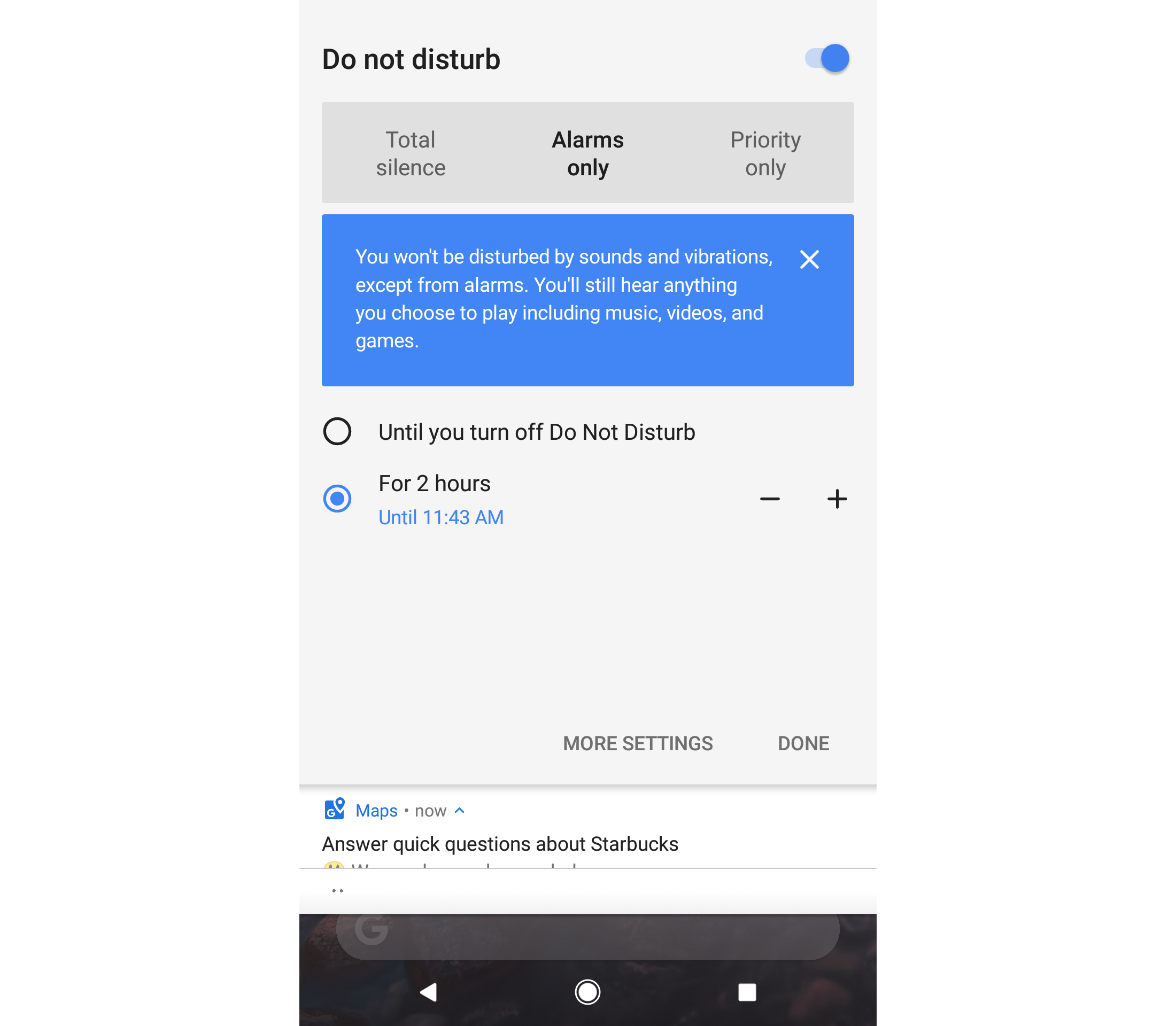
One of the coolest features of Android is how it handles Do Not Disturb. Just like iOS, you can set it to go on and off at certain specific times or manually whenever you want, but you can also tell it to go on DND for a set amount of time. This is great for when I go to a movie, for example, where I can set DND to go for 2 hours and then not have to remember to turn it off when I leave the theater.
It would be cool to have the ability to set DND to turn itself off when I leave a location, but as it stand now, it does everything DND does on iOS and then some. Apple, please steal this!
Android Pay
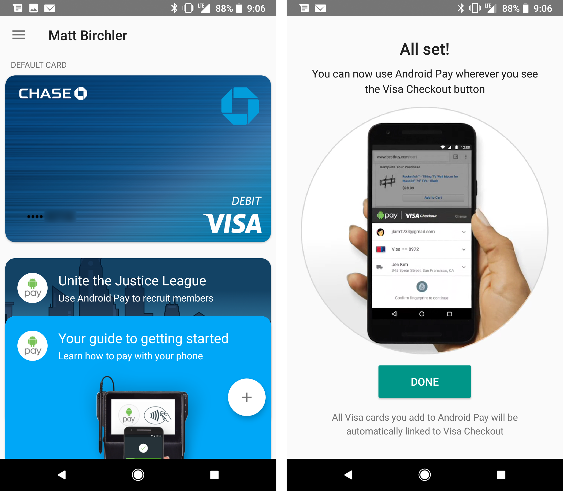
Android Pay is wonderful! I adore Apple Pay on the iPhone and Apple Watch, and it’s honestly just as good on Android. Just like Apple Pay, the setup is smooth and I was up and running in about 2 minutes.
Paying in stores is a breeze too, as it’s simply a matter of holding the phone near the terminal and holding my finger to the fingerprint reader. It was just as fast and easy as Apple Pay in most instances, which is a far cry from the Google Wallet days not too long ago.
As for reach, Android Pay is accepted most places that Apple Pay is, and I only ran into one instance where a store took Apple Pay but not Android Pay1. Looking in the Android Pay app right now, I can see dozens of stores within 3 miles of me who take Android Pay.
Additionally, Android Pay has some sort of partnership with Visa so you can link you Android Pay account to your Visa Checkout account and use Android pay on any website that uses Visa Checkout. I still find more websites and apps that use Apple Pay, but Android is not as far behind as you might think.
Inter-app Communication
I’ve gotten the impression that one of the great draws of Android is that the concept of “apps” is looser here. Somehow apps are supposed to be more interconnected than on iOS. I personally have not seen this to be the case.
Android 100% has the advantage when it comes to default apps, as I can freely change the default apps for browser, launcher, phone, SMS, and NFC payments. This is very nice to have, and I wish Apple would allow this on iOS.
Also, Android allows links to open in specific apps as well. For example, a link to a Reddit post can either open my browser to that page, or I can choose to have Relay or the official Reddit app take that link. iOS allows apps to do this, but the user does not have control, so the official Reddit app can handle Reddit links, but Monochrome or Narwhal can’t request permission to open Reddit links.
But that’s really where it ends in my experience. I still have to open a share sheet and scroll through a bunch of apps to open something elsewhere, and I have not found a useful instance where one app is enhanced by another app exiting on the phone. There are icon packs and wallpaper apps that can talk to custom launchers to make their icons/walls available in those apps, but that’s about it.
Frankly, third party apps seem to talk no more to each other on Android than they do on iOS, and the URL scheme ecosystem on iOS actually enables some workflows that I have not been able to replicate on Android. Namely, anything I do in Workflow for iOS is basically impossible in any app I’ve tried.
Android Auto
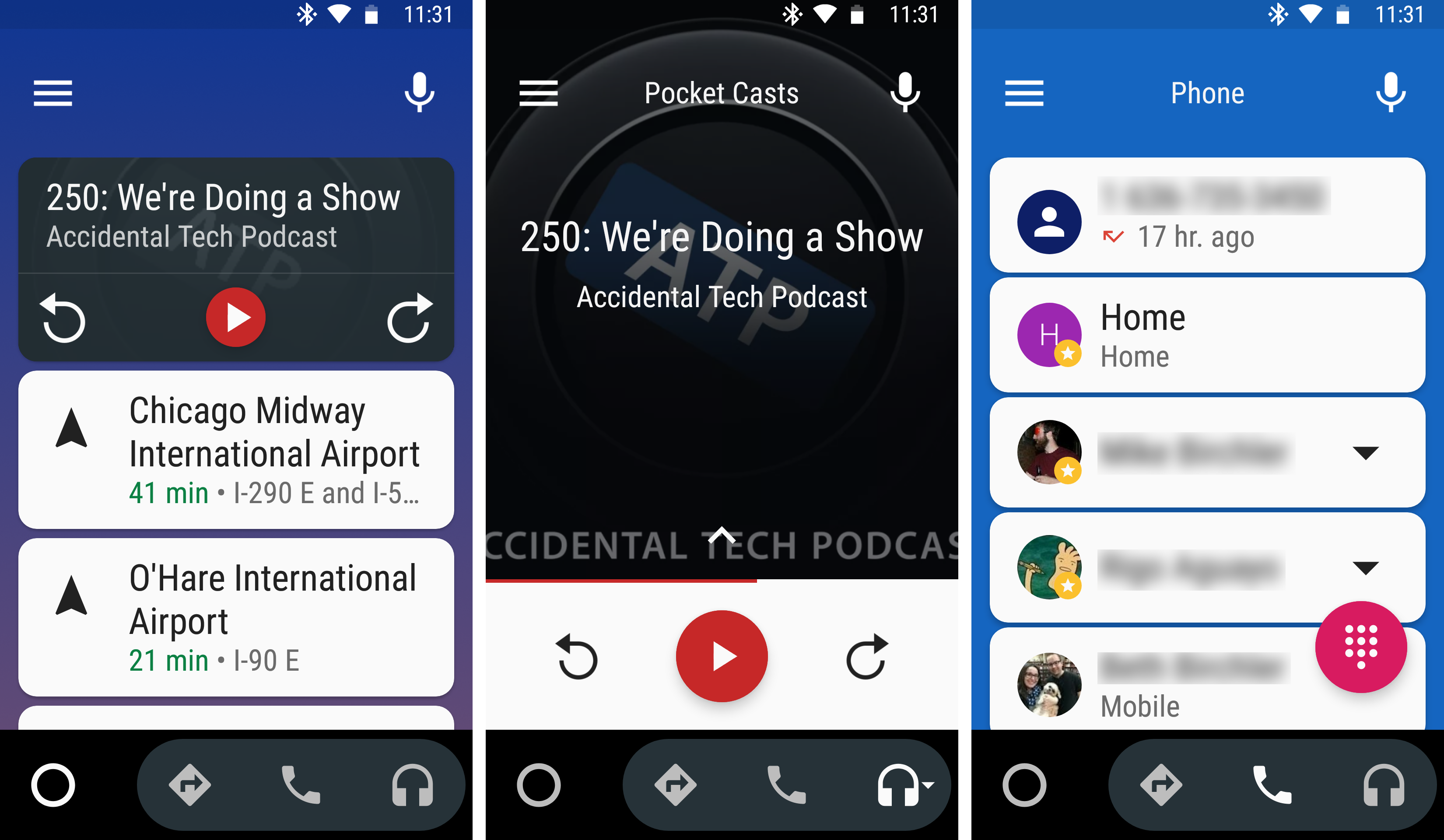
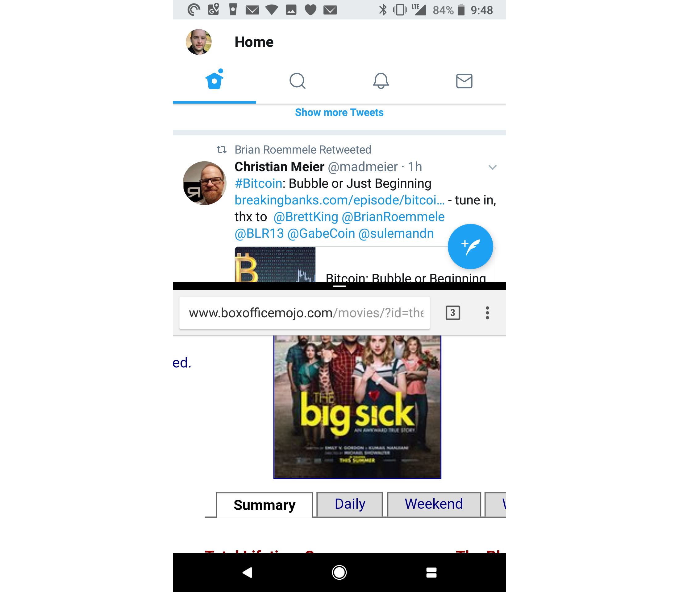
Android Auto is one of those apps I didn’t think I would care about, but I find myself enjoying it more often than not. This isn’t a built in Android feature, but you can get it from the Google Play Store. I like that I can have custom triggers to launch it automatically. I have a Bluetooth receiver in my car, and I have it set up to launch automatically whenever I connect to that device.
Essentially this will give you an oversized interface to use while in the car, and is meant to be used in a car mount or something of the like, not just in your hands. The “home screen” (left) will show the current media playing app as well as some common destinations for quick navigation.
You can tap into the music/podcast app and it will bring up a car-specific interface for that app if the app supports Android Auto. Pocket Casts, Google Play Music, and Spotify use it, but sadly my music streaming service of choice, Apple Music does not.
Tapping the navigation button opens Maps in an interface with bigger buttons, and tapping the phone icon brings up a list of your recent contacts for quick calling.
Somewhat related, Google has added a “do not disturb while driving” feature that works about as well as iOS 11’s same feature.
Emoji
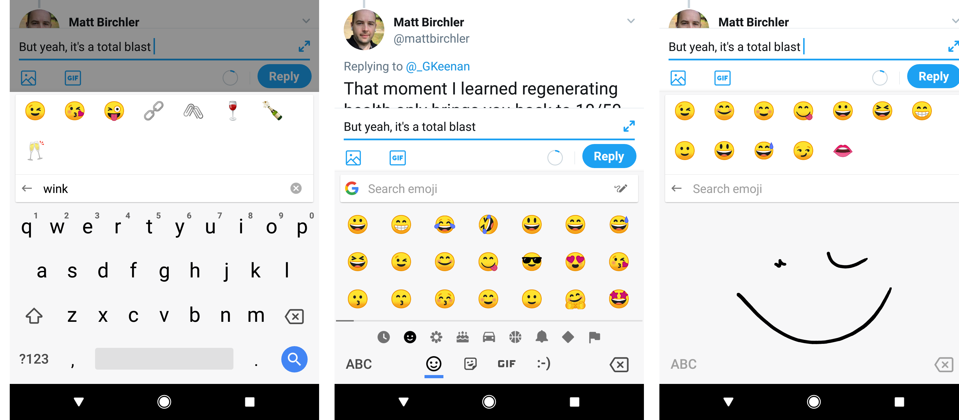
I personally like Apple’s emoji art better than Android’s, which has never hit the mark for me. The old “blobs” were my least favorite emoji set ever, and the new ones look better, but only just. Still. I’m happy to see Google moving in the right direction.
Where Google has a big lead over iOS is in the emoji keyboard built into the system keyboard. You have the standard picker like we have on iOS, but there is also a search bar that lets you search for specific emoji. In the left image above you can see I searched for “wink” and it gave me the faces that are winking as well as a few that are close to what I typed (in case of a typo on my part). This is good, but it’s oddly specific with what it shows you. For example “lol” returns zero faces laughing, but instead some lollipops 🍭 and the hibiscus 🌺 for some reason. Interestingly, I can install the Gboard app on iOS and the searches work more how I’d expect. “lol” for example, returns 😆 😅 😂 and 🤣.
The Android keyboard also has a tab at the bottom for ASCII-style emoji, as well as GIF search, and stickers. iMessage has these features on iOS, but Android brings them system-wide and it’s great.
Messaging is a Hot Mess
This has been the story every year since 2008. Android has many apps for chatting, but none of them are really universal. I use WhatsApp to talk to my wife and a few other friends (all of which wish I would just go back to iMessage), and some friends use Hangouts. Allo is here too, and while it’s a nice app, literally no one I know uses it, so it’s a non starter.
My big problem is that SMS, which is terrible, is still essential to my communications and the only apps that can do SMS are miserable. Messages is Google’s stock option and it’s incredibly simple, and the third party ones I have tried are either buggy or too messy to use on a regular basis. I like that Android allows me to set my own SMS app, but I just wish my options were better. I miss Messages for iOS dearly. It’s a better app for SMS, and everyone I know with an iPhone uses it and likes it.
I can use Messages on iOS to talk to anyone in my life and that sort of app does not exist on Android. I’d suggest Google allow Allo to be the SMS app on the phone so more people would use that and people would actually enjoy messaging on Android, but they seem oddly reluctant to do this.
Oh, and losing the ability to seamlessly carry on my conversations between my phone, tablet, and Mac is a major loss.
Camera Shortcuts
I can double tap the power button at any time to open the camera app on the Pixel 2. Other phones have similar methods, and i find all of these to be easier than iOS’s method of raising the phone or turning on the screen some other way and then swiping to the side to bring up the camera. This is especially hard when there are notifications on your lock screen and you accidentally swipe one of them instead of going to the camera.
Google Assistant vs Siri
This will get it’s own article, but after many weeks with the Pixel 2, I can safely say that I enjoy Google Assistant more than Siri as my voice assistant on the phone. It’s not by a large margin or anything, but it takes the lead for 2 main reasons:
- I trust it more to understand the words I’m saying, which makes it query the right thing more often and makes speech-to-text more usable.
- The fact it can do Google searches natively means it is better at answering general knowledge questions, something Siri is more hit-and-miss with.
Again, this will get more info later, but I’m quite happy with the Assistant.
Color Options
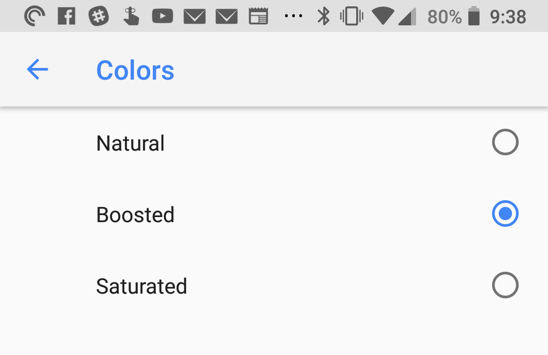
This is a Pixel 2 feature in Android 8.1 (currently in beta), but many Android phones have this feature in some way or another. Google offers 3 modes: Natural, Boosted, and Saturated. I personally like the middle option myself, but you can pick the one that looks best to you.
iOS does a great job of having a wonderful color profile in their iPhones, but it’s nice to be able to change things up a little.
Google Home Screen
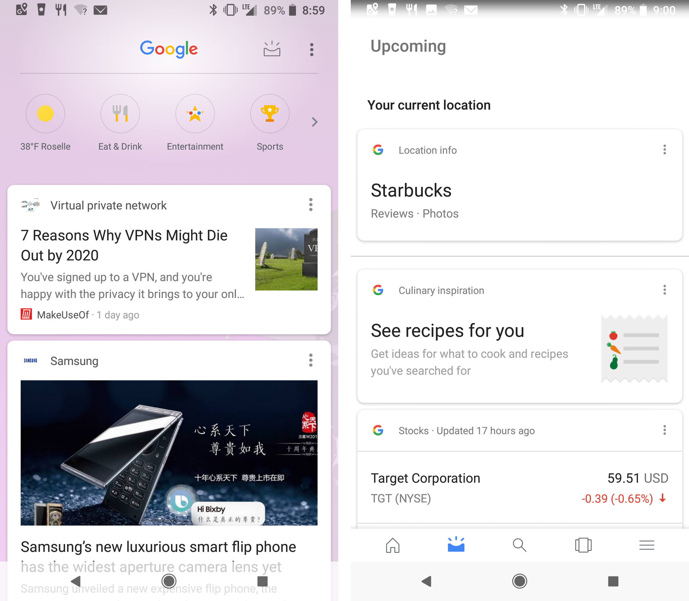
This is a page that has gotten a ton of changes over the years, and you never quite know what you’re going to get year in and year out. The current iteration treats this page as a news feed first and foremost, and change that has generated more than a little angst.
Essentially, this page (accessed by swiping to the left on the Pixel Launcher or in the Google app) shows you news stories and sports scores from topics and teams you’ve shown interest in. Google pulls this info based mostly on your search and web history (\#thepowerofgoogle), but you can also customize your feed content by editing a manual list of interests. That said, you can not turn off its use of your web history, so searching for anything on Google or visiting any site in Chrome will cause that content to appear in your feed.
This feed is fine, and I do find it generally useful. I don’t read the content in the feed that often, but it’s nice once in a while to just get a quick refresher on the news. It’s quite rare that a story will appear in here that I’m totally not interested in, which is pretty impressive.
That little inbox icon at the top right takes you to the “Upcoming” page, which displays the same info as an older Google Home version, and I honestly find it more compelling. This is where you’ll find that classic “Google uses A.I. to give you useful info!” feeling you’re supposed to get from Android. I see info on where I currently am, calendar events on the horizon, flight info, travel times, and more. This isn’t a news feed, it’s a “me feed” and it’s quite nice. Apple Watch users can think of the Siri watch face in the latest watchOS release as a good comparison. I wish this screen could be the default one that comes up when I bring up the Google Home screen because it’s more useful. As it stands, I usually forget about it because it’s numerous taps away.
As one final note, the iconography on this page is terrible. The icons for weather, food, entertainment, and sports are so pale that they almost disappear into the transparent layer behind them. Also look at the gradient at the top of the page on the upcoming page (right screenshot above). That tiny black-to-white gradient at the top of the page appears to be trying to make the menu bar visible, but it’s hilariously bad in execution.
You Can’t Copy Images (ugh!!!!!)
This is a small one, but it turns out I copy images from one app to another regularly on iOS. My main use case for this is copying an image from Safari so I can paste it into Twitter or an iMessage conversation. Android appears to only be able to copy text only. This means my workflow for finding an image online that I want to share elsewhere is to download the image to my device, uploading it to the second app, and then going into my file manager to delete the image. This is a shitty experience and I didn’t realize how much I depend on this simple interaction until going to Android full time.
Per its documentation, Android Oreo supports copying text, urls, and intents. I’m a little unclear about the “intents” option, but that appears to be something like URL Schemes on iOS.
Fingerprint Gestures
Android Oreo brings the ability for apps to map gestures (swiping up, down, left, and right) to functions in their interface. I personally use the Pixel Launcher’s options to swipe down to bring down the notification panel. This is pretty nice when I want it, since it saves me from having to reach all the way up to the top of the screen.
I have had to start treating my phone more gingerly because of this though. I can’t count the times I’ve been trying to take a selfie with someone and had to start over because I brushed the reader and brought up my notifications. Every time I’ve given my phone to someone else to do something they’ve been baffled by the behavior as well. It turns out a fingerprint readers in a spot your fingers naturally fall on the back means you touch it a lot.
Oreo allows any app to implement these gestures for when you’re in their app only, but I have not found a single app in my time using Android that has done this. There may be some out there, but I haven’t gone out of my way looking for them. If it’s not in the apps I actually find useful, then it may as well not exist.
Turning on Wi-Fi Automatically
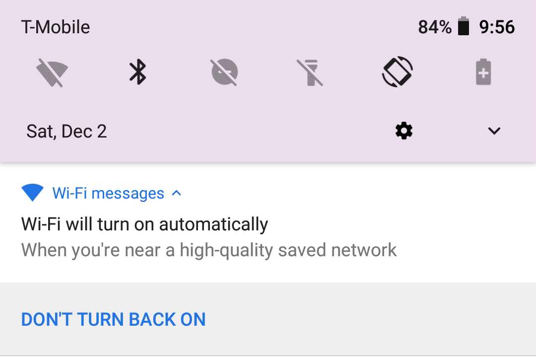
This one is really cool! So when I tap the Wi-Fi icon in the notification panel to turn it off, it will disconnect me from any networks I’m currently connected to, and will keep Wi-Fi off until I’m close to another Wi-Fi network I’ve deemed a trusted network. This means I can turn off my Wi-Fi when I’m at the mall and don’t want to connect to any of their networks, but it will turn itself back on when I get home.
Picture-in-picture
Android Oreo has 2 types of “multitasking” and only one of them is worth a damn. Fortunately, it’s this one 🙂
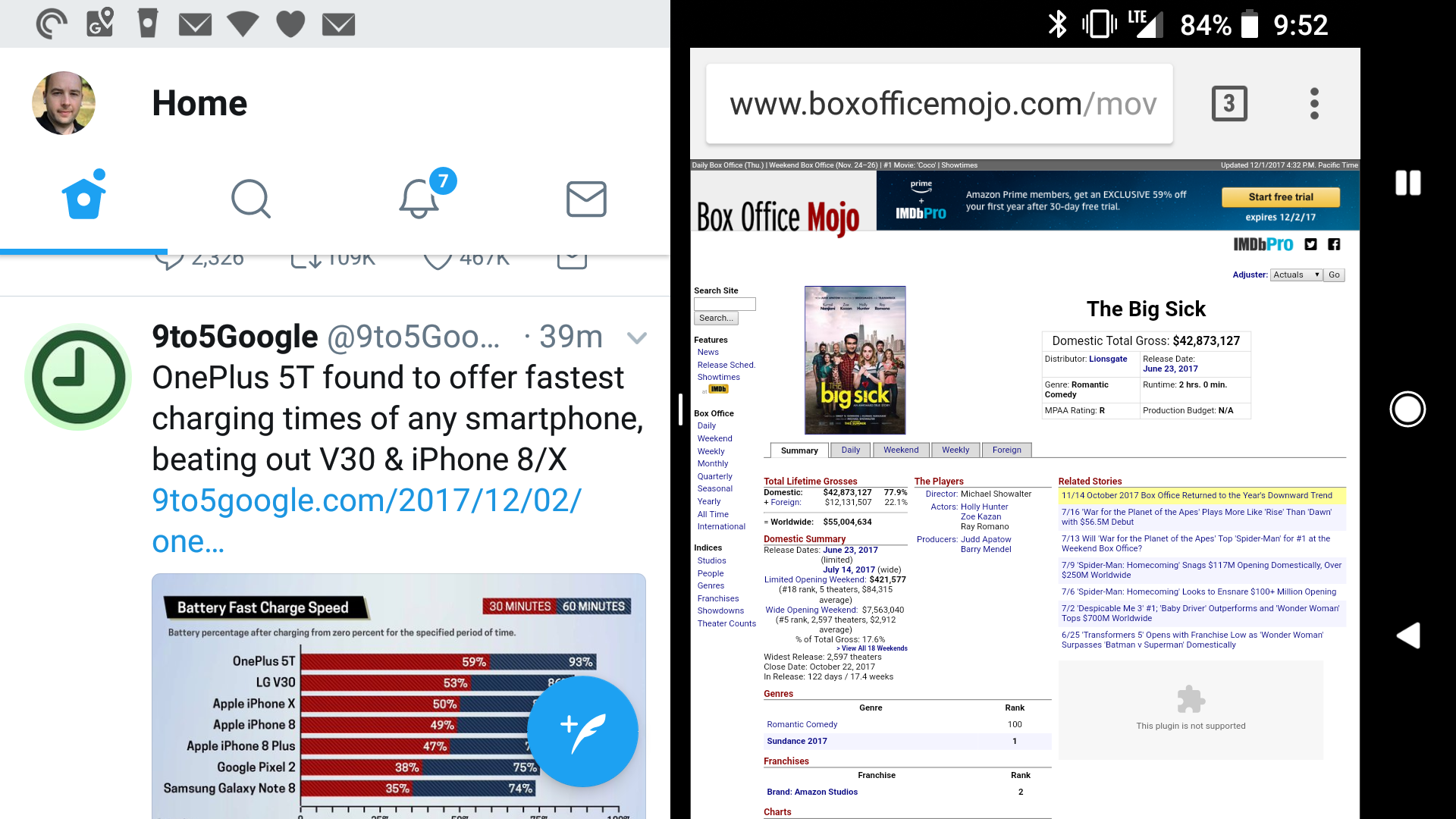
The only 2 apps I’ve used on my phone that use this feature are Youtube and Google Maps, and it’s appreciated in both cases. I can’t tell you how nice it is to be able to have a YouTube playing in a small corner of the screen while I scroll through my Twitter feed or triage my email/RSS feeds.
Maps is less useful, as the display is so small that it doesn’t give me much info, but it’s nice to have in a pinch.
Split Screen Apps
And this is the other multitasking interface, and I simply don’t get it. On a tablet, this must be nice, but on the phone it makes no sense to me. All it does is make both apps unusable.
Seriously, look at the apps there! Chrome on it’s own: useful. Twitter on its own: useful. Both on screen at once: completely useless!
Maybe it makes more sense in landscape, but still, it feels like I’m running each app on my Apple Watch! I think it’s a usability nightmare and is not something I’ve ever used for any productive reason.
Battery Settings
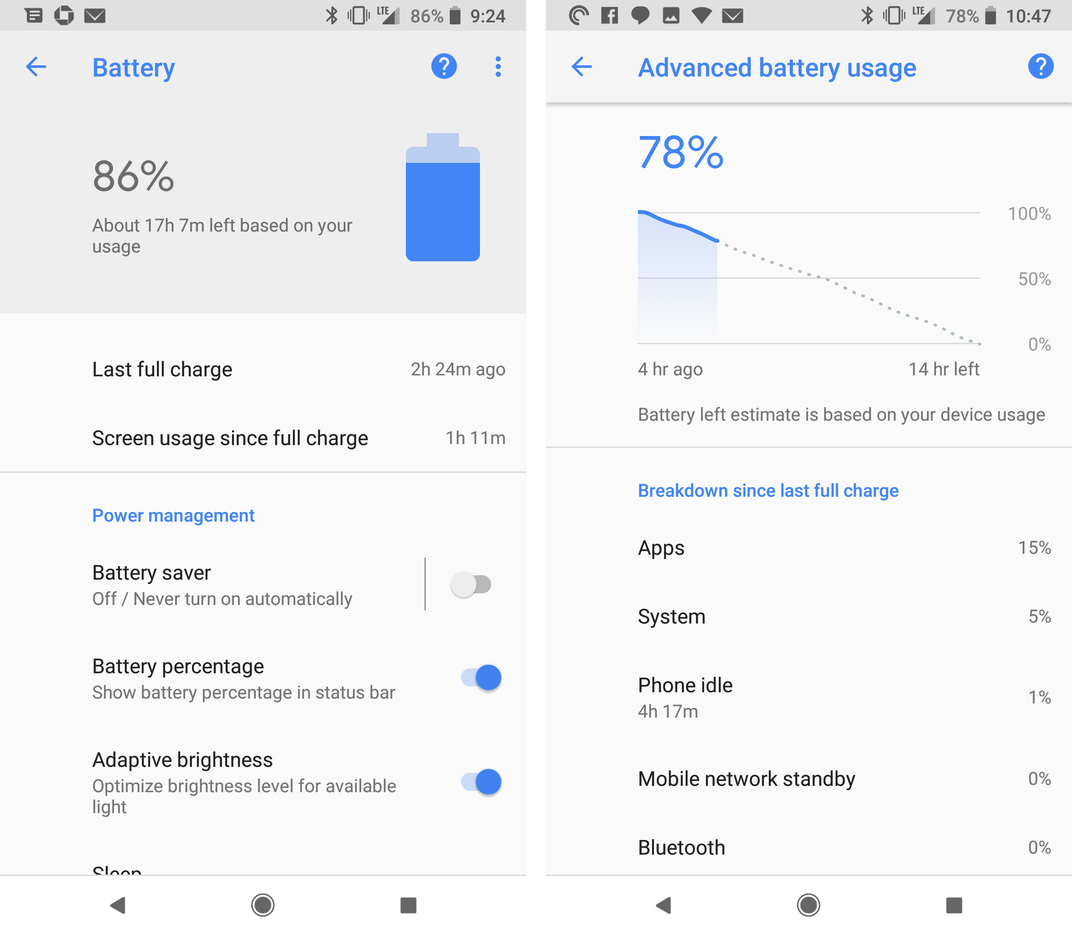
Without going into too much detail, the battery page in the Settings app is more powerful than it is on iOS. The graph in the screenshot above is particularly useful, as it gives you an idea for how long your battery will likely last. Just like iOS, this page will show you how much impact each of your apps are having on battery life, and you can uninstall or modify settings for each app from this page. If an app is out of control, it’s nice to be able to remove it so quickly.
Wi-Fi Aware (AirDrop-ish)
This one is more theoretical, but Oreo has a new feature called Wi-Fi Aware that Google describes like this:
On some devices running Android 8.0 (API level 26) and higher, Wi-Fi Aware provides the ability to discover and connect directly to each other without any other type of connectivity between them, such as Wi-Fi Access Point or Cellular. Wi-Fi Aware is also known as Neighbor Awareness Networking or NAN.
So yeah, basically AirDrop. Sadly, this is not something I have been able to test since I have not found another person in my life who has a phone with Android on it yet (and I work with software developers who almost all use Android).
The good news is that for sharing between my own devices, Pushbullet does a pretty good job of filling this gap. If you haven’t used it before, it’s awesome, and it available for iOS and Android.
Smart Text Selection
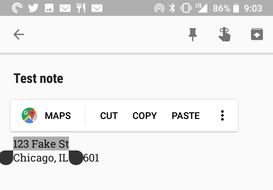
Anyone who uses iOS should be familiar with this feature. Apple turns things that I recognize as phone numbers, addresses, emails, websites, movies and more into links that can be tapped to open the specific item in Safari/Maps/Contacts/Phone, and now Google does much the same thing. In some cases, Android will underline the notable content, and other times it will not. Either way, after selecting the text that falls into one of the above categories, the contextual pop up menu that includes copy/paste/etc. will have an option to open the selected content in the Google app that makes the most sense.
There’s a ton of stuff here, and again your experience may be different, but for me it’s a little more bad than good here. There are plenty of things above that Apple should implement ASAP though, because I’m going to miss them when I go back to iOS.
- JCPenny. I was buying a gift for my mother in law, I swear! ↩


