Android Oreo Review: Notifications
This is part 7 of a multipart series on Android Oreo. The subsequent parts in this series will be posted daily to BirchTree, so subscribe via RSS, Twitter, or Apple News.
- Part 1: Introduction
- Part 2: All the Little Things
- Part 3: Google’s Assistant and Other Apps
- Part 4: Third Party Software
- Part 5: Performance and Stability
- Part 6: AirPods
- Part 7: Notifications
- Part 8: Conclusion
Notifications are the definition of a mixed bag on Android. I’ll break notifications down into 3 sections in this section of the review: home screen, notification screen, and individual notifications.
Home Screen
Notifications on the home screen are where I’m most conflicted about them. I’m specifically looking at the menubar where you can see icons for all the apps that have unread notifications, as well as the new-to-Oreo notification dots that appear on icons when they have an “unread” notification.
Icons in the menu bar
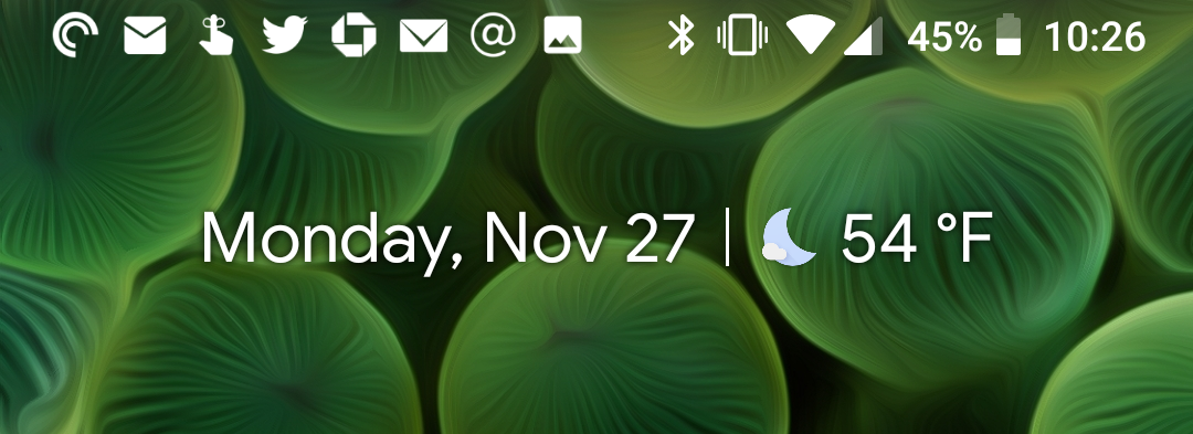
The more controversial aspect of this for iOS users will be the icons in the menu bar. All of your status icons are right-aligned in the menu, so all the icons on the left will be icons for the apps that have outstanding notifications that you need to deal with. For most people, this will mean that you almost always have icons for text messages, emails, social media mentions, and more in the menu. This space gets very cluttered very easily, which is where people get a little touchy about these icons.
I’ll be the first to admit that the icons look ugly as hell up there and they make the home screen look bad. BUT there is a silver lining here. Because the icons make my screen look bad, I’m more inclined to pull down my notification shade and deal with the notifications that have come in. Unlike iOS where you can basically ignore your notifications and let them simply fall down the line of chronological notifications as new ones come in, Android notifications don’t go anywhere until you do something about them (we’ll get to that shortly).
Amazingly, even though Android allows for some control over what apps can do what with notifications, you can not make it so an app will not show up in the menu bar. The only way to prevent an app from showing up there is to completely turning off notifications entirely for that app. So if I want to get email notifications but I don’t want a million envelops cluttering my menu bar, I can’t do that. It seems like a reasonable request, but sadly it is not at this moment in time.
Ultimately, I think I do actually like these ugly icons because they help remind me to triage and handle my notifications in a way that iOS never does. Some people may like that iOS lets their notifications wash over them and doesn’t nudge you to take care of them, but I tend to let apps send me notifications specifically because I do want to deal with them, so the hit on beauty is something I’m willing to tolerate for the better habits it’s forming in me.
Notification dots
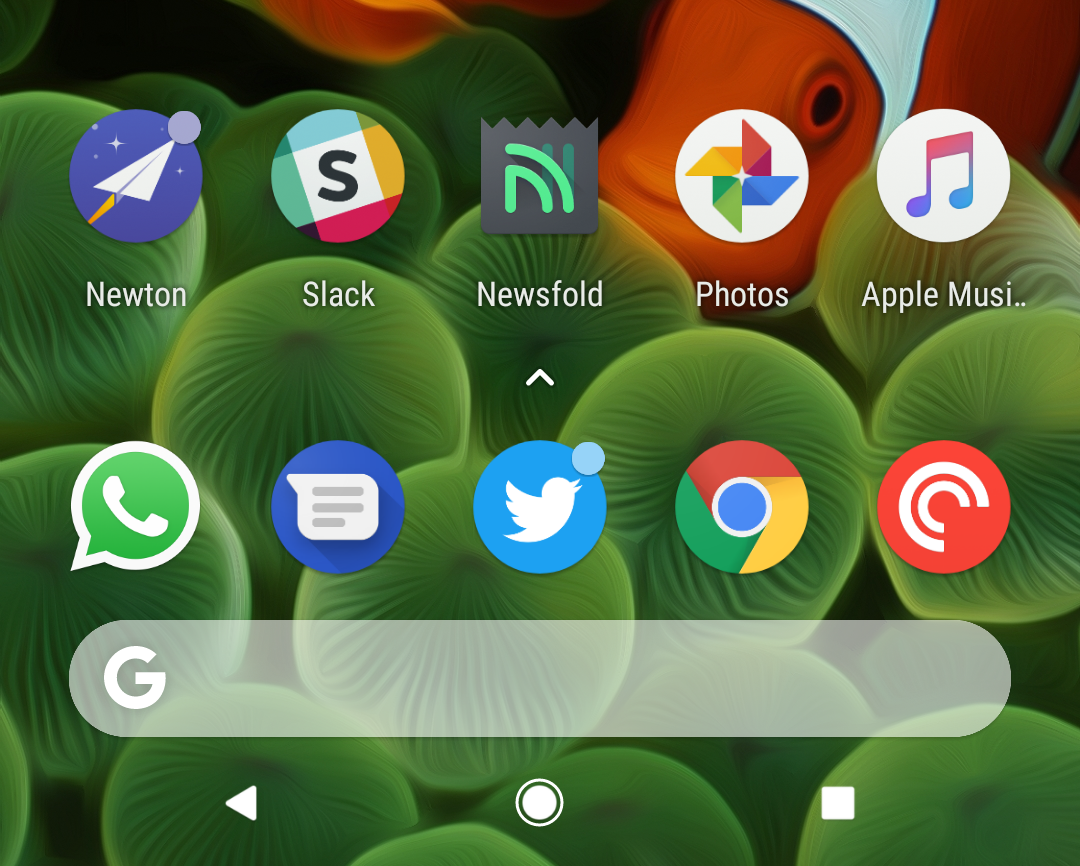
Think of notification dots like the red badges on iOS. They will appear on the top right corner of app icons when they have an active notification. The dots are going to be similar to the ones you know and love/hate on iOS, but they’re not exactly the same.
When a notification comes in, it will add a dot to the app that sent the notification1. The dots are not all the same color either, as they will take on one of the colors of the icon they are being applied to. I personally find this to be an odd choice for a UI element, as it (A) makes the indicator different every place you see it and (B) makes the dot blend into the app icon in some cases. It’s amore subtle look than the red dots on iOS, but I also find myself basically ignoring these entirely.
There is one innovation here that you don’t have on iOS, and that’s the menu you see when holding down on an icon for a second.
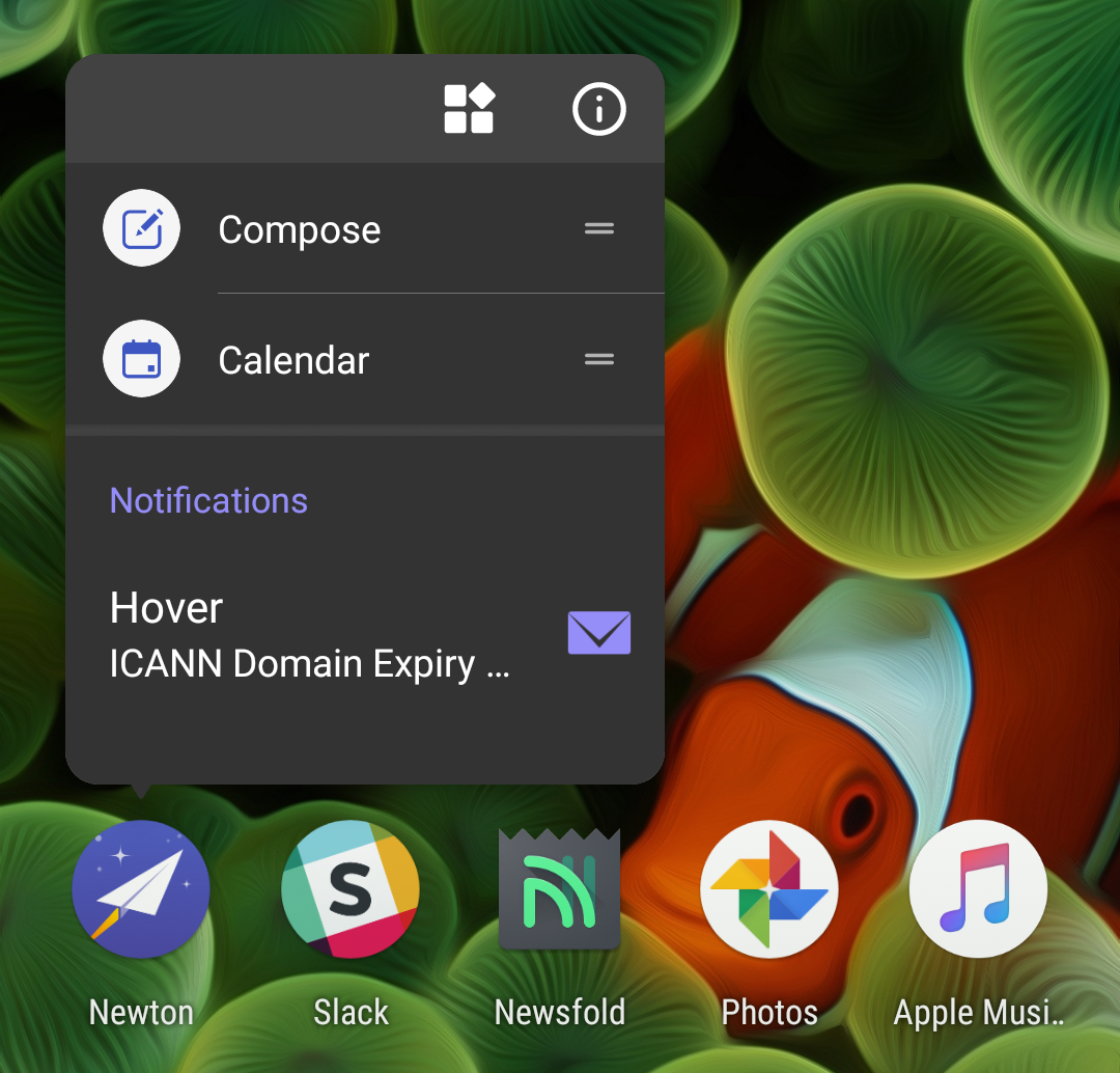
This will show you the most recent notification from that app. This is also a largely unused feature for me because I don’t find value in it. As you can see in the image above, you only see a tiny portion of the notification content for the first available notification for that app. I can either tap into the notification to dive into the app to that notification, or I can swipe it to the right or left to dismiss it. It’s overly simple in my opinion, and it does not make me want to use it over just pulling down from the top of the screen and looking at the actual notifications, which I find much more useful.
Notification Shade
This section is mostly pulled from another blog post where I went into depth on this topic.
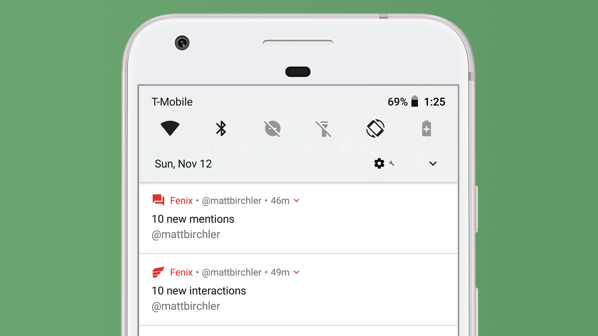
Right at the top of the page we have access to some frequently used controls. Think of this like Control Center from iOS, but paired down a bit. Those 6 controls let me toggle WiFi, Bluetooth, Do Not Disturb, flashlight, auto-rotation, and battery saver mode quickly. Those are the system defaults, and I can customize these to show a few other controls as well. I wouldn’t trade these for iOS 11’s Control Center, which got far more powerful this year, but I like this implementation as well.
You can already see a bit of what I really love about Android’s notifications below that, but let’s take a more full view of the notifications I currently have.
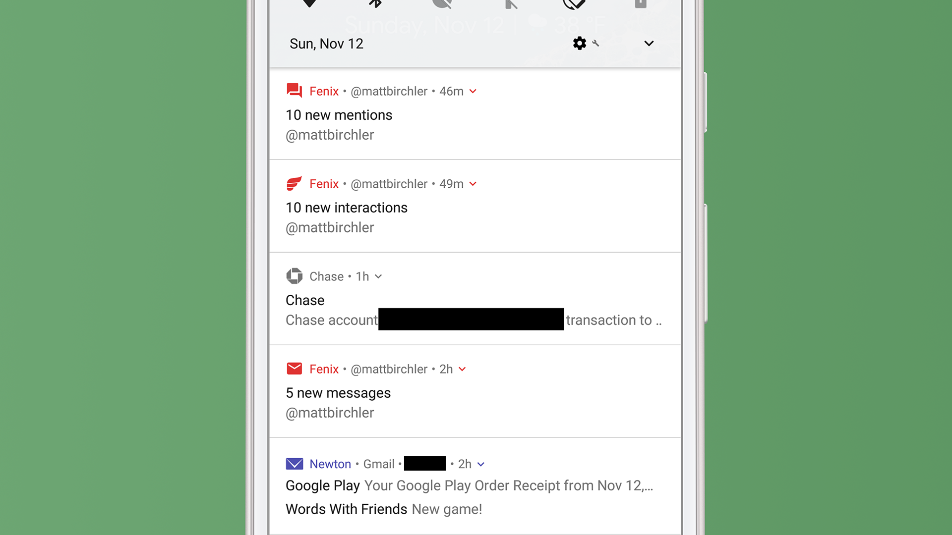
The Chase notification isn’t that exciting, and is nothing that iOS couldn’t do today, bu the Fenix and Newton notifications are really interesting.
Looking at Newton first, you see one basic advantage Android has over iOS; the ability to combine notifications from individual apps into one. I have 2 email notifications, and they only take up one notification slot, which is how it should be. No, I don’t know where those emails came in regards to the tweets above them, but I don’t really care either. I don’t deal with my notifications in chronological order, I do them one app at a time. While iOS makes it nearly impossible to scan your notifications if you have more than a couple, Android makes this a breeze. I can triage notifications much faster with this system.
There is a little downward facing carrot icon to the right of the time, and I can tap that to expand the Newton notification to show each email’s notification on its own. From there I can tap into or swipe away each email individually. I can also sometimes swipe down on one of these combined notifications to expand it, but it only works sometimes and is kind of a weird interaction. I tend to just tap the (admittedly too small touch target) carrot.
Fenix is an example of an app that really does a good job with notifications. Fenix 2 is a Twitter app that I quite enjoy, and the developer understands that there a different types of notifications that one can get on Twitter: mentions, DMs, and other (likes, retweets, lists, etc.). They have helpfully split up their app’s grouping of notifications to reflect this reality and it’s fantastic.
I like seeing my likes and retweets, but I can’t really act on them, so seeing them all bundled together and being able to swipe them all away at once is convenient. On the flip side, I do want to be able to act on my mentions and DMs, so seeing them broken out like this a godsend (the fact that DMs and mentions are separate is just a bonus). Just like the other combined notifications, I can tap the carrot icon to expand to see each tweet included in this overview. The one bad thing is that expanding these replies shows a preview of each tweet and I can not reply to them or perform any other action on their from the notification itself.
As a quick aside here, Android Oreo introduced a new feature called Notification Channels that lets developers categorize the different types of notifications they send and you can allow only the ones you want. Google advertises this for shopping apps (only delivery updates, not advertised products, for example), but I have only seen a couple apps update for this feature so far. Major notification offenders like Facebook and Amazon have not updated to use this, and frankly there is little incentive for them to do so. Twitter has at least, so there’s that.
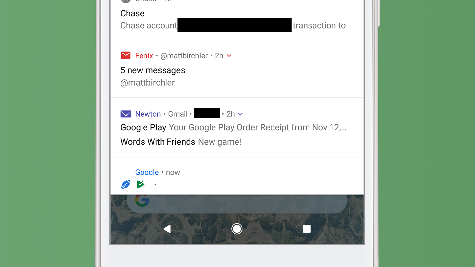
And finally we get to the bottom, at which point you’ll tell me “Matt, we’ve already looked at the Newton notification!” You would be correct, but take a look at the football and Play Store icons along the bottom of the page. These indicate notifications are available for those apps, but they are not on screen yet. They’re not terribly useful, but they do give you an idea for how much more you have to go in your list.
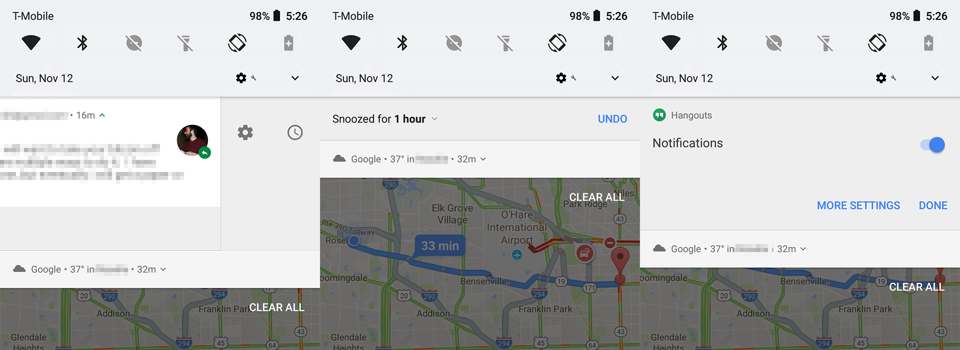
And finally you can swipe and hold on a notification to bring up 2 more buttons. The one on the right lets me snooze a notification for a certain amount of time and the one of the left allows me to either turn off notifications entirely for this app or I can tap MORE SETTINGS to go to the app’s notification settings page in the Settings app. These are nice shortcuts to have, and they are especially helpful when you just want to tell an app to shut the hell up.
Single Notifications
While Android clearly kicks iOS’s butt when it comes to managing multiple notifications, but iOS smokes Android when it comes to what individual notifications can do. For a basic example, heck out this notification from my email app, Newton:
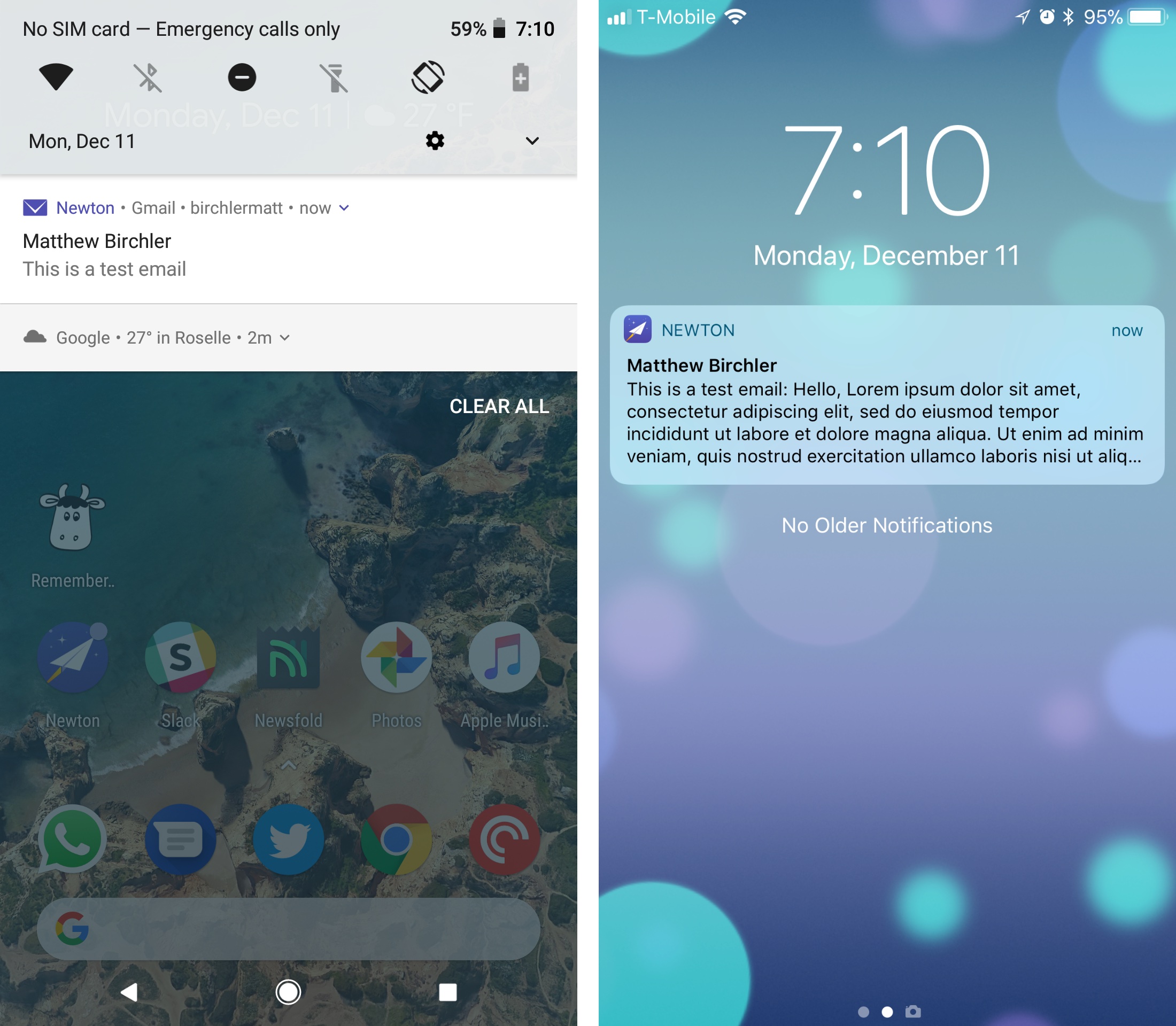
At this point it’s a matter of taste, as Android trims this down to less information (just the sender and subject line), while iOS shows the sender, subject line, and as much of the email body as possible. For all intents and purposes, I’m getting the same information. It’s when I expand the notification that I start to see the difference.
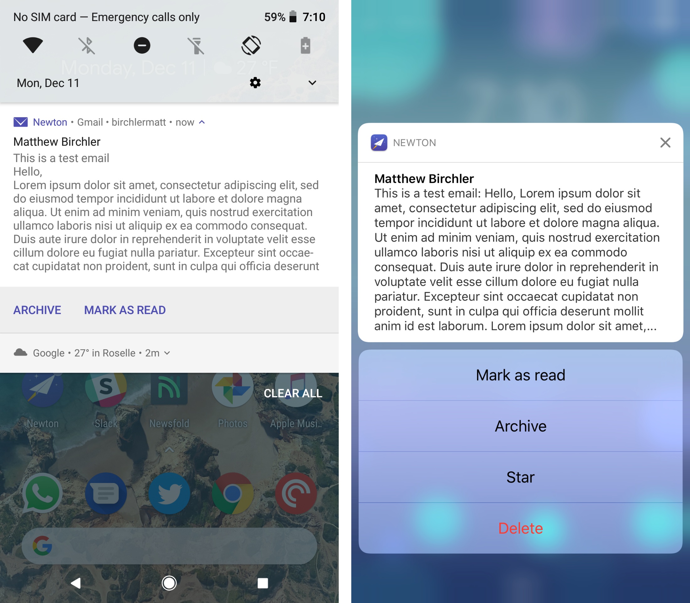
Newton has not done much with iOS’s rich notifications, so the email text looks exactly the same, but it has embraced a standard iOS practice of giving lots of actions in the notification itself. The Android app lets me archive or mark the email as read, while I can also star or delete the email on iOS. This trend holds true across most, but not all apps2.
Where iOS really separates itself my my book is when it comes to what Apple calls “rich notifications.” This refers to the ability developers have to embed all sorts of content into their notifications.
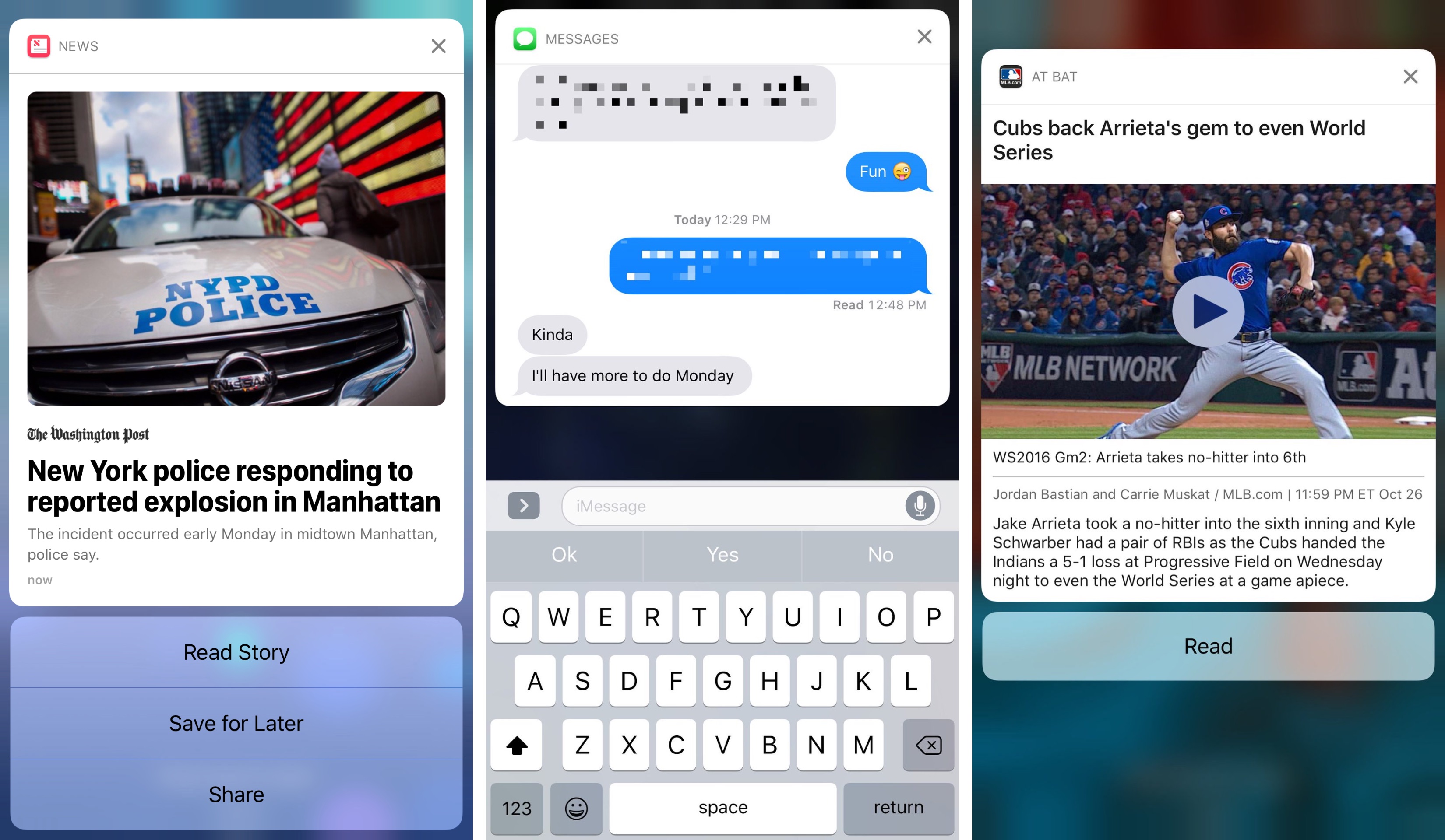
In the above examples3 you can see a news notification that gives me the lede, an image, and options to read, save, or share the story. There’s also an iMessage notification that not only lets me reply to a message and gives me some context by showing the last few messages back and forth. And finally there’s an MLB At Bat notification what not only has an image and text describing what happened, but I can tap that image to play a video inside the notification.
Ultimately, there is more that each notification can do on iOS, and more developers have jumped on board to enable these features for users.
Notifications Conclusion
Of all the things that are different between iOS and Android, I see notifications are the biggest win for Android. I know not everyone agrees with this, but for me the ability to group individual apps’ notifications together is a godsend, and I absolutely miss it when I go back to my iPhone. I really appreciate iOS’s rich notifications and I am glad I have them everyday, but Apple should take some notes from Android when it comes to helping me triage my notifications a little better.
- This can of course be toggled on or off on a per-app basis. ↩
- Google’s own YouTube app is an example of this, as video notifications on Android have the option to add it to my Watch Later queue, while iOS does not have this option. This is definitely the exception, not the rule, though. ↩
- The right image is a little old, but this is still how they work on iOS 11. I just wanted to show off the Cubs winning the world series again :) ↩


